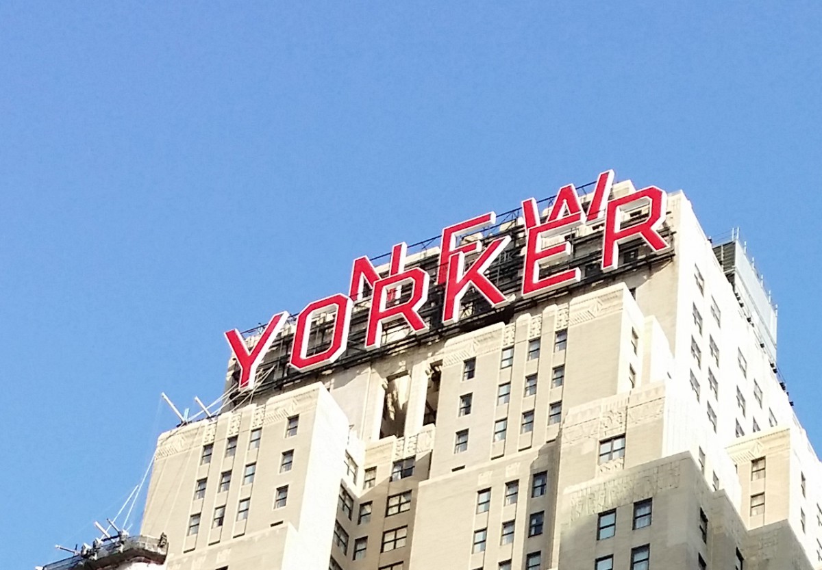
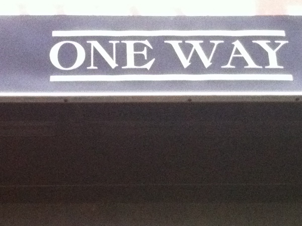
The photo was taken around 8th Ave. This is a sans serif because it has no serif at all and low contrast. They chose this typeface because it makes reading the text all the way up there much easier for people walking by.
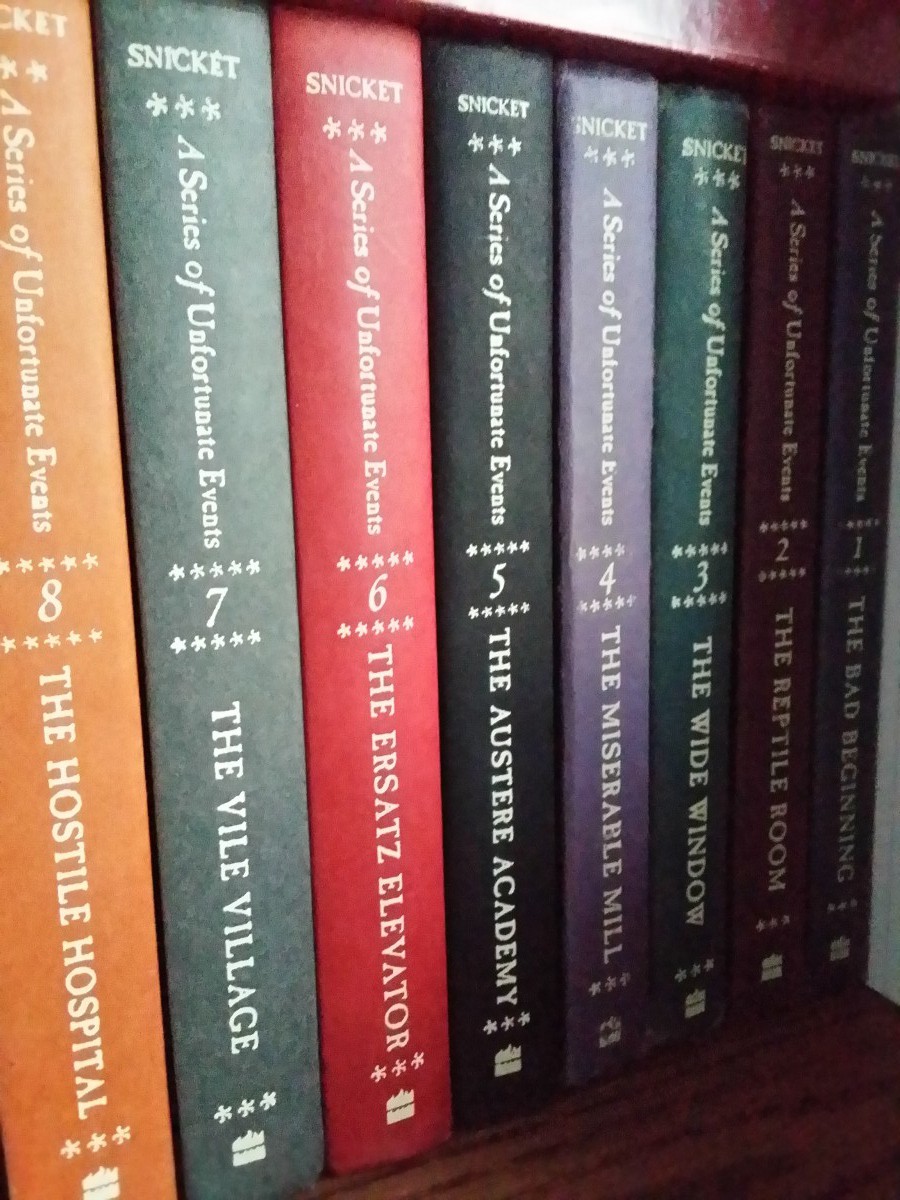
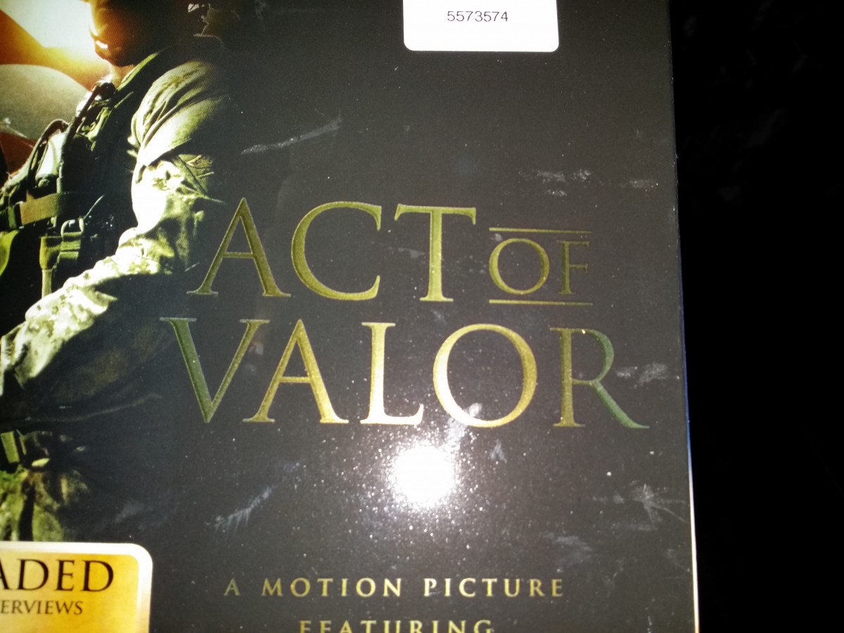
These “A Series of Unfortunate Events” books all use a transitional typeface. It’s a transitional typeface because the head serifs are more horizontal and has more stress on thick and thin strokes you can clearly see on the upper case letters.Lastly the lowercase have stress on the vertical bars.This cover of a magazine found in my home used a modern typeface (Bodoni). It’s a modern typeface because it has a thin hairline serifs. There is a lot horizontal stress and thick and thin strokes mainly on the upper case letters. This typeface seems to be used a lot in fashion magazines.This is a picture of the cover of the film “Act of Valor”. The typeface used for the box art is old style because the letters have both thin and thick strokes. The serifs has a more wedge shape than other typefaces. I think this typeface is the most appropriate for this kind of film and it actually fits well in the box art.
The Sony symbol used on this PS4 box is a Slab/Egyptian Serifs because the serifs are flat and have a rectangular shape. The serifs are also about the same thickness as the entire body font. Sony has been using this kind of typeface since the start of the company.
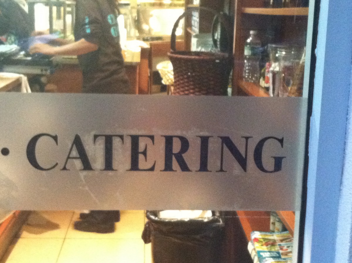
This type is Slab serif because of the some of the letters serif is rectangular and some of the words are like blocks.I found this font will i was in a mcdonalds on a poster promoting a soccer tournament. It is in this catagory simply because of the letters rectangular shape. They used This type because it fit the best because most slab serif type was used for posters. That is why this is a slab serif.This type is old style because of the more wedge serif. The second reason is because the words have a more sharper when you look at them. The last reason is because because the words seem the have thicker contrast them most word i’ve seen.I found the serif in Brooklyn the sign of a dehli store.I believed they used this type to attract costumers because the word are suppose to catch the persons eye. That is why this picture is a old style font.This is transitional because for one the head of the serif is horizontal. The second reason it is transitional is because it has a very low calligraphy flow. Finally it is transitional do to the small rectangular and thick stress on the words. I found these on the sign of a catering store. I believe just like the old style it was made this way to attract the attention of customers.That is why is type is a transitional.
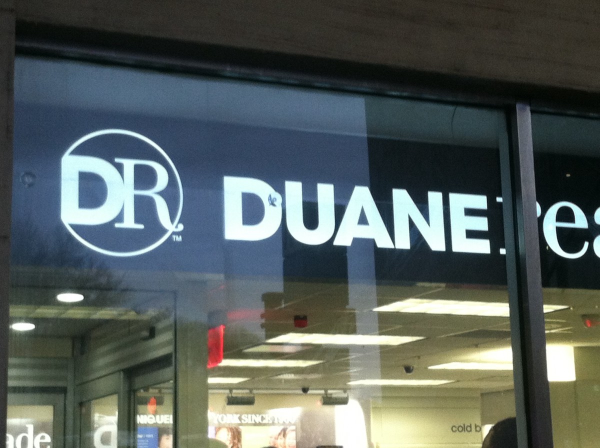
This type is san serif simply because it has no serif. The final reason is the low calligraphy. I found this type on one half of a stores name This type was used make it so the reader always read the first half the name. That is why this type is san serif.
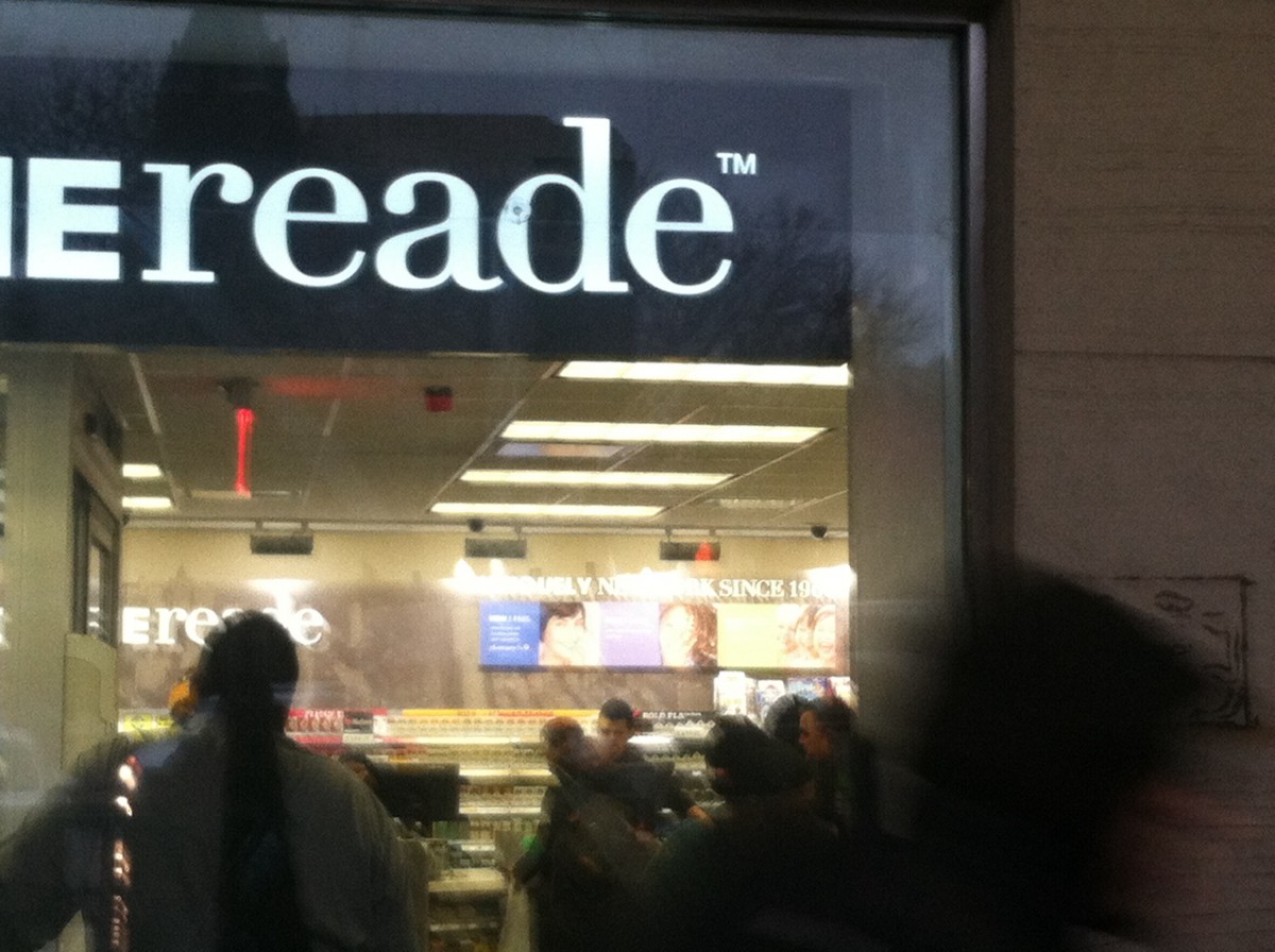
This type happens to be modern firstly because of the vertical axis on some of the letters. The second reason is the straight not curve change in to a serif. The final reason is that is that is has a horizontal stress.I Found this picture in the same place i found the fourth it is the other half of the pharmacy title. I believe the owners uses the part as a way to make sure the reader reads the entire title and once finshed will automatically know what and who they are.
Find 5 examples that use a typeface from one of the 5 families/classifications of type we discussed in class. Take a photograph of each.
Upload the 5 photos to our OpenLab website and write a brief caption for each photo indicating the following: which scenario each was used, describe the classification to which you think it belongs and why.
DO NOT use Google to get your images. Take the photos as you travel about your business during the weekend.
One of main projects of the semester will be to create a type book that each student will be able to use as reference as they continue their graphic design studies. The book is created using InDesign and consists of a variety of exercises.
The lecture for the day included a demonstration on creating and using multiple InDesign documents.
Topics Covered
Creating multi-page documents
Using the Page Panel
Working with Master Pages
If you need a little help with InDesign, here are couple of video tutorials which may be helpful.
InDesign 5 – How to Work with Pages
Working with Master Pages – InDesign 6
In-Class Lab & Homework
In class we begin a 5-page document which should be completed and turned in on Monday, Feb 24. The instructions are as follows:
Create a 5-page document using the 5-column grid we set up in class.
The 5th column of each page will contain the following: Families of Type
—Name of family
—Timeline
—Characteristics (at least 2)
—Name of the font used
Use the first 4 columns as your art area.
Using the name of the famous person you selected, create an interesting composition with caps and lowercase or all lowercase type
Use lines and basic shapes to make your composition interesting.
Do 1 page for each of the five families of type.
Create a new composition for each family
Save your file as follows:
ADV1167_yourlastname_5Families
Then save the file again as a PDF (which will be submitted) with the same name.
The 5 Classifications of Type – with so many typefaces, it is important to be able to distinguish and categorize the different varieties. Knowing the various characteristics of the different classifications will help to make identifying type a bit easier.
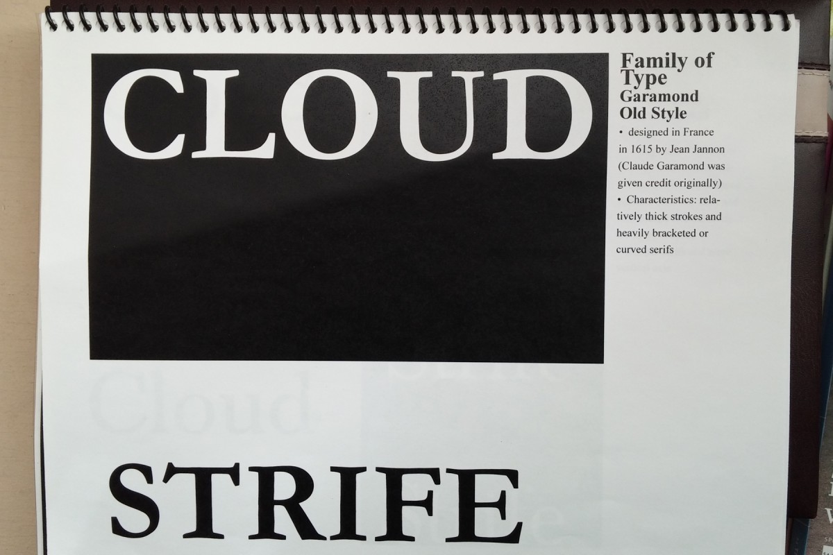
Old Style (Garamond is one example)
Transitional (Baskerville is one example)
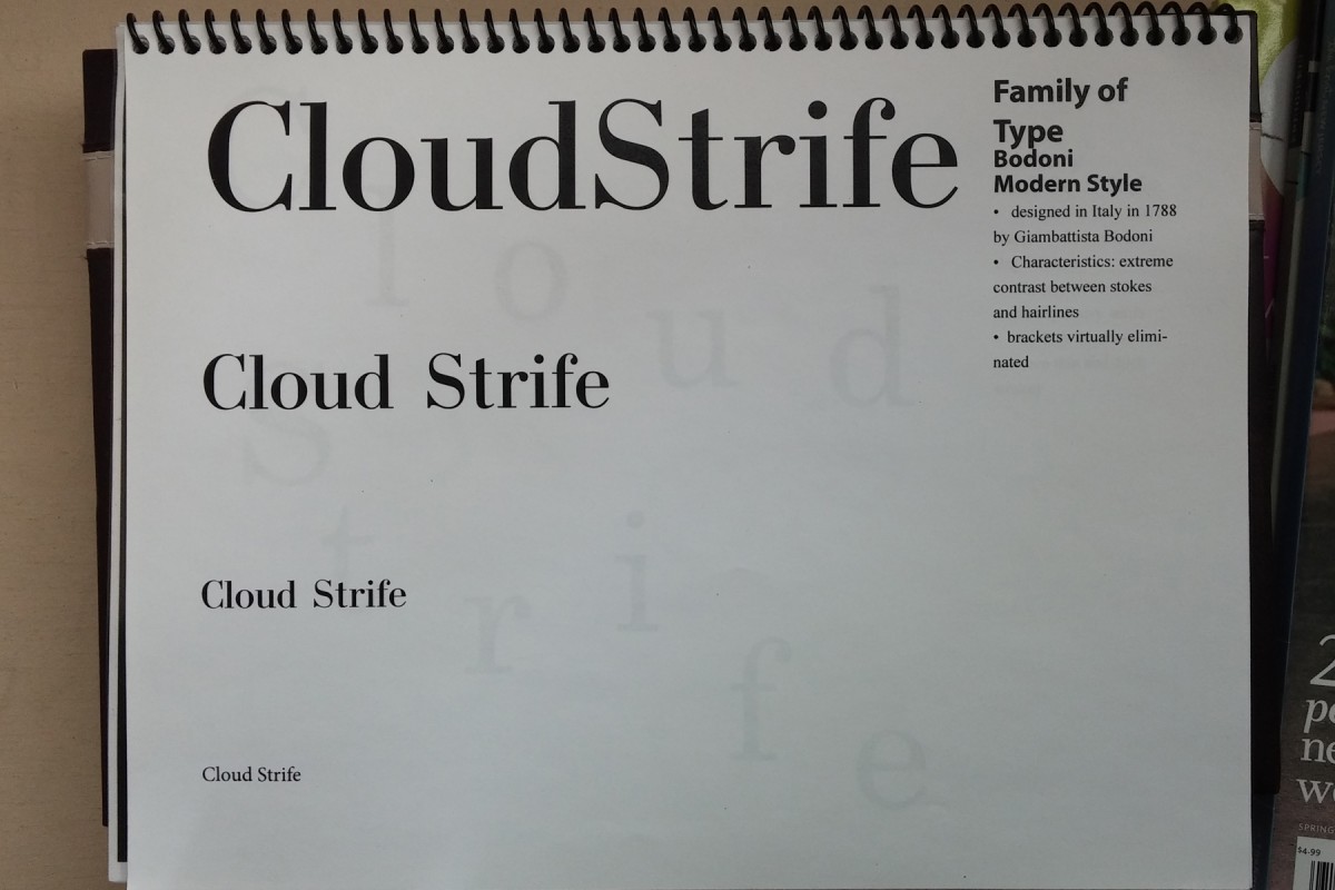
Modern (Bodoni is one example)
Egyptian or Slab-Serifs (Rockwell is one example)
Sans Serifs (Helvetica is one example)
The reading assignment, The History of Type contains all the information about the different classifications.
Homework
Prepare for Quiz #1 for Friday, 2/21/14 (will include 5-10 questions covering everything we’ve talked about so far, including readings)
Type Book – Choose a performer, famous person, or fictional character about whom you will do your type book assignments. You will use this person’s name or text about them to thematically tie the exercises together.
Create a 1-page document (use the grid in the Dropbox folder)
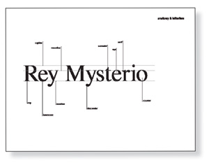
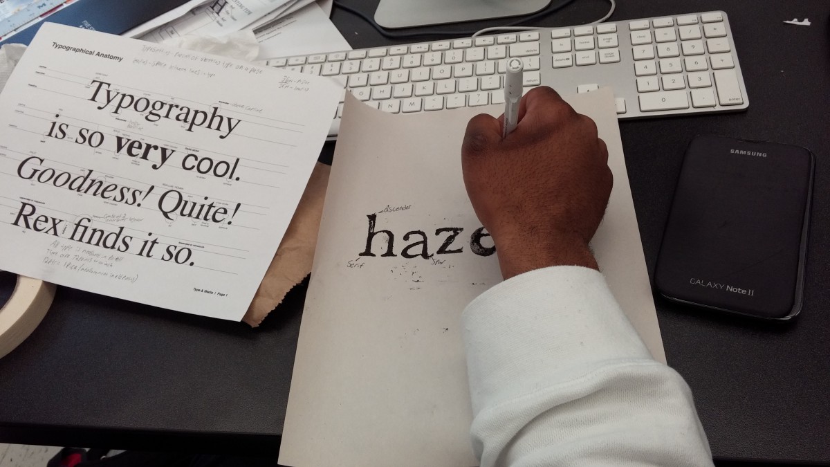
The document has 5 columns. In the 5th column, title the page: Anatomy and Letterforms
In the 1st to 4th column, type the name of your performer or famous person. Use these type specifications: Times, C/lc, approximately 120 pts and adjust if the type size is too big for the name you are using.
Align the baseline of this word with the first your horizontal guides
Use the LINE TOOL from your tool menu and PLACE a horizontal line indicating the baseline, meanline, and capline. These lines should be gray.
Use the LINE TOOL again and set lines and/or arrow to identify the following:
baseline (gray line)
meanline (gray line)
capline (gray line)
serif
counter
x-height
ascenders
descenders
When completed save your INDESIGN file as ADV1167_yourname_anatomy
Then save again as a PDF: Go to FIle > Export > ADOBE PDF > ADV1167_yourname_anatomy.pdf


 Topics Covered