We will be using InDesign a bit more during each class. If you need a bit of a refresher on starting a new document or, there is a link to a video tutorial in my last update. (see here).
Topics Covered
How to use kerning and tracking
Setting up new documents
Using the type blocks to understand leading
Setting up guides and columns to create a grid
Using the ruler horizontal and vertical rulers in InDesign
Creating strokes
Filling color
Homework
Take the best and worst prints of stacked words and write a paragraph (about 5-6 sentences) describing why one works well and why the other doesn’t well in terms of leading. For this exercise, you were to concentrate on getting good leading with your 2 stacked words. On Friday the 14th you will have one last time to complete this printing if you need to try it again.
Take the best and worst prints of stacked words and write a paragraph (about 5-6 sentences) describing why one works well and why the other doesn’t well in terms of leading. For this exercise, you were to concentrate on getting good leading with your 2 stacked words. On Friday, you will have one last time to complete this printing if you need to try it again.
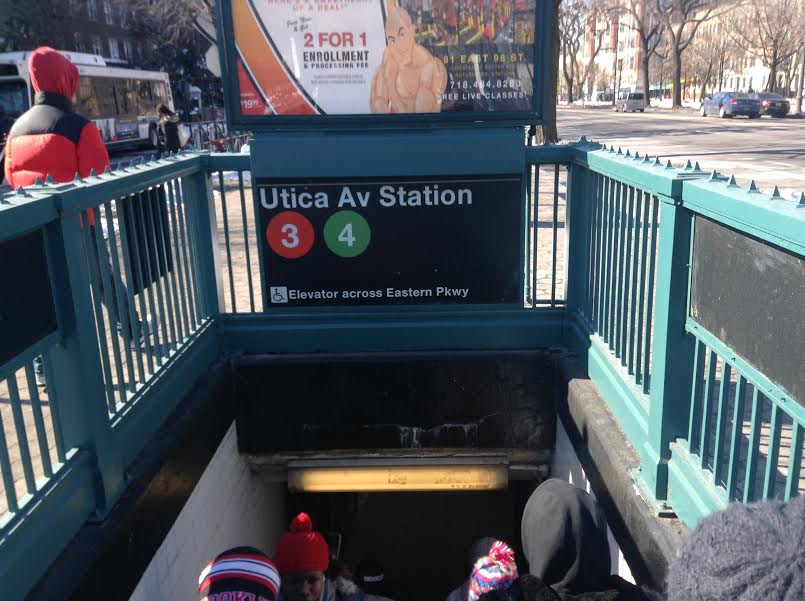
I live in the neighborhood Crown Heights, which is located in Brooklyn, New York. This neighborhood is full of interesting things, colors and a different way of life. Its somewhat of a urban setting, full of apartment buildings and brownstone buildings, so you would see many varieties of typography. There are a lot of West Indians, including myself, living in Crown Heights, with a lot of different businesses such as West Indian cuisine restaurants, Chinese food restaurants, corner stores, clothing and shoe stores and even discount stores, also known as the 99 cent stores. There are different forms of public transportation here in Crown Heights that serves the area, so you would see numbered typography around. There is different types of typography that decorates Crown Heights, like simple but bold letters for businesses to creative art like pieces such as graffiti. Street signage typography is somewhat more out there than any other forms of typography.
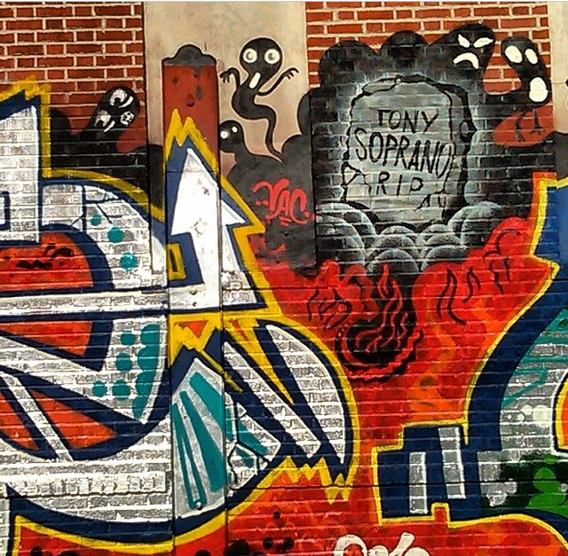
A graffiti in honor of Tony Soprano, in memory of him. The way they did the letter form with a touch of graffiti. -Sherman st. Bronx NY
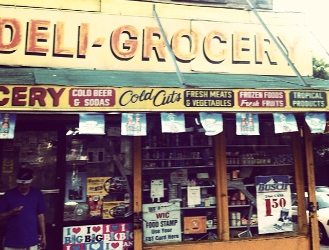
A typical bodega which are found usually in every corner around my neighborhood. Every letter is on a different font to catch people’s attention. -Hunts Point Bronx NY
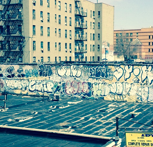
The way the graffiti is tag here. There’s a repair shop right under neat it. -161 st. Bronx NY
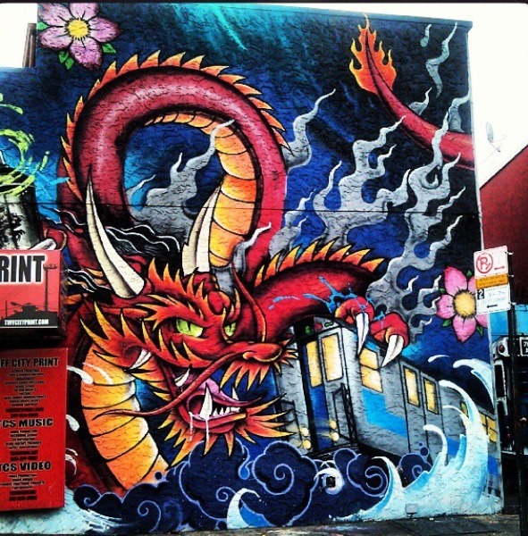
A tattoo shop art, the traditional Japanese dragon and the lettering is mostly all black. -Bruckner Blvd Bronx NY
Typography has been used in different fonts and lettering. Some ads with more color than others as well as lighter and darker colors. Most of the business stores usually have an ad outside for special deals of the day. My neighborhood’s has a variety of typography.
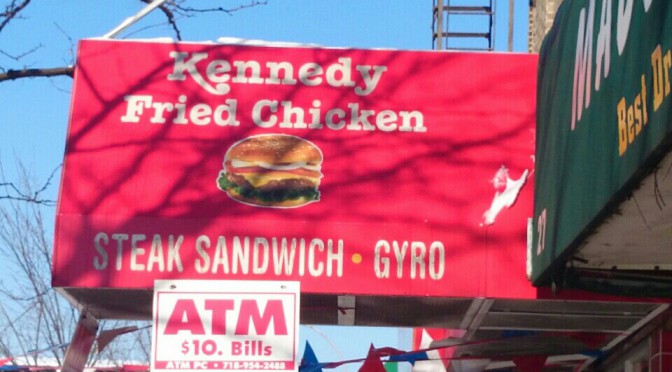
I live in the Bronx and in my neighborhood there are alot of businesses such as diners, chinese food, corner stores, barber shops and 99 cent stores. One thing that all these venues have in common is there store name, number and store number is visible because of the bold font they use. Also what helps them is the color behind the type that makes it pop drawing your eye to the venue. Although they are providing different type of services they all have a similar font, which looks like Arial or Times New Roman, a font that is readable from a distance and looks good to the eye.
Also in my neighborhood there is graffiti that comes in different forms and is expressed differently by everyone. There aren’t a lot of big mural pieces but there are a good amount of “tag ups” which is basically the artist stating that they were here or that’s their turf. So those types of graffiti are small and are usually a name in their font that expresses themselves. The building numbers also have a font to their own. Some building numbers are regular and just bold and some are in italics and bold. With all these different fonts in my neighborhood I feel they add a certain character that cant be added by something else.