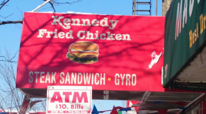
I live in the Bronx and in my neighborhood there are alot of businesses such as diners, chinese food, corner stores, barber shops and 99 cent stores. One thing that all these venues have in common is there store name, number and store number is visible because of the bold font they use. Also what helps them is the color behind the type that makes it pop drawing your eye to the venue. Although they are providing different type of services they all have a similar font, which looks like Arial or Times New Roman, a font that is readable from a distance and looks good to the eye.
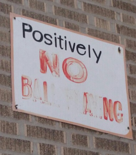
Also in my neighborhood there is graffiti that comes in different forms and is expressed differently by everyone. There aren’t a lot of big mural pieces but there are a good amount of “tag ups” which is basically the artist stating that they were here or that’s their turf. So those types of graffiti are small and are usually a name in their font that expresses themselves. The building numbers also have a font to their own. Some building numbers are regular and just bold and some are in italics and bold. With all these different fonts in my neighborhood I feel they add a certain character that cant be added by something else.