You final exam is on Monday, May 19th at 11:30. You should know the information that appeared on you mid-term, so be sure to study it. Also, here are some other specifics you should study and know for the exam:
how to do text on a path
an understanding of legibility/color
typographic hierarchy
how to design on a grid
how to create text wraps
adding photo images, resizing and maintaining proportions
All of your Type Book assignments are to be submitted as PDF files. This is a requirement, not a suggestion. We covered how to do this several times WEEKS ago. If you have submitted files without converting them to PDF format, (as I have mentioned before) they WILL NOT counted. Being able to follow instructions helps with being able to get a good grade in the end. So, NOW is your last opportunity to get credit for these assignments. The Type Book project is to completed by Fri, March 28. All late submissions will have points deducted and marked as LATE.
If you still have no clue how to create a PDF file, here is a video that can be found on YouTube. You can also do a search to find others if this one is not helpful.
One of main projects of the semester will be to create a type book that each student will be able to use as reference as they continue their graphic design studies. The book is created using InDesign and consists of a variety of exercises.
The lecture for the day included a demonstration on creating and using multiple InDesign documents.
Topics Covered
Creating multi-page documents
Using the Page Panel
Working with Master Pages
If you need a little help with InDesign, here are couple of video tutorials which may be helpful.
InDesign 5 – How to Work with Pages
Working with Master Pages – InDesign 6
In-Class Lab & Homework
In class we begin a 5-page document which should be completed and turned in on Monday, Feb 24. The instructions are as follows:
Create a 5-page document using the 5-column grid we set up in class.
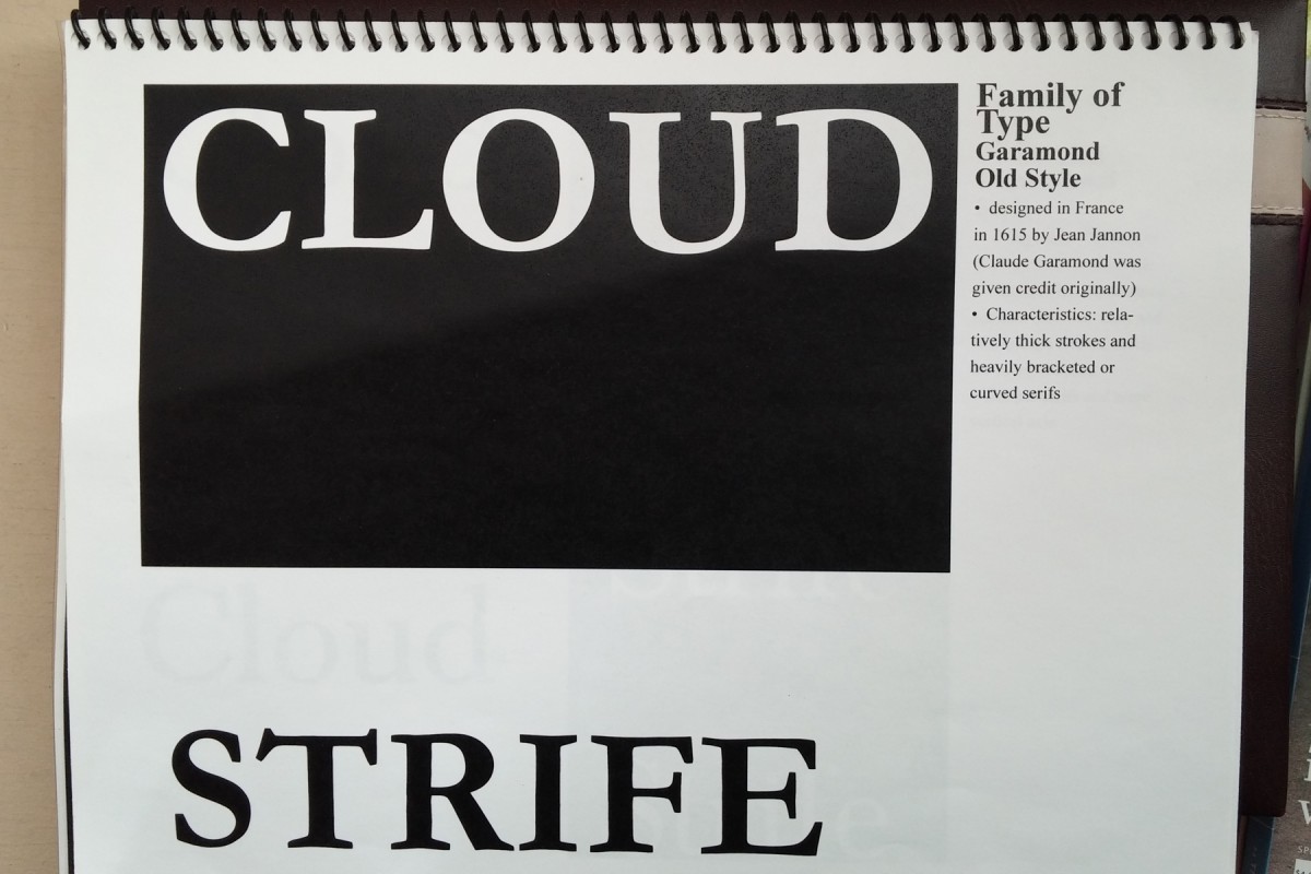
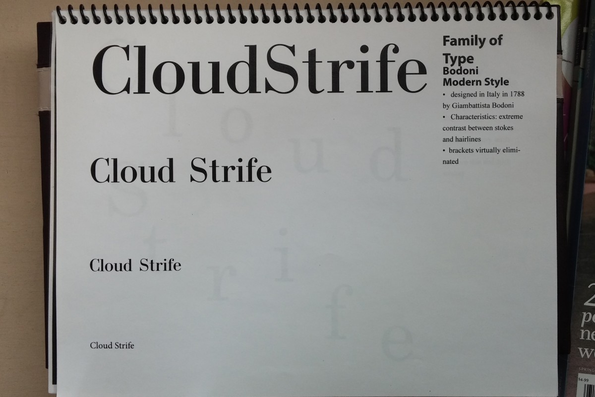
The 5th column of each page will contain the following: Families of Type
—Name of family
—Timeline
—Characteristics (at least 2)
—Name of the font used
Use the first 4 columns as your art area.
Using the name of the famous person you selected, create an interesting composition with caps and lowercase or all lowercase type
Use lines and basic shapes to make your composition interesting.
Do 1 page for each of the five families of type.
Create a new composition for each family
Save your file as follows:
ADV1167_yourlastname_5Families
Then save the file again as a PDF (which will be submitted) with the same name.
We will be using InDesign a bit more during each class. If you need a bit of a refresher on starting a new document or, there is a link to a video tutorial in my last update. (see here).
Topics Covered
How to use kerning and tracking
Setting up new documents
Using the type blocks to understand leading
Setting up guides and columns to create a grid
Using the ruler horizontal and vertical rulers in InDesign
Creating strokes
Filling color
Homework
Take the best and worst prints of stacked words and write a paragraph (about 5-6 sentences) describing why one works well and why the other doesn’t well in terms of leading. For this exercise, you were to concentrate on getting good leading with your 2 stacked words. On Friday the 14th you will have one last time to complete this printing if you need to try it again.
 You final exam is on Monday, May 19th at 11:30. You should know the information that appeared on you mid-term, so be sure to study it. Also, here are some other specifics you should study and know for the exam: