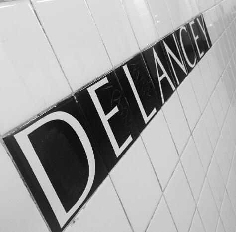
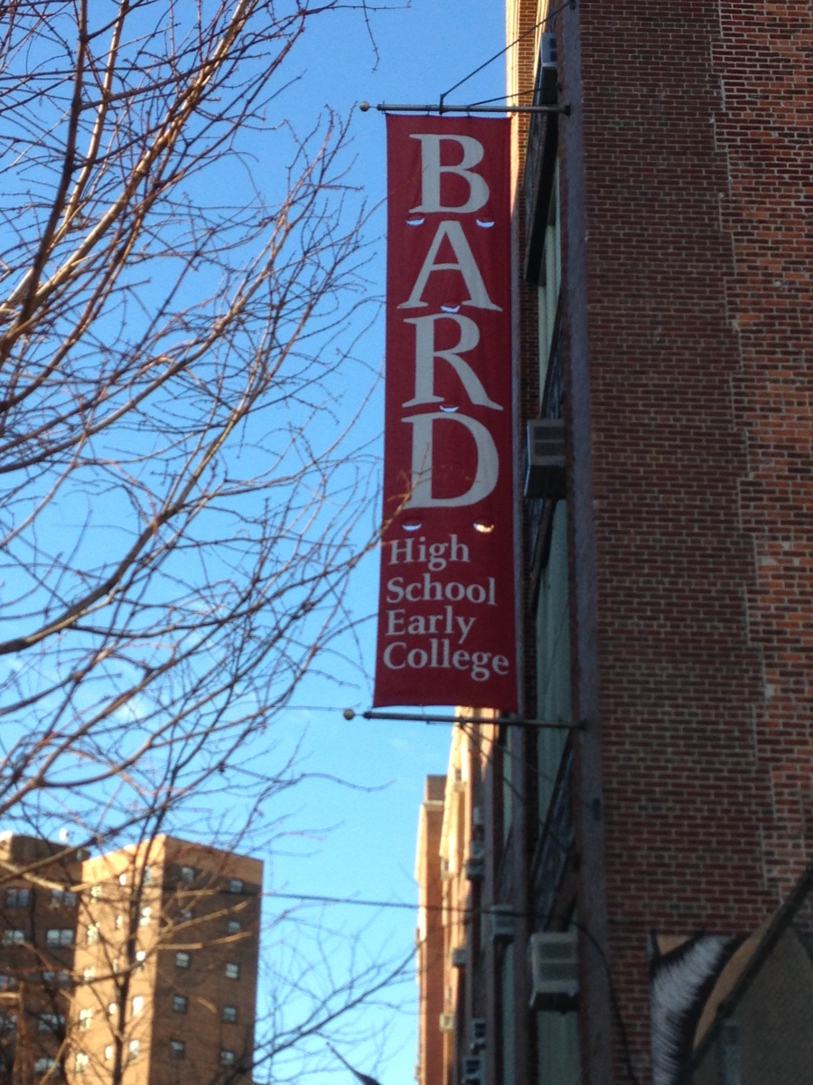
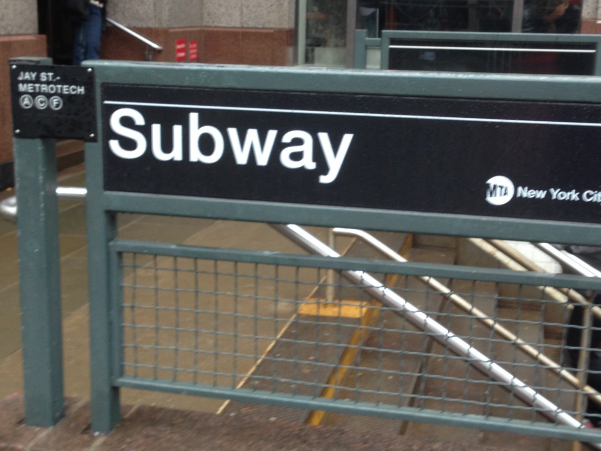
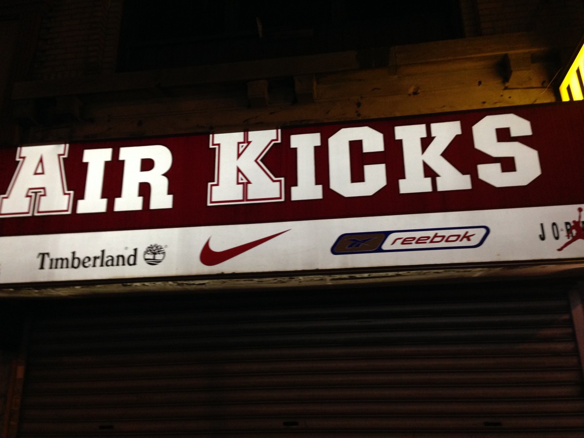
This is a magazine that I found in the train station. It is a Modern typeface because it has a very high contrast between thick and thin strokes, the hairline is unbracketed, The serif is also very thin. This typeface is used a lot in magazines as design.This typeface I found in the lower east side of Manhattan, Which is a high school banner. This Typeface is Old style. It is old style because it has wedge shaped seif and It has great contrast between thick and thin strokes. I think that this type face is used because it is easy to ready but to also draw the viewer’s attention.I found this on the jay street subway station. It is a san serif font. It has no serifs which indicates that it is san serif, but it also has low contrast. Most signs and posters in the subway use this font. I believe they use this font because the subway doesn’t have paragraphs of type just a few word, so they use this font as a design but to also make it easier to read for the reader.This is a sneaker store that I found in Queens. This typeface is a slab-serif. The letters are blocky and big. It has rectangular serifs with the same thickness as the rest of the strokes. I think that this typeface is used because they wanted more of a design look to the company’s name and to catch the eye much quicker.This I found in Jay street and it is a transitional font. It has great stress between thick and thin strokes. The head serifs are horizontal and it has a bracketed oblique serif. I believe this was used to attract people .
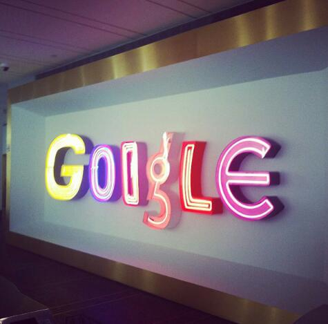
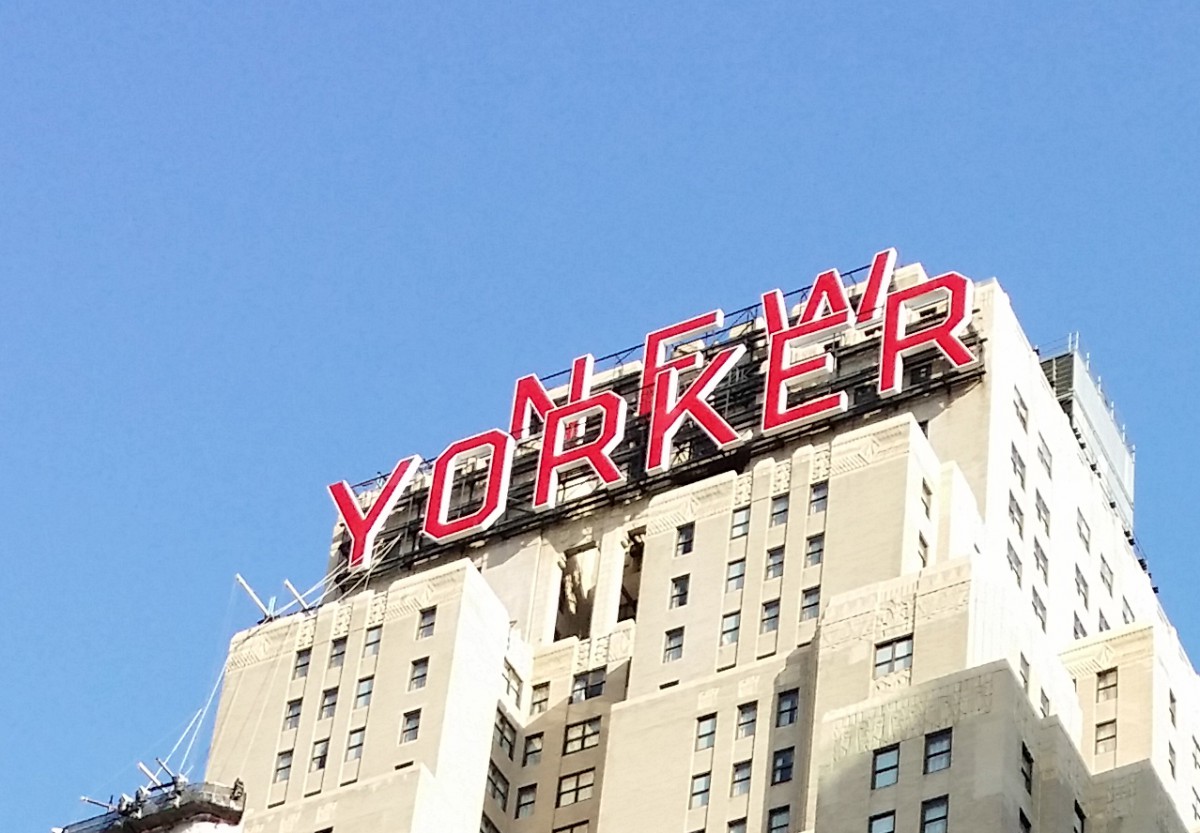
The photo was taken around 8th Ave. This is a sans serif because it has no serif at all and low contrast. They chose this typeface because it makes reading the text all the way up there much easier for people walking by.
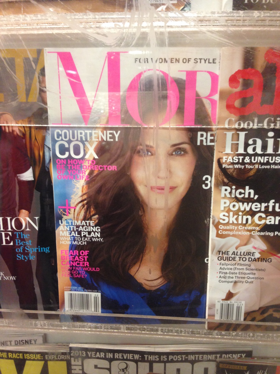
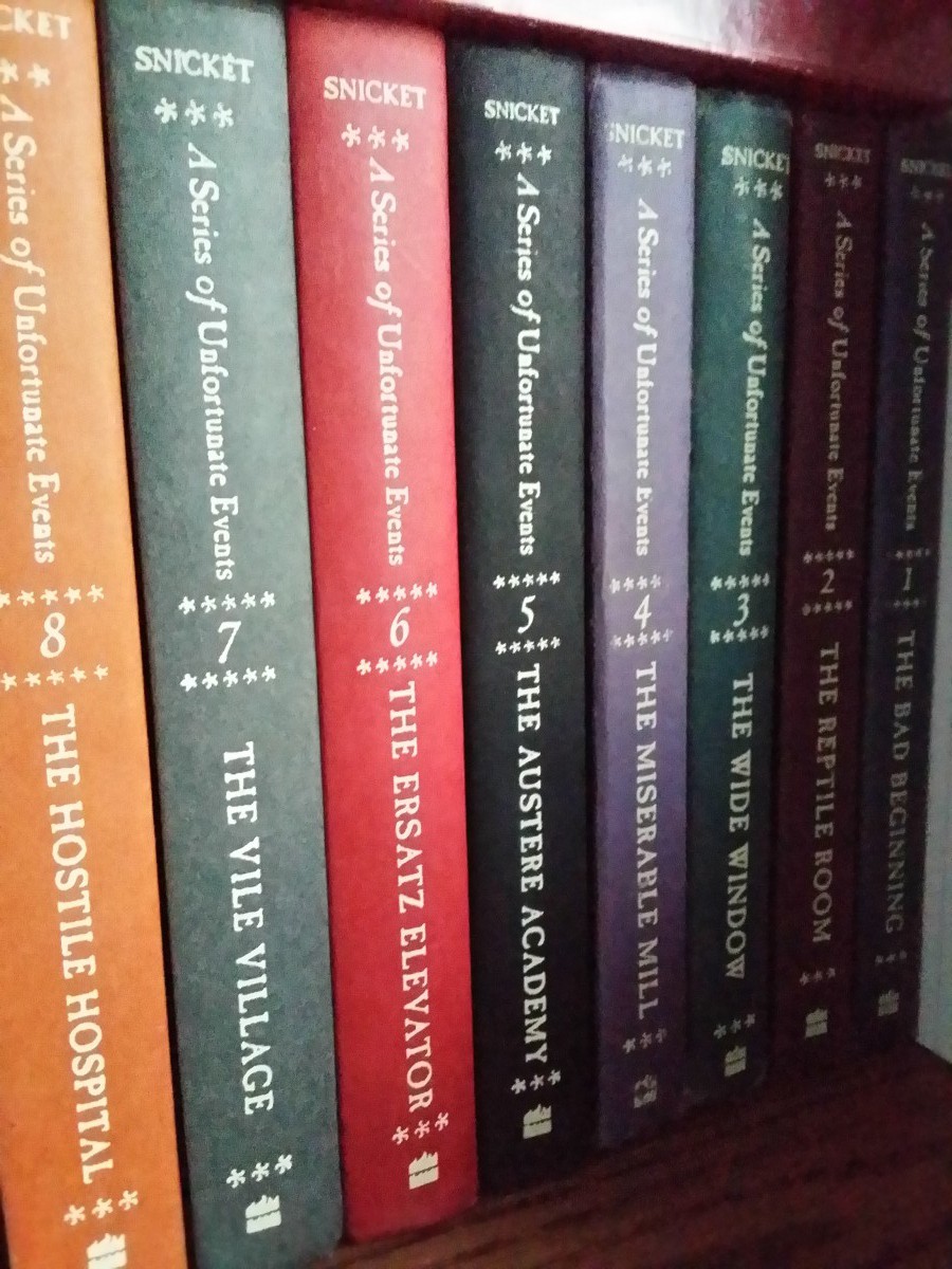
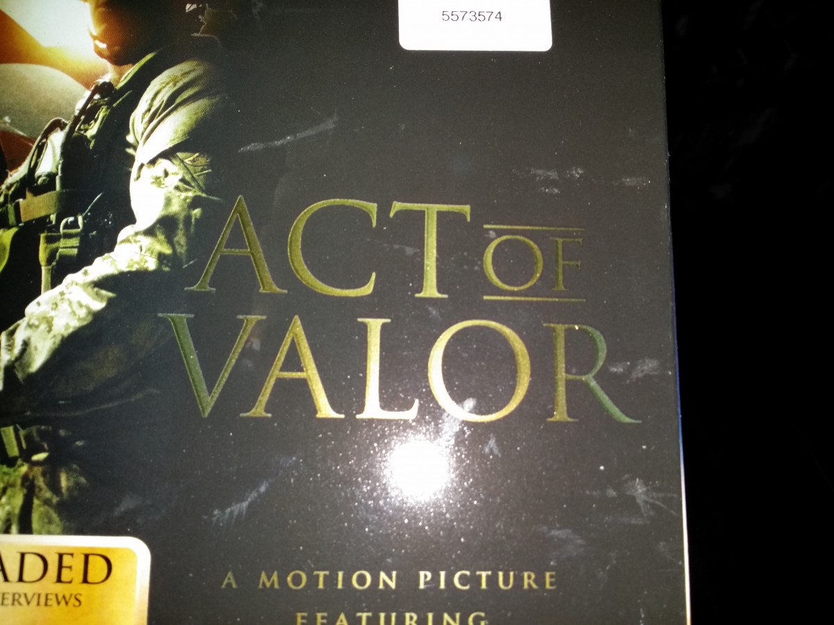
These “A Series of Unfortunate Events” books all use a transitional typeface. It’s a transitional typeface because the head serifs are more horizontal and has more stress on thick and thin strokes you can clearly see on the upper case letters.Lastly the lowercase have stress on the vertical bars.This cover of a magazine found in my home used a modern typeface (Bodoni). It’s a modern typeface because it has a thin hairline serifs. There is a lot horizontal stress and thick and thin strokes mainly on the upper case letters. This typeface seems to be used a lot in fashion magazines.This is a picture of the cover of the film “Act of Valor”. The typeface used for the box art is old style because the letters have both thin and thick strokes. The serifs has a more wedge shape than other typefaces. I think this typeface is the most appropriate for this kind of film and it actually fits well in the box art.
The Sony symbol used on this PS4 box is a Slab/Egyptian Serifs because the serifs are flat and have a rectangular shape. The serifs are also about the same thickness as the entire body font. Sony has been using this kind of typeface since the start of the company.
The 5 Classifications of Type – with so many typefaces, it is important to be able to distinguish and categorize the different varieties. Knowing the various characteristics of the different classifications will help to make identifying type a bit easier.
Old Style (Garamond is one example)
Transitional (Baskerville is one example)
Modern (Bodoni is one example)
Egyptian or Slab-Serifs (Rockwell is one example)
Sans Serifs (Helvetica is one example)
The reading assignment, The History of Type contains all the information about the different classifications.
Homework
Prepare for Quiz #1 for Friday, 2/21/14 (will include 5-10 questions covering everything we’ve talked about so far, including readings)
Type Book – Choose a performer, famous person, or fictional character about whom you will do your type book assignments. You will use this person’s name or text about them to thematically tie the exercises together.
Create a 1-page document (use the grid in the Dropbox folder)
The document has 5 columns. In the 5th column, title the page: Anatomy and Letterforms
In the 1st to 4th column, type the name of your performer or famous person. Use these type specifications: Times, C/lc, approximately 120 pts and adjust if the type size is too big for the name you are using.
Align the baseline of this word with the first your horizontal guides
Use the LINE TOOL from your tool menu and PLACE a horizontal line indicating the baseline, meanline, and capline. These lines should be gray.
Use the LINE TOOL again and set lines and/or arrow to identify the following:
baseline (gray line)
meanline (gray line)
capline (gray line)
serif
counter
x-height
ascenders
descenders
When completed save your INDESIGN file as ADV1167_yourname_anatomy
Then save again as a PDF: Go to FIle > Export > ADOBE PDF > ADV1167_yourname_anatomy.pdf
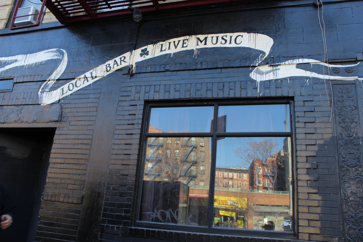
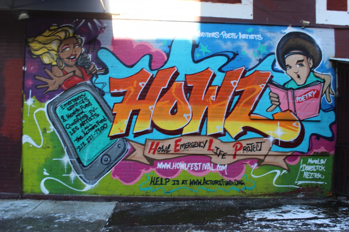
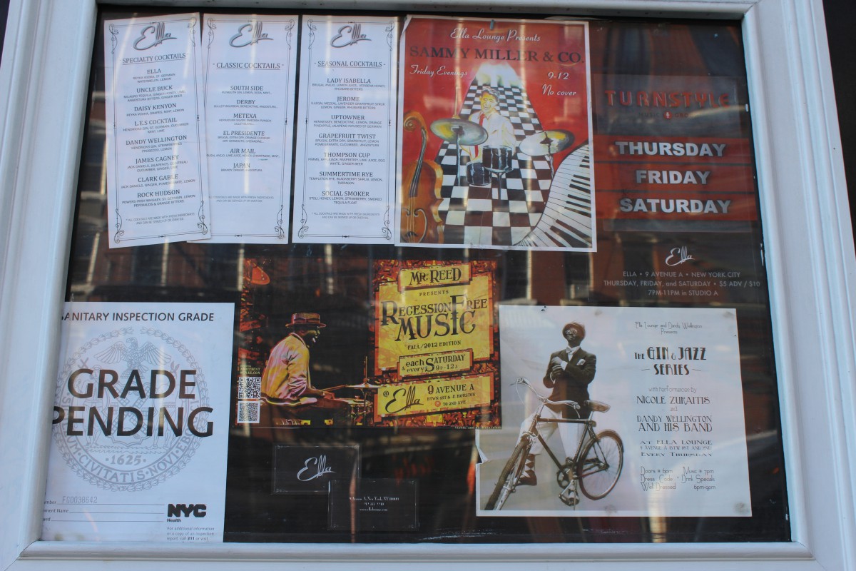
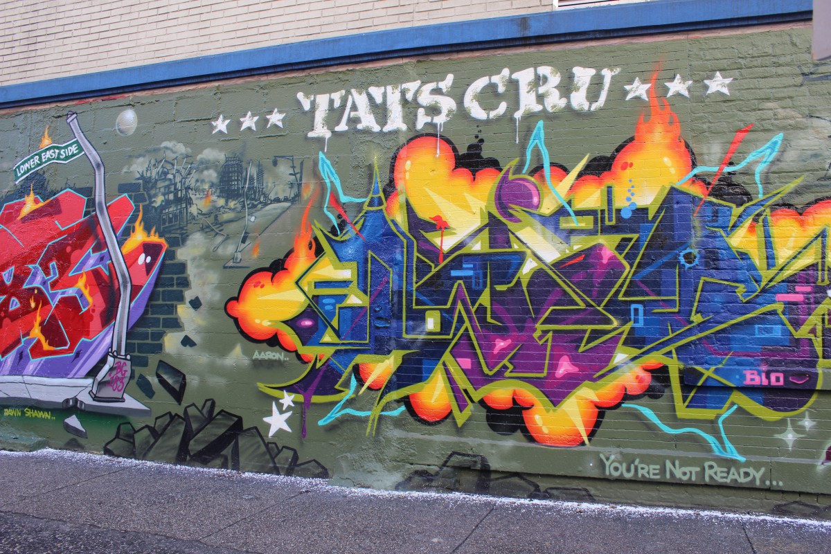
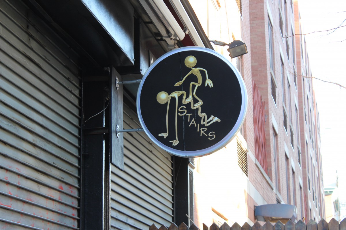
In my neighborhood, typography is used daily. You will see it on a daily basis. Typography is used to advertise a lot and it shows that my neighborhood is very busy. It advertises albums, movies, shows, clothing, merchandise and much more. There is also a lot of graffiti in my neighborhood, which also shows typography. The graffiti presents that there are some talented creative people within the neighborhood but also to get known. There are many posters of bands in my neighborhood as well. Which brings people together to listen to bands at a restaurant. There are also posters that advertise parties. Even the restaurants in my neighborhood would show typography with their menus, and the billboards that they leave outside. My neighborhood also has random pictures with random typographic lettering. There are different styles to the lettering in my neighborhood. There is normal use typography and also fancy, decorative, design type of typography. Since my neighborhood is busy. Basically what the typography in my neighborhood shows, is that my neighborhood is a working community that is also very urbanized.