These are the Classifications of Type I found while riding on the train.
This “Mercedes Benz” ad displays a Modern typeface in the logo. There are thick and thin strokes in the capital lettering and smooth serifs.

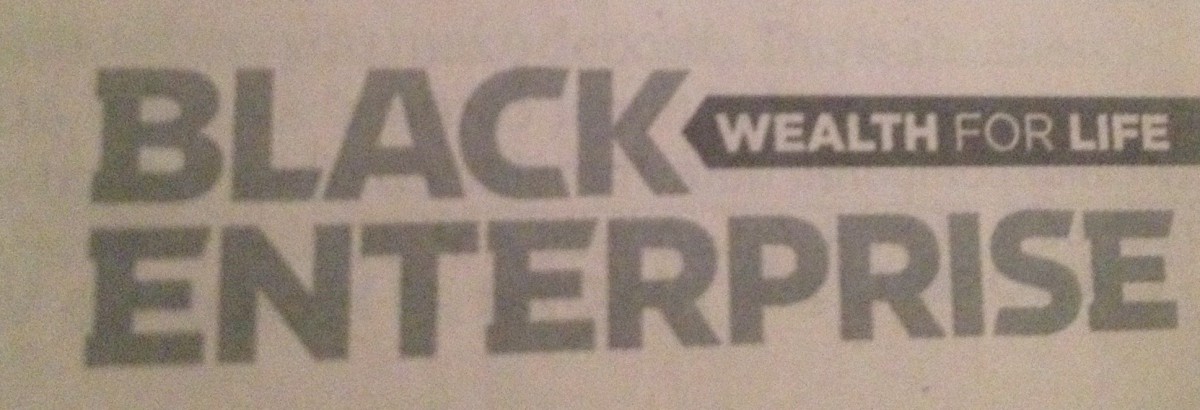
The “Black Enterprise” logo is done in a Slab Serif typeface. The serifs and Strokes of the font are both very thick and bold.
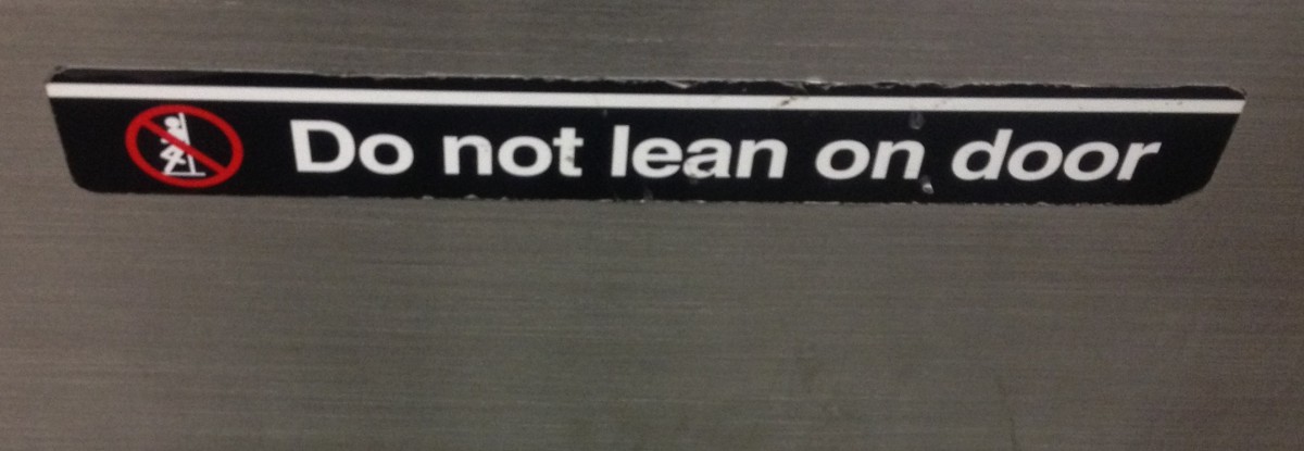
The “Do not lean on door” sign that is located on every train door is in a simple Sans Serif typeface I believe to be Helvetica similar to other subway type.
The Grand Central sign is done in a Transitional typeface where the strokes ease into the serifs.

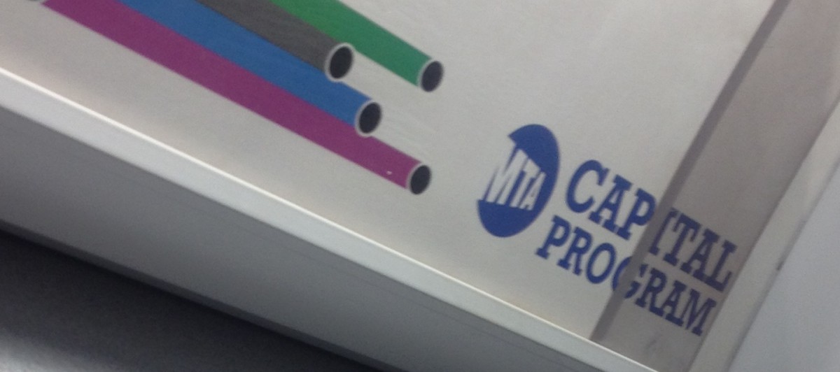
The Old Style typeface I found was in a sign on the train. The “Capital Program” type is done in a simple serif, which is kind of blocky like Old Style fonts