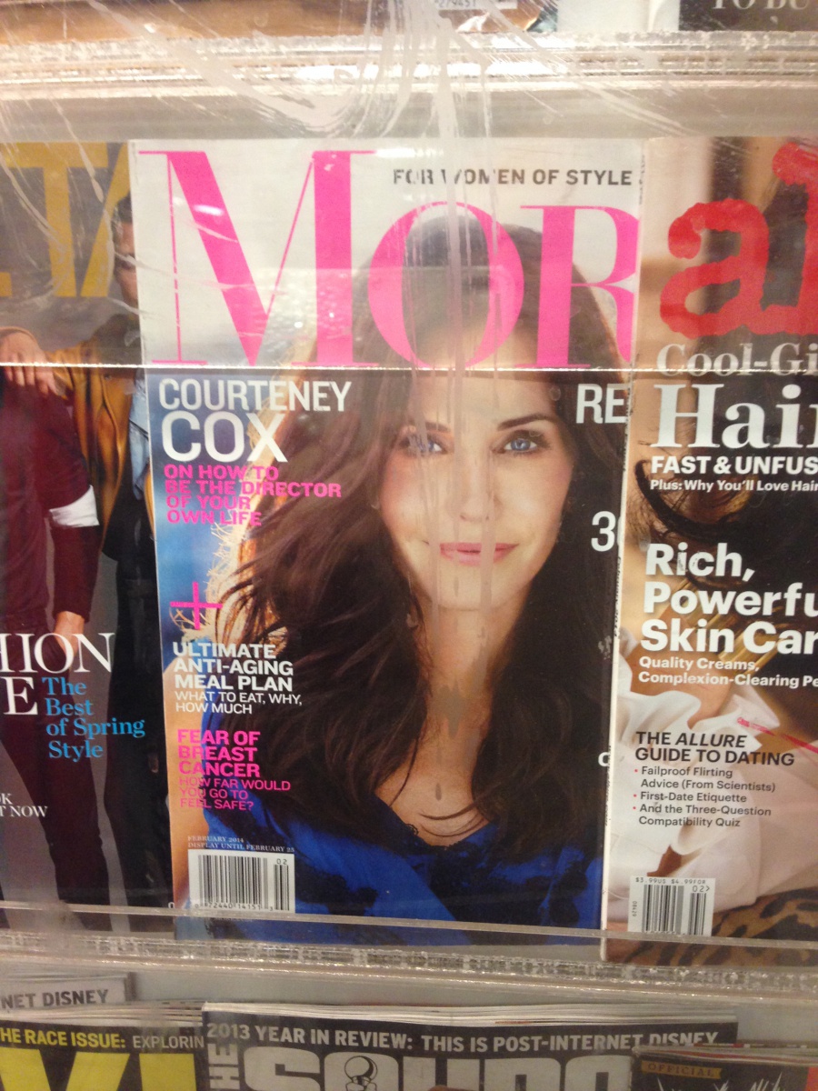
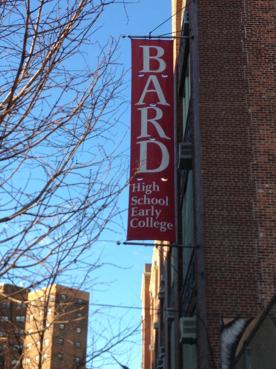
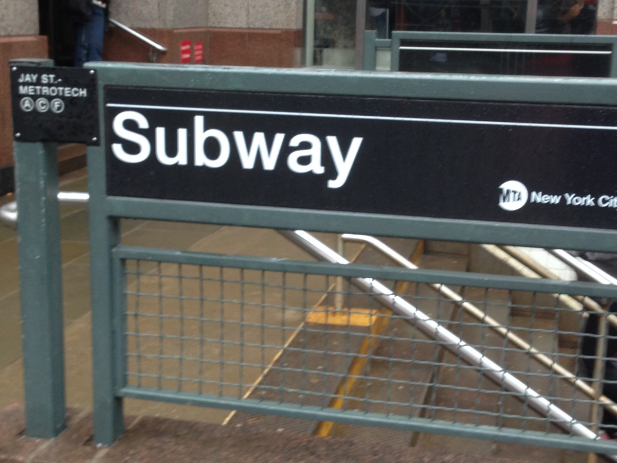
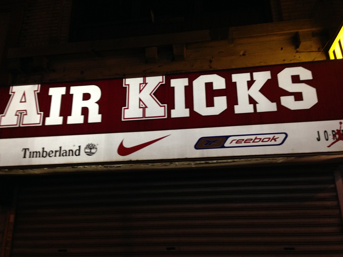
This is a magazine that I found in the train station. It is a Modern typeface because it has a very high contrast between thick and thin strokes, the hairline is unbracketed, The serif is also very thin. This typeface is used a lot in magazines as design.This typeface I found in the lower east side of Manhattan, Which is a high school banner. This Typeface is Old style. It is old style because it has wedge shaped seif and It has great contrast between thick and thin strokes. I think that this type face is used because it is easy to ready but to also draw the viewer’s attention.I found this on the jay street subway station. It is a san serif font. It has no serifs which indicates that it is san serif, but it also has low contrast. Most signs and posters in the subway use this font. I believe they use this font because the subway doesn’t have paragraphs of type just a few word, so they use this font as a design but to also make it easier to read for the reader.This is a sneaker store that I found in Queens. This typeface is a slab-serif. The letters are blocky and big. It has rectangular serifs with the same thickness as the rest of the strokes. I think that this typeface is used because they wanted more of a design look to the company’s name and to catch the eye much quicker.This I found in Jay street and it is a transitional font. It has great stress between thick and thin strokes. The head serifs are horizontal and it has a bracketed oblique serif. I believe this was used to attract people .
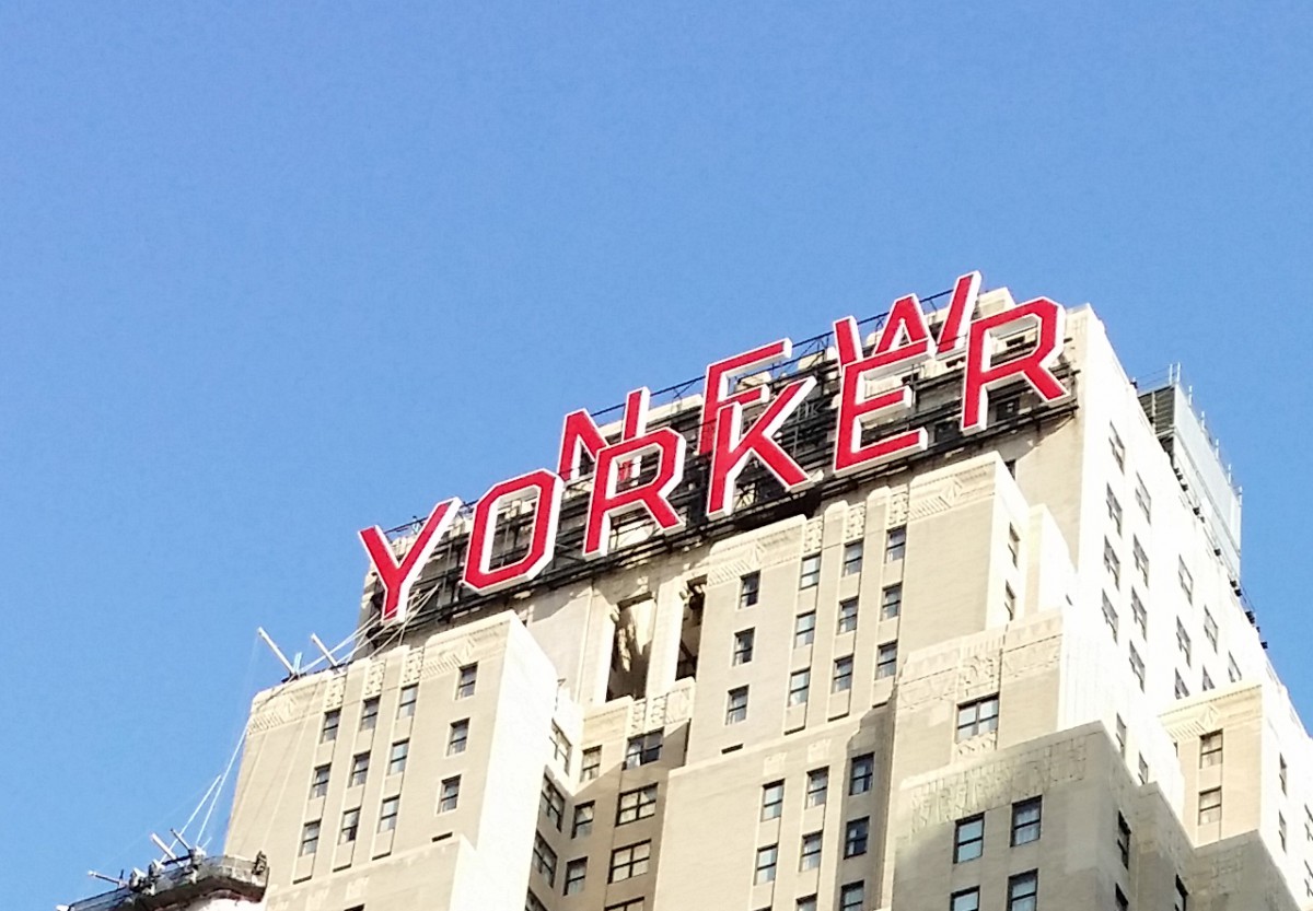
The photo was taken around 8th Ave. This is a sans serif because it has no serif at all and low contrast. They chose this typeface because it makes reading the text all the way up there much easier for people walking by.
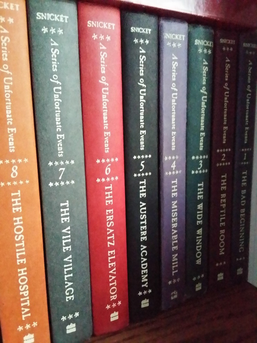
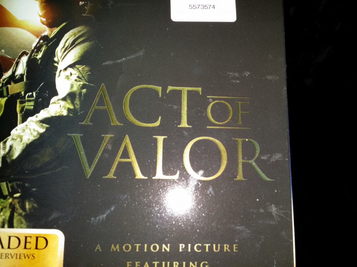
These “A Series of Unfortunate Events” books all use a transitional typeface. It’s a transitional typeface because the head serifs are more horizontal and has more stress on thick and thin strokes you can clearly see on the upper case letters.Lastly the lowercase have stress on the vertical bars.This cover of a magazine found in my home used a modern typeface (Bodoni). It’s a modern typeface because it has a thin hairline serifs. There is a lot horizontal stress and thick and thin strokes mainly on the upper case letters. This typeface seems to be used a lot in fashion magazines.This is a picture of the cover of the film “Act of Valor”. The typeface used for the box art is old style because the letters have both thin and thick strokes. The serifs has a more wedge shape than other typefaces. I think this typeface is the most appropriate for this kind of film and it actually fits well in the box art.
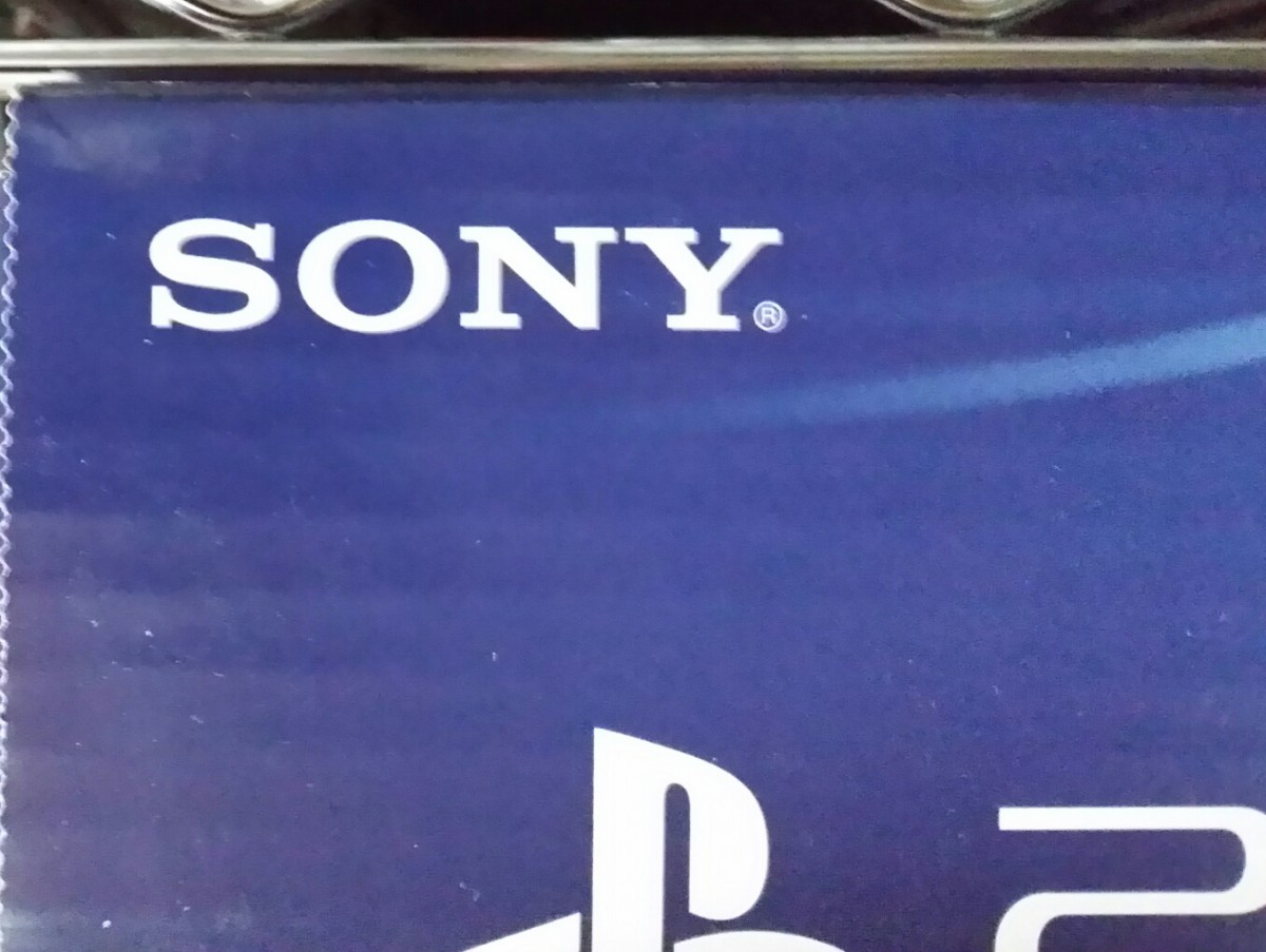
The Sony symbol used on this PS4 box is a Slab/Egyptian Serifs because the serifs are flat and have a rectangular shape. The serifs are also about the same thickness as the entire body font. Sony has been using this kind of typeface since the start of the company.