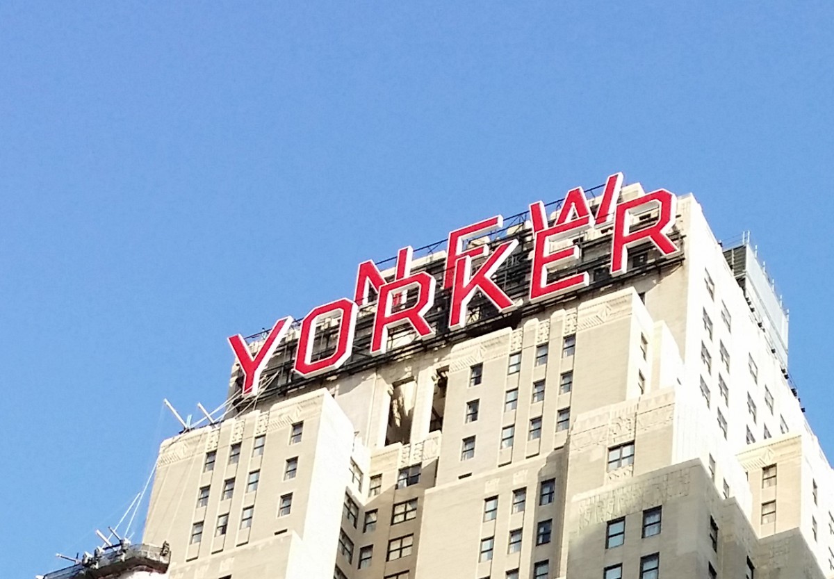
The photo was taken around 8th Ave. This is a sans serif because it has no serif at all and low contrast. They chose this typeface because it makes reading the text all the way up there much easier for people walking by.
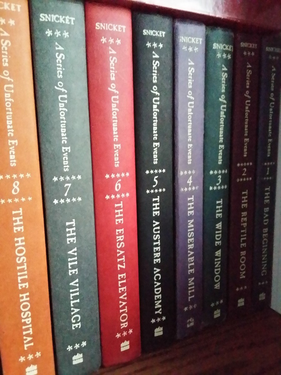
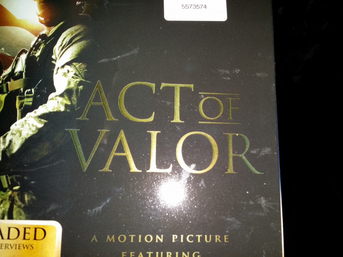
These “A Series of Unfortunate Events” books all use a transitional typeface. It’s a transitional typeface because the head serifs are more horizontal and has more stress on thick and thin strokes you can clearly see on the upper case letters.Lastly the lowercase have stress on the vertical bars.This cover of a magazine found in my home used a modern typeface (Bodoni). It’s a modern typeface because it has a thin hairline serifs. There is a lot horizontal stress and thick and thin strokes mainly on the upper case letters. This typeface seems to be used a lot in fashion magazines.This is a picture of the cover of the film “Act of Valor”. The typeface used for the box art is old style because the letters have both thin and thick strokes. The serifs has a more wedge shape than other typefaces. I think this typeface is the most appropriate for this kind of film and it actually fits well in the box art.
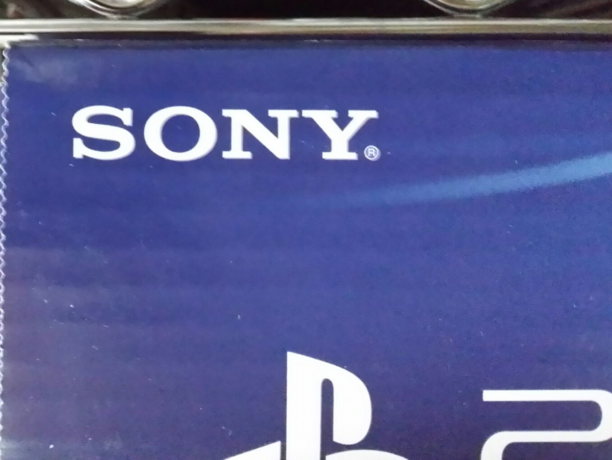
The Sony symbol used on this PS4 box is a Slab/Egyptian Serifs because the serifs are flat and have a rectangular shape. The serifs are also about the same thickness as the entire body font. Sony has been using this kind of typeface since the start of the company.
There are examples of these in the reading assignment listed for homework.
Typographical Anatomy
This document was handed out in class, but if you need a new copy, you may download from here. You should study this sheet and refer to it often throughout the course.
During class we reviewed some of the parts of letterforms. Here are a few terms introduced during class:
tracking – sometimes referred to as letterspacing, it is controlling the space between characters in a block of text.
kerning – the adjustment of letterspace between particular pairs of letter combinations; fitting pairs of letters closer together for a better look.
points – unit of measurement in typography: 72 points = 1 inch. All type is measured in points.
serif – the small finishing strokes that are added to the arms, stems and tails of characters. Serifs can improve the readability by leading the eye along the line of type.
sans serif – a typeface that does not have serifs.
font – one weight, width or style of a typeface.
typeface – the letters, numbers and symbols that make up a design of type. A typeface is part of a type family of coordinated designs. For example, Helvetica Bold is the typeface and is a part of the Helvetica family of type (Helvetica is the type family, Helvetica Bold is the typeface).
type family – the full collection of typefaces that were designed together and intended to be used together. For example, Garamond font family consists of roman, italics, semi bold, and bold weights. Combined together, these make up the Garamond type family.
Videos
The following video serves as a visual aid to the reading assignment.
In class we will be doing a bit of relief printing as we create our own letters. This video on the linocut process will give you an idea of what relief printing is. Be sure to refer to your class handout for the process we are using.
Homework Assignment
Read the PDF document, The History of Typography, which can be downloaded from Dropbox. Be prepared for a discussion for the next class.
Complete the letterform drawing worksheets that were handed out in class. Be sure to read the instructions for each section.