It is now time to print and bind your type book project. But first, you must make sure you have all your pages and they are in organized and in order. A handout with all the instructions is available for download here.
There is one last design assignment that you need to complete for this project. It is called Putting It All Together. In essence, you will create a poster that uses all the typographic design elements that you have learned this semester. You can download a file that has samples here.
You get the binding done (and printing) done at Staples or FedEx, but be sure to plan ahead.
As we move into the autobiographical Zine project, you will be putting to use the principals you’ve learned in this course and selecting a typefaces. It is important to select typefaces that work well together and not to get too carried away by using too many.
First, here is an interesting website I came across that is suppose to help designers match typefaces that work well together. It’s described as an online dating site for type. Give it a try, Type Connection, A Typographical Dating Game.
You should have your content (photos, illustrations, copy) ready for your magazine. Begin sketching out the order of your content. Bring everything to class. Bring your fonts if you need them also.
When you begin designing your magazines, you will have to select a font for the body text. There are some things you have to consider:
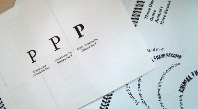
You have decide on the appropriate font. Reading it should be easy for your audience. You can choose a sans serif font or one with serifs.
You have to select the right body text size and leading. The point size of the body text should not be too large or too small. Also keep in mind the leading.
Selecting the body text alignment will also be important. Using a flush left will will have a more casual appearance. Justified text is more structured and will allow you to fit more text on the page.