Gotham is a typeface that is all around you every day. You’ve seen it but probably didn’t notice it. That is one of the things I like about Gotham. It has a strong, clean and simple design that is not over powering. Gotham happens to be one of my favorite typefaces to use—that is really an understatement. I use it on ALMOST every project I work on. I came across this quick video about the creators of the Gotham typeface and thought it might interesting for you to see the real faces behind some of the fonts you see everyday.
Tag Archives: letterforms
Five Families of Type


Class 6 – The 5 Classifications of Type
 Topics Covered

The 5 Classifications of Type – with so many typefaces, it is important to be able to distinguish and categorize the different varieties. Knowing the various characteristics of the different classifications will help to make identifying type a bit easier.
- Old Style (Garamond is one example)
- Transitional (Baskerville is one example)
- Modern (Bodoni is one example)
- Egyptian or Slab-Serifs (Rockwell is one example)
- Sans Serifs (Helvetica is one example)
The reading assignment, The History of Type contains all the information about the different classifications.
Homework
- Prepare for Quiz #1 for Friday, 2/21/14 (will include 5-10 questions covering everything we’ve talked about so far, including readings)
- Type Book – Choose a performer, famous person, or fictional character about whom you will do your type book assignments. You will use this person’s name or text about them to thematically tie the exercises together.
- Create a 1-page document (use the grid in the Dropbox folder)
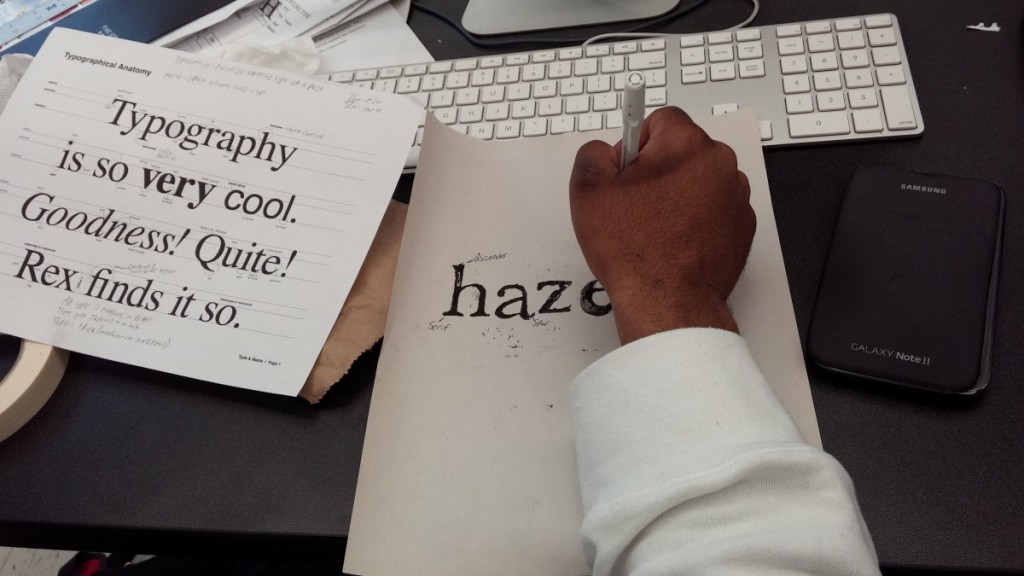
- The document has 5 columns. In the 5th column, title the page: Anatomy and Letterforms
- In the 1st to 4th column, type the name of your performer or famous person. Use these type specifications: Times, C/lc, approximately 120 pts and adjust if the type size is too big for the name you are using.
- Align the baseline of this word with the first your horizontal guides
- Use the LINE TOOL from your tool menu and PLACE a horizontal line indicating the baseline, meanline, and capline. These lines should be gray.
- Use the LINE TOOL again and set lines and/or arrow to identify the following:
- baseline (gray line)
- meanline (gray line)
- capline (gray line)
- serif
- counter
- x-height
- ascenders
- descenders
- When completed save your INDESIGN file as ADV1167_yourname_anatomy
- Then save again as a PDF: Go to FIle > Export > ADOBE PDF > ADV1167_yourname_anatomy.pdf
Additional Resources
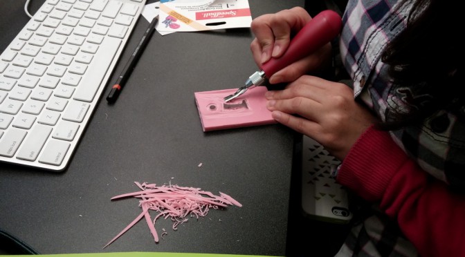
Class 3 – Relief Printing
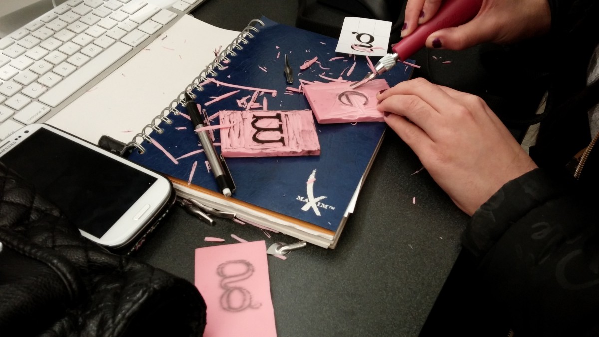 The main project for the class is the relief printing from the letter blocks made in class. One of the goals of this exercise is to help students understand the bounding box, it’s implications in typography and how it affects kerning. Everyone carves at least one letter. Students are encouraged to swap letters to make words. The letters that are carved should be kept to use again over the next few weeks.

Other Topics Covered
Homework
- Journal: Take your best print of a single work, draw in and neatly label at least 10 parts of the type anatomy. Use the handout from last week as a reference. This item will be added to your Journal that has to be submitted at the end of the semester.
- Complete the reading assignment from the last class, The History of Type and be prepared for class discussion.

