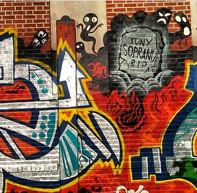
A graffiti in honor of Tony Soprano, in memory of him. The way they did the letter form with a touch of graffiti. -Sherman st. Bronx NY
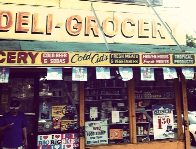
A typical bodega which are found usually in every corner around my neighborhood. Every letter is on a different font to catch people’s attention. -Hunts Point Bronx NY
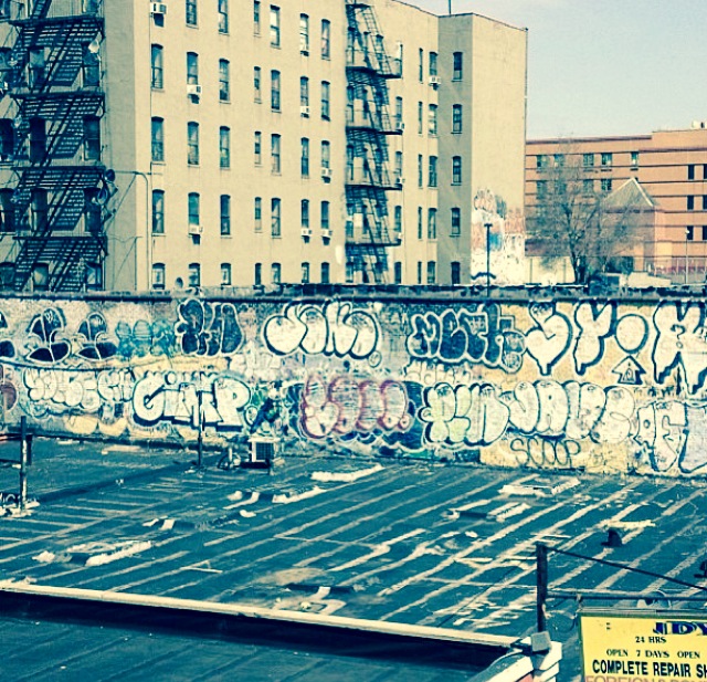
The way the graffiti is tag here. There’s a repair shop right under neat it. -161 st. Bronx NY
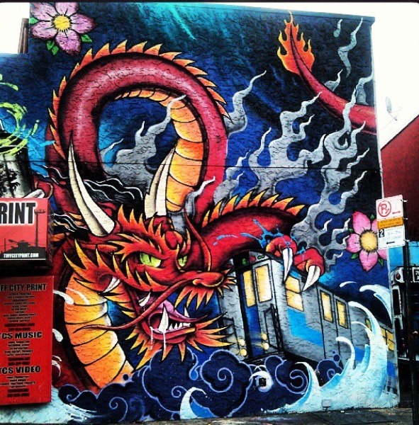
A tattoo shop art, the traditional Japanese dragon and the lettering is mostly all black. -Bruckner Blvd Bronx NY
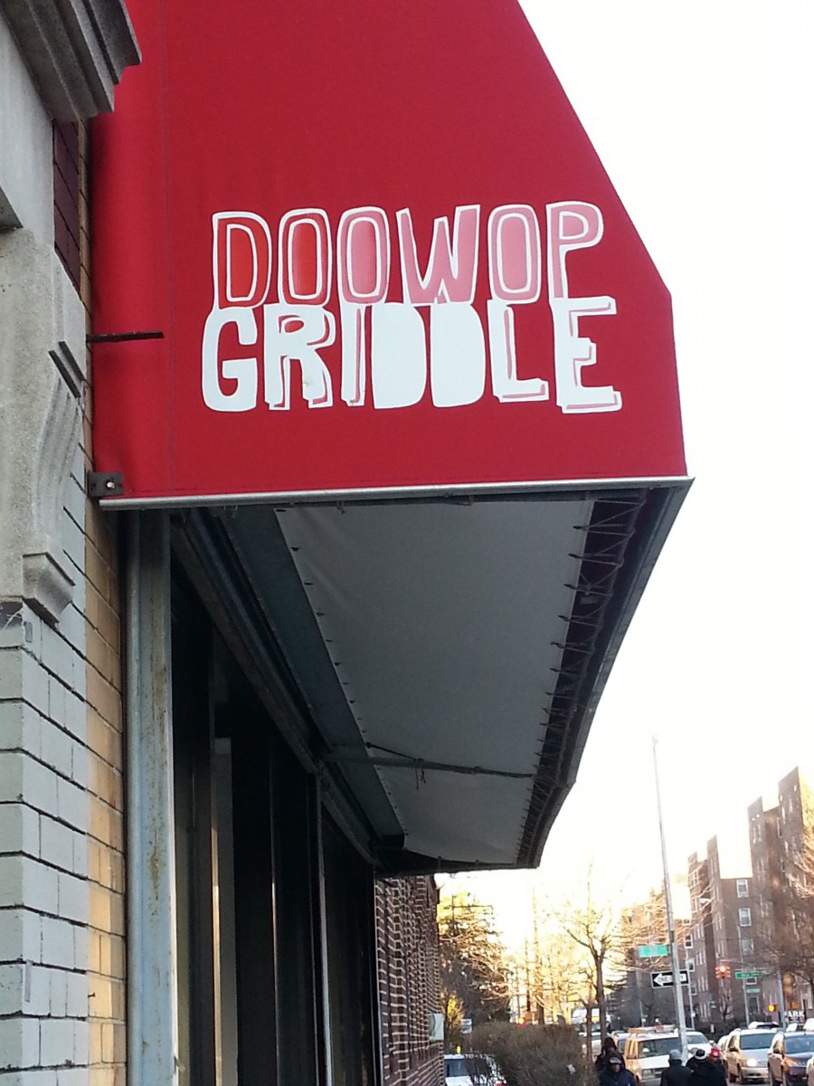
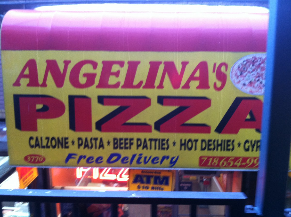
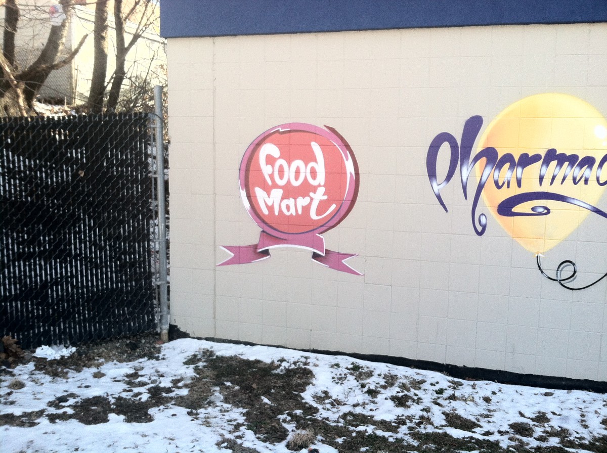
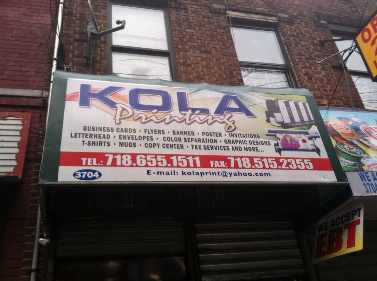
Typography has been used in different fonts and lettering. Some ads with more color than others as well as lighter and darker colors. Most of the business stores usually have an ad outside for special deals of the day. My neighborhood’s has a variety of typography.
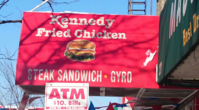
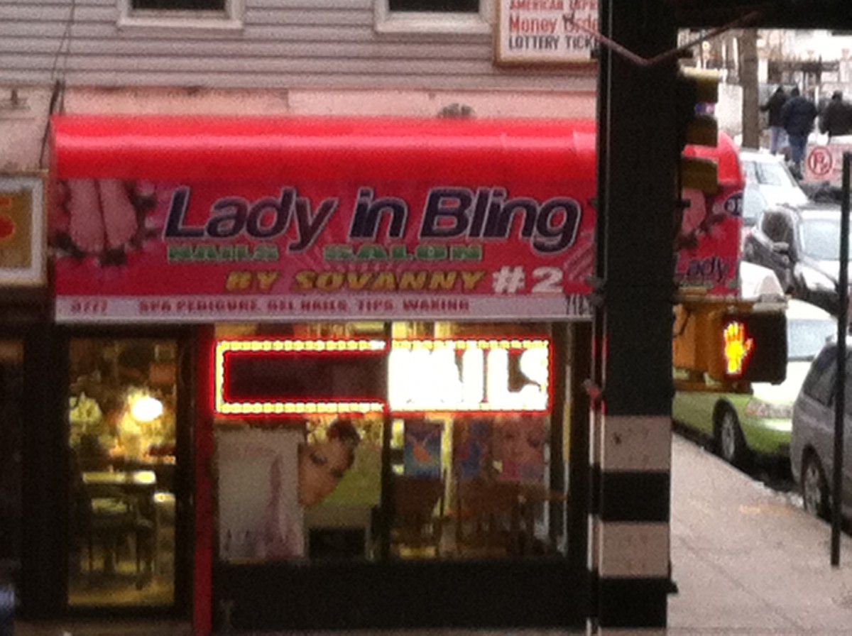
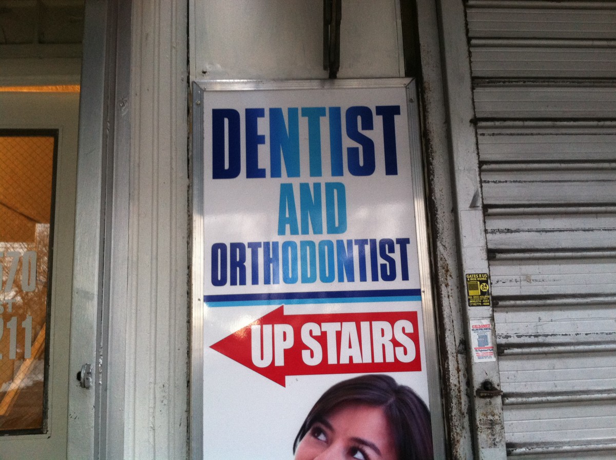
I live in the Bronx and in my neighborhood there are alot of businesses such as diners, chinese food, corner stores, barber shops and 99 cent stores. One thing that all these venues have in common is there store name, number and store number is visible because of the bold font they use. Also what helps them is the color behind the type that makes it pop drawing your eye to the venue. Although they are providing different type of services they all have a similar font, which looks like Arial or Times New Roman, a font that is readable from a distance and looks good to the eye.
Also in my neighborhood there is graffiti that comes in different forms and is expressed differently by everyone. There aren’t a lot of big mural pieces but there are a good amount of “tag ups” which is basically the artist stating that they were here or that’s their turf. So those types of graffiti are small and are usually a name in their font that expresses themselves. The building numbers also have a font to their own. Some building numbers are regular and just bold and some are in italics and bold. With all these different fonts in my neighborhood I feel they add a certain character that cant be added by something else.
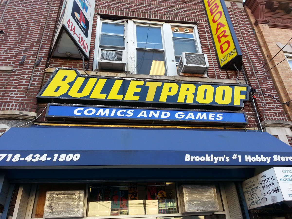
While doing research for this class this week, I noticed something that I never really paid attention to. I noticed that my neighborhood was such a commercialized area. It seemed like there were small businesses than places to live. I really never realized this because I have lived in Flatbush all my life so it always felt normal for me to be bombarded by advertisements, people handing out flyers, people sliding flyers under my apartment door and seeing business signs everywhere. I also learned that there are many self-starters in my area. The amount of independent businesses outweighs the amount of major business chains. There are a lot of restaurants owned by regular people that have lasted just as long if not longer than major food chains. There is another small business in my neighborhood called Bulletproof which has lasted since I was a child. It is a video game and comic book store that is still thriving even with big name stores such as Target and Gamestop moving in that sell the same products. This goes to show that it is possible for normal hardworking people to succeed against the machines as long as they continue to sell great products and get support from the community.
In this world there are all types of typography some that are colorful and unique and that are dull and boring but thought theses types of typography we learn many things about what the typography is trying to say. In my neighborhood I have many examples of typography and it is thought these that I have learned many new things about my neighborhood. One thing is that my neighborhood is very dull do to the fact much of the typography in my neighborhood is not very creative most of it is just bold face word with colors in them and seem to require no thought at all. The second thing that the typography of my neighborhood has told me is that my neighborhood is very simple it is not fancy and simply tells people what they are and what they do I got this from the typography because the type is arranged in a simple manor going from top to bottom and many time attaching picture show have they have. Finally the typography of my neighbor hood tells me its is busy because even thought my neighborhoods typography is not creative it does seem to catch the attention of the person passing by with its bright and dark colors and the shadowing that is used behind each lettering the word and even thought some of them are not very thought out they seem to do there job by attracting the passer by to step into or try what they are doing. I have learned that the typography is my neighborhood could tell me almost anything I wanted to know about my neighborhood and I have taken to heart every lesson I gained even thought my neighborhood is not the best at making typography it is still a great place to live.
My neighborhood is in a business area. I took some advertising photos that I see everyday . Each of them has different logo from the others. They were written in different kind of types that shows the purpose they are trying to present. Some letters in the pictures used old style typeface , other advertising uses Egyptian tape face ,and other kind like Modern or Sans Serif.


![IMG_2007[1]](https://openlab.citytech.cuny.edu/brownadv1167sp2014/files/2014/02/IMG_20071.jpg) ,
,![IMG_2019[1]](https://openlab.citytech.cuny.edu/brownadv1167sp2014/files/2014/02/IMG_201911.jpg)
![IMG_2015[1]](https://openlab.citytech.cuny.edu/brownadv1167sp2014/files/2014/02/IMG_20151.jpg)

