All posts by Joval Davis

5 families of Type pictures

This type is Slab serif because of the some of the letters serif is rectangular and some of the words are like blocks.I found this font will i was in a mcdonalds on a poster promoting a soccer tournament. It is in this catagory simply because of the letters rectangular shape.  They used This type because it fit the best because most slab serif type was used for posters. That is why this is a slab serif.
This type is Slab serif because of the some of the letters serif is rectangular and some of the words are like blocks.I found this font will i was in a mcdonalds on a poster promoting a soccer tournament. It is in this catagory simply because of the letters rectangular shape. They used This type because it fit the best because most slab serif type was used for posters. That is why this is a slab serif.
This type is old style because of the more wedge serif. The second reason is because the words have a more sharper when you look at them. The last  reason is because because the words seem the have thicker contrast them most word i've seen.I found the serif in Brooklyn the sign of a dehli store.I believed  they used this type to attract costumers because the word are suppose to catch the persons eye. That is why this picture is a old style font.
This type is old style because of the more wedge serif. The second reason is because the words have a more sharper when you look at them. The last reason is because because the words seem the have thicker contrast them most word i’ve seen.I found the serif in Brooklyn the sign of a dehli store.I believed they used this type to attract costumers because the word are suppose to catch the persons eye. That is why this picture is a old style font.
This is transitional because for one the head of the serif is horizontal. The second reason it is transitional is because it has a very low calligraphy flow. Finally it is transitional do to the small rectangular  and thick stress on the words. I found these on the sign of a catering store. I  believe just like the old style it was made this way to attract the  attention of customers.That is why is type is a transitional.
This is transitional because for one the head of the serif is horizontal. The second reason it is transitional is because it has a very low calligraphy flow. Finally it is transitional do to the small rectangular and thick stress on the words. I found these on the sign of a catering store. I believe just like the old style it was made this way to attract the attention of customers.That is why is type is a transitional.


This type is san serif simply because it has no serif. The final reason is the low calligraphy. I found this type on one half of a stores name This type was used make it so the reader always read the first half the name. That is why this type is san serif
This type is san serif simply because it has no serif. The final reason is the low calligraphy. I found this type on one half of a stores name This type was used make it so the reader always read the first half the name. That is why this type is san serif.


This type happens to be modern firstly because of the vertical axis on some of the letters. The second reason is the straight not curve change in to a serif. The final reason  is that is that is has a horizontal stress.I Found this picture in the same place i found the fourth it is the other half of the pharmacy title. I believe the owners uses the part as a way to make sure the reader reads the entire title and once       finshed  will automatically know what and who they are.
This type happens to be modern firstly because of the vertical axis on some of the letters. The second reason is the straight not curve change in to a serif. The final reason is that is that is has a horizontal stress.I Found this picture in the same place i found the fourth it is the other half of the pharmacy title. I believe the owners uses the part as a way to make sure the reader reads the entire title and once finshed will automatically know what and who they are.


typography neighborhood

IMG_0221

Joval Davis 1/31/14
Journal #1


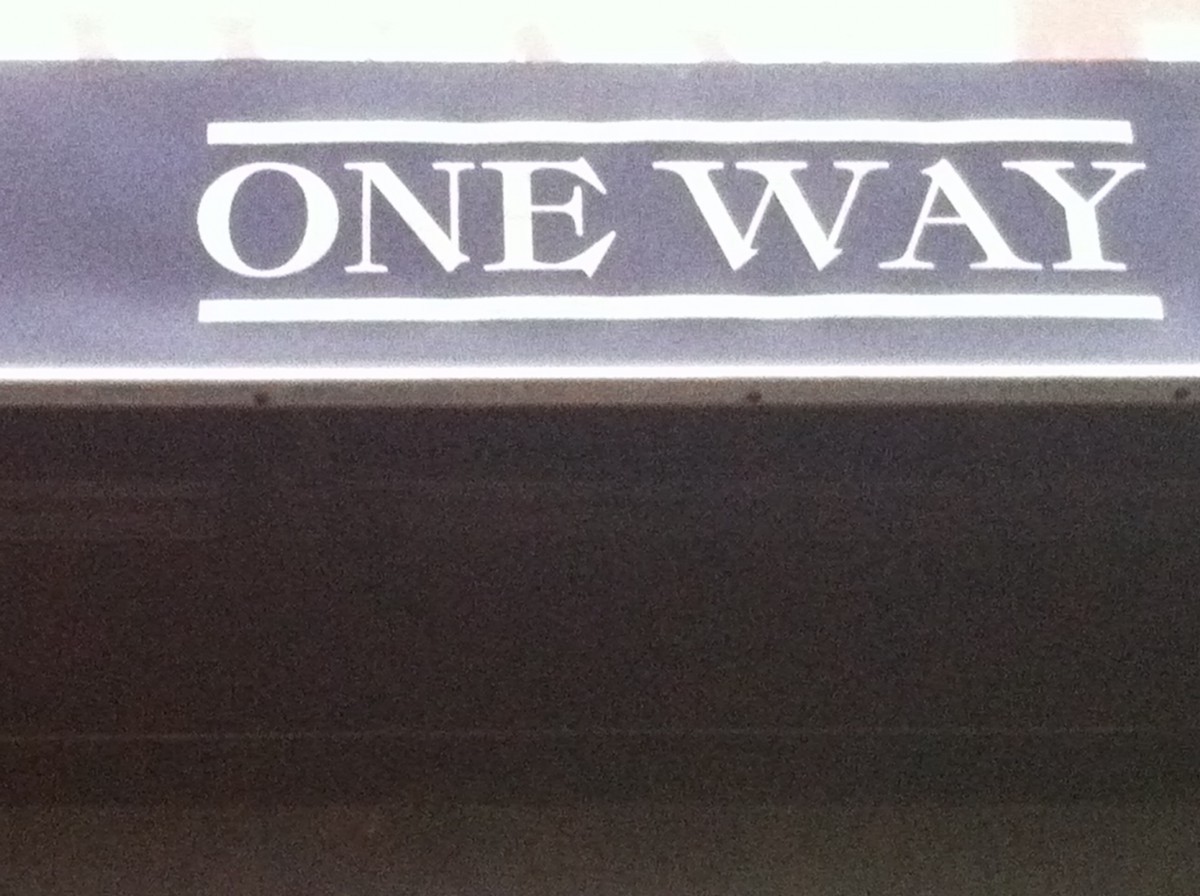
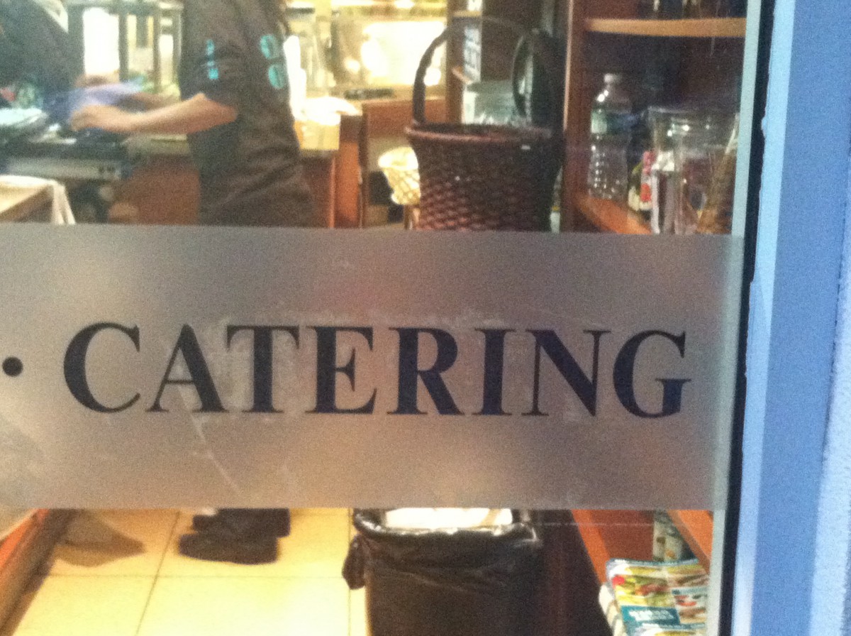
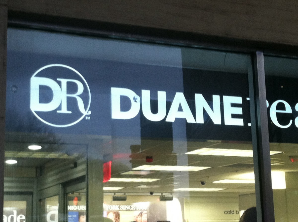
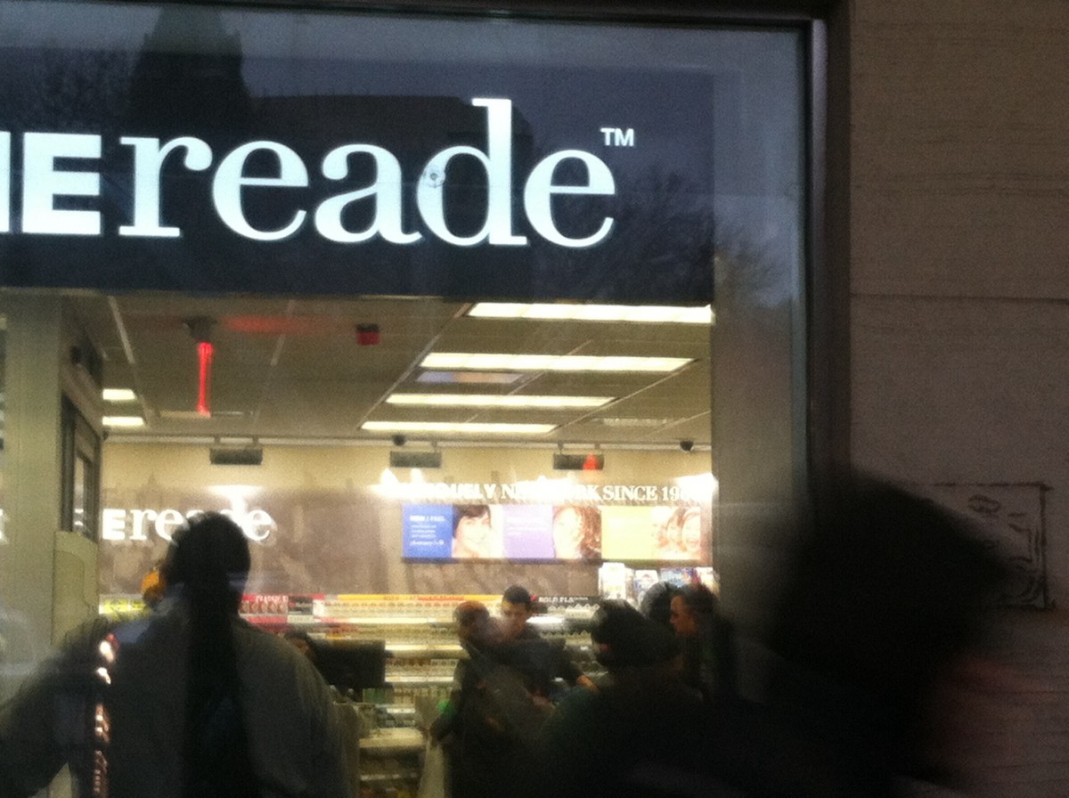
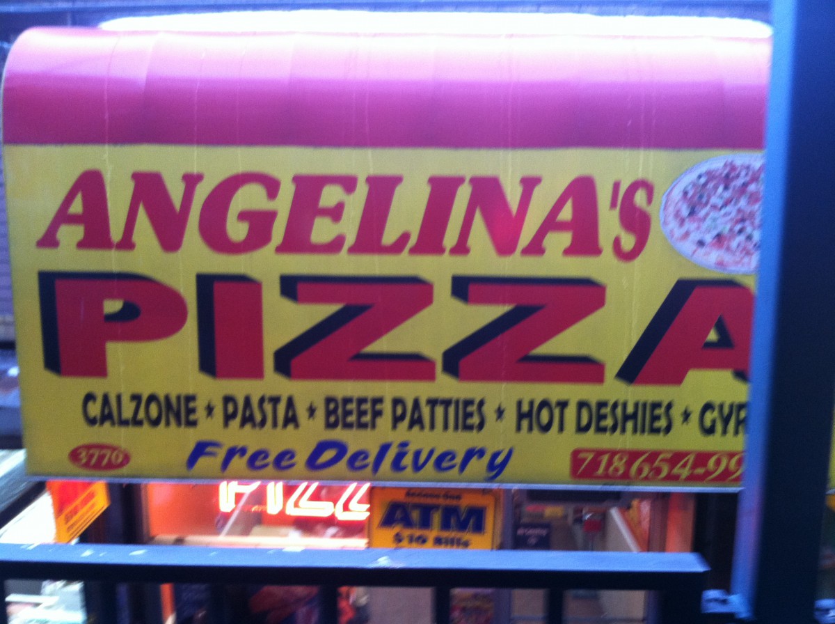
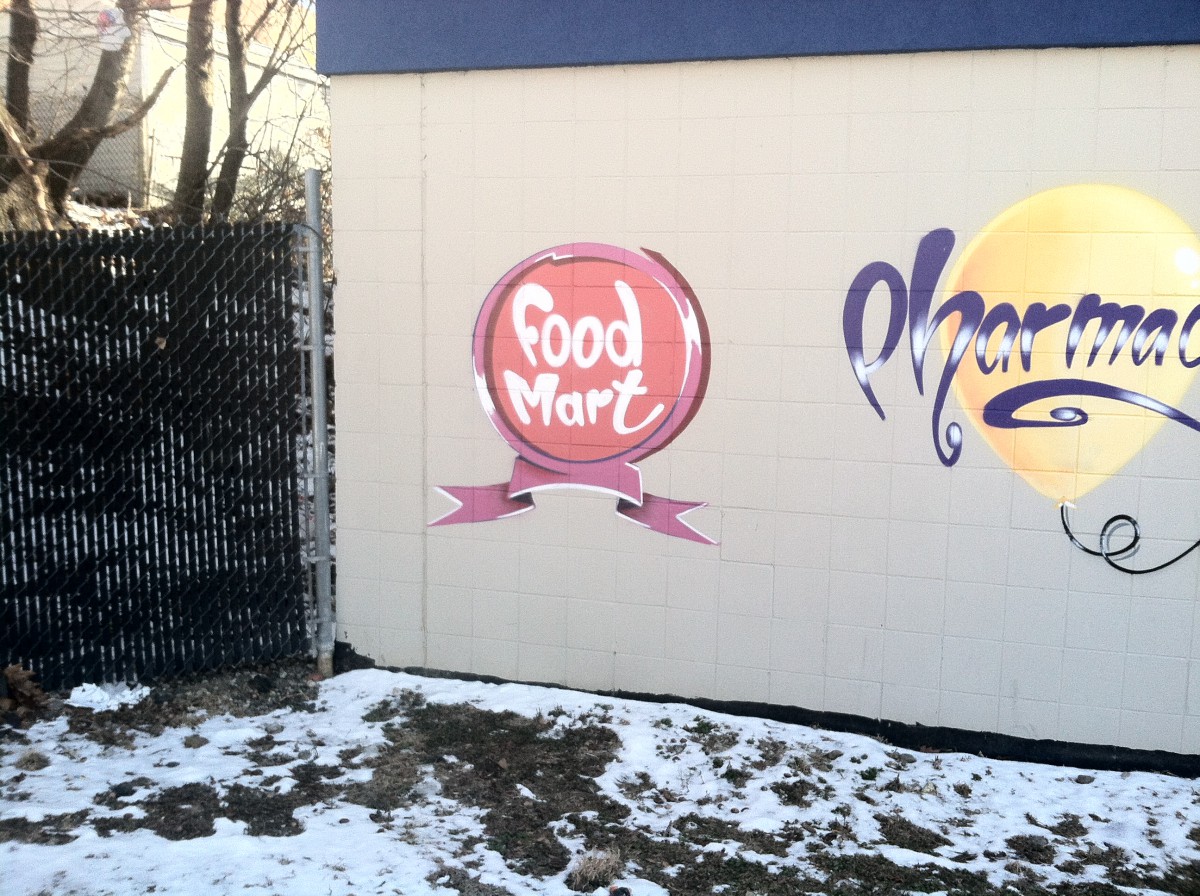
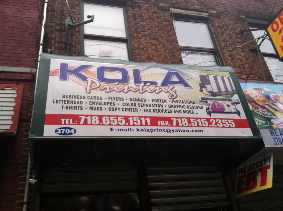
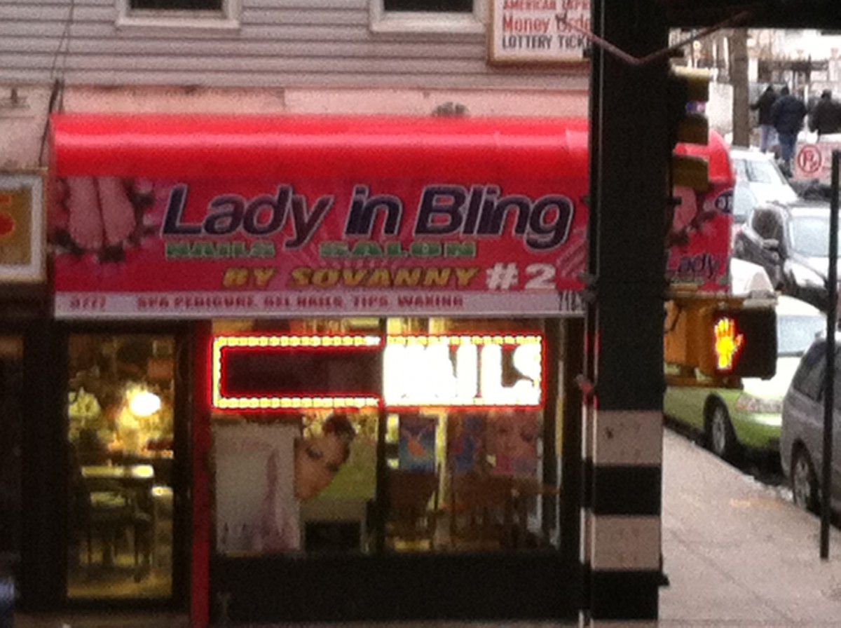
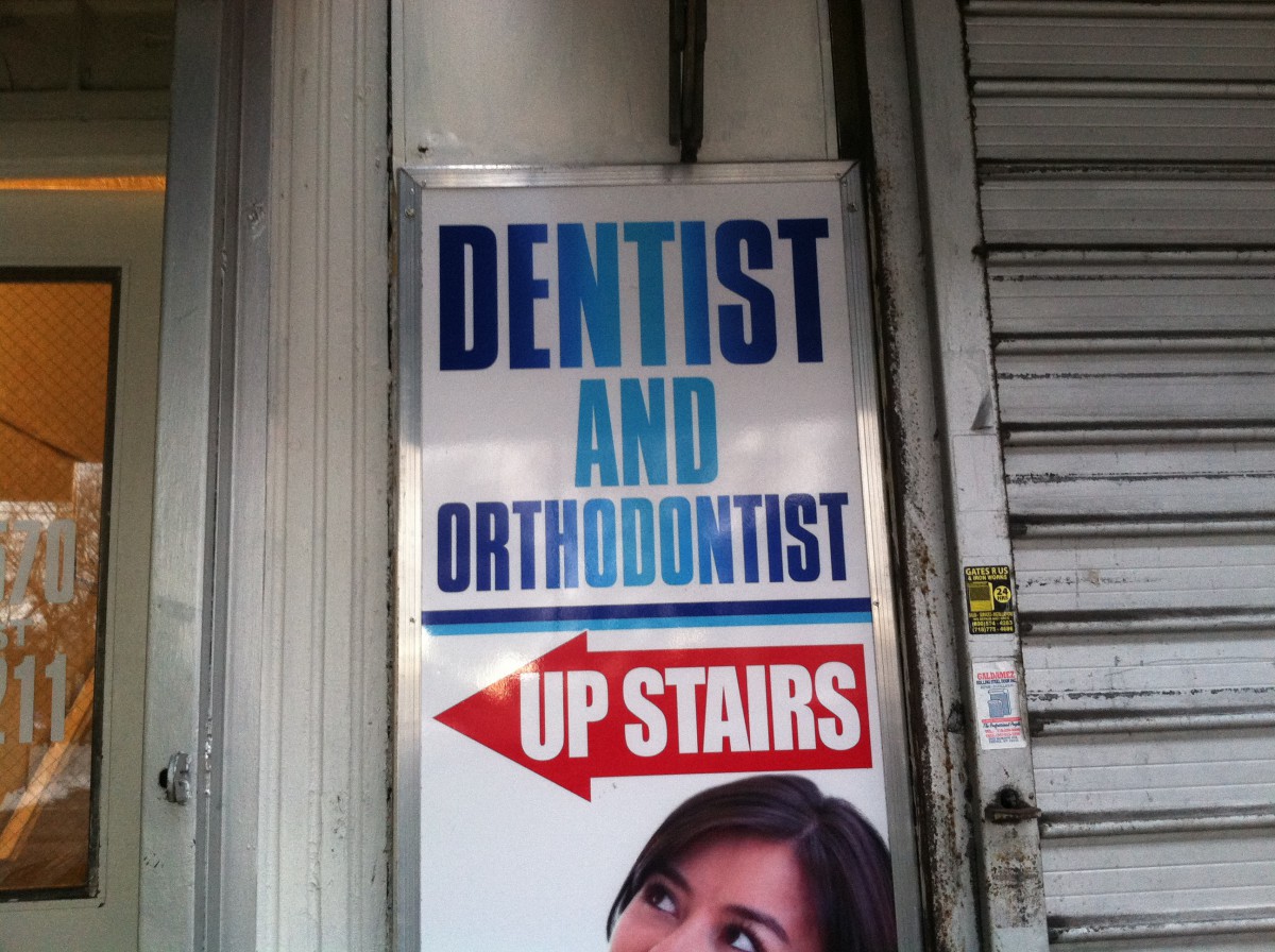
In this world there are all types of typography some that are colorful and unique and that are dull and boring but thought theses types of typography we learn many things about what the typography is trying to say. In my neighborhood I have many examples of typography and it is thought these that I have learned many new things about my neighborhood. One thing is that my neighborhood is very dull do to the fact much of the typography in my neighborhood is not very creative most of it is just bold face word with colors in them and seem to require no thought at all. The second thing that the typography of my neighborhood has told me is that my neighborhood is very simple it is not fancy and simply tells people what they are and what they do I got this from the typography because the type is arranged in a simple manor going from top to bottom and many time attaching picture show have they have. Finally the typography of my neighbor hood tells me its is busy because even thought my neighborhoods typography is not creative it does seem to catch the attention of the person passing by with its bright and dark colors and the shadowing that is used behind each lettering the word and even thought some of them are not very thought out they seem to do there job by attracting the passer by to step into or try what they are doing. I have learned that the typography is my neighborhood could tell me almost anything I wanted to know about my neighborhood and I have taken to heart every lesson I gained even thought my neighborhood is not the best at making typography it is still a great place to live.

IMG_0251IMG_0229IMG_0218IMG_0222