Category Archives: HW1: Ad Campaign Analysis

HW1: Ad Campaign Analysis

6 “Monster Cable Products is the manufacturer of high performance cables that connect audio/video components for home, car and professional use as well as computers and computer games. MonsterCable is for music lovers, audiophiles, recording studios, sound professionals, musicians…” http://www.monsterproducts.com/company/about-monster

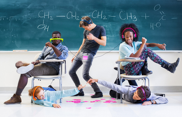
Elena Zhukova Photographer.     Monster Cable Products, Back to School

This Ad Campaign consisted of diverse people with realistic looks on what looks like a college/university campus. Each photograph is taken in different settings on campus, surrounded with props such as books, post-its and bag packs. They are very dynamic, and fun-filled which captures the excitement in the students in their behavior and expressions of the first days back to school. The images display freedom, vibrancy and youthfulness. Elena Zhukova was able to show the burst of energy and fun from these students-models by using graphic elements such as the hi-key; bright white florescent front light used which made the images feel happy and lively. Also the colors are bright, vibrant and a little saturated. The viewpoint is at eye level, which makes the viewer feel as if they are a part of the Ad. In one particular photograph with the female model sitting on the grass, there is a shallow depth of field, allowing you to focus solely on her and the product. The images showcase student lifestyle in a creative way that is consistent throughout the campaign.

Monster Cable Products caters to a large demographic. This campaign is to advertise the launch of their new headphone lines that are available in loud, vibrant, fun colors targeted towards college students. The photographer does a great job in connecting the brand with the demographic in these Ads, with the photographic elements chosen. The Campaign derives around “windows” because the photographs are in the presence of reality. The first photograph is the only one that sticks out as being a little more “posed” than real-life. The images aren’t showing the every-day student life, but more of the feeling of freedom and excitement on the campus when school re-opens.

HW#1: AD Campaign Analysis Robert Tadio

The Ad campaign that I looked up on the website it’s from Robert Tadio. This campaign is shot for BOSE headphones. The whole campaign gives the reader a bright positive feeling, and it is emphasizing the detail of the product. Therefore, it gives out the message of buying this product with a really good quality. Two of the ads have a close up shot for their consumers, and they also shot the white and black color at the same time, so it creates a good sense of contrast in both black and white color.

The product is shoot in eye level, and it also uses many photographic styles. They have a frontlit and sidelit to create shadows in the back, so it creates a depth of filed. For the shadow, they also have a diffused light to soft the edge of the shadow. In the second ad, it is a close up shot of the headphone. They have a reaveling light directly hit on the headphone, so it would be emphsizing the details of the headphone. The black grandground is black, the heaphone is white, it creates a color comparison, and it makes the consumers feel more about the quality of the headphone.

At the end, in my opinion, I think this campaign is a window. It lets people to see, to notice more about the products, and it drags out the consumers attention. It makes people to know more about the world, the technology that we have today, and how their product improves time by time.

HW1 Ad Campaign Analysis Yoshiko Nakamura

SoundCloud1 soundCloud2 SoundCloud3

The images for SoundCloud’s campaign called “Hear the world’s sounds” photographed by Anthony Georgis are vivid and have a spontaneous atmosphere. SoundCloud is the online audio distribution platform which you can share and listen to music. I believe that the main target audience is digital natives to digital immigrants ranging from teenagers to 30-somethings using the Internet as a tool of music player and communication on a daily basis. The images convey a sense of how cool and fun it is to be connected with companies which have same interests. The subjects look like they are enjoying the moment sharing music with their friends. What the campaign is trying to express is that, although it is online interface, you can share your impression, joy, and happiness through the music.

The images are taken at eye level, medium depth of field, uses red side-lit and back-lit and front-lit flash, with low key exposure. These settings produce a more lively and natural mood of the subjects.

I feel like these photographs are applied with the metaphor of both Windows and Mirrors. The reason of the Window is that the images looks kind of a documentary taste of looks rather than an intentional stage setting even though it actually is. The scene appears to be set in a dark inside space such as a music venue. Some subjects are looking at the camera and some are not. I got the impression that the photographer just cut out the moments of what are taken place there as these are.  However, I also see some emotional direction which the photographer meant to represent. The dark background and those back-lit and sid-lit light makes those subject pop up and it shows their spontaneous facial expression naturally well. I think the campaign fully succeeded with the the technical directions to convincing the target audience that using SoundCloud promise that pleasant opportunities sharing your creations and favorite sounds with people all over the world.

Antonio Griffith HW1 Advertising Campaign Analysis

The Campaign I picked was from New Balance sneaker and the photographer was Lori Adamski-Peek. It was made during the month of October for Breast Cancer Awareness. You can’t use New Balance to cure breast cancer but what the ad is trying to say is “here ladies before you get cancer or already have it, you can use our shoes to run and keep healthy because they are running shoes.” The ad is also letting people know that they care about cancer and it helps refresh people that New Balance is still around as a company for more profit in their business. The ad is specifically targeting women because they are the ones who get breast cancer majority of the time. Only using women figures photographically is powerful to any woman looking at this ad on Tv or print. Since new balance is a running shoes they have all the people in the photographs wear sporty clothing to give consistency. Everyone in the photos are in action from jogging to exercising so it emphasizes on the health aspect on what can help prevent breast cancer. What help me realize what this ad was about has to be the color of the text being pink and the body copy itself.


All the photographs in this ad is taking at eye level and all have a sense of depth of field focusing on one subject and slightly blurring out the person next to them and the background. Another thing that help with keep the cohesive aspect is that all of their subjects are outside and not indoors. We can not forget that the color pink is found on the sneakers, cloths and the text to help with consistency too.

I think this ad is a mirror concept because it is a idea that is very planned by the photographer to convey to the audience that these shoes are for exercising. The ad is a mirror concept with photography because instead of putting the subject indoors he placed them outside to be shot for the ad on purpose. The background of every photo has nature in it to represent life and a sense of energy with the natural sunlight.


Barrington Simpson Hw1: Ad Campaign Analysis

The Homewood Suites campaign,done by the Van Winkle agency and  shot by photographer Dana Neibert, appears to target recruits  within  the military. The print ads are basically Polaroids of military veterans interacting with their families which they have been away from. The setting for the areas are set in  typical family environment. Whether its their son learning how to ride a bike, thanksgiving diner or a ball game.  The ads use the tagline “For all those moments you missed to serve us, its our turn to serve you” So from this and the name of the campaign its is easy to assume the literal meaning of the ads. The ads was created to advertise Homwood Suites that would be a great place for the veteran and their family to catch up during their return home. The ads also give off the feel of bonding and  relaxation, as they rem anise on all the things you missed while you were away.

In terms of photographic styles, most of the print ads are lit and arranged in similar ways. All of them whether intentional or not seem to have glowing light. Except for the first and last ads, the rest are all set in the outdoors and as such would have seem to have been shot in natural light. So depicting on the location of the sun that is where the light source would arise from and even thou the first ad is set indoors, the glowing light  is still present in this situation. Another visual style i noticed is that most of the pictures have low contrast and in relation to the Polaroid and picture background there is a lot of shallow depth of field. From simply viewing the ads its clear that they all are mirrors. They are all meant to give that nostalgic feeling, the longing for what you have been missing  which sparks the human emotions. All in all i say this was a great set of ads and have done their work well.


Mirrors and Windows: Zales Jewelers by Bowen Ross

This series of images by Bowen Ross depicts loving couples in highly idealized versions of everyday life. While the subject matter in these photos is similar throughout, each image is quite different in style.

  • The lighting moves from a dramatic sidelight to strong backlight to diffused light.
  • The photos also range from a fairly low-key image (the food truck) to a high-key image (the snowman).
  • The figure/ground relationship shifts a bit throughout as well; in the snowman image, the couple appears almost swallowed up by the scene around them. The image in front of the house is zoomed in a bit more on the couple, followed by the laundromat, and the tightest shot of them is in front of the food truck.
  • The viewpoint also shifts throughout the images; we move from ever-so-slightly overhead to low-level to eye level.

While all of these elements are very different, what ties them together is the subject matter. The images presumably depict couples just after becoming engaged, or possibly simply declaring their love, via a piece of Zales jewelry, naturally! They are all in the process of doing everyday things: laundry, watering the lawn, building snowmen, getting a hot dog. It’s appropriate that the images are all different, because every couple is unique. Every couple wants to think that their love story is different from everyone else’s. I like the idea that even while performing the most mundane of tasks, one can still bring a sense of romance to even the most commonplace events.

Despite the fact that these sweet images depict familiar occurrences and activities, I think this campaign is more of a mirror than it is a window. True, we all perform similar activities to these, but I’m pretty sure that the last time I did laundry with my fiancĂ©, we were not embracing passionately. For me, getting a hot dog has never looked quite this romantic. These images are aspirational; we can all hope that we have the type of loving relationship that can transform even the most boring chore into an outpouring of affection.


HW1 – Advertising CMPGN Analysis – Wilbert Perez

The intended message for Microsoft’s “a tribute to 25 Years of Office users” was to exemplify how modern day life has evolved quickly growing into the 21st century and how Microsoft’s software has changed people’s productivity in their workplace or background. The denotation-connotation relationship is shown through Sandro’s photography by expressing how well the Office software has developed over time to help within the duration of one’s person’s life whether it was building data for spreadsheet or simply building a presentation for a class. The expressions shown from the subjects reinforce the idea of confidence, strength and resilience that Microsoft products offer to its market base.

Sandro’s uses a wide range of light from front-lit, side-lit, backlit and even directional-diffused light. They seem to work within the campaign’s agenda in my opinion. The texture is emphasized due to the light hitting the subject from an angle. I’d say that most of the photos are using are using selective focus and a mid-range of depth of field between background and subject. For the most part, the overall images use an eye-level viewpoint, making the relationship between subject and audience more easily relatable.

When applied to the metaphor of mirrors and windows, I definitely think the campaign is more of a mirror then a window. The use of rule-of-thirds when looking at these photo’s make you feel as if you could be one of these subjects, getting shot on your big game date, while your company breaks new industry standards or when you develop the next greatest videogame blockbuster. Within that moment, the lighting used in each photo stands as triumphant aspect of each photo, as if each subject has just won a new achievement. The achievement doesn’t seem to be a surprise to any one of these subjects, but the certainty in their expressions allows the audience to understand that hard-work was put in to place and no luck was involved, only the expertise offered by Microsoft through it’s Office software to be a helping-hand for each of our subject’s successes.

Lifeproof Galaxy S5 campaign- AnaMaria

Lifeproof Galaxy S5 Caked campaign by Tim Tadder

The primary meaning of the images of the lifeproof galaxy s5 campaign is on how effective the lifeproof cases are when is time to protect cellphones in extreme conditions; they comply fully with their homework. The photographer use images of people practicing extreme sports like kayaking, mountain biking, surfing and adventure motorcycle to signify the effectiveness of cases under extreme conditions. Very provocative images suggest buying the kits as they serve in all fields, the campaign has an air of defiance since the photos incite viewers to dare to take their cellphones around the world without being afraid that something might happen to them.

The campaign is very Colorful, see how the individual or model always maintained in every photo in the center over a portion of the field in which practice their extreme sport, that with the mood to give the viewer an idea of the environment which the case would be exposed.
The photographer use directional-diffused light for a touch of naturalness to photos, notice also how he gives a luminous circle around the subject to highlight the background. All the pictures are frontal shots and eye level.

The campaign’s photos are mirrors, as they convey a message that has been previously designed and which is a personal interpretation of the reality of the photographer and his team in which there are feelings to be transmitted. For instance, in the first picture we see the photograph conveys the idea of adventure, exploration, risk, through the sportswear and the scene. You can also appreciate the model with his helmet, life jacket, oars. Besides the stage shows the natural environment where the sport is developed such as: river rapids and waterfalls, which gives a sensation of speed, adrenaline. Also stones in the bottom of the river gives you a sense of danger, anything could happen in this sport. Another thing are animals circulating around gives the feeling of wildlife in which you would be exposed, nature itself powerful and of respect.
In the second picture also shows how the sludge is enemy number one of cellphones and the one that you see often in this sport of mountaineering cycle. The photographer continues with the same setup across the campaign, the model in the center, strong colors making allusion to nature ;etc.
In the third photo the same, the danger that seawater might cause to cellphones and how these would be safe using the cases.
And the last photo the serious enemies would be the dust and mud which would be isolated once again for the fabulous lifeproof cases.

Throughout the campaign shows the possible natural factors which would ruin a cellphone ,but thanks to the cases which give the feeling of security and confidence towards phones ,as these would be safe in all weather conditions as just demonstrate.
Screen Shot 2015-02-03 at 11.39.16 AM

Screen Shot 2015-02-03 at 11.39.23 AM

Screen Shot 2015-02-03 at 11.39.32 AM
Screen Shot 2015-02-03 at 11.39.07 AM

Mikhail Reid: Hw1 Advertising campaign

GATO_BRND_X3466_E5137_A_EG1.pgs GATO_BRND_X3445_E5137_A_EG1.pgs


The campaign “Gatorade: Sweat it all” by Gary Land (Photographer), Brent Anderson (Group Creative Director) & Annie Johnston (Art Director ). This campaign message intend to tell the audience to help rehydrate their body quickly and help improve performance and productivity. Gary communicates this message by showing the athletes need to re-energize to continue either playing the sport or practicing for the next game. The images make you feel that you would want to drink this product to keep you going in any sport that you part take in just by looking how the athletes perspire and ready to get back to the game. As you can see the photos are taken from an eye to eye level. The Serena Williams ad photo have an high key which is mostly light tones, selective focus (Serena and the product is in focus while the background have an blur effect) and also the type of lighting Gary used was front light. On the other hand, Dwayne wade ad have high contrast which have light and dark areas, sidelit lighting and selective focus (the athlete and the product is sharp and as you can see the Miami heat logo and basketball hoop have a soft blur) . Personally these photos Gary land took are both mirror and window and the reason for that is; the audience  who are viewing the ads can relate and feel what these athletes go through on a daily basis to increase their performance . It gives people a positive message to motivate them push to their limits further and exceed their goals to have a good performance on the field for the world to see.

Khyriel Palmer: Advertising Campaign Analysis

698_13060 698_13058698_13059


Phillip Roston did a campaign on Tech Deck the finger skateboards using hands in a standing position with very few props. I feel like the message in this campaign is that playing with Tech Decks aren’t just for kids. Its a serious toy for people of any age. Just like how anyone can skateboard if they want. This ad campaign is trying to sell a lifestyle that you can take anywhere sine skateboards cant be used in anywhere but the streets and skate parks. They are not limiting the product to just any specific age rang either. Whoever has a passion for it is welcomed. As someone who enjoys the sport, I’m sure i would actually buy the product because it is speaking to my demographic. All three of these images are at eye level with the viewer. Each photograph was taken with direct lighting with a very faint shallow space. The High contrast in these images helps display that this is a toy based upon a serious lifestyle of dedication to get better. It is also has a soft focus with an emphasized texture that looks similar to the marks on a used skateboard that grinds often. These images also feel balanced equally, none of them feel heavier than the other.  I believe that these images are mirrors. They display trial and error of skateboarding as well as the image people depict about it. You can notice that from the bandage on the finger that is standing on the desk. Then there is a finger which has a brace on it. Which it probably got from landing a trick the wrong way. And lastly the one is different from those two because it just has a tattoo. It could be a symbol meaning that they endure pain which is true. Overall this piece is a mirror because the hands represent people who love skateboarding. I’m pretty sure if you ever tried skateboarding you would be able to relate to this campaign.