Author Archives: cynthia

FINAL PROJECT – Last Shot

IMG_0638


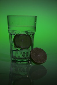
For the last time of my shooting, I use color paper to shot with my watery fruit. The result comes out pretty nice, but I think the most important thing with the color paper is setting and the position of my fruit. I use green light to shot with lime, and also this time I use continues light. It is bring enough and the background color is very elegant. When I see the photos after, I feel very happy with the photo. Also, I figure out that if I shot without any light light, It comes out with some kind of darkness sense too, but we still can see a clear reflection under neath it. I like this shot.

Final – Second Shot

IMG_1841-2

I didn’t shot for the first time, so this post will be my first shot for my final project. My theme for the final project is fresh fruit drinks for summer. After I have done shooting, I figured out that my lighting is a bit dark in the front. I had a strobe light on top and one under neath. What works out for this time is the splash. I throw the fruit into the water, and it came out pretty nice, and I tried to throw the fake ice into the water, it came out good too. I also shot the water with the fake ice. the shadow and the ice have a nice contrast, so It looks pretty elegant, even it is just a glass cup of ice water. Next time, I will be shooting with color papers and try to shot with the continues light. I think I have enough splash photo, so I want to try to shot with the color paper and continues light.

RR5

Today we have learned something about metaphor. There are differences between metaphor and similes. Similes are something you can compare, and metaphor is something you can actually feel from the reading. We did two poetry reading. The first one is called ” she being Brand “. The whole tonality of this poem is very positive and very excited. At the end of the poem, we can know that this poem is describing a man first time driving a car. We can tell that the man is the first time driving this car by ” thoroughly oiled the universal joint tested my gas felt of her radiator made sure her spring were O.K. ” We can also feel the excitement  in the poem, the writer says ” and then somehow got into reverse she kicked what the hell ” Here we can tell how much nervousness and excitement it is.

Then the second poem is called “Coming home, Detroit ” After reading this poem, we can feel the tonality is totally different from the first one we read. The tonality of this poem is very cold and sad.  We try to pull out the history behind this poem and study more about it. There was a big new back then, people were trying to burn down the buildings and destroying things.  At that day, it was the same day the writer coming back from by driving his car. We have an image by the writer says ” pouring fire ” and ” The fat stacks of breweries hold their tongues.” The writer expresses the sad feeling by what he is seeing in the car ” One brown child stares and stares into your frozen eyes until the lights change and you go forward to work ” This sentence just make a strong image into my brain, a child is staring at my face, and his eyes are full of sadness, no smile, maybe there is helpless in his eyes. This sentence rises up the sadness. Therefore, from these two poems, we can tell that metaphor is very important for our writing, or sometimes even when we are communicating. Metaphor makes people feel, and also it can make connection between different things.

RR4

We have done a reading in class today. It is called On Photography by Susan Sontage. We watch a video about cave mens. There are prisoners in the cave, there is a bridge behind them. Everyday day people walking through, with animals, or woman bringing stuff to the market place. Everything that the prisoners can see is the shadows from the wall. They have no idea how the outside world looks like. Once they have a chance to be released, they are looking at the real world by their eyes. They can see the world, and feel the world. If they come back, ant tell other prisoners about what he sees, no one is going to understand him, and they don’t have any images in their heads. From this video, we can say that visual perception is very important to human beings. The first photo was shoot in 1893, since so many years change, today we have a lot of different way to take photos. Today’s photographs are not just images to people, it also contains lots of messages. Because we have eyes, we can see our world, and we have a huge images in our head. Comparing to the old art, it is a different way to observes messages. In the reading, Susan Sontage states that being educated by photographs is not like being educated by older, more artisanal images. I agree with statement, because in my opinion, photography is mo realistic than painting. From the old painting we can learn the history, and the message from history. For photography, We can learn more about the world that we are living today, photography is more like knowledge to me.

Class Work RR3

According what we have watch in class today, We can see that  powerful images can bring in so much more powerful messages to the readers. We have watched the still life painting in Dutch 17th and 18th century. From my opinion, I like the Jan van Huysum painting, Vase with Flowers the most. Compare to the Rachel Ruysch painting Fruit and Insects, Jan van focus more on the details, and it has more contracts in the painting. The details of Jan van’s paint is the amazing emphasis. She paints out the details on the flower, the water drop, the insects and even the boy on the back.

The last thing we watch in the class is the shooting from Hector Rene Membreno-Canales. I think the way he use the the style of Dutch is pretty effective. Also I am agree with what people say in the class about his photographs. His shooting represents mortality, and also it is saying when we enjoying the world this second, there is always somethings bad happens in the other side of the world, or maybe the one who next to you. This set of photographs represents death and mortality. The interesting point is he is using wines, foods and fruits to connect with soldiers and their guns. Therefore, I think these photographs are effective and it is an interesting way to get this kind of message.

Differentiation

Based on the reading that we do today, I have learned a lot from it. When we shooting the photos, there is a relationship between the object and the person itself. Such as Catherine’s face and the bottle of the Channel perfume. It doesn’t means that the shape of the bottle is the same with Catherine’s face, but yet, there is meanings between them.  In this ad, there is 2 different objects but presenting the same meaning. As we know, Catherine Deneuve is very famous in magazines and films, that is what people can think of when they look at her face. Her face represents her history, with honor and significance. Therefore, the ad for Channel N5 is meaning the same thing, which is it represents the world of consumer goods, and it also give the readers a feeling of high quality product.


HW#1: AD Campaign Analysis Robert Tadio

The Ad campaign that I looked up on the website it’s from Robert Tadio. This campaign is shot for BOSE headphones. The whole campaign gives the reader a bright positive feeling, and it is emphasizing the detail of the product. Therefore, it gives out the message of buying this product with a really good quality. Two of the ads have a close up shot for their consumers, and they also shot the white and black color at the same time, so it creates a good sense of contrast in both black and white color.

The product is shoot in eye level, and it also uses many photographic styles. They have a frontlit and sidelit to create shadows in the back, so it creates a depth of filed. For the shadow, they also have a diffused light to soft the edge of the shadow. In the second ad, it is a close up shot of the headphone. They have a reaveling light directly hit on the headphone, so it would be emphsizing the details of the headphone. The black grandground is black, the heaphone is white, it creates a color comparison, and it makes the consumers feel more about the quality of the headphone.

At the end, in my opinion, I think this campaign is a window. It lets people to see, to notice more about the products, and it drags out the consumers attention. It makes people to know more about the world, the technology that we have today, and how their product improves time by time.