Category Archives: Homework

Final Project

I think this project helped me have a better understanding of advertising photography. I learned a lot about lighting, angles, etc. I consider my weakness in my second shooting was the lighting, but this third shooting improved considerably. Use colored paper to give a more provocative sense and capture textures and shapes of different desserts. I took pictures at an angle of 45 degrees above them to achieve depth. Also I experiment more with the positions of these and their reflections. consider that textures of the desserts had a strong impact on this shooting.
It was a big challenge to take something common, and make it look spectacular.

Second Shooting

The second shooting was a challenge, after having arranged the lights in different positions I realized they were very strong for the subject that it was portraying. Apart from that ,I had an inconvenience with the product shape. Despite all these mishaps, I reaffirm my knowledge in lighting .Especially as for desserts, I learned what kind of those could work better in this type of ambience to be kept intact and provocative in photo session.

3 Para, Trip Description (Antonio Griffith

The first exhibition we went to was for the Chinese photo book at the Aperture Magazine headquarters. I have never been in that buildings before where this exhibition was but I sure liked it at first site. I visit some galleries in Chelsea a few weeks before this trip and did not see this one. I did not like the exhibition as much because it was so much history going on when the tour lady was explaining to me. Each section of this exhibition was different to emphasize certain points about the Chinese culture at that particular time in history. What I did liked about what I saw there was the Aperture Magazine. I like the magazine because of the weird front cover along with other creative weird images that made me say wow.


The second exhibition from artist Jimmy Nelson I saw before  2 – 3 weeks with my friend. This trip reminded me on how good the photographs were at this gallery. I pretty much like all the photographs there because it captures a culture I have never seen before. Most photographs like myself do not get the chance to photograph these subject matter that was displayed in the exhibition. The images were so raw because these people are living in poverty compare to the American culture and the way they decorate themselves with raw material. The decoration they have on their body is part of their culture and is not just put on for the photographs. I wish I could travel to places like Jimmy Nelson and photograph exotic subjects we don’t see everyday.


The last exhibition “Public Eye” was pretty good as well. It felt like a museum because of how the design of the building inside. My favorite piece was the photograph of a wide landscape. The photograph was multiple shots of the town put together to look like one shot. The photo was taking by Eadweard J. Muybridge. The photograph was a 360 degree panorama from one of San Francisco’s tallest hills. I got inspire when I saw this shot because I feel like I can do it myself one day. The feel of the photo gave a dreamy feel as if I want to go there and see how the people live there. Also made me feel hope about life and making me feel like I want create art because I love it so much.

Gallery Report & Final Project Ideas

The Chinese photobook exhibit at Aperture was quite interesting. Not because of the aesthetics of the work or the technique of the photographers, but because it reminds me that we always need to use a critical eye when examining media. There’s an old phrase –  “cameras don’t lie,” and it illustrates an idea that people used to believe, namely, that photographs depict the truth. But whose truth is it depicting? The most telling was the two photobooks that contained images of the the Sino-Japanese war. One book was pro-Japanese propaganda. The other told the opposite story.

The Jimmy Nelson exhibit at the Bryce Wolkowitz gallery was stunning. The images themselves were breathtaking. Jimmy Nelson has traveled the world and made photos of indigenous people in very remote locales. I do take issue with the way he exotifies his subjects – we are basically forced to look at them as “other,” as people who are very foreign to us in every way. That being said, his images are also incredibly successful. One of my favorites was a man with a very elaborately painted face and headdress. He’s in what appears to be smoke (or perhaps fog) and the contrast between the reds and blacks of his face paint and the smoky white is extraordinary.

The third exhibit, the Public Eye, at the NYPL was also very interesting. Stylistically, it was a bit of a grab-bag. There was all kinds of work, from Ansel Adams to anonymous selfies! I was drawn to work by a photographer who was previously unknown to me – Ethan Levitas. He’s a street photographer who uses a large format camera to obstruct the image feed of surveillance cameras. It’s interesting because in doing so, he is basically “removing a frame” from the surveillance stream and creating something else with it. The images themselves were also interesting in their candid nature.

Career Goals

My major is web design, and ultimately, I’d like to design sites for artistic clients. I feel as though it would be interesting to design sites for musicians, artists, and fashion designers. I’m also really interested in the culinary arts – designing restaurant logos and websites is something that I do already. I would like to work for a small firm or agency, where I could learn things from my colleagues, but I’d also like to freelance for myself on the side. Basically, I want to make money and have some flexibility in how I accomplish that.

Final Project

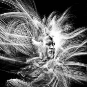
I could go in many different directions for my final project, since I’m a web designer I feel as though I have a lot of flexibility. I’m contemplating doing some interesting portraiture and “paint with light.” I’m really drawn to the experimental nature of it – you don’t know what you’re going to get with each shot. Here’s an example:

deforest1
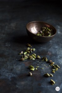
Another idea could be food photography. It could be useful if I’m looking to brand myself as someone who specializes in restaurant websites. The only drawback is that I feel as though food photography is deceptively difficult! Perhaps doing some sort of food-related still life could be interesting. Something like this: Nadine-Greeff-Dark-Food-Photography-6


Trip Description, Final Project Description and Career Goal – AnaMaria Saenz

Final Project and Career Goals

After I graduate I would like to work, in any company that requires updating or design for their web pages. It doesn’t have to be a company of design, such as:
The New York Times, Thomson Reuters, etc.
The idea would be, that my portfolio show my photography skills. And can present a story or a product successfully to the public.
About the project, I thought of showing the public ; the paintings of a friend which will be published on a website. On which I am working on.It is going to showcase the talents of students around the world.

The Chinese Photobook

I’m really surprised how the government (Communist) controls the media. In this case the photos that were divulge. All trying to sell a good image of Mao Tse-Tung , such as charismatic as he was; his favoritism towards the village. etc. The photographer obviously showed him smiling, sharing; finally as a friendly person, also as a leader. From a low level view point the photographer tried to empower him with this angle.
Another thing I seemed curious, was how the Chinese government used a “magazine” between people of the same government. To put them all up to date, as what this wanted such as: when they were selling the idea of agriculture. From idea and how easy that they made it seem, with smiling people without fatigue.
Another thing that caught my attention was, how the Japanese government showed the friendly face of war; with soldiers smiling and saying goodbye to their families. They were going to this, when in fact the war was not, if no a waste of blood and suffering for all the people.

Second Exhibition

Jimmy Nelson, exhibition seemed to me spectacular; must be because I like photojournalism. The portraits that he took from all indigenes around the world, I found spectacular . He clearly presented the different cultures to the society, so we had a general idea and remind us of them. All typical costumes, decorations and colors represent something of the tribe. As well as their social position, also those imposing landscapes that he capture in his photos; such as the lush jungle with waterfalls and rivers made his work wonderful.

Third Exhibition

The NYPL Exhibition, public eye caught my attention; the work of Eadweard Muybridge. Since for the time they were taken seems very wasteful work, and interesting . This photo 360 degree panorama , of San Francisco gives the feeling of freedom. As it is not restricted by measures, of conventional photos and the overhead view; you always wonder ” what lies beyond the edge?” and the answer is plenty. definitely unleash the imagination..
IMG_1939

jimmi nelson

e.e cummings- AnaMaria

The two poems is about cars. In the first poem , the driver treats the car as if it were a woman. the poem is a little intense for example: ” avenue i touched the acceleterator and give her the juice, good it “that was agood example of peaks that you can find out in this poem. Also the driver treats his car like if it were alive, well after of that emotional description that he gave us I am sure that he think it is.

In the second poem the author describes his homecoming.
It’s a bit cold, without much emotion, describes a materialized town like :”On sleds inn the false sun the new material rests. One brown child stares and stares into your frozen eyes until the light change and you go forward to work” it is little gray, dark dull .

Vanitas – (AnaMaria)

Rachel Ruysch used a simile to represent life and death in her painting called fruits and insects, putting juicy fruits and its maximum splendor normally invites to consume . Fruits and eggs represent life and birth in contrast to the danger of death when is close. For example the butterfly trying to stands on the table at the same time it senses the death that in this case is represented by a salamander, that is attentive to devour the butterfly.It should emphasize her great capacity of observation for details in her painting.

The Jan Van Huysum still life painting vase with flowers use flowers with a lot of detail. He also uses eggs in a nest and a little boy naked running in the background to represent birth . Using contrary colors he brings harmony to his still life painting.

Hector Rene’s pictures are inspired by Vanitas. He belonged to the United States Armed Forces and had the opportunity to see the two realities at once life and death. Some of the photos have a Christian connotation as when the soldier holds the child with one hand and in the other holds flowers that seems carnations, this photo is very similar to a Christian painting with child Jesus. In another picture Rene makes a simile of death of jesus .but in this case the one who is holding the death person is a soldier.

HW1: Ad Campaign Analysis

6 “Monster Cable Products is the manufacturer of high performance cables that connect audio/video components for home, car and professional use as well as computers and computer games. MonsterCable is for music lovers, audiophiles, recording studios, sound professionals, musicians…” http://www.monsterproducts.com/company/about-monster

Elena Zhukova Photographer.     Monster Cable Products, Back to School

This Ad Campaign consisted of diverse people with realistic looks on what looks like a college/university campus. Each photograph is taken in different settings on campus, surrounded with props such as books, post-its and bag packs. They are very dynamic, and fun-filled which captures the excitement in the students in their behavior and expressions of the first days back to school. The images display freedom, vibrancy and youthfulness. Elena Zhukova was able to show the burst of energy and fun from these students-models by using graphic elements such as the hi-key; bright white florescent front light used which made the images feel happy and lively. Also the colors are bright, vibrant and a little saturated. The viewpoint is at eye level, which makes the viewer feel as if they are a part of the Ad. In one particular photograph with the female model sitting on the grass, there is a shallow depth of field, allowing you to focus solely on her and the product. The images showcase student lifestyle in a creative way that is consistent throughout the campaign.

Monster Cable Products caters to a large demographic. This campaign is to advertise the launch of their new headphone lines that are available in loud, vibrant, fun colors targeted towards college students. The photographer does a great job in connecting the brand with the demographic in these Ads, with the photographic elements chosen. The Campaign derives around “windows” because the photographs are in the presence of reality. The first photograph is the only one that sticks out as being a little more “posed” than real-life. The images aren’t showing the every-day student life, but more of the feeling of freedom and excitement on the campus when school re-opens.

HW#1: AD Campaign Analysis Robert Tadio

The Ad campaign that I looked up on the website it’s from Robert Tadio. This campaign is shot for BOSE headphones. The whole campaign gives the reader a bright positive feeling, and it is emphasizing the detail of the product. Therefore, it gives out the message of buying this product with a really good quality. Two of the ads have a close up shot for their consumers, and they also shot the white and black color at the same time, so it creates a good sense of contrast in both black and white color.

The product is shoot in eye level, and it also uses many photographic styles. They have a frontlit and sidelit to create shadows in the back, so it creates a depth of filed. For the shadow, they also have a diffused light to soft the edge of the shadow. In the second ad, it is a close up shot of the headphone. They have a reaveling light directly hit on the headphone, so it would be emphsizing the details of the headphone. The black grandground is black, the heaphone is white, it creates a color comparison, and it makes the consumers feel more about the quality of the headphone.

At the end, in my opinion, I think this campaign is a window. It lets people to see, to notice more about the products, and it drags out the consumers attention. It makes people to know more about the world, the technology that we have today, and how their product improves time by time.

HW1 Ad Campaign Analysis Yoshiko Nakamura

SoundCloud1 soundCloud2 SoundCloud3

The images for SoundCloud’s campaign called “Hear the world’s sounds” photographed by Anthony Georgis are vivid and have a spontaneous atmosphere. SoundCloud is the online audio distribution platform which you can share and listen to music. I believe that the main target audience is digital natives to digital immigrants ranging from teenagers to 30-somethings using the Internet as a tool of music player and communication on a daily basis. The images convey a sense of how cool and fun it is to be connected with companies which have same interests. The subjects look like they are enjoying the moment sharing music with their friends. What the campaign is trying to express is that, although it is online interface, you can share your impression, joy, and happiness through the music.

The images are taken at eye level, medium depth of field, uses red side-lit and back-lit and front-lit flash, with low key exposure. These settings produce a more lively and natural mood of the subjects.

I feel like these photographs are applied with the metaphor of both Windows and Mirrors. The reason of the Window is that the images looks kind of a documentary taste of looks rather than an intentional stage setting even though it actually is. The scene appears to be set in a dark inside space such as a music venue. Some subjects are looking at the camera and some are not. I got the impression that the photographer just cut out the moments of what are taken place there as these are.  However, I also see some emotional direction which the photographer meant to represent. The dark background and those back-lit and sid-lit light makes those subject pop up and it shows their spontaneous facial expression naturally well. I think the campaign fully succeeded with the the technical directions to convincing the target audience that using SoundCloud promise that pleasant opportunities sharing your creations and favorite sounds with people all over the world.