Author Archives: jasminewelch

Final Shoot – Light Painting

For my final shoot, I was fairly pleased with the quality of the images I got.  Joseph and Josh were my models, and I was able to have them interact with the light in new and interesting ways. Joseph brought a more dramatic feel to the pictures because of his facial expressions and body movements, and the shots greatly benefited as a result.

I wish I had more time to push it even further, because I feel that towards the end I was only just starting to get the effects I wanted, but I loved this project so much that I really want to keep experimenting with this effect.

Second Shoot – review

I was really disappointed with the quality of my photography for the second shoot. While the setup was arguably the same as the first week, I was trying to do trickier things and it really wasn’t working.

I was trying to get Antonio (who is a great sport) to look like lightning bolts were coming off of his hands. We tried the shoots in a variety of ways – having him stay in the shot so we could measure where to “draw” the lightning, and having him come out of the shot just after the flash went off.

When he stayed in the shot, he was blurry every single time, because it’ s impossible for a human to stay perfectly still for ten seconds, or even eight seconds, or six seconds. We tried many different exposure times and virtually none of them were usable.

When we had him come out of the shot, it was impossible to draw the lightning without overlapping where his head was, or somehow not getting the light to line up correctly.

By the end of the shoot, I’d reverted to my technique from the week prior, and not have him interact with the light. I was just too frustrated.

I got almost no usable shots for this session.

First Shoot – Review

For my final project, I’m creating portraiture that’s enhanced by playing with light.

What worked: there was one really cool shot of Barrington, one of Marielos, and one of Antonio. The shot of Barrington that I liked showed his head, and his torso was covered in a variety of light streaks. He has a slightly mischievous expression on his face that I felt worked in the shot.

The shot of Marielos was one of my favorites because it was the most minimal. It was more of a portrait without the light covering her up too much.

Antonio’s was cool because it was really moody. His face is strangely doubled in the image, but it went with the overall theme, and the way the light is coming off his body is really different than in the other shots.

What didn’t work: in the early shoots, we were all a little overzealous in the light painting, and got carried away. In some of them, the model is all but obscured by the light streaks. Next time, I think less is more. Also, instead of just having my model stand there, I want them to interact with the light more. Do different things with their bodies. Pretend the light is coming off their hands, or write a word or symbol with the light. For as dynamic as the images can be, I was having my models behave in a way that seemed a little static.

That being said, it seemed as though people were really having fun with this idea, and I enjoyed the collaborative aspect of it. And there’s no real way to ever know 100% how each shot is going to turn out. That’s partly why I was drawn to this project in the first place.

I also should play with the settings a bit more — there were some light leaks that got into my shots. It is unavoidable to a certain degree (multiple people shooting while I was shooting), but maybe if I shorten the exposure a bit, less light will get in.

Final Project J Welch

Topic:  My topic is painting with light. I’ve always loved this style of photography, mostly because of the element of randomness. It’s impossible to know exactly how each picture will turn out.

Subject Matter: I’d like to create portraiture and use long exposures to create streaks of light across the frame.

Style: Moody and kinetic. Dark backgrounds and brilliant bursts of light.

Lighting: I think none, except for the colored lights I will use.

Props: Strings of light, battery powered color-changing light.

Gallery Report & Final Project Ideas

The Chinese photobook exhibit at Aperture was quite interesting. Not because of the aesthetics of the work or the technique of the photographers, but because it reminds me that we always need to use a critical eye when examining media. There’s an old phrase –  “cameras don’t lie,” and it illustrates an idea that people used to believe, namely, that photographs depict the truth. But whose truth is it depicting? The most telling was the two photobooks that contained images of the the Sino-Japanese war. One book was pro-Japanese propaganda. The other told the opposite story.

The Jimmy Nelson exhibit at the Bryce Wolkowitz gallery was stunning. The images themselves were breathtaking. Jimmy Nelson has traveled the world and made photos of indigenous people in very remote locales. I do take issue with the way he exotifies his subjects – we are basically forced to look at them as “other,” as people who are very foreign to us in every way. That being said, his images are also incredibly successful. One of my favorites was a man with a very elaborately painted face and headdress. He’s in what appears to be smoke (or perhaps fog) and the contrast between the reds and blacks of his face paint and the smoky white is extraordinary.

The third exhibit, the Public Eye, at the NYPL was also very interesting. Stylistically, it was a bit of a grab-bag. There was all kinds of work, from Ansel Adams to anonymous selfies! I was drawn to work by a photographer who was previously unknown to me – Ethan Levitas. He’s a street photographer who uses a large format camera to obstruct the image feed of surveillance cameras. It’s interesting because in doing so, he is basically “removing a frame” from the surveillance stream and creating something else with it. The images themselves were also interesting in their candid nature.

Career Goals

My major is web design, and ultimately, I’d like to design sites for artistic clients. I feel as though it would be interesting to design sites for musicians, artists, and fashion designers. I’m also really interested in the culinary arts – designing restaurant logos and websites is something that I do already. I would like to work for a small firm or agency, where I could learn things from my colleagues, but I’d also like to freelance for myself on the side. Basically, I want to make money and have some flexibility in how I accomplish that.

Final Project

I could go in many different directions for my final project, since I’m a web designer I feel as though I have a lot of flexibility. I’m contemplating doing some interesting portraiture and “paint with light.” I’m really drawn to the experimental nature of it – you don’t know what you’re going to get with each shot. Here’s an example:
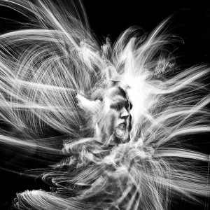
deforest1
Another idea could be food photography. It could be useful if I’m looking to brand myself as someone who specializes in restaurant websites. The only drawback is that I feel as though food photography is deceptively difficult! Perhaps doing some sort of food-related still life could be interesting. Something like this: Nadine-Greeff-Dark-Food-Photography-6

 

“she being Brand” and “Coming Home, Detroit, 1968”

While the two poems by e.e. cummings and Phillip Levine both use metaphors for driving, the intention of the poems is strikingly different.

The first piece we analyzed is rather fun. cummings describes a new driver taking his car out for a spin. The car is responsive and his description of the drive has movement and flow, the energy ebbs and flows. But the poem is also metaphor for sex. The driver has “thoroughly oiled the universal joint… / felt of her radiator made sure her springs were O.K.” This describes the act of foreplay, and as the poem continues, it reaches a climax and ends abruptly.  “I slammed on/the internalexpanding & externalcontracting/ breaks Bothatonce and / brought allofhertremB-ling / to a:dead. / stand- / ; still). ”


In contrast, Levine’s poem is disturbingly mournful. From the very first stanza he uses the phrase “dirtied with words.” Before today, I was unaware of the racially charged climate in Detroit during this era, but that phrase alone has a very negative connotation.  Moving on, he describes the people who have been displaced by the automobile industry. “The charred faces, the eyes/boarded up, the rubble of innards, the cry of wet smoke hanging in your throat, / the twisted river stopped at the color of iron.” None of these are positive images. Eyes are blank, the river polluted, and the city is in absolute turmoil.

Susan Sontag & Plato’s Cave

The classic allegory of Plato’s cave is often used to illustrate the point that perception is everything. In one form or another, humans live in a cave of their own making; our ignorance leaves us in the dark.

In Sontag’s piece, she likens our perception of photography as “truth” to the prisoners viewing the shadows on the wall as reality. If we look at modern advertising, for example, one would think that all women are thin and beautiful, with flawless skin. This, as we all know, is far from the truth. Even the models themselves often only bear passing resemblance to their own images in the media: pores are airbrushed, thighs are thinned, etc. Light and shadow are manipulated to present an idealized image of the real thing.

In other cases, such as photojournalism, the images are typically not as manipulated. However, these photographs are still a mere representation of the subject and not the subject itself. A photograph of the Eiffel Tower is still just that: a two-dimensional photograph. It is not the actual tower itself.

It is important that viewers recognize the distinction in this era of the omnipresent camera phone. In the age of instagram, people can (and do) take pictures of their “life” that actually don’t represent reality whatsoever. An “artist” named Amalia Ulman turned her instagram account into performance art. She snuck into luxury hotels to take selfies and bought and returned clothing for her work.

https://i-d.vice.com/en_gb/article/from-plastic-surgery-to-public-meltdowns-amalia-ulman-is-turning-instagram-into-performance-art

Vanitas: van Huysum, Ruysch, and Membreno-Canales

Describe in your own words the style of Dutch 17th and 18th Century still life painting. How does this painting style create a metaphor for mortality? Be specific and use as evidence things you can observe in the Rachel Ruysch painting Fruit and Insects, 1711 or the Jan van Huysum painting, Vase with Flowers, c. 1718-20.

Why and how does Hector Rene Membreno-Canales use the style of Dutch still life painting and the idea of Vanitas in his series Hegemony or Survival? Do you think the use of this style and the implied Vanitas metaphor for mortality is effective or heavy-handed? Please state clear reasons for your answer.

The Vanitas style of still life painting refers to the symbolic juxtaposition of life and death. At first glance, the paintings are simple representations of flowers and fruit. But as one examines them further, there is more than a whiff of the morbid about them. In Ruysch’s work, there is a fly on the fruit, as well as a moth (or butterfly?) and a salamander in the foreground, perhaps ready to attack the beautiful butterfly. This is meant to remind the viewer that even in life, death is always present. Life is transient.

Similarly, van Huysum depicts the life cycle. In the bottom right, there’s a nest with eggs. On the vase itself is a painting of a young boy. The flowers are in various stages of bloom: some are young and tightly closed, others are past their prime and are ready to fall apart. The eye travels all over the image and the cycle repeats again.

The photographer Membreno-Canales is clearly inspired by this style of painting. Like Ruysch and van Huysum, he uses a limited color palette and depicts lush flowers and fruit.However, instead of the subtle details found in the Vanitas paintings, his are blatant: a gas mask here, a machine gun there. While the images are certainly heavy-handed, I still think that they are successful. The images themselves are striking. By placing an emphasis on these tools of war, he’s shifting the focus from an abstract concept of life and death to an overtly political statement.


Judith Williamson: Decoding Advertisements

Judith Williamson makes several interesting points regarding differentiation in advertising. The first is that there is very little distinction between products in any given category. This means that one brand of cigarette or hand soap is essentially the same as the next. It is up to marketing to emphasize what makes each brand unique from the rest; as often as not, this distinction is an arbitrary one.

She continues by saying that there are occasionally products that are unique, but that they typically don’t need the same level of advertising that other, more commonplace products need.

Her primary examples draw from  the world of perfume advertising. A classic example is Chanel No. 5. The ad for this perfume is simply that of an image of Catherine Deneuve looking into the camera and a bottle of the perfume with its logo on the bottom of the page. There is no real connection between Catherine Deneuve and Chanel No. 5 . This ad wants you, the viewer, to draw a connection between the glamorous, sophisticated actress and the perfume. Perhaps the viewer will feel that if she uses Chanel No. 5, she too will be glamorous and sophisticated. The ad works because the viewer is already familiar with the image of Catherine Deneuve.

Williamson contrasts the ad for Chanel with one of a brand of perfume called Babe. The image for this ad is in striking contrast to the Chanel ad. In this one, another actress named Margaux Hemingway is practicing karate with her hair tied back. The values associated with this product are distinctly different from Chanel because they are using a very tomboyish, unusual image to sell the product.

At their very core, Babe and Chanel No 5 are essentially the same product. They are both bottles of perfume with a similar chemical makeup. But they hope to sell to consumers by appealing to different values, thus standing out in a very saturated marketplace.

Mirrors and Windows: Zales Jewelers by Bowen Ross

This series of images by Bowen Ross depicts loving couples in highly idealized versions of everyday life. While the subject matter in these photos is similar throughout, each image is quite different in style.

  • The lighting moves from a dramatic sidelight to strong backlight to diffused light.
  • The photos also range from a fairly low-key image (the food truck) to a high-key image (the snowman).
  • The figure/ground relationship shifts a bit throughout as well; in the snowman image, the couple appears almost swallowed up by the scene around them. The image in front of the house is zoomed in a bit more on the couple, followed by the laundromat, and the tightest shot of them is in front of the food truck.
  • The viewpoint also shifts throughout the images; we move from ever-so-slightly overhead to low-level to eye level.

While all of these elements are very different, what ties them together is the subject matter. The images presumably depict couples just after becoming engaged, or possibly simply declaring their love, via a piece of Zales jewelry, naturally! They are all in the process of doing everyday things: laundry, watering the lawn, building snowmen, getting a hot dog. It’s appropriate that the images are all different, because every couple is unique. Every couple wants to think that their love story is different from everyone else’s. I like the idea that even while performing the most mundane of tasks, one can still bring a sense of romance to even the most commonplace events.

Despite the fact that these sweet images depict familiar occurrences and activities, I think this campaign is more of a mirror than it is a window. True, we all perform similar activities to these, but I’m pretty sure that the last time I did laundry with my fiancé, we were not embracing passionately. For me, getting a hot dog has never looked quite this romantic. These images are aspirational; we can all hope that we have the type of loving relationship that can transform even the most boring chore into an outpouring of affection.