Author Archives: Kelly-Ann

Second Shoot

For the second shoot, I was able to take 2 portraits. It took more time than expected to do the face paint, find the best suitable lighting and positioning for the model. The challenge during this shoot was having limited time and the facial expressions I needed to compliment the face art. After several attempts, I was able to capture successful shots of Tera and Yoshiko. Even thought Yoshiko was not looking directly into the camera, her facial expression and position of her face made the portrait just as powerful.

Third Shoot Review

The Final Shoot was very rushed, so I was only able to shoot 2 models. Regardless of the limited time, I quite liked the end results from this shoot. I was able to capture a very dramatic mood in Antonio’s portrait by playing with the lighting and different facial expressions. His hair casted few shadows in his face which also added more to the mood that I liked. The portrait of Peter was very subtle, quite opposite of Antonio’s but also powerful by having his face at a 45 degree angle and eyes directly into the camera. Throughout the entire project I wanted to keep the images consistent but having their own unique quality at the same time. I was most successful at this on this shoot. For my final model, I shot myself in my home studio. This was difficult and took a long time. However,  I was still able to maintain the consistency I had with the other images. I chose not to use color for my face paint, since I had in 4 out of the 6 portraits taken, I thought this will have balance the group of images better as a whole.

First Shoot Review

I was able to shoot one model last class, which was successful. I wanted to create a dark, very masculine, macho mood for my first portrait since the parallel lines painted on his face created a very dynamic and dramatic feeling. The side light and back light which really helped to convey that mood. After several shots, playing around with different lighting positions, the final shot was ideal. In this first shoot I was able to see how effective the lighting will be for these portraits which was intended. For the next shoot, I hope to spend more time experimenting with lighting on the models face and shooting from a different angle which will aid in setting the emotion/mood for each portrait.

Final Project- Kelly-Ann Thompson

Topic:  My topic is painted face portraits. I want to communicate individuality and how different lighting is able to create different moods and emotions. I plan on using regular and glow in the dark face paint.  I do intend to use this as a future advertising campaign, and also to have some portraits.

Subject Matter: The subject matter will be models faces, face paint- both regular and glow in the dark.

Style: Each portrait will convey a different style in relation to the abstract art painted on their faces. This means the lighting will be different for each model. However, I think a black background will be kept consistent throughout each portrait, (this is subject to change). The faces will be centered, since it is the main focus.

dfcee2cd2712d886a206a13461393d9d 9ab670be55a799629d8f8beffbe608ad

Lighting: The lighting is key to this project, this is what I will use to create the emotion and mood for each individual, in order to tell a store and bring the face paint to life, especially the glow in the dark ones. So therefore it will be all different lighting used (side lighting, front, backlight, e.t.c) what is best suited for the emotion I’ll be conveying.

Props: The most that will be used is a stool for the model to be seated while shooting. This project will show my lighting skills combined with my design skills hands on.

Trip Description, Final Project, Career Goal

The Chinese Photobook at Aperture

The visit to Aperture was very insightful and interesting. The photographs at the Chinese Photobook revealed many things about its dynamic culture, dramatic twists in politics and its’ rich diverse heritage. The photographs depicting the history of China during numerous years were very different. The section that stood out to me most at this exhibition were the photographs taken of Chinese Leader Mao Zedong. From viewing the photographs, you could tell the photographer took great thought in how he chose to deliberate the photographs of him. Ranging from the angle and position, to the composition of the photographs of Mao gave the audience the impression that he was a “Great” leader, one who was looked up to and highly respected, which surely was an intentional decision. Taking the photos from a low angle allowed us to view him as if we were looking up to him. The lighting were always bright and mainly focused on his face, even shots that were taken outdoors. The backgrounds were mostly not in focus and not as lit as Mao was which made him look much more radiant in comparison. Not only by the way the photos where taken, but in photographs where people surrounded him, were applauding him. The photographs captured Mao at different stages of his life, doing various political and non-political tasks.  The positioning of the physical photographs in the gallery also made an affect of how we understood who this man was. It seemed as if they were positioned from the start of his term to the end, forming a visual record of his reign. I really liked these portraits of him, mainly because it shows how using elements of photography can give definition to a person or thing.

Jimmy Nelson

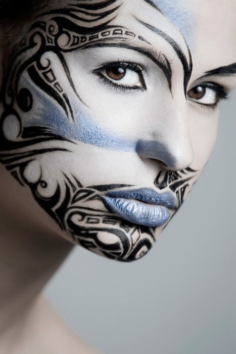
Jimmy Nelson’s exhibit at the Bryce Wolfowitz gallery was stunning. The images that he captured were simply captivating. His interest in cultures were beautifully depicted through the emotions of the models, and locations where they were shot. I loved that his photographs were composed of very vibrant, saturated colors and of high contrast. It gave the photos an equal balance since the models expressions’ were very serious. The facial expressions drew you into each photo and their culture. He was successful in showing a lot about the culture, by the decisions he made in the positioning of the models, lighting used etc. He showed the woman being strong and independent and the men in other photos equally the same. The one photograph that really stood out to me was the portrait of the man whose face had a tribal painting in black, looking at a 45 degree angle. The intricate detail of this photo lured me in as if I was staring into his soul. The poise of his body and lighting on his skin made us think of him as a strong leader of his tribe or someone of importance that unconsciously whispered “I was here”, which is what Jimmy Nelson is trying to do with this project. Truly an amazing and a successful portrait.

The Public Eye

The last exhibit of the Public eye was ironically very “eye-opening”. It showed me the different ways in which photographs were used and shared before and now. Whether by crowd sourcing, photo journalism, social networks and others. This exhibition opened my eyes to how photography has come a long way and the comparison between how photos were shared centuries ago to now conscious and unconsciously and the fact that photography has always been and still is a social interaction to us. I was really intrigued by Jeff Wolin photographs, where he created a series of portraits in the environments of the subjects home and have hand written stories behind of them. A unique way of how photographs play a role in forming and captivating our memories. In each photograph you were immediately confronted with the portrait, their expression and their story. The choice of having the photos in Black and white, also gives you the feeling that the subject’s story were something of the past.

Final Project

For my final project, I have few ideas in mind, but have not made a final decision. I am thinking of doing some detailed and intricate close-up portraits where each model will have a face painting that depicts themselves, whether it be their favorite sports team, culture or favorite food. I would like to capture very vibrant images that also tells the story of different individuals showcasing that everyone is unique and different.  Another is creating patterns using different types of food. I also thought of an idea themed “seeing double” where i will create a series of photographs of pairs of things that are usually unconscious to us in everyday life. These are ideas that I think I will be able to use in future ad projects for my portfolio to display my design and photography skills combined.

Career goals upon graduation

My goal upon graduation is to start working as a freelance graphic designer and photographer. I would also like to then further my education in pursuing my Masters in Graphic Design. I would like to build long lasting relationships by connecting with people in this industry who share the same passion as I do along the way. I want my portfolio to show my diversity in advertising and understanding of graphic design principles with my own unique style. Also, my ability to think outside the box and the creative combination of photography in my work. My longterm goal is to be able to open my own Advertising  and Print Agency overseas. I want my portfolio to show my diversity in advertising and understanding of graphic design principles blended with my own unique style and skills in photography.


RR4 Susan Sontag

According to Susan Sontag’s , photographs and the images in Plato’s cave are “Mere images of the truth”. I think that for Sontag, truth or reality stand for only “what we can see”. There is a difference between what we can see with our own eyes (reality) and what we see with a camera.Sontag relates this to Plato’s allegory in which prisoner’s in a cave see shadows of objects cast on the wall due to a fire, in effect, seeing false images of reality. To her, photos are the same; false images of reality that one cannot absolutely deduce anything from.

I think the key point in Susan Sontag’s “In Plato’s Cave” is that we rely too much on photography to give meaning to our experiences. Over the years, Photography has given us the opportunity to turn our experiences and moments in life into infinite objects that last for as long as we want. She reveals her  views on how photography has affected society foreshadowing the consequences of such desperate reliance on photos.

However, in my opinion, this reliance on photos has useful purpose in some cases. It is without doubt that photos cannot be trusted entirely, but this is dependent on the viewer’s judgment and supporting information.


RR5 Poetry

In the poem, “she being Brand” by e.e Cummings, an extended metaphor is used. The poem appears to be about a a driver’s excitement to a new car. He describes the car as “she”, which could be man’s way to refer to automobiles. However, after understanding the poem,  it becomes clear that the poem is actually an extended metaphor for a man’s sexual experience with a woman, and the woman brand new, otherwise meaning she is a “virgin”. He uses the feeling of excitement of a brand new car in comparison with the sexual feeling towards a woman. One example that supports this is when he says ” it was the first ride and i believe i was happy to see how nice and acted right up to the last minute…” He also plays with form, composition and structure in which he wrote the poem in the use of the “awkward” punctuation This also plays a part in pushing  the true meaning to the metaphor.

Coming home, by Phillip Levine, he speaks about going home to his hometown “Detroit”, where you can tell the city is a riot when he say ” the charred faces, the eyes, boarded up…”. The auto factories dirt and smoke dominates the hellish landscape, ” we burn this city to the every day”.  He opens the poem with a very warm, calm mood with the use of the words “pouring fire”, “rouge sulfurs”, which shows that he sees beauty in this viscous city.

Both poems differ from one another since the meaning of the metaphors speak of two different things. E.E. Cummings compares the action to the use of brand new car to having a sexual relation to a woman, and Phillip Levine speaks about his city and the people, while driving in a car. In both poems, the author uses an extended metaphor to tell their story.


RR2: Differenciation

Judith Williamson discussed that a sign can neither be the thing nor the meaning alone, but the two together can be used in the ad. I found it very interesting how Williamson talked about how advertisements create links between something.

She gives an example of Catherine Deneuve, who is a famous french actress and film star who did an ad for the Chanel No.5 perfume. In the Ad, a portrait of Catherine’s face is used and is placed next to the  bottle of Chanel No.5 perfume. Williamson argues that in order to successfully decode the ad, the reader must be familiar with Catherine Deneuve and recognize the fact that she is part of a system of signs that marks her different from other stars. By using Catherine’s Deneuve in this Ad, the viewer is then invited to make the connection between the Actress (who is sophisticated and elegant)  and the perfume. The ad refers back to the system of which the sign is Catherine’s face.

I agree with Judith’s argument because without using a well known person or celebrity to associate with the ad, it would be meaningless. If the viewer does not already have notions in their heads then advertising would not be effective.

She then contrasts the Chanel No.5 Ad with the Babe Ad, where in the Babe Ad, there is a full body image of Margaux Hemingway dressed in a martial arts outfit positioned with a karate kick. In each advertisement, they chose to represent the product with a female celebrity. Judith Williamson points out that it is the difference between the two female celebrities that marks the contrast that the advertisers are trying to create between the two similar products.  Catherine represents beauty, sophistication and glamor, whereas Margaux represents youth, agility and adventure, which is what we associate the brands and differentiate them with.

Therefore, I must agree advertisements creates the meaning of a brand or product through a system of signs and not just the person, but what that celebrity or well known person signifies. And through this the consumer identifies the brand through the face of the product by the way they feel or through the mirror of the ad.

Mirrors and Windows

From my understanding, John Szarkowski’s describes a mirror as a romantic expression as it reveals itself onto things in this world and a window as a the world as we know it is explored in reality and existence.

 In Crewdson’s photograph, the people looked more staged and unrealistic, which makes it a mirror. The people in this elaborate photo reveal psychological anxieties, fears, and longings in the viewer. This it because, it is not a usual scene to see a teenage girl outside in the night in just her underwear. Also, the photograph evokes emotion to the viewer from not only the unusual scenario but by the dramatic photographic elements used to support the staged scene and the facial expressions on the mothers face. She looks deep in thought and the daughter seems isolated and ashamed, both to the mother and the viewer.Although a very creative, staged scene, the photograph background is normal; a dark night in a small suburban town.The lighting helps to play a part of the mood and emotion in the photograph, such as the different pockets of light on the lawn and houses, the lighting in the back outlining the tree and the main front light on the car and daughter.

Whereas, in the Winogrand photograph, the opposite is shown as a window. The scene is more realistic. Seeing a child in a garage while passing by is not as unusual as the scene set in Crewdson photograph. His photograph does evokes a different emotion, the viewers are more caught up in why the the children are alone and the vast emptiness of desert scrub and mountains in the distance.The stormy thunderclouds that are seen looming over the distant mountain peak, and the high contrast in black and white, adds another emotion to the photograph, a depressing feeling. This photograph does not look staged, the garage and children look real. 

There are some similarities and differences in both photographs, however they both evoke a different type of emotion. 

HW1: Ad Campaign Analysis

6 “Monster Cable Products is the manufacturer of high performance cables that connect audio/video components for home, car and professional use as well as computers and computer games. MonsterCable is for music lovers, audiophiles, recording studios, sound professionals, musicianshttp://www.monsterproducts.com/company/about-monster

Elena Zhukova Photographer.     Monster Cable Products, Back to School

This Ad Campaign consisted of diverse people with realistic looks on what looks like a college/university campus. Each photograph is taken in different settings on campus, surrounded with props such as books, post-its and bag packs. They are very dynamic, and fun-filled which captures the excitement in the students in their behavior and expressions of the first days back to school. The images display freedom, vibrancy and youthfulness. Elena Zhukova was able to show the burst of energy and fun from these students-models by using graphic elements such as the hi-key; bright white florescent front light used which made the images feel happy and lively. Also the colors are bright, vibrant and a little saturated. The viewpoint is at eye level, which makes the viewer feel as if they are a part of the Ad. In one particular photograph with the female model sitting on the grass, there is a shallow depth of field, allowing you to focus solely on her and the product. The images showcase student lifestyle in a creative way that is consistent throughout the campaign.

Monster Cable Products caters to a large demographic. This campaign is to advertise the launch of their new headphone lines that are available in loud, vibrant, fun colors targeted towards college students. The photographer does a great job in connecting the brand with the demographic in these Ads, with the photographic elements chosen. The Campaign derives around “windows” because the photographs are in the presence of reality. The first photograph is the only one that sticks out as being a little more “posed” than real-life. The images aren’t showing the every-day student life, but more of the feeling of freedom and excitement on the campus when school re-opens.