I was third person to shoot this time so I barely have time to shoot today. I did’t have enough time to experiment around the different settings, but the settings with the top soft box, flash underneath and white background makes the sliced citrus look I was trying to abstract pattern with the surface of citrus kind of mystical. I used 200mm lens which i wasn’t used to it, so i had little hard time to focus on the subject for the first attempt. Some of those photo came out interesting, but I wish I had more time to experiment other settings, too.
Author Archives: Yoshiko
Second Shooting – Yoshiko
I changed the the contents of vegetables and light settings from the first shoot. I used underneath light this time so the subject got seen pretty vivid and fresh this time; but the one thing that that I struggled with was that the middle of frame had just right amount of exposure but the edge of the flame was dark. Then I tried two underneath soft-box put next each other, then the area where were exposed to the light got wider and softer, so the flamed area got evenly bright. I think it ended up succeeding in terms of lighting this time.
First Shoot review
I was enjoying playing around with the layout of my subjects (vegetables, soil, and utensils) at first. The several arrangement I tried on the shooting table looked great with my naked eye, but I had a trouble about the light settings. It was very difficult to make those vegetables look fresh and vivid in NOT artificial light settings.
Final Project Idea
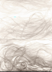
For my final project, I want to shoot is something related to food in abstract pattern or layout. Items can be produce, fish/meat, spice/flour, noodle etc. It can be for a food magazine, or an advertising. It’s not necessary to look delicious, but it should show the beauty of organic life such as the veins of a leaf or geometric pattern in nature. I want to make it have refreshing feeling so viewers would admire a beauty of what you eat.
Gallery Trip description
The first exhibition we visited at Aperture Foundation was “The Chinese Photobook”. The wide variety of photobook publications is organized chronologically, beginning with post-World War II era works up to the present. At that time the style of photo-book was limited. Many of the earlier Chinese photobooks were used in political propaganda magazines and posters for Chinese Communism as well as posters promoting the virtues of industriousness. Many of the photos were edited and printed in vivid colors to give views positive images of their political and industrial policy. Later works on display from the modern era use a wider variety of artistic or journalistic styles. As freedom of photo publishing has gained ground, the subjects have been more diverse and sometime more personal. Through looking the passage of photobook in China, I see a part of histories and culture of the country.
Jimmy Nelson’s photo exhibition features photos of several different native tribes in the world. His works were overwhelmingly powerful and those subjects look resolute and strong; however, at the same time, the images are also peaceful and calm. Some of those were medium shot, some were wide/long shot with beautiful nature as a background, and a few were close up. Their native costumes and body/face paints symbolized their pride and dignity, and those were very interesting to look at. However, what fascinated me the most was their expression, especially their eyes. I felt those eyes spoke of their pride. It was innocent and strong. Most of the medium and close up shots use shallow depth of field, focusing on the subjects’ faces. The wide and long shots use deep depth of field showing the subjects in the context of their environment. Their posing and attitude are also represent their poise.
The last exhibition we visited was “Public Eye” at the NYPL. There were all kinds of style and media of photography through this 175 years in the U.S. There were landscape, portrait, aerial photo, commercial photo, street photo for publication purpose to private memories.
I was especially liked the collection of black and white printed photographs of pastoral landscape in America around 1930-40, such as Walker Evans’s works. Those works captures the beauty in people’s everyday life. Those works has documentary style but at the same time it was poetic. I think the uses of natural lights made those photos make dramatic, even though that subjects were clippings of their ordinary life.
RR5 Yoshiko Nakamura
In the Poem “she being Brand” by e.e. cummings, I feel that the driver is having excitement and pleasure to drive the car using the metaphorical expressions as having sex with a woman for the first time. Usage of unique paragraph and line organization creates rhythmical fun feelings. While, “Coming Home, Detroit, 1968” by Phillip Levine, I feel that the driver has depressing and sad impression towered the sudden grown up industry of car manufacture in his home town using the colors, animals, and chemical materials as metaphor for negative effects of having development of factories in your old town regarding pollutions and unjust condition for labors.
HW1 Ad Campaign Analysis Yoshiko Nakamura
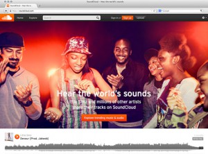
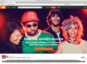
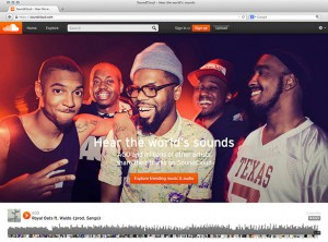
The images for SoundCloud’s campaign called “Hear the world’s sounds” photographed by Anthony Georgis are vivid and have a spontaneous atmosphere. SoundCloud is the online audio distribution platform which you can share and listen to music. I believe that the main target audience is digital natives to digital immigrants ranging from teenagers to 30-somethings using the Internet as a tool of music player and communication on a daily basis. The images convey a sense of how cool and fun it is to be connected with companies which have same interests. The subjects look like they are enjoying the moment sharing music with their friends. What the campaign is trying to express is that, although it is online interface, you can share your impression, joy, and happiness through the music.
The images are taken at eye level, medium depth of field, uses red side-lit and back-lit and front-lit flash, with low key exposure. These settings produce a more lively and natural mood of the subjects.
I feel like these photographs are applied with the metaphor of both Windows and Mirrors. The reason of the Window is that the images looks kind of a documentary taste of looks rather than an intentional stage setting even though it actually is. The scene appears to be set in a dark inside space such as a music venue. Some subjects are looking at the camera and some are not. I got the impression that the photographer just cut out the moments of what are taken place there as these are. However, I also see some emotional direction which the photographer meant to represent. The dark background and those back-lit and sid-lit light makes those subject pop up and it shows their spontaneous facial expression naturally well. I think the campaign fully succeeded with the the technical directions to convincing the target audience that using SoundCloud promise that pleasant opportunities sharing your creations and favorite sounds with people all over the world.

