Quentin Bacon

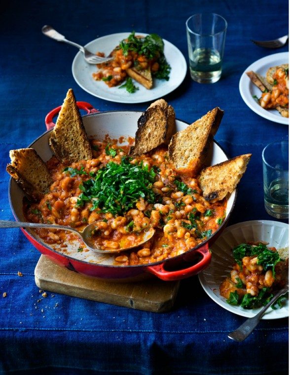
Quentin Bacon, uses his background to connect with the subject, which are the different kinds of foods and drinks. For example, he does not use a solid white background, as seen with other photographers, who make the food the only subject in the image. The background he uses includes cups, silverware, ingredients used, etc. The image below is of what seems like a bean stew with bread on the side. In this photograph the viewer can see that there is a variety of colors and contrast between the background and the main dish. The table cloth is a vibrant dark blue color that brings out the color of the food because of its orange color. Bacon did this intentionally because blue and orange are complementary colors. The photograph was taken on an overhead angle slanted a little to the right, since the image is not centered and not on eye level. When it comes to composition, I think the plates could’ve been organized differently because the far right hand plate is cropped out, therefore making the image distracting. I believe there was no need to add a third plate and if it was necessary then it could’ve been more towards the center and out of focus. The green parsley in the photo makes the orange beans have even more contrast between them. The crumbs on the left hand side give the image a more realistic mood because when food is being served, it can get messy at times. The lighting used does a good job at focusing primarily on the big pan with the bread pointing out. The details of the bread are crisp and clear. Overall, the photo was well taken and the viewer can tell that the main subject is the big pan towards the front since most of the surrounding items are out of focus.


Inspiration: Quentin Bacon

Bacon’s style of food photography is very unique and appealing. The background in a lot of these photos are very simple backgrounds like a wooden table or a marble table, a tablecloth, there are even some photos where the background is someone holding the food either the person eating it or the chef. One of the things I notice stands out about these simple backgrounds is that it provides a nice contrast to the food that is the main subject of the photo. I feel like the simplistic backgrounds bring out the detail and color and texture of the food more since there is nothing too heavy in the background that is distracting, and if there is like a person for example Bacon uses shallow depth of field so they are not the main focus of the photo. This photo I have chosen from Bacon is one that I really enjoy a lot.  I love the detailing of the squeezed blood oranges as well as the detailing of the freshly cut ones. Also the simple table top background really allows the colors to pop out more even from the juice on the table to the knife to pop out more. I also love the juice in the cup and the deep purple red color that shows there along with the dark orange coloring on the skin of the oranges.

Peter Hurley, Celeste Sloman

Peter Hurley, a New York City photographer specialized in headshots and portraits. At first glance the viewer can see that, even though there is three point lighting, he has a specific style for the most part, which is butterfly lighting. There is a lot of lighting coming from over the models’ heads, which is one of the most favorable styles when shooting portraits. The lighting just hits the skin and it fills the texture of it which lead to there being softness in his photographs. Also, the eyes are a significant point of attention in his photographs. The reflection of the lights create a depth into the models’ eyes. When it comes to composition, in his People Portraits, the models are centered and have more of a serious tone to them due to their facial expressions. Even though, there is a lot going on in the background, Hurley did a great job making sure the main focus was the model by putting more lights on them. There is contrast between their faces and the rest of the photographs.


Celeste Sloman, is also a photographer specialized in portraits. The difference between her and Peter Hurley, is that her photographs are mainly from the subjects’ shoulder, up, instead of full body or three quarters. The main focus is their facial expressions, which, for the most part, are subtle and calm. The background is a solid color, or very little movement going on, which brings out the subject more since there are no distracting objects in the way. I enjoy the way Sloman uses objects or sunlight to create shadows, that have become patterns, in the subjects’ faces. She has a minimalist and simple style which is why the viewer can tell that there is not an overuse of light.


“PETER HURLEY”

Peter Hurley is a photographer who lives in New York City expert on headshot and portrait. “He’s best known for the genuine expressions he captures for his executive business portraits and actor’s headshots.”
I’m a big fan of studio shoots but more I looked up all this inspiration it makes me hate studio shoots because it’s so limited and every picture starting to look smiler and all use of light like front light or backlight or any other light accept nature light because it makes feel less connected to the photo.
I like this picture because this is a creative way of using light. this picture related me you can see it not night sun is not when down but is going to sleep that’s how life s you have to wake up early for the job and can’t get enough sleep. This picture show was the life of city people living in an apartment and alone because of city people is so busy with their job and this shows all of that.

“HEISLER”

“Gregory Heisler is a professional photographer known for his evocative portrait work often found on the cover of magazines, such as Time, for which he has produced a number of Man, Person, and People of the Year cover” So, I read this fist before I looked up his work because I wanted to know bit about photographer. Then I saw his portfolios all of his is work is just like what it said lots of portraits shoots.
When I looked in his portfolios I can not find something I like because it’s all looks just like other inspiration people we did before but the end of this portfolios there is a section called “Other” I looked up that and I loved it. In “other” all the picture is high speed photography and it had so much emotional even when its just place without any people in the picture. I liked this picture because it’s so simple, picture of a window but what makes this so great is the use of high speed. when you look at this picture you will feel insecure and scared because its look like someone is watching you or something is coming in your room. Also, the sky and the tree helps to make this photo feel more scared.

Celeste Sloman

Celeste Sloman has a lot of great work. What I love most about Sloman’s work is how clean the shots are. As in clean I mean that the lighting is always perfect and the edits are not overbearing and works perfectly with the photo. The lightning in each picture always goes perfectly with the subjects expression.

From the Women of the 116th Congress album, this picture stood out to me the most. The first thing that I noticed about the photograph was the facial expression. I feel that the smile was genuine and was a candid shot. Her smile looks natural and it’s as if you can picture her laughing at that moment. Another observation that I subject isn’t looking in the camera, which makes the picture look even more candid.

The lighting that was used in this image was short light with a fill. I could tell it’s short light because the subject isn’t face directly at the camera and her one side of the face isn’t fully lit. Short light helped make the black and white look amazing. The side that isn’t lit helped bring more contrast in the black and white, making it feel more detailed.

Inspiration- Celeste Sloman

This photo was the one I chose out of a series representing the Women of the 116th Congress by Celeste Sloman. This portrait of Kirsten Gillibrand caught my attention. What I really liked about this photo as soon as I saw it I was really pulled in my the lightness and softness of this photo. From the lighting to the color to the positioning, this photo gives off a really soft and light feeling. The lighting in this photo is soft broad lighting and it seems that there was also a diffuser used since the lighting is so soft. The composition in this photo is good as well because her head and shoulders fill the frame so it is laid out well. There also seems to be a good amount of emotion in this photo as well. Gillibrand’s eyes in the photo look to be ‘hopeful’ or ‘looking forward to the future’. Gillibrand’s eyes also are well composed with the backdrop of the photo. Gillibrand is also posed with her chin up and at a 3/4 view which allows her jawline to be extenuated and makes her look powerful and confident. Her facial expression as well makes her seem confident giving off the calming smile and also making her look confident.

Celeste Sloman

Ms. Sloman is an incredible photographer with so much talent and dedication is her crafts. She has received various clients in her time in which include political personnel such as Ms. Cortez.

Alexandria Ocasio-Cortez

This portrait is by far my favorite due to the person of interest. As a representative of the United States, someone who fights for the rights of the minorities and does not give up until our voices our heard, she should be taken seriously and that is exactly what this portrait portrays. The essence of black and white photography captures sincerity and mannerisms, this photo of Ms. Cortez shows that she is intelligent, serious about her job and also calm, she is friendly, that half smile gives us so much intake about her. The lights, the key light is positioned directly in front of her to bring light to her face, it gives a nicer vibe to her photo rather than if her face wasn’t as lit up and dark it would give more of a sinister personality trait. I admire the shadows on her face and under her chin as well it brings a sense of balance and it shows the beautiful features of her face, sharp and agile just like her.

Insperation #4 – Celeste Sloman

Deb Haaland

Deb Haaland. Credit: Celeste Sloman for The New York Times

Out of all the photos from the women of the 116th congress taken by photographer Celeste Sloman, my absolute favorite is of congress woman Deb Haaland. The image gives off this presence of power, retaliation, and not taking no as an answer. Her facial expression and her posture being completely straight displays this sense of sternness and stoicism. Her stare demands that you give her your immediate attention. You also see her wrinkles which help demonstrate that she has been through a lot, fought a lot, that she knows what it is like to struggle. Overall she illustrates this feeling of intimidation. In portrait photo right off the bat you can tell she is separate from the background, you can identify her entire body nor does it begin to disappear further away the body gets from the source of light. This shows off her importance of being a congresswoman and law maker, a Native American one at that as well. Another thing that makes her stand out is her beige/khaki suit. The color is dull and mundane yet vibrate enough to make her pop against the background. Which is somewhat contradictory. Then we have lighting, which in my opinion it appears to be front light evident from the lack of shadows and the glare in her eyes. First off, the light makes her long hair look beautiful, as it looks silky smooth and glossy and it also makes her standout from the background. As previously stated, the light was probably in front of her, showing every single detail of Deb Haaland as possible, which again shows her importance. Due the lighting style, her image lacks contrast with light shadows. In a way the shadows are nonexistent, it’s only predominantly seen on the side of her face, her neck and wrinkles from the suit.

Inspiration #3

Gregory Heisler is a very interesting photographer. Looking through his gallery was very eye catchy. He has different styles of taking pictures. One that really caught my attention was this portrait above. What I love about this picture is the use of color is so vibrant and rich in color. I like how the color flow very well. I also like the use of expression and hand gestures he’s doing, it adds this seriousness in the picture. i also like the use of framing and light. I noticed how the light is hitting the right side of his head. I also like how there is so shadow of the left side of his face.