Final Project Proposal

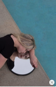
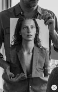
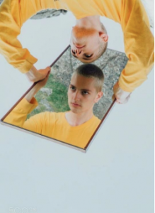
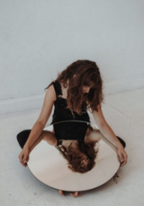
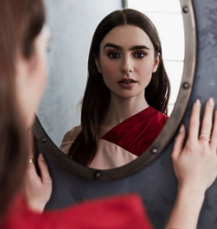
For my final project, I want to do a campaign that promotes ā€œSelf Love.ā€ Self Love is very important and I feel that a lot of people aren’t aware of how important it is.Ā  I want my images to help people with low self-esteem and helping them build their self-image. When I attended a self-love class the first activity was to stand in front of a mirror and tell yourself what you love about yourself and shockingly it was hard for a lot of people couldn’t even look in the mirror.Ā  I want to include this image in my project, with the goal of people embracing their reflection, their true selves.Ā Ā 

That being said I want to have different mirror sizes and shots of the models looking in the mirror and smiling.Ā  Every shot I want to be able to catch their expression along with their reflection. My biggest challenge will be figuring out the best lighting because mirrors are hard to capture without the flash showing. I did a lot of researching and found a lot of inspiration on Pinterest.Ā 

Ā Ā Ā Ā 

Final Project Proposal

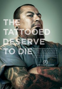
My final project prompt is going to be a hair campaign specifically based around women of color and how they are treated based on their hairstyle and discrimination they get for their hair in the workplace. Many women even in this day and age still receive discrimination or may not even be hired for a job based on the way they wear their hair. Many women of color have their natural hair in afros, dreads, braids, or just out loose and curly or even their hair colored or dyed and are comfortable with their hair and how they choose to wear it. I think that this subject needs more attention since discrimination like this still happens not just necessarily in the workplace but throughout society but it is noticeably prominent in the workplace. My idea for how to handle the shoot is to have at least 3 models that are women of color and have their hair in different styles; out loose, braids, etc. and have them dress up in workplace attire button shirt, slacks etc. and have them maybe contrasted standing next to someone who would be perceived as having ‘appropriate’ hair and attire etc. I would still have to illustrate thumbnails for the shoot but I have ideas. I was also thinking about the lighting and set up like having maybe a grey backdrop with dramatic lighting similar to some of the photography examples from our midterm quiz.

final proposal


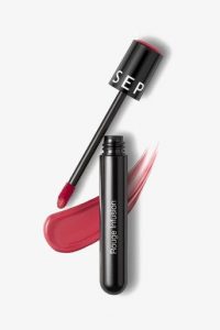
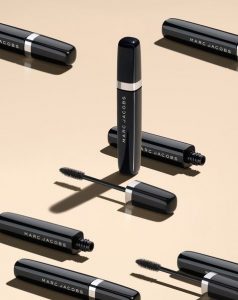
For my final project, my idea is to photograph beauty products for the company, Clinique. My target audience are beauty guruā€™s or people who are part of the makeup industry. My images will include still life photography with objects such as mascaras, lipsticks, cleansers, masks, etc. My goal is to create clean and crisp, catalog-looking products. Lighting should be bright with no silhouette in the back. The lighting should be almost as that of butterfly lighting, on a white background. The tone/ mood is going to be kind of sensuous and cheerful. I then plan to edit them in photoshop, and possibly add their logo or text to create ad campaigns.

Ā Ā 

Brian Rodgers

What i like about this photo so much is the color. I like how the color stands out. I also like the color of the background. I also noticed there’s shadow in the background and he also added some light in the background. However i also noticed there is some shadow underneath the dummy teeth. I also like how he has this white light around it that makes it stand out even more. On the other hand his photoshop skills are amazing. I wonder how many lights he used on this photo and i wonder how many layers it took to create the splash effect.

Richard Foster

This is an incredible photograph from Richard Foster. The photo is powerful, made by the way a single ray of light falls onto the cologne. It makes the cologne seem of great value and special as there is nothing else to distract the viewer. The light itself leads our eyes to the center of the photograph, reinforcing the importance of the cologne. Not only does the photo make the cologne seem important, but the lighting even sets the mood and tone of what the cologne may smell like. The darkness of the photo suggests that this would be worn in the evening or night, and the warm glow can imply the notes of the fragrance are from warm spices such as cardammom or cinnamon. The cologne looks desirable, but also makes the viewer think that if he wears the cologne, he too will be desirable. This is why the photo works so well!

Richard Foster

Richard

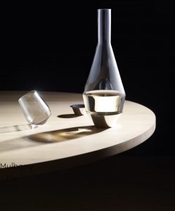
Richard Foster has phenomenal photographs, from his website Iā€™ve seen that he specializes in not just one particular type of style but various, there was even a winter edition within his portfolio. I chose this photo in particular because of the composition of the photo and because of the lighting. I love how the light plays with the shadows, even with something as clear as that glass cup, the shadows make it look interesting. I adore how he added a tilt which makes it far more pleasing compared to just the typical glass straight on the table. What I also love about this photograph is how the light touches the water, thereā€™s not a harsh light and itā€™s not beaming directly into it, itā€™s a soft light. This photograph is beautiful because of the way Richard separated the features, sharpening and lighting up the object of importance being the glasses and keeping the rest of things to be dark like the background, there is a sense of sharpness to this and thatā€™s wha makes it all the more pleasing.

Inspiration Richard Foster

This photograph by by Foster is from one of his many perfume campaigns. Though I am unsure which this perfume from whichever campaign he shot. I think from looking throughout his work that this photo is definitely one of his strongest examples of a ‘hero’ shot. I think that this photo is really strong due to not only the prominent reflection shown here but also the colorful gradient shown on the bottle throughout the casted reflection. I don’t think this even has to show the brand of perfume necessarily since the strength of the photo speaks for itself. I think that the reflections on the sides of the bottle and the lid are also well done. They show a nice contrast of the shadow silhouette and the color gradient. I also like how the reflection from the sides of the bottle also cast down over the gradient that is casted down like a shadow from the bottle while it is just light going through the bottle to give off that effect.

Richard Foster

Richard Fosterā€™s photographs are all very interesting. From the crisp and clear detail to the aesthetically pleasing shadows that are created in most of his pieces. Even though, I enjoy all of his photographs, the ones that caught my attention the most were Audemar Piguet. One of the reasons is because I, myself, work with jewelry and watches. Automatic ones, usually referred to as ā€œopen heartā€ have always been one of my favorite ones because of how much detail, one can see, was put into the creation of them. Foster did a precise job using a black/dark background for these shots. The watches stand out due to all the light that is hitting them from the front. Main lights and a diffused light with a softbox were most likely used so that there wouldnā€™t be a hard light hitting them, instead there would be an even amount of light hitting the watch from all angles. The photos are so crisp that one could imagine a longer macro lens, probably a 100/105mm was used so that there could be a greater focus so that the subject could appear larger. The composition of them is very well done because they are all put straight in the center, except the first one. The way the watch is positioned, even though a part of the right side is missing, is well captured because the viewer knows what the subject is. The detail in the mechanics make up for the missing space.

Richard Foster

I heard his name last year in a photography class and I got interested so I look up for his work every scene that I change my style because every time I see his work it makes me feel things. About him ā€œA leading specialist in still life photography and moving image, Richard Foster works with some of the worldā€™s best magazines. He is also commissioned for numerous high profile campaigns with leading brands and agencies.ā€ To me he is one of the most successful photography he has a lot of Clients like Adidas, Anya Hindmarch, Audemars Piguet, De Beers, Dunhill, Fendi, Gieves & Hawkes, Graff, Grants, Glenlivet, Gucci, Hermes, Elle Decoration, Esquire, GQ, Hole & Corner, and National Geographic. So about his work, his style is minimalistic or simplistic.

One of my favourites is his work on Brandy Glass it’s so amazing. All you see this amazing shape all-black background and highlight of the glass. Thing is you canā€™t see all the glass shape just the highlight so that makes you think what is it.