Category Archives: Uncategorized

BRIAN RODGERS JR

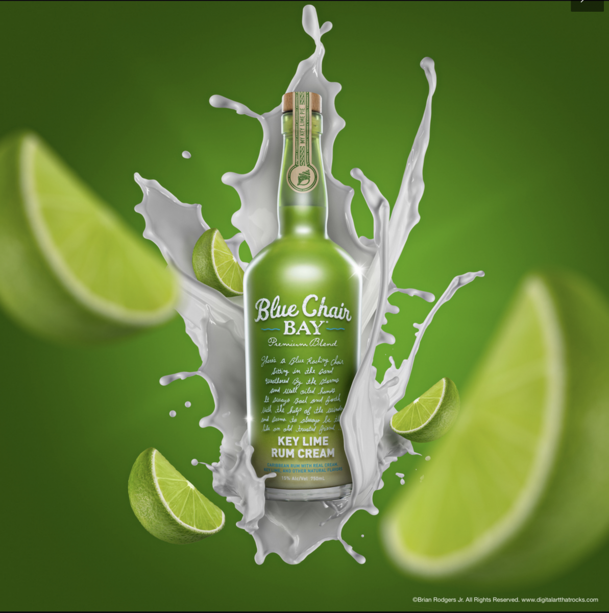
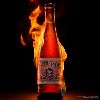
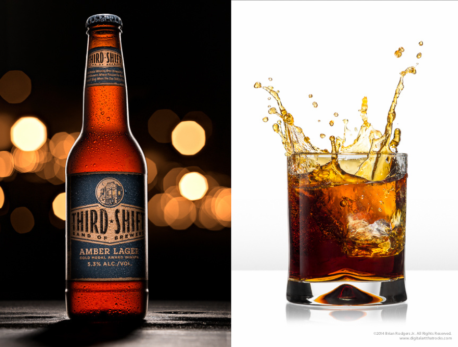
Brian Rodgers Jr. “is an American Advertising Federation award-winning commercial advertising photographer and digital artist based out of South Bend, Indiana. He’s the founder and owner of Digital Art That Rocks and specializes in product and architectural photography with an emphasis on the post-production process.” Love his work I know his work scene 2015 and he became my inspiration on products photography.

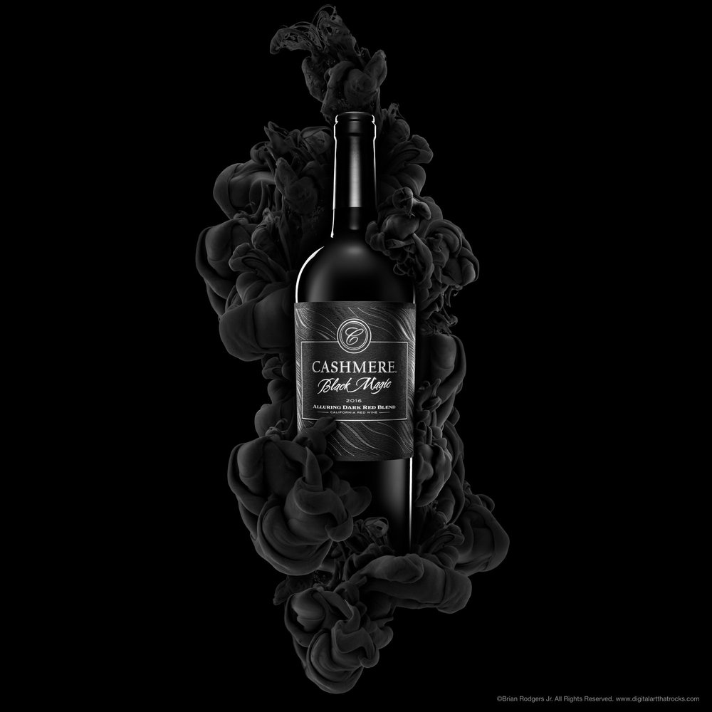
I love his work because of all his works like real minimalistic. Also, all of the work done in the studio and he does it really well on showing what his products are capable. His work on the beverage is amazing. When seeing his work it looks amazing all of this picture of beverage style is same like the black background to make the product main focus and most of them have like smoke going around to make look good because if it’s just a drink then it will look boring and not interesting. When you see his work it will make you want it I think when viewers feel that you have done your job and he has done it. 

Quentin Bacon

Who love taking photos, food, people, travel, the unique, my amazing family, thick fog. What inspired him most is a “ visual world and the hearts that make it beat. I find peace in capturing life in stillness, conjuring the inner life through the use of light.” I looked at his work and he doesn’t have a specific style that makes it more interesting about his work. I can learn a lot because there are many photography styles. Also, even when he uses different style but to me, he follows some rules like making this subject main focus and really good use of depth of field. All of his picture colours are goes with food like if food is hot or fried his image colour is warm and dark. If it’s like drinks or desserts like ice cream and cake his picture vibe is light and simple. Whatever he put in the picture to decorate it’s all are like ingredients and something in the food.
Love is work on this picture just like his other work good force on the subject and I think he used natural light. The egg drop is amazing choice makes everything look delicious.

Brian Rogers Jr.

Lime

Looking into his photographs, this one took the shot. I love the composure and definition of  his photo, how he looks keeps the bottle sharp and the limes blurred out. I also love the consitency to his photo in which everything is green, the same hue of green as well. What makes this photo look so beautiful is not just the limes but the liquid. Liquid photography is hard to capture but he got it just right. I truly admire the proportions in which he set the limes to clash with the liquid. The bottle as well, matches the purpose, if it wasn’t obvious to the view then it is with the type placed within the bottle  Blue Chair Bay Key Lime Rum Cream. Looking at this really makes me want to drink some because i love lime (hispanic present!) Sal con limon am I right?

Brian Rodgers Jr.

Brian Rdogers Jr. has a lot of nice photos. One thing that I noticed that’s different from the other photographers I’ve written about is that he adds a lot of props, which may have been adding after the shoot. For example one of his pictures was of a drink but he added a fire texture, which brought life to the photograph. Another picture I saw was of an orange drink and around the drink were lemons, but the lemons were portraying movement.

From all of his photos, I feel like this one stood out to me the most. Both pictures are of the same product, yet were shoot differently. The first picture is of the bottle and what I love the most about it is how well lit the bottle is. I feel as if there was a backlight hitting the bottle because of how well lit the bottle looks. Another thing I love about the first picture is the details, the water sprayed on the bottle, helps the drink to be portrayed at cold and refreshing. Lastly, I love the details behind the bottle, It brings a great depth of field and makes nice colors. The colors are a good balance and aren’t taking away from the bottle.

Lastly on the other side, he captured the drink in a cup. What’s most successful about this image is the splash. The splash makes a great shape, it’s the most perfect splash I’ve ever seen. Another thing that’s most successful about the shoot is the lighting, everything is well lit, it’s hard to shoot glass in my opinion but he was able to perfectly get the glass to look super clear. The great detail of the ice being dropped makes the shot so interesting. One question I have is, in this picture is that a natural shadow, or what is possibly produced after the shoot?


Inspiration Brian Rodgers Jr.

This photo by Rodgers features a Sixth Glass beer front and center being lit on fire. This photo is very bold and strong and tells the story of the beer being ‘good’ or ‘strong’ or ‘impactful’ with the fire around it. The fire on the beer is what makes the statement of the beer being good and not just the beer itself. If the photo just featured the beer itself then I don’t think it would be as strong of a photo composition wise nor would it show the consumer how good and powerful the product really is. The hero product which is the beer shown in the photo also has a good visual look in terms of form and color. The color of the bottle matches well with the fire that was placed in the photo and the label also matches well with the rest of the photo. The black backdrop also allows the beer and fire to stand out more and is much stronger compared to if the backdrop was white or any other color.

Brian Rodgers Jr

Seeing Brian Rodgers Jr.’s photographs was very interesting. They all seem as if they took a lot of setup time and retouching in order to get that nice, crisp, high-end magazine/catalog style that defines his work. One of the many photographs that caught my attention was the commercial beer and splash. The beer bottle caught my attention at first glance by the way it is outlined by, what seems to be, a very lit back light. The contrast between the actual bottle and background is intense, in my opinion. Reason being, because the bottle is sort of a bright scarlet color that is outlined with white, and then the background is very dark, except in the center. The background lights bring out the bottle more, even besides the fact that it is the main center focus while everything else is out of focus. The shadows work well because of the strong light at the right that creates a shadow at the foot of the bottom left side of the beer bottle. The droplets of “condensation” on the bottle create a more realistic look. As if the beer were fresh out the fridge. This “trick” was done very nicely because there is not too much or too little of it. The image to the right is also one of my favorites because of how the liquid seems to be falling out of the glass cup. The moment was captured at the right moment. There must’ve been a fast shutter speed used since it lets in less light and gives the effect of freezing an object in motion, such as the liquid that was poured.

Jill Keller

This photograph tells an American meal, It gives off a feel of “get ready to dig in.”   The large portion of meat patty catches the eye because as a consumer a good burger depends on amount of meat. Besides the meat the toppings as well we see every ingredient in this three quarter view, on a plate that doesn’t distract use from the burger. Accompanied by some french fries and a drink, and sauces. The napkin on the bottom right corner adds to the story because your hands and mouth get messy when eating a burger, The lighting adds to the food looking appetizing because it’s coming from both sides or a reflector was used as well. Lastly, some choices that the photographer added to this photograph is that the fries stay stacked up and not on the side of the burger. The main focus is the burger, the bottle cap as well to adds reality to the drink although the cup is full of the drink.

Jill Keller

Jill Keller is a photo stylist who’s also a City Tech graduate, has captured several food moments, from raw ingredients, to amazingly created dished. One of the photographs that caught my attention the most is the first one from her Pasta album. As soon as I saw this photo, I imagined a whole scenario. This takes place in the country side. A family of 4, the parents and two sisters. They are having a gathering because it is the younger girls’ birthday and she did not want a party, only a small gathering with her parents where they could enjoy their mothers homemade cooking and talk about what careers they want to pursue in the future. Their mothers’ specialty is pastas. As she was creating the pasta, her oldest daughter wanted to capture this moment right before her mother mixed the dry ingredients with the wet ones. She thought to herself, “the best of both worlds”. The flour, the salt and the raw eggs, in general don’t make the photograph appetizing, but what does make the photo appetizing is the fact that the viewer knows that the results from these ingredients mixed together will create fresh and delicious pasta. Nothing compares to handmade pasta. It’s nothing like buying pre-made pasta which who knows how long has been sitting in a plastic bag for. What makes this image look like it’s telling a story is the fact that it is not a crisp steady image. The hands, specifically the left one, is out of focus which makes the viewer think that it was taken while the subject was actually making the pasta. The lighting is well used because we can see that there is light coming from the left side which is causing for there to be soft shadows around the right side of the bowls where the egg shells, eggs and salt are.

Inspiration Jill Keller

This photo by Jill Keller is from the section on her site called “Jello”. The photo just consists of a bunch of fruits, jello, ice etc. on a tray but the thing that makes it interesting is that they are all color coordinated and sectioned. The thing that makes the food in this photo look appetizing to me is the fact that there is a variety of shape, color and size of the fruit ice and jello. You can see the kiwi for example sliced open and seeing all of the inside parts of it and next to the broken up jello and fruit mixed in with each other. The overall look and composition of this photo looks very appetizing and refreshing. Some of the props for this photo like the ice and the tray for example add to the refreshing look of this photo. It makes the fruit and jello combined feel fresh and more appetizing and helps tells the story of the photo being appealing. I think the choice of color coordination of the fruits was a smart choice by the photographer and really brings out the composition and the feeling of it being appetizing. I feel like color coordination is very nice and flows well together rather than if the fruit was spread randomly without any coordination.

Jill Keller

From looking at Jill Keller’s page, I was fascinated with the great pictures she took. My favorite series from her website was the Burgers. From the series, this burger was my favorite from the rest.

From the looks of the picture, the picture tells a story. The story that I get from the picture is that this burger is possible from a restaurant. The clue that helps me see that is from the add on she placed in the pictures. When I say add ons, I mean the fries and drink. I give me a feel as if this is a combo or his burger works well with these add ons. The add ons works for the burger because they go well together and makes me want it even more.

What makes the food look so appetizing is how much detail was captured. Every ingredient is well caught in the picture, from how vibranT the lettuce and tomatoes are to how well the cheese is melting on the burger. The small details bring life to the bigger picture.

I also love the props that were used in this image. Keller used a lot of props that helped bring the burger alive. She used plates, napkins, sauces and even as something as a beer cap. The beer caps add to the story of being able to enjoy this burger with dinner. It helps build the burger.

Keller did a great job shooting the burger. Though it loaded with a lot of props I feel that it works well. It brings character to the burger.