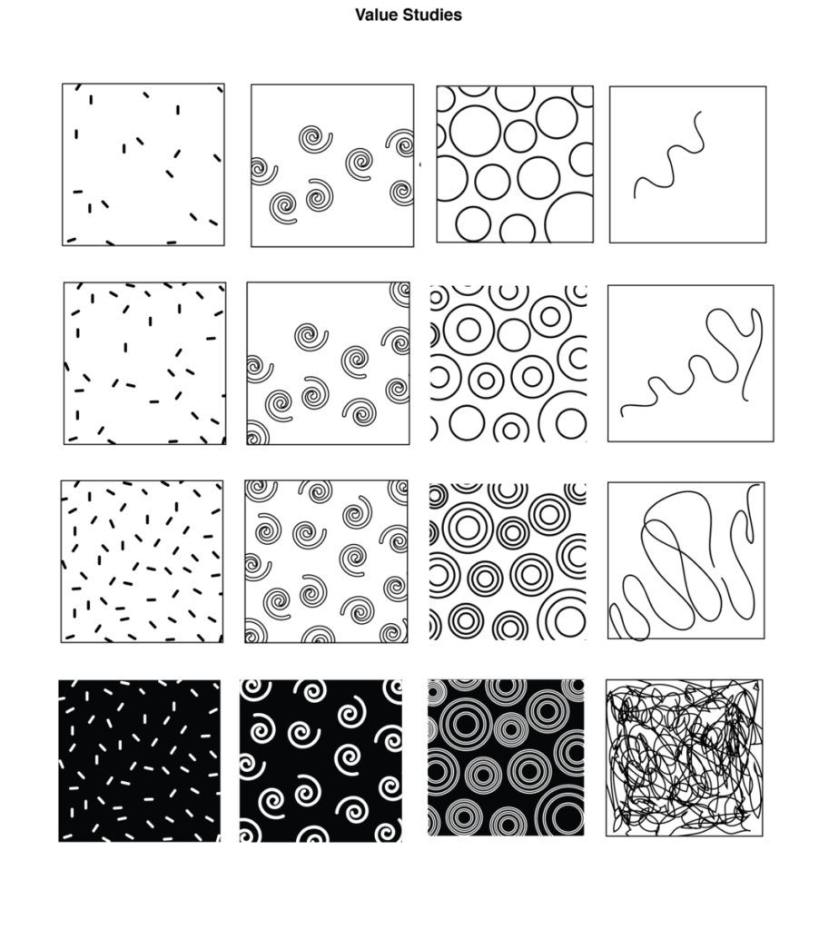
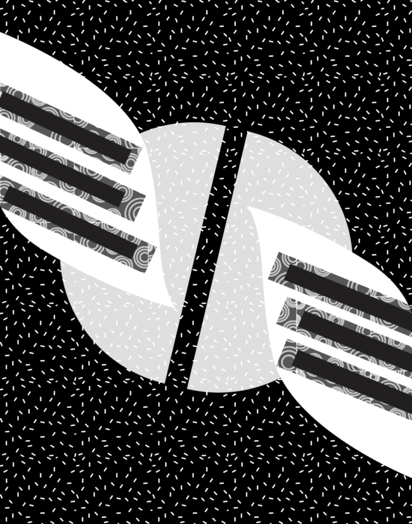
Professor Woolley | COMD3313 OL74| FA20


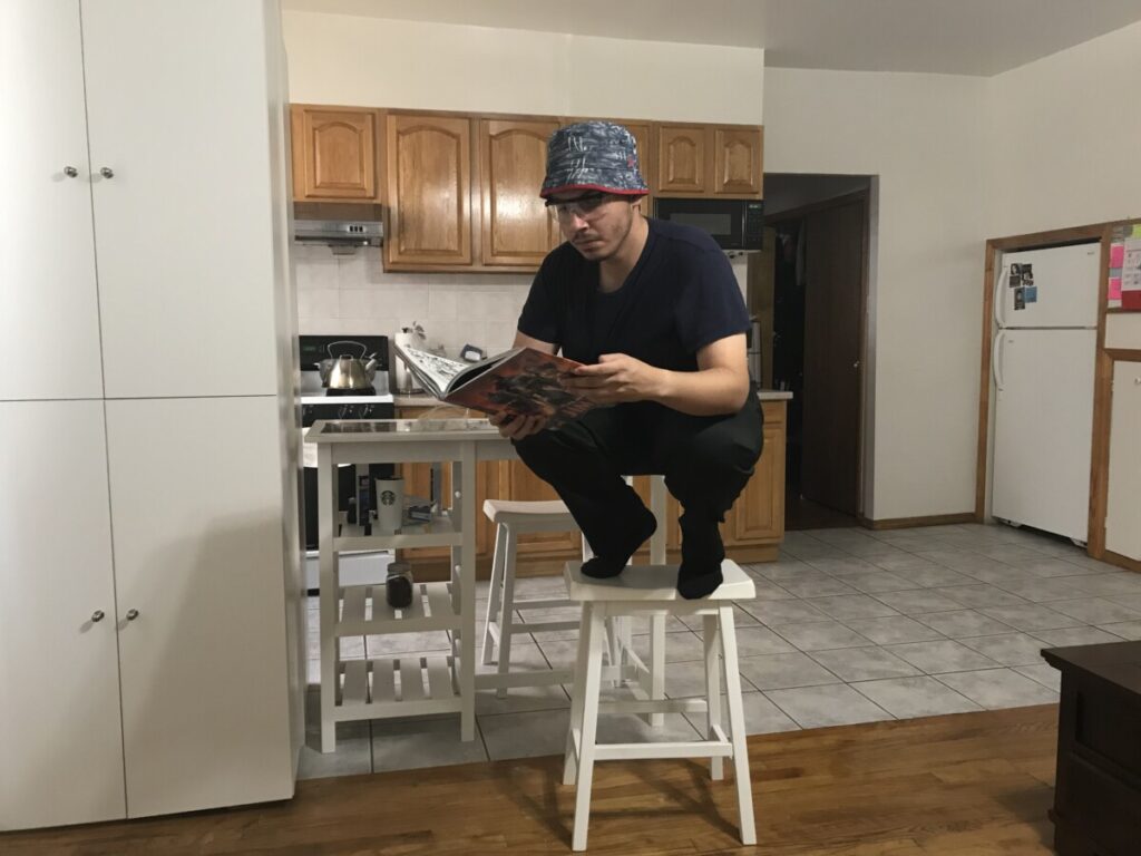

This first sketch was supposed to be reminiscent of someone perching (someone of the superhero persuasion)or brooding on a ledge reading a book giving it an aesthetic tone

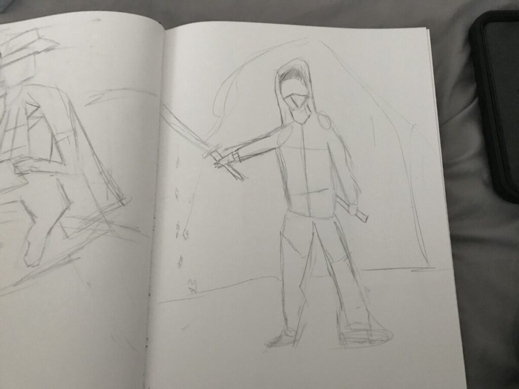
(This is a fake sword y’all so don’t report me) This is a pic of me giving off ninja vibes unsheathing the sword ready for battle. Unfortunately the translation to paper didn’t go as well

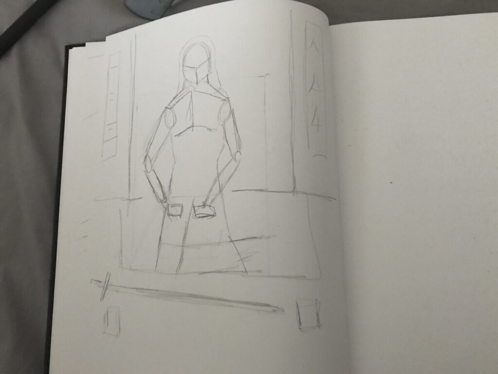
This is me once again dressed up as a ninja laying down my weapon resting…i drew the background to be a temple or monastery of some sort
Since for my first project, I am working on a wine label redesign, I decided to look at other wine labels on Pinterest to get inspired.
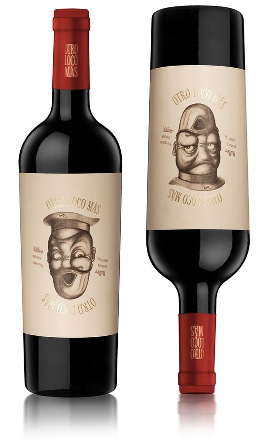
I really like this design because it’s humorous as well as interactive. Every time, the person pours wine into a glass, he will be able to enjoy this comical and creative illustration. This a great way to create a memorable design.
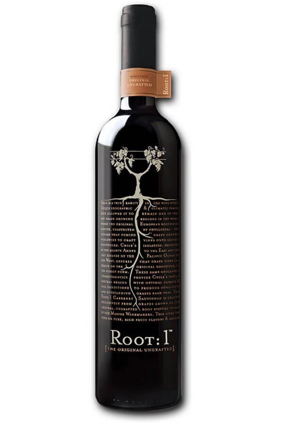
I also really like this design below as the visual is effectively communicating the name of the wine. Having a block of typography for the soil is creative and original.
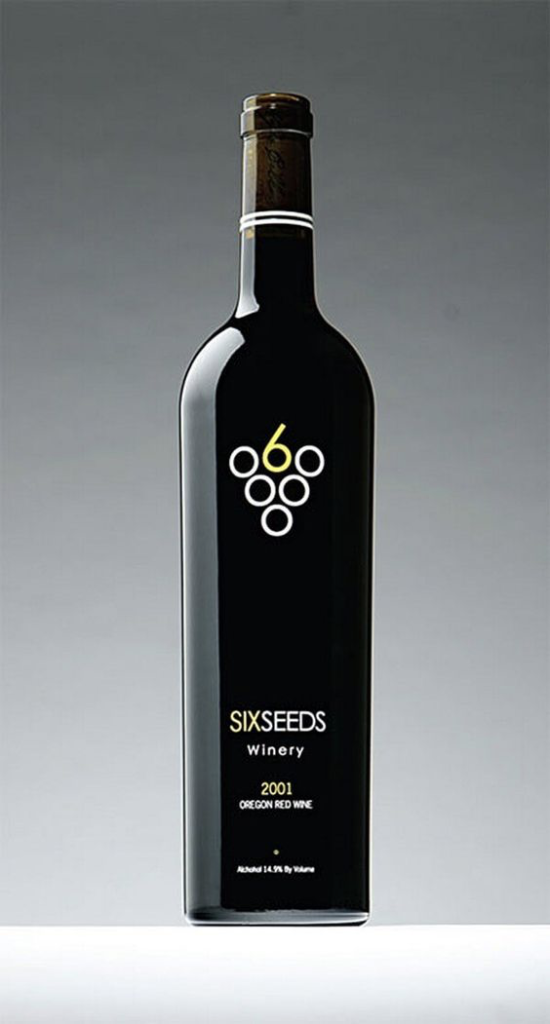
Lastly, I find the wine label design below interesting because of its simplistic and minimalistic design approach. Often times, I gravitate towards minimalistic designs since they are not overwhelming with ideas and imagery.
© 2024 Illustration One
Theme by Anders Noren — Up ↑
Recent Comments