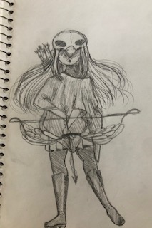
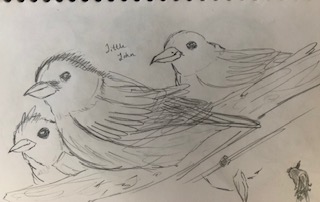
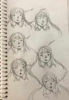
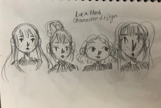
For this weeks sketchbook exercise I had a lot of fun designing my Robin Hood character. I didn’t get too carried away with designs however, I think that is okay because I really want to focus on other aspects of the illustration that I’m not very good at for example birds and the forest. It was fun doing the expressions, I know I could’ve animated her more but I wasn’t really sure how to do that exactly. I have this problem with my art where I can draw the same character over and over but all the drawings just look slightly off/slightly different. Knowing that about my art I wasn’t super confident going into the emotion drawings but they turned out good I think.
Author: Angela Iacono (Page 1 of 10)
My partner this week for this critique was my sister Maria Iacono. During the week she really focused on colors and line weight. She stated that she struggled the most with varying her line weight within the character design. With that in mind, I was able to help her out by suggesting to make certain lines thicker for example the lines in the hair could use some work. I also stated that she could make some lines thinner for example, the feather on the hat and the clothes. For her color palette on her character design she kept with the primary colors with a variety of different shades from those three colors. She stated that she wanted to keep the classic look of Pinocchio and she didn’t want to change the colors too drastically. I thought this was a good idea because Pinocchio is such an iconic character, especially the Disney version, which she is referencing, and it was good that she didn’t change too much because then it might not have been so recognizable. Overall I think my sister did well and had some things to fix that weren’t major but not minor either.
The lectures from the last classes were very helpful, interesting, and insightful. It was fun to see very recognizable children authors. The lectures also allowed me to realize what important moment you should be illustrating, the image you choose to illustrate will show the audience the main idea. I also think that Alice in Wonderland is probably the most done over concept/story. I think that’s because Alice in Wonderland allows the illustrator to be super creative because the movie/story itself is super creative and unique with it’s characters.
From week 12 it went over important aspects of considering yourself to be a director. Thinking of yourself as the person in charge and that includes character design, POV, setting, and tone. The slides goes over different angles and point of view of the same illustration and how that can make your illustration dynamic and more interesting. There are many POV such as birds eye view, worms eye view, eye level, long shot, and medium shot. All in all, this technique is super important and makes your illustrations more affective.
Recent Comments