The illustrations I have decided to share for limited color palette discussion were created by Tim McDonagh who is an illustrator from Brighton, England. He is also famous for illustrating the reference books Star Wars: Galactic Atlas and Star Wars: Alien Archive.
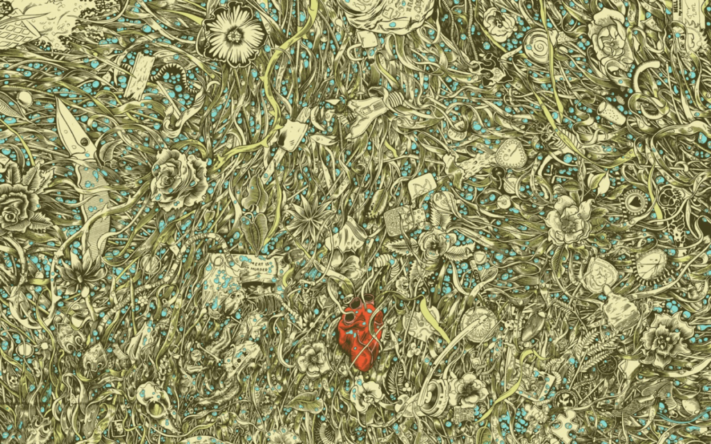
Based on the pieces I have decided to share, it seems like his favorite choice of palette might indeed be a very limited palette. I’m particularly drawn to the illustration below which although is very busy with its design, the overall piece comes off as well balanced and unified. In this piece, he uses primary colors of light, red, green and blue. The value of each color is very similar to each other and that I believe acts as a main balancer between the colors and the busy illustration. The combination of tertiary yellow-green and blue-green colors is also interesting for this illustration and I’m in love with the contrast of everything with a red heart.
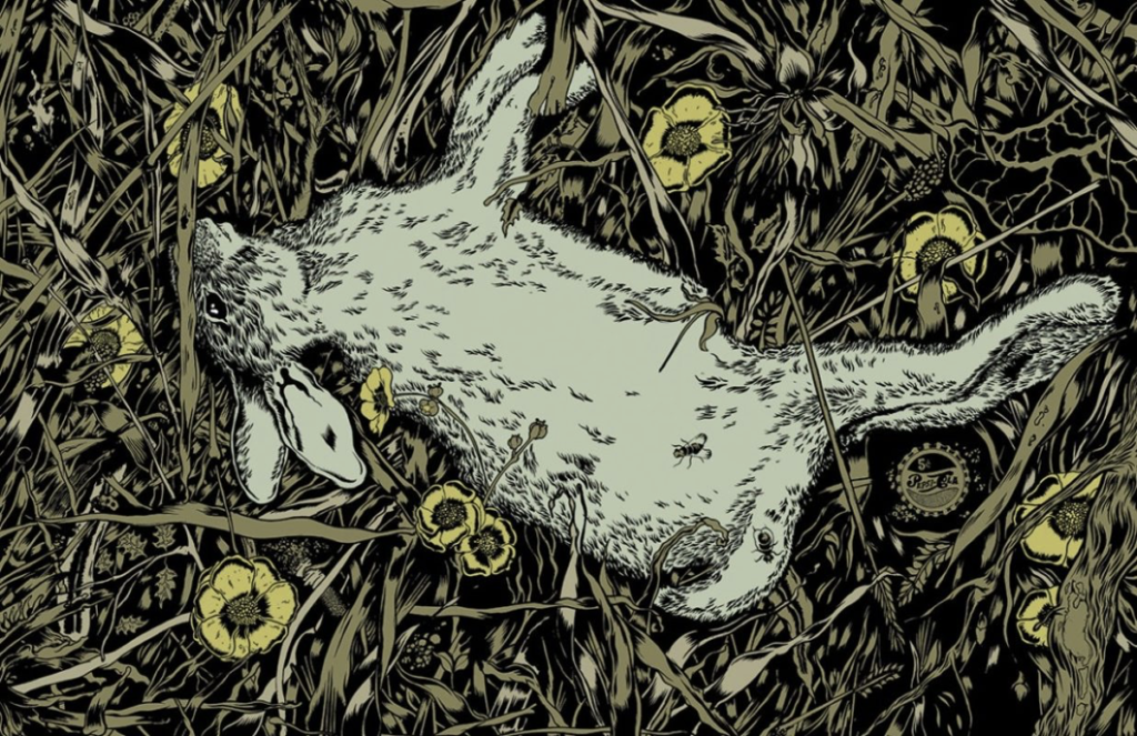
In this illustration, his palette choice is even more limited than the one above. Here you can see two shades of greens and yellow. The green on the rabbit compared to the grass has much lower chroma and almost shows up as grey.


Leave a Reply