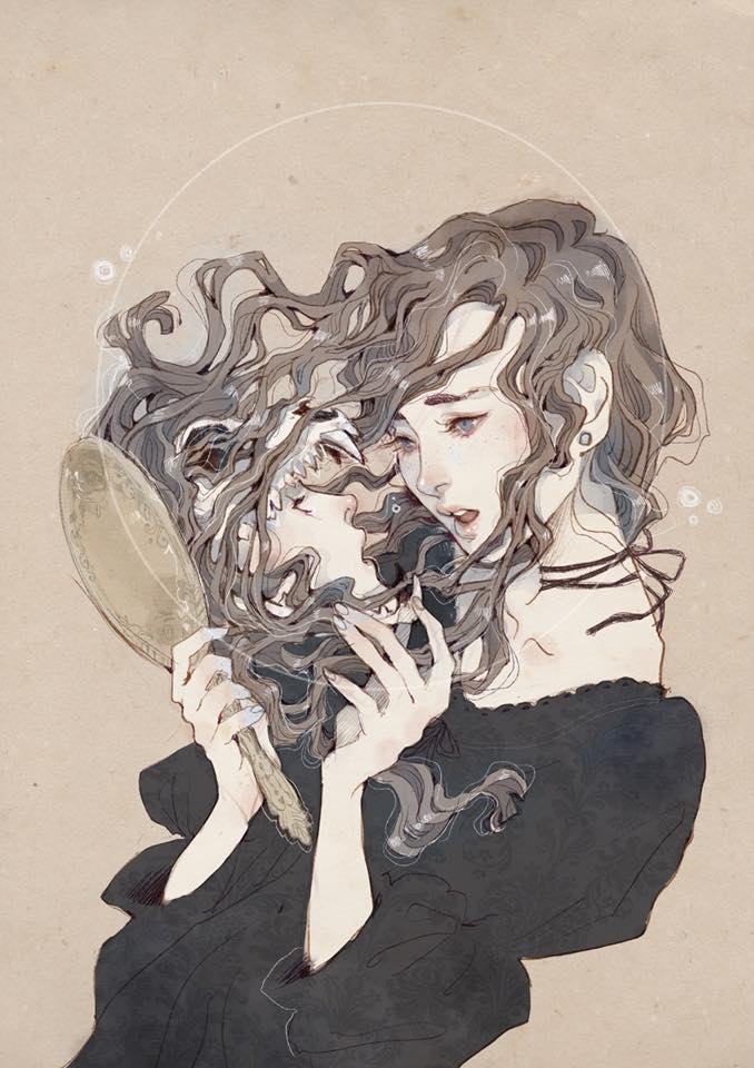
The artist that I chose for discussion week 4 is named Loputyn and I believe that she used a program for digital illustration, and I found this photo on her instagram. I think one compositional technique the illustrator used is directional lines because there’s one that leads up the figure and then there is one where the girl is looking in the mirror, it leads your eye right up to the figure so you can see what they are seeing. I also think this certain illustrator thought about negative space and the illustration balances really well. The negative space of the image is really needed because of how busy the middle of the illustration is. I think it’s balanced because there’s the girl looking in the mirror on the right side and the figure coming out of the mirror on the left side. I think all these techniques work really well together and are super effective because they help tell a story and they allow the viewer to sit back and think and I believe that’s what a good composition should do. I think I would integrate more directional lines into my artwork to make it more dynamic because my art tends to be very one dimensional and isn’t as efforless and groovy as I’d like it to be, much like how loputyn’s illustrations are.
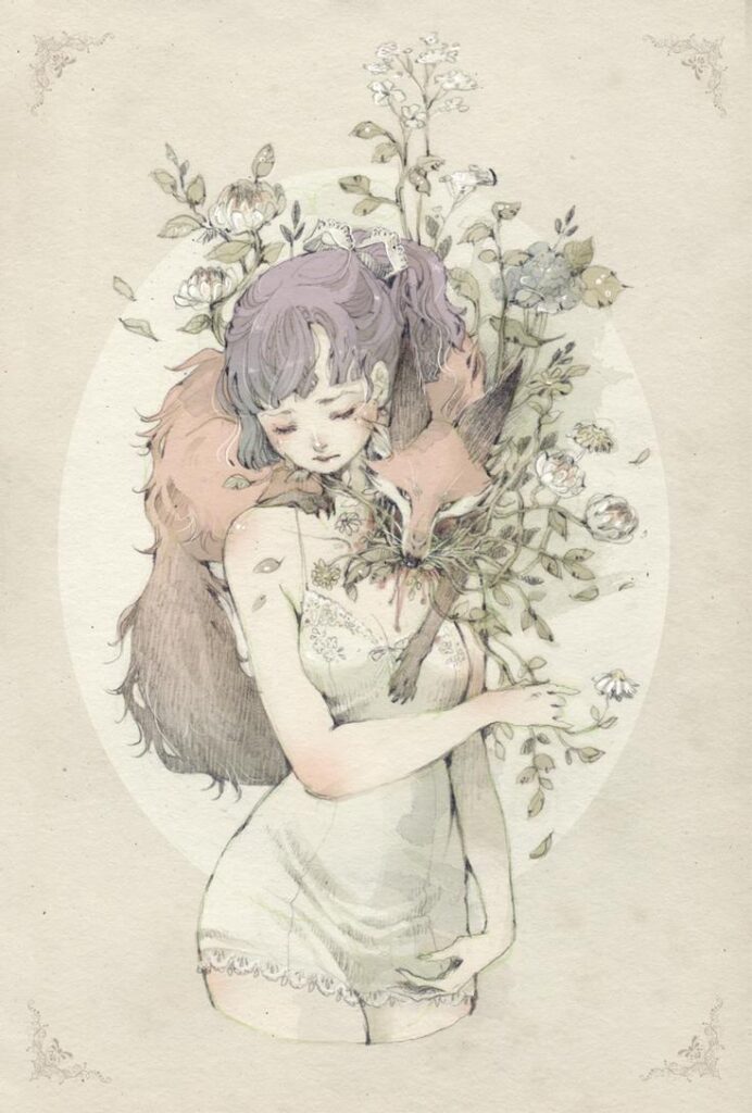
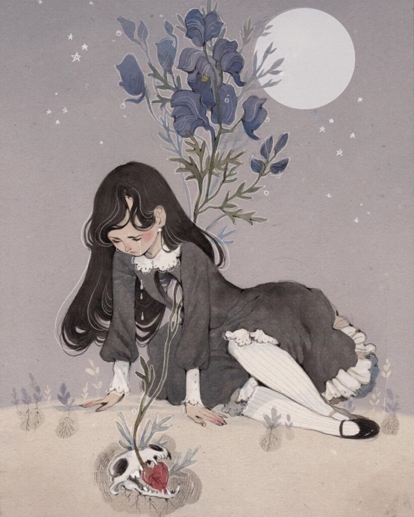
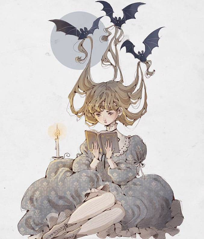
Some of my Favorites she’s done


I would totally agree with the fact that this composition is very well balanced. I also really like how her head is tilted down and the second face is looking up, placed so close. The negative space in the background leaves a lot of room for a viewer to breathe and digest the image 🙂
Angela, what a FANTASTIC example! I love the negative space and the movement here. Also the mirror image is a great example of intentionally using balance for play with the theme of the image!