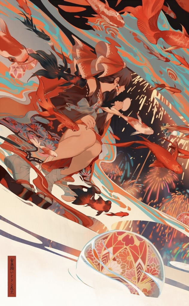
I chose this digital illustration from my collection of favorite pieces because of its fun and dynamic look. Unfortunately, I was not able to find the artist although I tried to search everywhere. This piece of illustration is a digital illustration, most likely created with various kinds of brushes and strokes in a Japanese anime style drawing.
One of the most visually striking compositional technique the artist uses in this illustration is directional lines. There are endless diagonal lines emerging from top left picture plane to the bottom right, which all together create a sense of fast motion and intense curiosity of what happens after this frame. I believe that the artist created a very successful and dynamic scene by using the compositional technique of employing directional lines.
There is also a great sense of visual unity in this composition. Although, I would say that design elements in this piece are placed somewhat asymmetrically, at the end, they all give a sense of unified, balanced image. For example, in the bottom right corner of the composition, the ball in the water balances the bottom empty area with busy top area. It is also carefully placed right underneath the girl’s face, also implying an invisible direction line pointing back to the girl’s face. Another way the artist is able to convey the sense of unity from her/his illustration is color. By using a limited color palette of about four hues, the artist is able to create flawlessly blending and balanced scene. Being fascinated by colors myself, one of the reasons I found this illustration striking is the color palette. The orange color that is clearly a dominating hue in this piece is beautifully balanced with its complementary color – blue. That gives rise to smooth, balanced, trouble-free visual that is pleasant and easy on the eyes.
In addition to the dynamic movement created by directional lines, the repetition of many swimming fish also amounts to liveliness of this image. There is a strong sense of rhythm that is so engaging in this illustration.
One of the most useful techniques I can integrate from this composition to the kind of work I like to do is directional lines and a limited color palette. I rarely create scenes of motion and movement but from this example, I have realized that just by placing elements in a way that follows some type of direction besides horizontal and vertical, I will be able to create a more dynamic visual that is fun and engaging.


Leave a Reply