4/27/2022 – 4:27 PM
nytimes.com/2022/03/18/t-magazine/indulgence-starvation-food-inequality.html
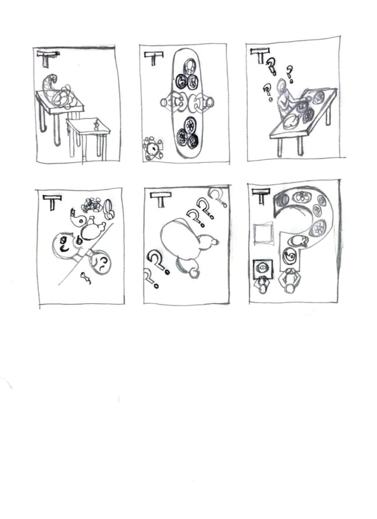
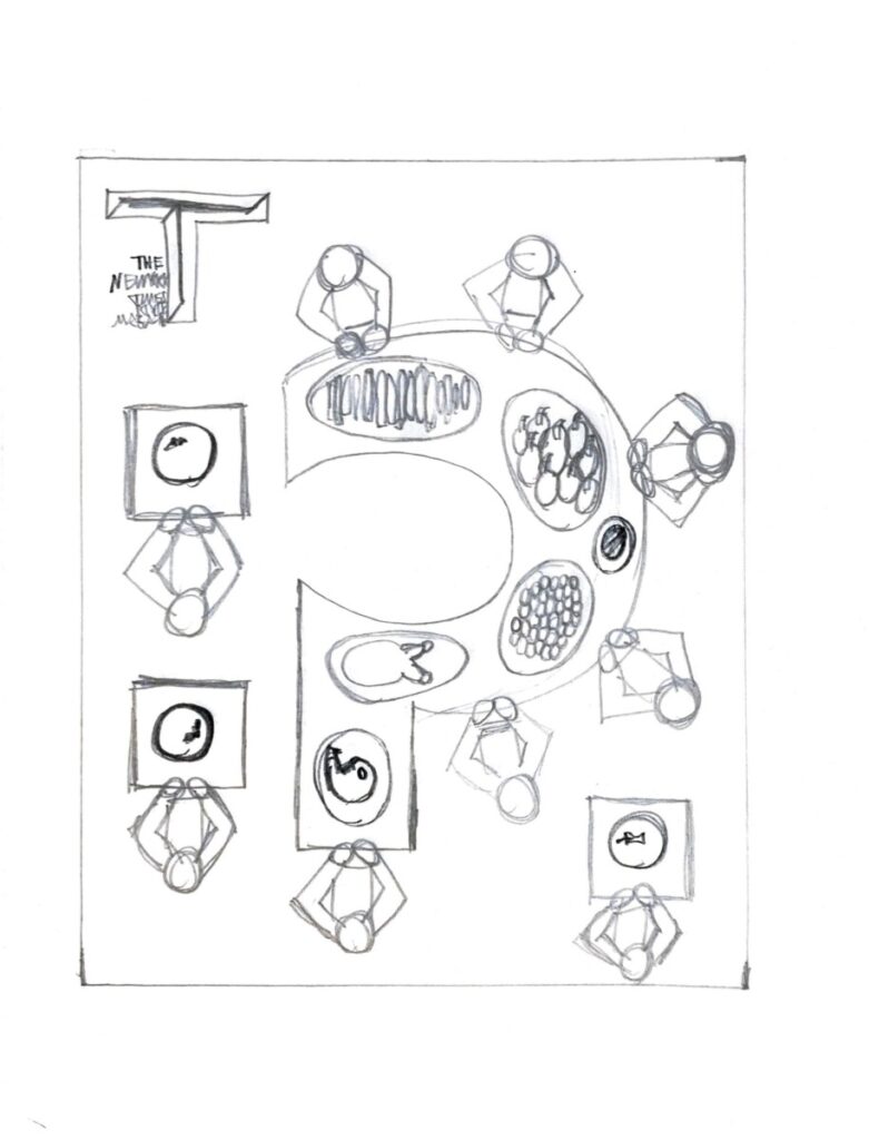
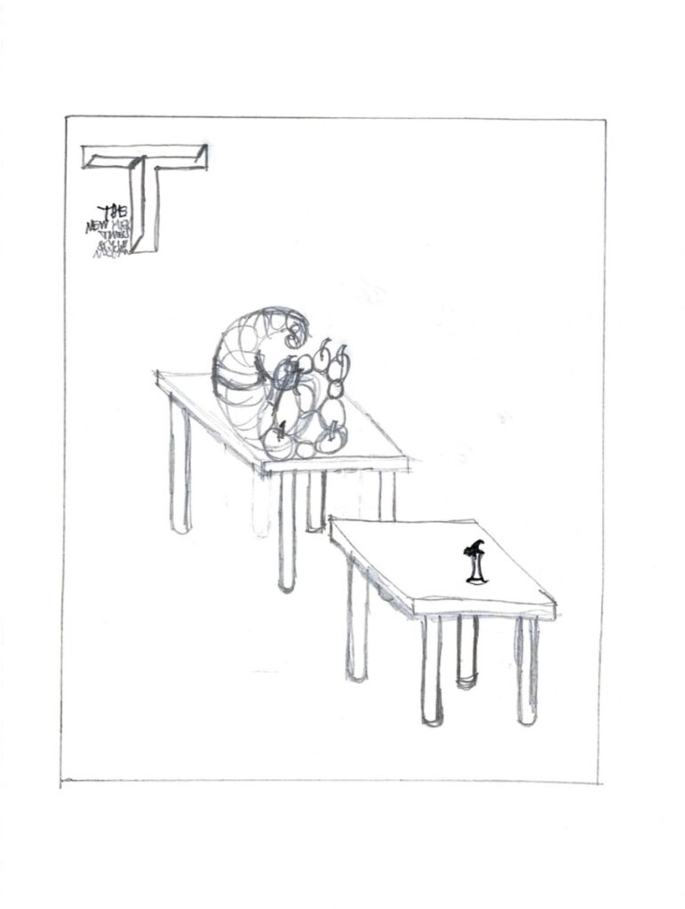
For assignment 2 my client is T, the New York Times style magazine. The article I chose to illustrate is titled “In a Starving World, Is Eating Well Unethical?” In my thumbnail sketches, I tried to show different versions of people feasting at a big table, with other people eating tiny amounts of food, scraps basically, at other smaller tables. I ultimately narrowed it down to two concept sketches. The first shows a big question mark shaped table with people feasting on it and smaller tables around it with one person per table eating scraps of food at each. I thought it would be very effective and interesting to make the table with the feast on it into a metaphorical symbol, showing the theme of the article, which is about the question of – is it ethical to consume luxurious foods while a huge portion of the world’s population doesn’t have access to basic foods? I like this first concept sketch a lot. The second concept sketch is very simple, and shows two tables side by side, one with a cornucopia of lots of food on it, and the other with only the scrap of an apple core on it. This one was meant to show the disparity in access to food between the different parts of the world’s population, and make the viewer think about that main question of the article – is it ethical to consume lots of food while a huge amount of people throughout the world scrape by on a tiny amount of food? I wanted to keep it simple in this concept sketch so the viewer would just stop and think and bring their own perspective to the questions examined in the article.




Recent Comments