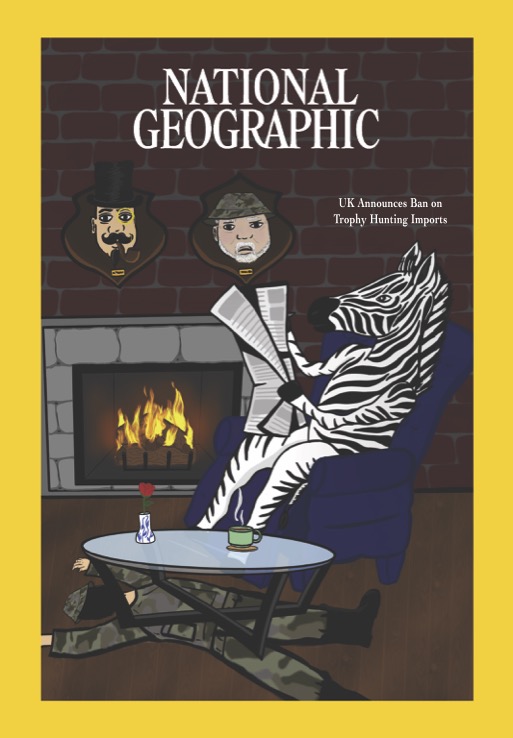
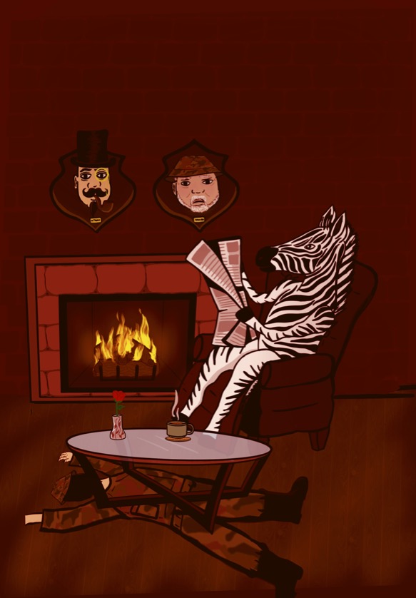
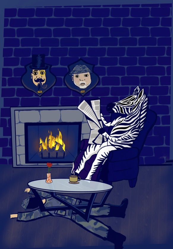
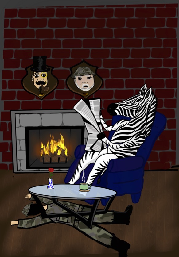
For my cover I chose to go with the real colors of the scene since I felt like it was easier to see what is going on. The other two palettes I tried was a monochromatic red with the pop of yellow and blue tones for the other one, with a little of orange in it. This was for National Geographic magazine and the article I choose you can find here: https://www.nationalgeographic.co.uk/environment-and-conservation/2021/12/uk-announces-ban-on-trophy-hunting-imports
Recent Comments
- Robert Waya on Deasia G: ice cream
- Deasia.G on Deasia G: ice cream
- Tarique on Meet the Artist: Deasia Grant
Member Portfolios
OpenLab Help
Acknowledgments
This course is based on the following course(s):


Leave a Reply