On April 20, 2015, I had a nice time visiting the Museum of the City of New York with my class at the New York City College of Technology. I can honestly say that there was a lot that I loved about my arrival to this museum. For starters, the entrance to this old-style brick building was at the top of white marble steps, surrounded by a sitting area with a plethora of outdoor tables umbrellas and chairs. Watch your step if you go after it rains– Slippery much??
Walking into the museum, I was greeted by a man at a table, the usual. Here are maps to the museum, “We have a new exhibit. Please keep your bags close to you. There are FREE lockers to put them in if you do not wish to carry them around–” all of that good stuff. Yeah, that was helpful, but I was more interested in what was behind him.
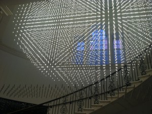
This light fixture was one of the most alluring things I saw because of the magnificent contrast in the spiral staircase and the technology and symmetry of the lights. It was equally beautiful even when I moved around to view it from different perspectives. The to exhibits that my class and I were scheduled to see were the Paul Rand Exhibit and the History of Hip Hop. I trailed off and took the advantage of going to see an extra exhibit and a stair case, but that comes in later.
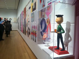
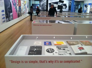
The Paul Rand Exhibit was something similar to an exhibit I went to called “The Master Series: Tom Geismar” at the School of Visual Arts (SVA). All of Paul Rand’s greatest designs and creations were either on the walls, or incased in tall box like tables with a see through top so that whatever was inside could be viewed.
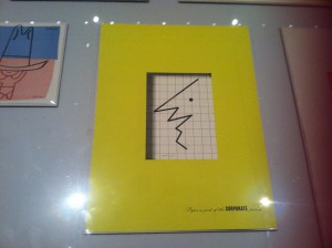
When I walked in, the first thing I saw was small figure of a man holding a beverage. To the right of him were printed repeated versions of the man, but in different forms. For example, in one image, he was holding a beach ball, but in the picture next to that were of him holding iced tea. I liked this in particular because of the use of said repetition. In one of the boxes, the cover of a book caught my eye.
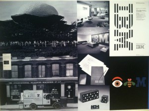
One might take one look as go,”Oh. It’s a face… Great.”, but if one were to look closer, it would look like a line graph or some type of terrain. To me, that was creative because I was one of those people that shrugged it off… but then went back to it to actually stare at it and take it in. There was one thing that I grew up just seeing when ever my dad went to the bank and my siblings and I waited in the car.
Why of course. IBM.
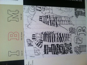
You know, it is most often, if not always, a shock to actually be able to know who the person was that designed everyday things that I grew up with or own. I guess the part that amazes me is the part where I get a conscience understanding of how they think about certain projects, and how they had separate trials and errors trying to reach their goal. One thing I learned that will always stick with me throughout my journey of becoming a designer is,”When working on a design, not knowing wether your many ideas would look good, try it. No idea is a bad idea.” I see that motto being fulfilled in every designer I’ve had the pleasure of going to a museum or exhibit for, looking at the many drafts one product had before becoming well known.
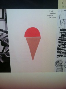
Right next to IBM was an abstract and almost cut out image of a cone with ice cream on top with the words,”To all children who like ice cream.” flush top right of the picture. I liked it because it was simple. the cursive typeface gave way to its simplicity and balanced out the rest of the image.
Turning around, I found that on each of the tall viewing tables were quotes from Paul Rand himself, flush top left in a bright right sans serif typeface. Quotes like,”Design is so simple, that’s why it’s so complicated.”, “Without play, there would be no Picasso.” and “What the designer and his client have in common is the license to practice without a license.” struck me as witty and simple, as if Paul Rand really sat down and thought about his work and the world of a designer.
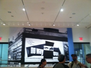
Looking around some more, I saw this HUGE design of Paul Rand’s eyes and even more sans serif, but in a white bold typeface.
It read “NO WAY OUT”, which to me was funny because… well… there were two doors and I was not going to stay in that one room and do nothing. There was way too much that I had not seen yet. On to the Hip Hop exhibit!!!
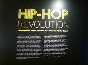
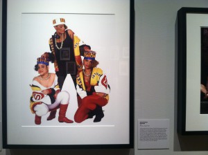
I was so excited!!! I grew up with hip hop among other genres of music, so I was anxious to see what this exhibit in particular had in store for my wandering eyes and restless feet. I walked in and first thing I see
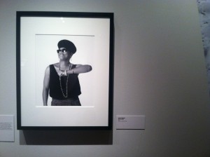
Oh my– Queen Latifah!!! I love her!!! See now at this point, I was giddy. I was flailing my arms, smiling and looking around at the other pictures and memorabilia. I immediately noticed lights and touch screens in one section of the exhibit. When I walked over, I saw music. Oh look!! More happiness and bliss!! I think I was standing there with big clunky headphones on while bobbing my head to the music on the touch screen for about… 20 minutes?
Listening to songs by artists like Slick Rick, Big Daddy Kane, Afrika Bambaattaa and Soulsonic Force, I remembered listening to the same songs, along with many more, as a kid. While there, I listened to a long list of songs:
Rob Base & D.J. E-Z Rock- It takes Two
Big Daddy Kane- Ain’t No Half Steppin’
Queen Latifah- Ladies First
Public Enemy- Fight The Power
Salt-N-Pepa- Push It
Slick Rick- Children’s Story
Gang Star- Just Get A Rep
EMPD- So Wat Cha Sayin
LL Cool J- I Can’t Live Without My Radio
Kurtis Blow- The Breaks
Afrika Bambaattaa & Soulsonic Force- Renegades of Funk
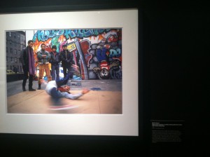
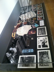
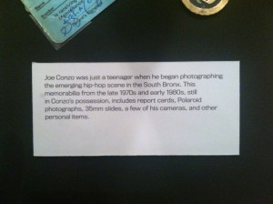
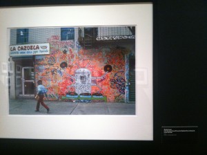
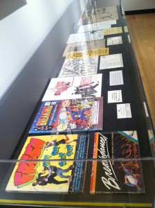
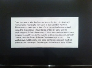
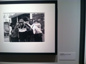
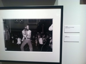
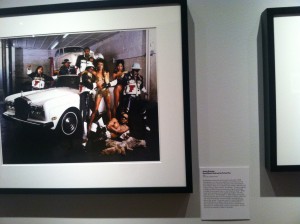
After I realized that I could no longer feel my feet, I started walking around to view the photographs people, places and graffiti, memorabilia, and items left behind by photographers like Joe Conzo and Martha Cooper.
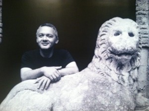
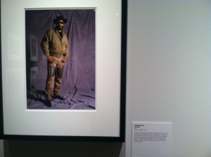
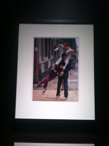
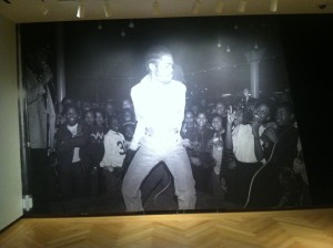
At this point, my phone was on the verge of dying. I was a fool to not charge it earlier that morning. As I was leaving, I was able to catch one more picture.
I felt honored to at least look at the music and people who inspired a lot of what I listen to today. I would love to go back and get lost for a day soon.




Pingback: Places | Some kind of title