Conditional Probability

This past Monday, we introduced conditional probability in our Blackboard Collaborate session.  Here is a brief recap, with some online resources included below that go over the definition and go through some examples.

The conditional probability of A given B is defined as:

P(A|B) = P(A & B)/P(B)

Note that by switching A and B, we can also look at the conditional probability of B given A:

P(B|A) = P(A & B)/P(A)

(Note that the numerator is the same in both cases, since P(A&B) = P(B&A).  The denominator is the probability of the “condition” i.e., the event after the vertical line “|”.)

The following 2 videos may be helpful:

If you have a copy of the textbook (Ross), you should read the examples listed on the class outline pdf.  I will try to update this post with some additional online examples shortly.


Video: “Exponential growth and epidemics”

Here is a 9min video that I highly recommend you watch:

You can get a lot out of just watching the first minute: watch how he steps up the graph of the # of COVID-19 cases (outside mainland China) from Jan 22 to March 6, and shows that C(n+1) ≈ 1.2*C(n), i.e., we’re seeing exponential growth with C(n) = C(0)*(1.2)^n. Note that he has the advantage that he can just “zoom out” to redraw the scale of the y-axis.

After that initial segment, he starts discussing some parameters relevant to the topics of our course (“E = Average number of people someone infected is exposed to each day,” and “p = Probability of each exposure becoming an infection”).

Also starting at around 1:50 mark, he shows what a logarithmic scale is, and why it’s useful for graphing exponential growth curves–they turn into straight lines on a log scale! And then he does a linear regression, and shows the R^2 (the coefficient of determination!)

Distance Learning Update: 1st official Blackboard Collaborate session TODAY

Hopefully you have been receiving the Blackboard annoucements via email. For now, I will also post them to OpenLab:


Hi all,

I will plan to have Blackboard Collaborate Ultra sessions during our regularly scheduled class times. So our first one will be today (Monday) from 12p-1:40p. You should be able to see the session scheduled under Course Tools->Blackboard Collaborate Ultra in Blackboard. You can join the session there, or via the guest link:

https://us.bbcollab.com/guest/19342ee95c5d4e8a80a6886e4b5cfd21

Attendance (i.e., logging in) for class sessions is not required, but I do strongly recommend it, assuming you have access to a device and a reliable wifi or data connection. As some of you saw last week, you can even join and view these sessions via a phone (but I do recommend a computer or tablet, so that you have a bigger screen to view pdfs, the whiteboard and other content that I will share in the sessions).

Tomorrow we can go over any remaining HW5 questions, and discuss conditional probability (using the Class 12 outline pdf I uploaded to Openlab on March 11):
https://openlab.citytech.cuny.edu/groups/math1372-ganguli-spring2020/files/

For those of you that can’t join, I will post a summary and followup instructions on OpenLab this afternoon after the Blackboard session.

Hope to see all of you on Blackboard!

Blackboard Collaborate test session – today!

[I posted this as an announcement on Blackboard just now, which you may have already received as an email. I thought I’d post to OpenLab too.  Note that you can log in to Blackboard at https://bbhosted.cuny.edu.]

I am going to run a test session in Blackboard Collaborate Ultra today, 12p-1p. If it’s possible for you to join, it would help me a lot if you do, even if only for a minute. I want to see how it will work for running class sessions. Also it would also be nice to hear from some of you and see how things are going through all of this.

Blackboard allows streaming audio and/or video from all participants, but there is also text chat if you’d rather just do that (or just join, you don’t have to chat at all!)

Here is the link for today’s session, which you can open on a computer or on your phone:

https://us.bbcollab.com/guest/71fc6a48d1df41a0a1b1e29fa922e3cb

I tried joining a Blackboard Collaborate session yesterday from my phone, and it works pretty well.

I will likely run another test session tomorrow (Thurs) but I haven’t figured out what time yet.

Hope to chat with some of you soon!

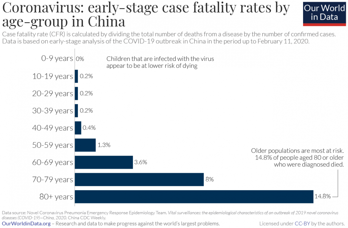
Our World in Data: “Coronavirus case fatality rates by age-group in China”

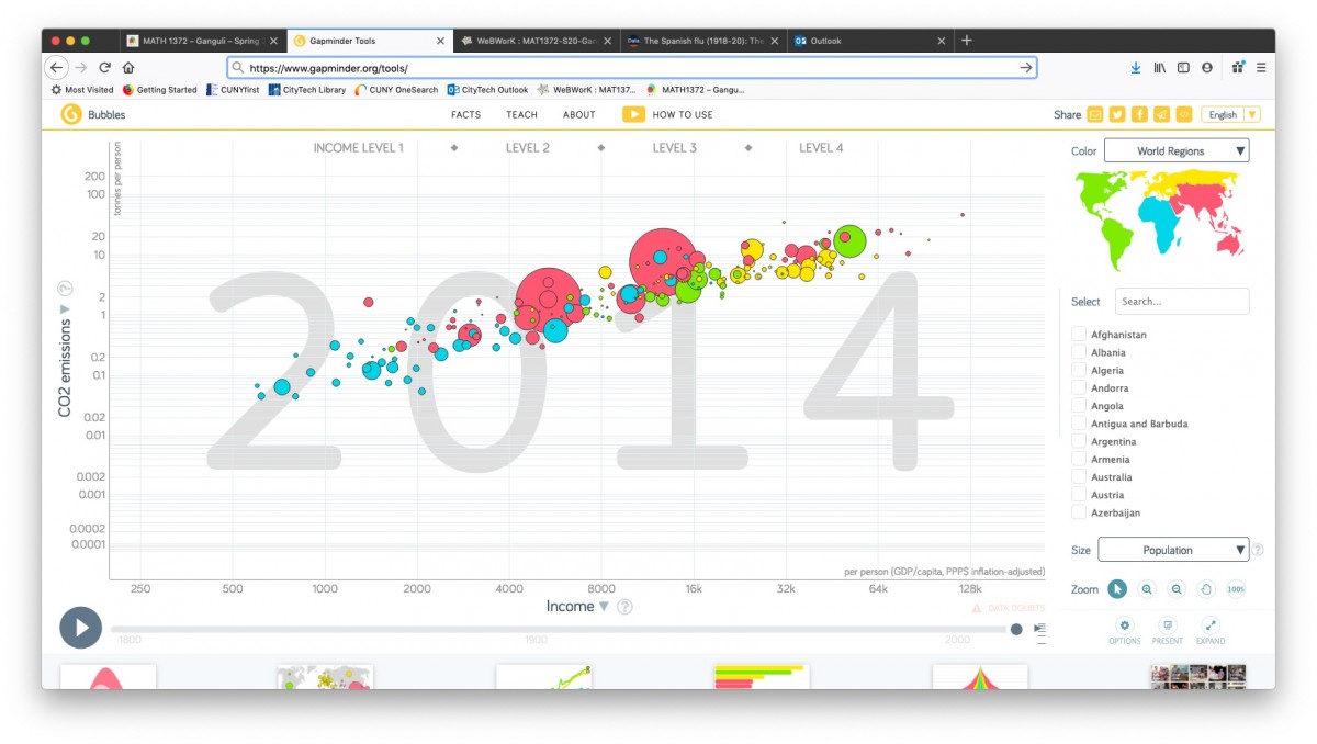
In addition to Gapminder, another good source of data is a website called Our World in Data.

In particular, take a look at their recently posted article on Coronavirus, which they will be updating as the pandemic develops:

“The purpose of this article on COVID-19 is to aggregate existing research, refer to relevant data and allow readers to make sense of the published early research and data on the coronavirus outbreak.”

Here is a histogram which we can discuss (via the subsection https://ourworldindata.org/coronavirus#case-fatality-rate-of-covid-19-by-age):

Coronavirus-CFR-by-age-in-China
Coronavirus CFR by age

“What Worked in 1918-1919?”

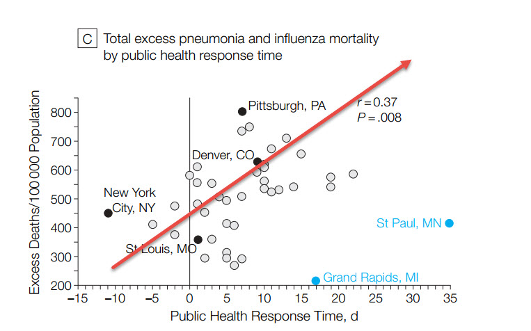
Here is a scatterplot from a March 7 blog post titled “What Worked in 1918-1919?“:

1918 flu: excess mortality vs public health response time

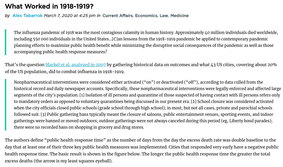
Here is the intro to this graph from the Marginal Revolution blog post:

Marginal Revolution blog post

Take a look at the 2007 paper (“Nonpharmaceutical Interventions Implemented by US Cities During the 1918-1919 Influenza Pandemic“) which contains a number of additional scatterplots!

Interpreting the linear regression parameters

Yesterday in class I discussed how we can interpret the linear regression parameters (i.e., the y-intercept a (“alpha”) and the slope (“beta”) yielding a linear regression line (or what we also call a “linear model”)

y = a + bx

See below for a summary (you can also take a look at the Khan Academy videos “Interpreting y-intercept in regression” and “Interpreting slope in regression“):

  • Recall that the linear model is used to predict an “output” value y for a given “input” value x
  • In terms of the line, the y-intercept a is the y-value where the line intersects the x-axis, i.e., when x = 0.  Thus, in terms of the linear regression model, the y-intercept a is the predicted value of the dependent variable y when the independent variable x is 0.
  • In terms of the line, the slope b is how much y increases or decreases if x is increased by 1.  Thus, in terms of the linear regression model, the slope b is the predicted change in the dependent variable y if the independent variable x is increased by 1.

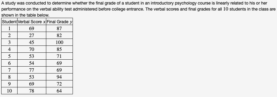
For example, this was an exercise on the “HW4-Paired Data” WebWork set:

Paired data set from WebWork HW4
Exercise from WebWork “HW4-Paired Data”

The results of linear regression for this data set (i.e., regressing the dependent variable y (final grade) on the independent variable x (verbal score) yield the linear regression parameters:

  • y-intercept a ≈ 99.1 ; this can be interpreted as the predicted final grade of a student who gets a verbal score of 0
  • slope b ≈ -0.333 ; this can be interpreted as saying that a student who increases their verbal score by 1 will decrease their final grade by -0.333

Exam #1 – Wed March 4

As I announced in class, we will take our first midterm exam this Wednesday (March 4).  The exam will cover the material up to and including basic probability.

Here is a list of concepts/topics that will be covered on the exam:

  • frequency tables, relative frequencies, frequency histograms
  • measures of central location: mean & median
  • measures of variability: sample standard deviation, sample variance
  • quartiles, 5-number summary, box plots
  • paired data sets: scatterplots, positive vs negative correlation, the correlation coefficient, linear regression
  • basic concepts of probability: simple probability experiments, sample spaces, events

Here is a guide on how to prepare for the exam:

  • do these exercises from “HW5-Probability”: #1, 2(a)-(d), 4, 5(a)-(c), 8, 9
  • review the outlines/notes/spreadsheets for Classes#1-8 (available under Files and the Calendar page)
  • review the solutions to Quiz 1 and Quiz 2 (available under Files)
  • review the WebWork exercises and solutions from “HW2-Graphs”, “HW3”, and “HW4-PairedData”
  • in particular, review the following WebWork exercises:
    • HW2-Graphs: #2, 3, 4, 10, 11, 13, 14
    • HW3: #1, 2, 3, 5, 10
    • HW4-PairedData: #1, 3, 6, 13, 14, 20, 21, 22

(Note that you can view solutions for past WebWork sets by clicking on “Download PDF or TeX Hardcopy for Current Set” and selecting the options for “Show:


“How Bad Will the Coronavirus Outbreak Get?” (R_0 and Case Fatality Scatterplot)

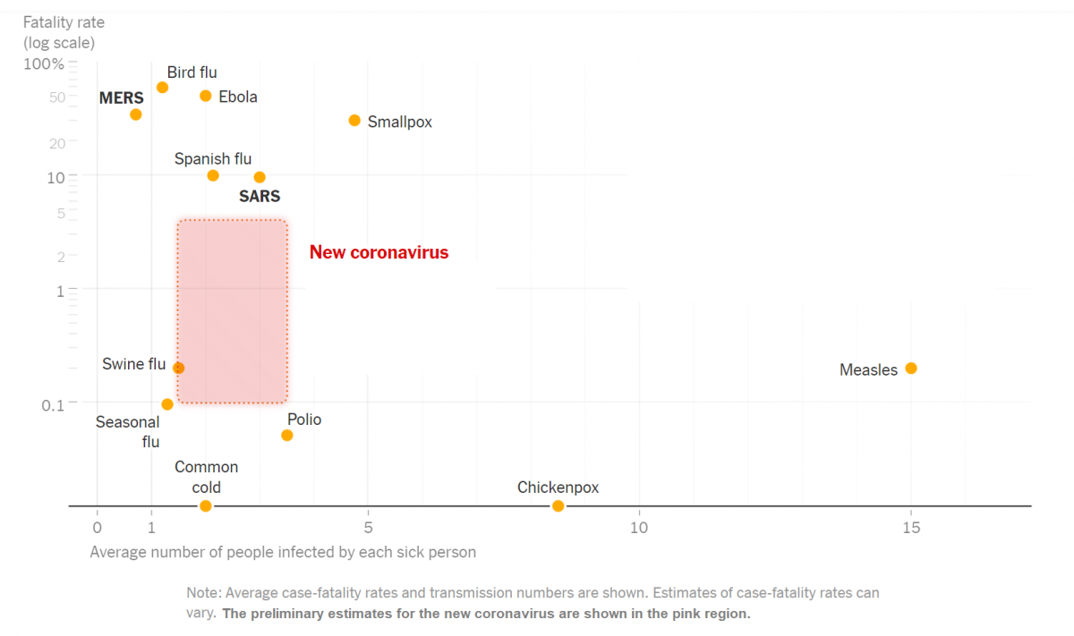
Here is a scatterplot (among a number of interesting graphs) contained in a NYT article headlined “How Bad Will the Coronavirus Outbreak Get? Here Are 6 Key Factors”

Infectious diseases: fatality rates vs transmission (via nytimes.com)
Infectious diseases: fatality rates vs transmission numbers (via nytimes.com)

The article includes this text regarding the graph: “The chart above uses a logarithmic vertical scale: data near the top is compressed into a smaller space to make the variation between less-deadly diseases easier to see. Diseases near the top of the chart are much deadlier than those in the middle.”

(See also this link which includes a number of discussion questions regarding this graph: “What’s Going On in This Graph? | Coronavirus Outbreak“)

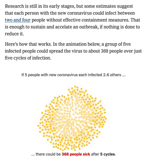
Note that the variable on the horizontal axis in the scatterplot above is “Average number of people infected by each sick person”.  Also from that  article is this discussion of that statistic:

excerpt from "How Bad Will the Coronavirus Outbreak Get? Here Are 6 Key Factors" (nytimes.com)
excerpt from “How Bad Will the Coronavirus Outbreak Get?
Here Are 6 Key Factors” (nytimes.com)

(Click thru to the article to see the animation, which illustrates a form of exponential growth.)

In epidemiology, that number is called “the basic reproductive number” of an infection; see https://en.wikipedia.org/wiki/Basic_reproduction_number.

Here is the paper linked to in the excerpt above (published on Feb 13) that summarizes various estimates of the basic reproductive number for coronavirus: “The reproductive number of COVID-19 is higher compared to SARS coronavirus