Our World in Data: “Coronavirus case fatality rates by age-group in China”

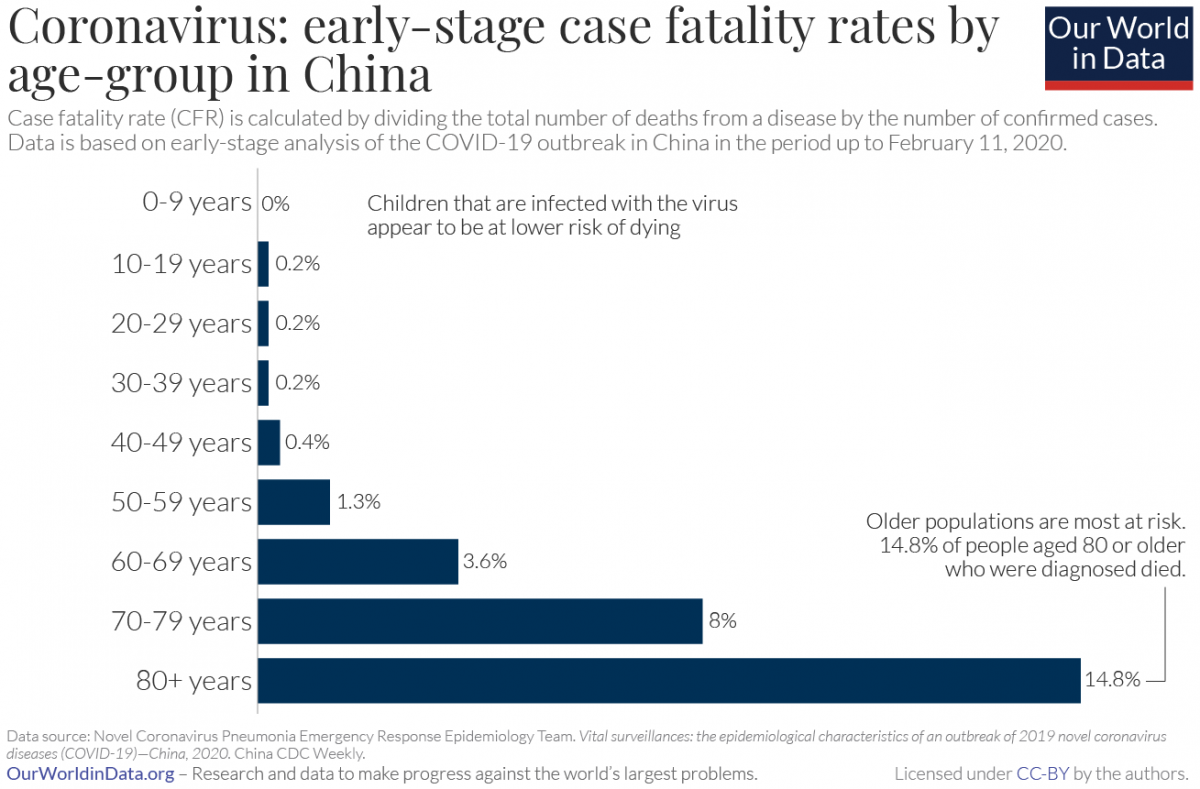
In addition to Gapminder, another good source of data is a website called Our World in Data.

In particular, take a look at their recently posted article on Coronavirus, which they will be updating as the pandemic develops:

“The purpose of this article on COVID-19 is to aggregate existing research, refer to relevant data and allow readers to make sense of the published early research and data on the coronavirus outbreak.”

Here is a histogram which we can discuss (via the subsection https://ourworldindata.org/coronavirus#case-fatality-rate-of-covid-19-by-age):

Coronavirus-CFR-by-age-in-China
Coronavirus CFR by age

“The Aging of America”: Frequency Histograms For US Population Age Distributions

Here are some examples of frequency histograms showing the age distributions of the US population at different times in history (and projected into the future):

  • From the New York Times: “The Aging of America” (Published: February 5, 2011)
  • A similar post appeared on WashingtonPost’s Wonkblog: (published: August 13, 2013), which included this: “This is a mesmerizing little animation created by Bill McBride of Calculated Risk. It shows the distribution of the U.S. population by age over time, starting at 1900 and ending with Census Bureau forecasts between now and 2060.”

What do you notice about how the distributions evolve over time? Click thru to either the CalculatedRisk blog post on which this animation first appeared or to the WashingtonPost link to read some discussion.

Also here is a related set of histograms that were featured in the NYT Business section in May 2014, as part of an article titled “Younger Turn for a Graying Nation“:

NYT-graying

That was an installment of a weekly column in the NYT Business section titled “Off the Charts,” which discussed a graph and the underlying data.