“How Bad Will the Coronavirus Outbreak Get?” (R_0 and Case Fatality Scatterplot)

Here is a scatterplot (among a number of interesting graphs) contained in a NYT article headlined “How Bad Will the Coronavirus Outbreak Get? Here Are 6 Key Factors”

Infectious diseases: fatality rates vs transmission (via nytimes.com)
Infectious diseases: fatality rates vs transmission numbers (via nytimes.com)

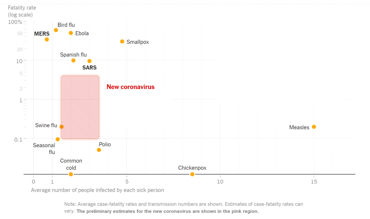
The article includes this text regarding the graph: “The chart above uses a logarithmic vertical scale: data near the top is compressed into a smaller space to make the variation between less-deadly diseases easier to see. Diseases near the top of the chart are much deadlier than those in the middle.”

(See also this link which includes a number of discussion questions regarding this graph: “What’s Going On in This Graph? | Coronavirus Outbreak“)

Note that the variable on the horizontal axis in the scatterplot above is “Average number of people infected by each sick person”.  Also from that  article is this discussion of that statistic:

excerpt from "How Bad Will the Coronavirus Outbreak Get? Here Are 6 Key Factors" (nytimes.com)
excerpt from “How Bad Will the Coronavirus Outbreak Get?
Here Are 6 Key Factors” (nytimes.com)

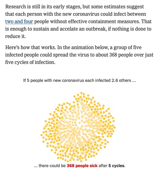
(Click thru to the article to see the animation, which illustrates a form of exponential growth.)

In epidemiology, that number is called “the basic reproductive number” of an infection; see https://en.wikipedia.org/wiki/Basic_reproduction_number.

Here is the paper linked to in the excerpt above (published on Feb 13) that summarizes various estimates of the basic reproductive number for coronavirus: “The reproductive number of COVID-19 is higher compared to SARS coronavirus

“The Aging of America”: Frequency Histograms For US Population Age Distributions

Here are some examples of frequency histograms showing the age distributions of the US population at different times in history (and projected into the future):

  • From the New York Times: “The Aging of America” (Published: February 5, 2011)
  • A similar post appeared on WashingtonPost’s Wonkblog: (published: August 13, 2013), which included this: “This is a mesmerizing little animation created by Bill McBride of Calculated Risk. It shows the distribution of the U.S. population by age over time, starting at 1900 and ending with Census Bureau forecasts between now and 2060.”

What do you notice about how the distributions evolve over time? Click thru to either the CalculatedRisk blog post on which this animation first appeared or to the WashingtonPost link to read some discussion.

Also here is a related set of histograms that were featured in the NYT Business section in May 2014, as part of an article titled “Younger Turn for a Graying Nation“:

NYT-graying

That was an installment of a weekly column in the NYT Business section titled “Off the Charts,” which discussed a graph and the underlying data.