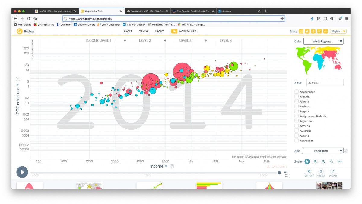
Please visit and explore the Gapminder website I showed in class yesterday:
- the homepage Gapminder.org has links to various features on the site
- the Tools page has the interactive scatterplot tool I demonstrated in class:
MATH 1372 – Ganguli – Spring 2020
Statistics and Probability

Please visit and explore the Gapminder website I showed in class yesterday:
Yesterday in class I discussed how we can interpret the linear regression parameters (i.e., the y-intercept a (“alpha”) and the slope b (“beta”) yielding a linear regression line (or what we also call a “linear model”)
y = a + bx
See below for a summary (you can also take a look at the Khan Academy videos “Interpreting y-intercept in regression” and “Interpreting slope in regression“):
For example, this was an exercise on the “HW4-Paired Data” WebWork set:
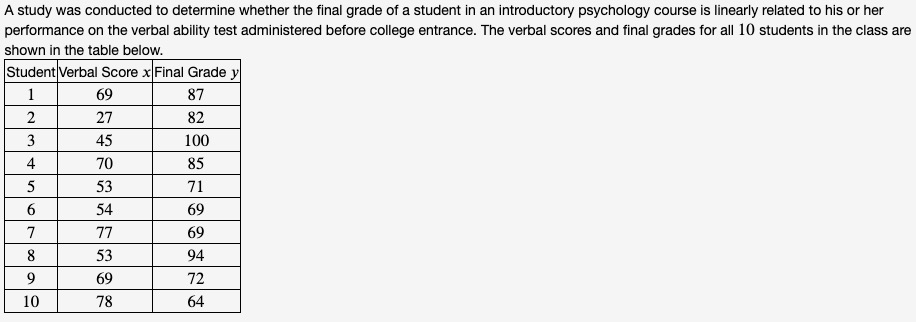
The results of linear regression for this data set (i.e., regressing the dependent variable y (final grade) on the independent variable x (verbal score) yield the linear regression parameters:
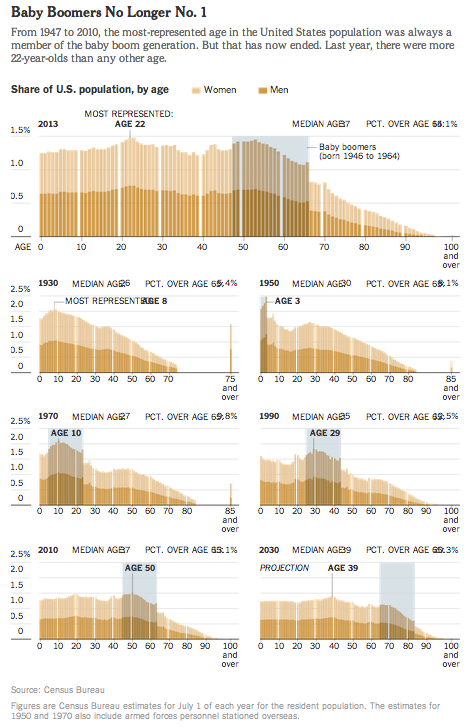
Here are some examples of frequency histograms showing the age distributions of the US population at different times in history (and projected into the future):

What do you notice about how the distributions evolve over time? Click thru to either the CalculatedRisk blog post on which this animation first appeared or to the WashingtonPost link to read some discussion.
Also here is a related set of histograms that were featured in the NYT Business section in May 2014, as part of an article titled “Younger Turn for a Graying Nation“:
That was an installment of a weekly column in the NYT Business section titled “Off the Charts,” which discussed a graph and the underlying data.
The OpenLab is an open-source, digital platform designed to support teaching and learning at City Tech (New York City College of Technology), and to promote student and faculty engagement in the intellectual and social life of the college community.

