Video: “Exponential growth and epidemics”

Here is a 9min video that I highly recommend you watch:

You can get a lot out of just watching the first minute: watch how he steps up the graph of the # of COVID-19 cases (outside mainland China) from Jan 22 to March 6, and shows that C(n+1) ≈ 1.2*C(n), i.e., we’re seeing exponential growth with C(n) = C(0)*(1.2)^n. Note that he has the advantage that he can just “zoom out” to redraw the scale of the y-axis.

After that initial segment, he starts discussing some parameters relevant to the topics of our course (“E = Average number of people someone infected is exposed to each day,” and “p = Probability of each exposure becoming an infection”).

Also starting at around 1:50 mark, he shows what a logarithmic scale is, and why it’s useful for graphing exponential growth curves–they turn into straight lines on a log scale! And then he does a linear regression, and shows the R^2 (the coefficient of determination!)

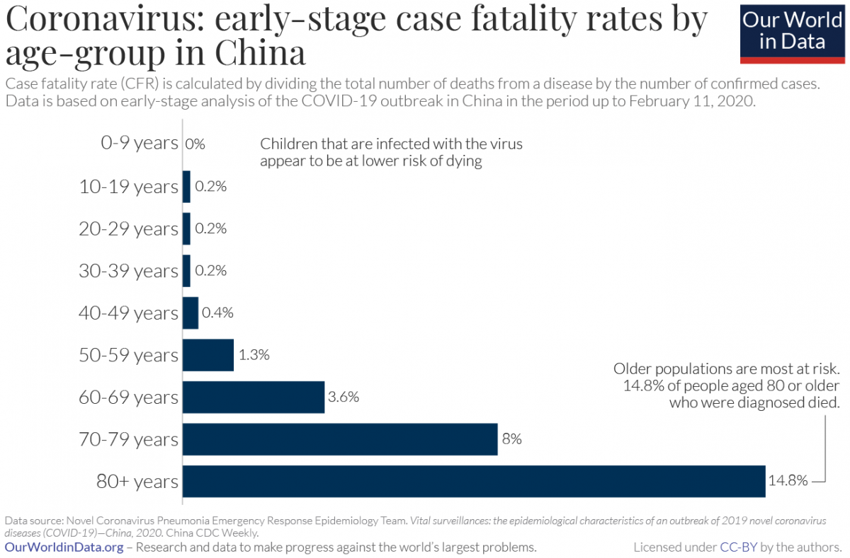
Our World in Data: “Coronavirus case fatality rates by age-group in China”

In addition to Gapminder, another good source of data is a website called Our World in Data.

In particular, take a look at their recently posted article on Coronavirus, which they will be updating as the pandemic develops:

“The purpose of this article on COVID-19 is to aggregate existing research, refer to relevant data and allow readers to make sense of the published early research and data on the coronavirus outbreak.”

Here is a histogram which we can discuss (via the subsection https://ourworldindata.org/coronavirus#case-fatality-rate-of-covid-19-by-age):

Coronavirus-CFR-by-age-in-China
Coronavirus CFR by age

“What Worked in 1918-1919?”

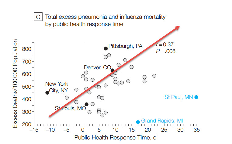
Here is a scatterplot from a March 7 blog post titled “What Worked in 1918-1919?“:

1918 flu: excess mortality vs public health response time

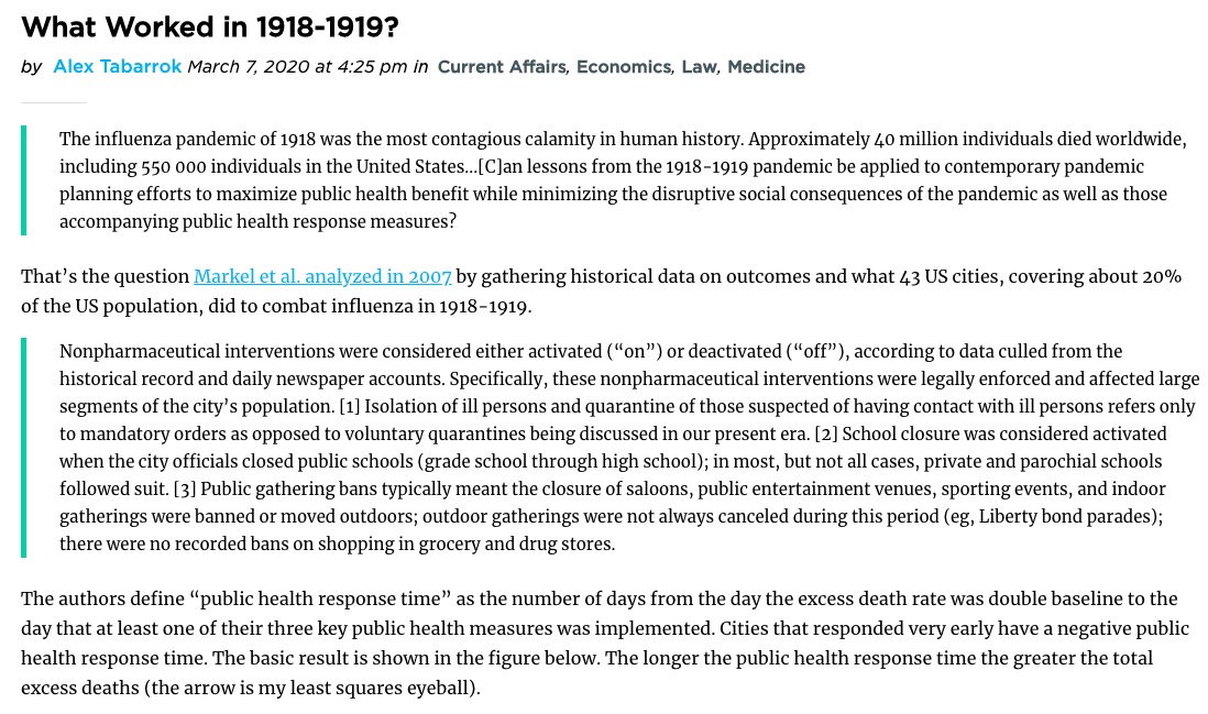
Here is the intro to this graph from the Marginal Revolution blog post:

Marginal Revolution blog post

Take a look at the 2007 paper (“Nonpharmaceutical Interventions Implemented by US Cities During the 1918-1919 Influenza Pandemic“) which contains a number of additional scatterplots!

“How Bad Will the Coronavirus Outbreak Get?” (R_0 and Case Fatality Scatterplot)

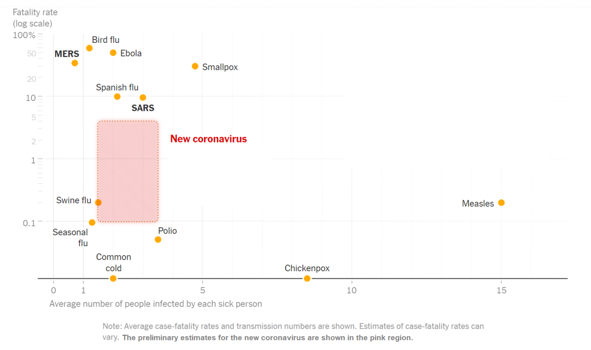
Here is a scatterplot (among a number of interesting graphs) contained in a NYT article headlined “How Bad Will the Coronavirus Outbreak Get? Here Are 6 Key Factors”

Infectious diseases: fatality rates vs transmission (via nytimes.com)
Infectious diseases: fatality rates vs transmission numbers (via nytimes.com)

The article includes this text regarding the graph: “The chart above uses a logarithmic vertical scale: data near the top is compressed into a smaller space to make the variation between less-deadly diseases easier to see. Diseases near the top of the chart are much deadlier than those in the middle.”

(See also this link which includes a number of discussion questions regarding this graph: “What’s Going On in This Graph? | Coronavirus Outbreak“)

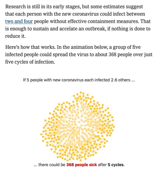
Note that the variable on the horizontal axis in the scatterplot above is “Average number of people infected by each sick person”.  Also from that  article is this discussion of that statistic:

excerpt from "How Bad Will the Coronavirus Outbreak Get? Here Are 6 Key Factors" (nytimes.com)
excerpt from “How Bad Will the Coronavirus Outbreak Get?
Here Are 6 Key Factors” (nytimes.com)

(Click thru to the article to see the animation, which illustrates a form of exponential growth.)

In epidemiology, that number is called “the basic reproductive number” of an infection; see https://en.wikipedia.org/wiki/Basic_reproduction_number.

Here is the paper linked to in the excerpt above (published on Feb 13) that summarizes various estimates of the basic reproductive number for coronavirus: “The reproductive number of COVID-19 is higher compared to SARS coronavirus