Tag Archives: signs

NANCY ACEVEDO ENTRY #11

This has been a great experience so far. I can feel and see myself become a better designer and just learning new things outside of school. Not only am I getting to know about bikes (which I never knew there were so many great things to know about them) I am learning a lot about managing my time and meeting deadlines. I sound a bit hypocritical since I have been slacking with my journals but they all have been for a good caused.

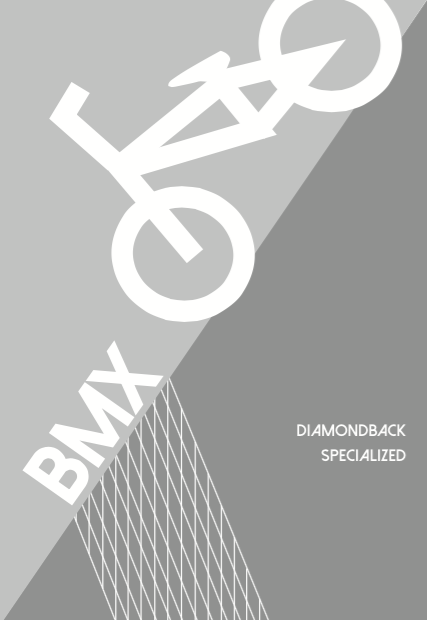
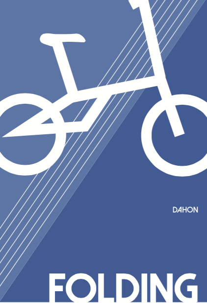
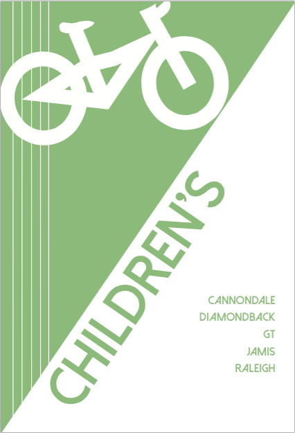
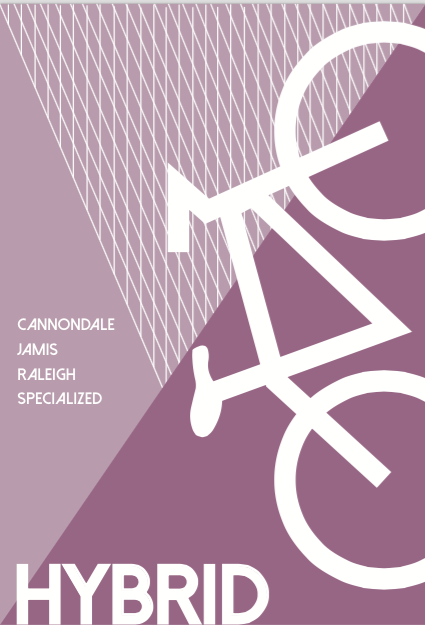
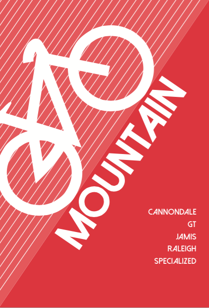
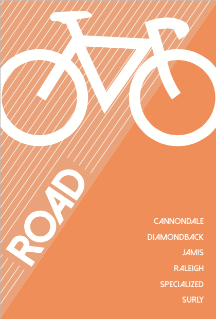
Today I got to see the finalized signs I created printed. They look pretty cool; I like how everyone was able to recognize the kind of bike it was by just looking at the illustrations I made for each of them. I kept them very minimal to no details, but the shape is what makes the brain understand what they are and of course the name helps. Here are the final ads that they chose to print out. These will be hung on the ceiling of the shop and they are all 3 pages each. One page shows the kind of bike it is with an illustration of the bike, second page are the brand names the shop has for that kind of bike and the third one is simply Tread’s logo.

signs2 <—– CLICK ME!


NANCY ACEVEDO ENTRY#8

Lately I have been just working on the same thing. Basically, revising and making sure that they work. One of my biggest challenges so far has been getting to know the shop’s style (their brand identity). It is easier for me to create something that they think will work if I understand better how they will like to present themselves. Another challenge has been focusing on everything from the internship while managing my other classes. It is difficult for me to give the same amount of time to all of my work pieces.

So far I’ve enjoyed interning at Tread, because the people are nice and friendly. Everyone that works there throws their little bit of criticism to whatever I create which definitely helps me in the long run since they’ve been working there for a while. The signs I made for the different kinds of bike look completely different now than how they first started. I am very pleased with how they have developed because it works better with the shop’s look. I hope that when I am done with all the revisions, it will be something that my boss will approve of and hopefully print out for it to be displayed.

NANCY ACEVEDO ENTRY #7

This week I kept working on the rest of the signs for the shop. They were pleased with the first 3 signs, so I kept the theme going and worked on the last 3. I also started working on their instagram account, which needs a bit more work, to gain more followers and raise awareness of TREAD which is one of the biggest bike shops in New York City. My goal is to post pictures of the store and the products they have, the new renovations, inspirational quotes for the cyclists and more…

These are the other 3 signs:

bmx folding kids

NANCY ACEVEDO ENTRY #6

This week’s project was to create signs for the type of bikes the bike shop sales. Which are Hybrid, road, mountain, folding, BMX and children’s bikes. The store is currently being modified to improve its look and make room for more merchandise. The signs will help customers know exactly where to find the bike that they specifically come in looking for.  I’ve tried to make every sign relate to each other visually, by using the same pattern as the background and utilizing lines for movement. I used bright colors to maintain a fun mood, and a capitalized san serif font for clear legibility.

There are the 3 first ones:

hybrid mountain road