Monthly Archives: May 2015

Humberto MV Journal Entry 12

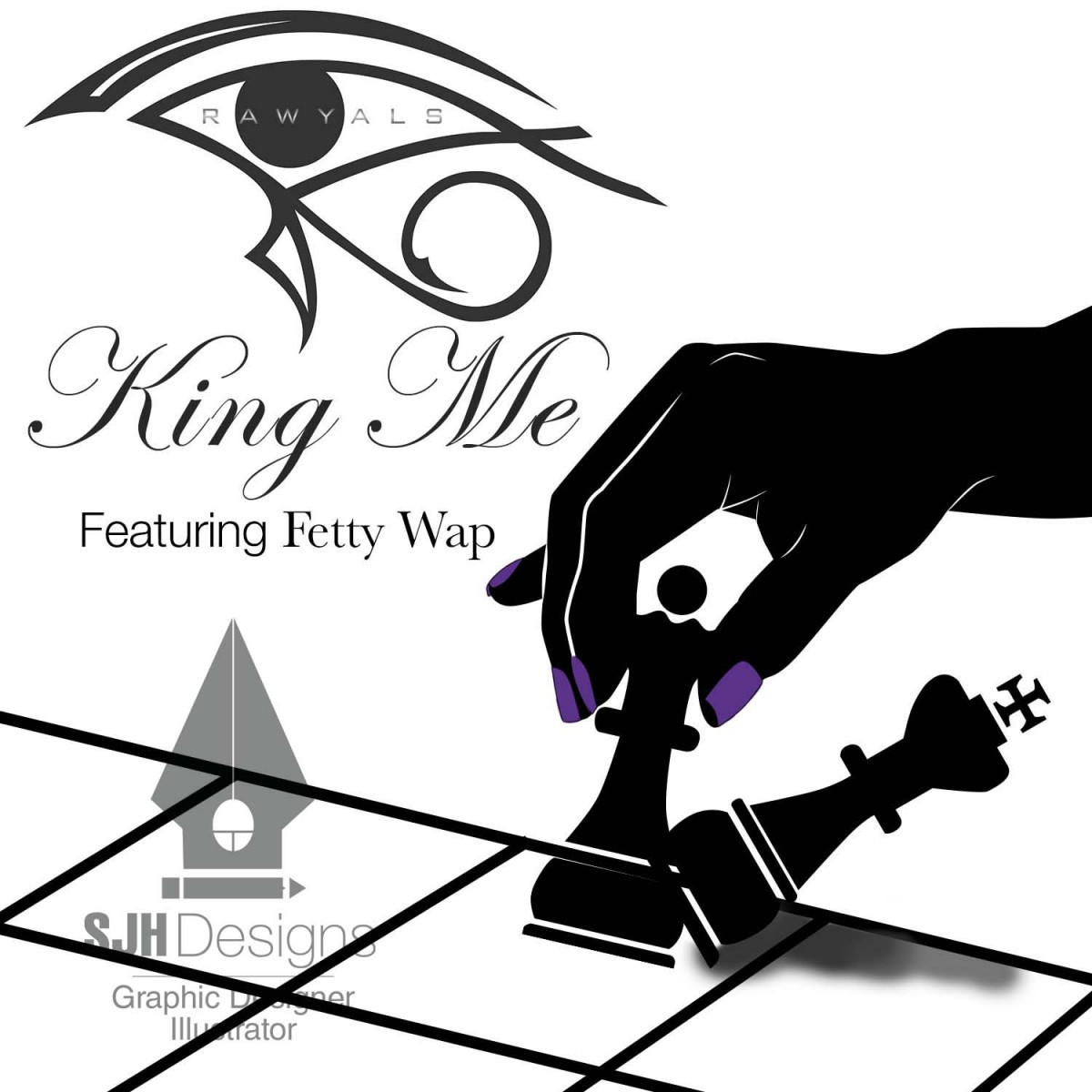
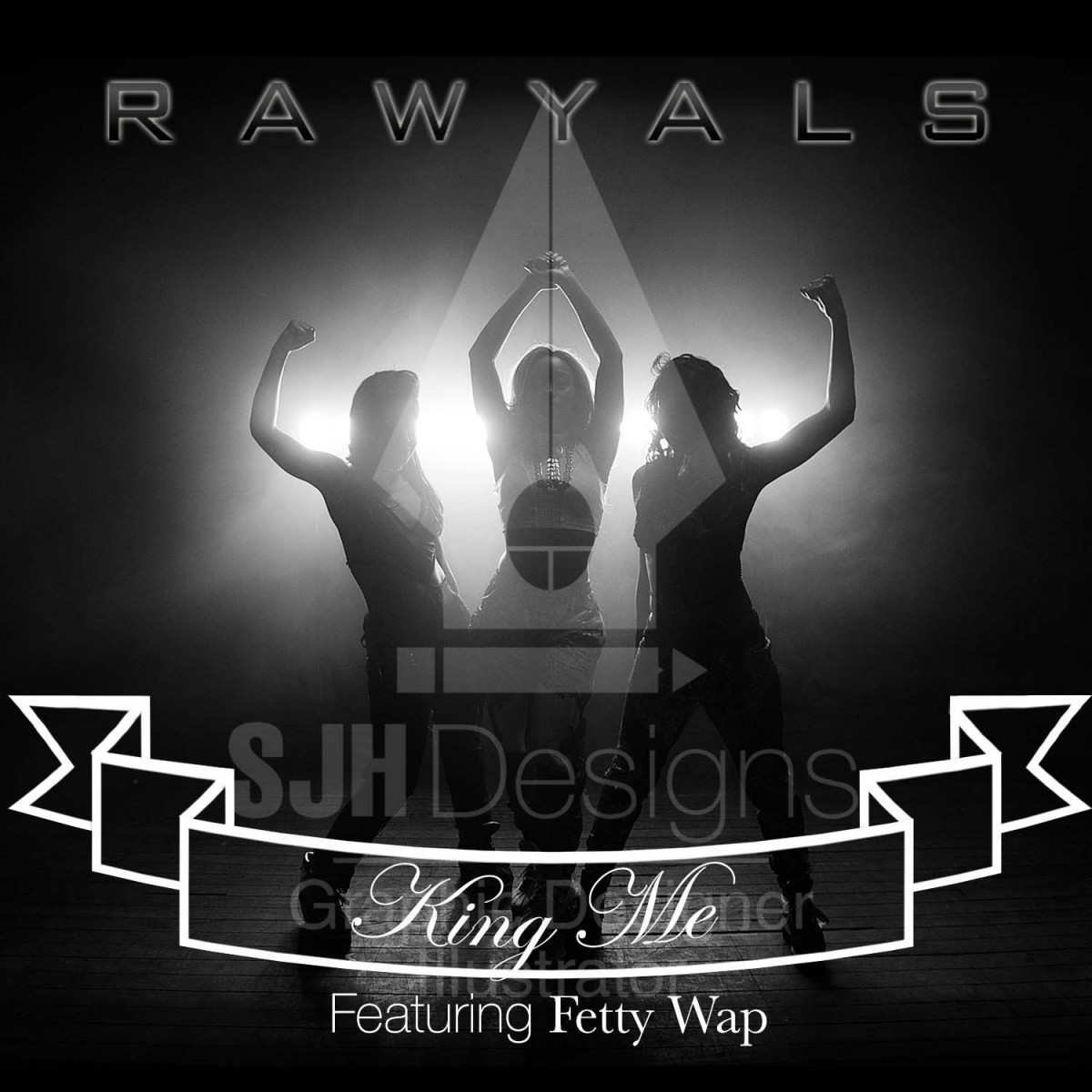
This week at bridge was more of the same. I showed what I came up with on the CD single cover album. Lets see what the client says if they approve or not. I had little time to come up with something really solid and barely any direction to go in. I listened to their unreleased single. It just sounded generic hip-hop. The title “king me” basically explains it. Its about women being in charge with comparisons to Cleopatra and other rulers. Like Beyonce I guess but its nothing to make it stand out. As for the video montage for St. Partricks. The designer told me to put it on hold because the client hasn’t paid or something I don’t really know the details, but it is ready to be exported and approved by the designer. The bridge series logo is coming along well I showed the different variations to them and they are narrowing it down so I can focus more on which direction they want. It looks like the logo will be for a panel discussion. I thought it was going to be for a video series. It is actually going to be for a quarterly panel for business and marketing, but with the same concept in mind of building your brand, expanding and marketing. Here is a sample of the logos and the CD cover.Bridge series logoKing_MeKingMe

Journal Entry #7 (Sean Beharry)

Today I received a few emails from both of my supervisors. They are beginning to provide all the things i requested in the list I emailed them. They sent me the logo, but not the right file type. So I called them to let them know I specially need the original Adobe Illustrator file,svg file, or a vector type of file. They also started sending some content like some logos of their sponsors, and info for an upcoming event they want me to design a flyer for. I’m waiting for some more content so I can start the mock ups as soon as possible. For now I am designing wire frames for myself but I would like to meet with the board soon so we can discuss the main pages of the site.

Journal Entry #6 (Sean Beharry)

I got an email two days ago from my supervisors requesting we have a board meeting using a desktop sharing program. They wanted to further discuss plans for the website since our last meeting. Since I had some time before the online meeting I created a presentation in InDesign using desktop and mobile screen shots of the PCC website. I know the board isn’t as knowledgeable as me in web design and wouldn’t understand some of the terms I would be using. So before starting the presentation using my PDF presentation I explained to them how a site is broken into three parts, a header,content, and footer and what goes in them.

I had the home page desktop and mobile screen shot side by side for comparison of consistency in design. I marked up the presentation with little notes so they would know what I’m talking about. I started with the header, first of all the logo has a misspelling. Then I show them how the mobile navigation is completely different in design from the desktop navigation. I also showed them how the designer carelessly had duplicated content and links on the home page. I broke down the whole home page so they could understand why things don’t work visually. For example they have a carousel on the home page that has 3 images of the city, making their site look like a Manhattan realty site instead of a postal company.

I also talked about the mobile navigation and how poorly designed it was, I showed them a good example of a mobile navigation that would suite their site. In the final part of the presentation, I presented their companies big brother’s website USPS.com. I explained to them that the USPS website’s design is something we can use as a reference. I explained to them its design/functions aren’t up to date and 100 percent perfect but its still a good example because it is the company the PCC works with. I show them whats good and bad, and the whys of all their placement of certain things.

They were all very pleased and thankful with the presentation, I felt really good I could translate all this web tech chit chat to people who don’t have a clue about it. I feel I really made an impact on how they look at their site and how it works. I later on got an email from my supervisor with a link of another PCC site I should look at as a reference. I’m glad she got the idea and I feel like we are going to make a lot of progress now.

Journal Entry #5 (Sean Beharry)

Today I went into the office to have a meeting with the board. They were very concerned with the site and how its actually helping the company. Our lack of communication before the meeting delayed anything major getting done. Since I been at the internship I’ve been reporting to two supervisors who have to get okays from their superiors most of the time before I make any major changes to the site. I’ve told them the site has a lot of issues before but they weren’t really passing the message along to their superiors I guess.

Finally I had my first sit down with all the board members to actually discuss my jobs tasks and how I can help them. I told them the same thing I’ve been telling my supervisors, the site is poorly designed. Visiting the site as a web designer I can clearly tell no effort was put into their site to make it unique and distinguish itself. I explained to them some of the careless things their hired web designer has done, and how we could go about improving it. Some content on the website that they have featured they aren’t really sure if they even wanted it up. Basically their web designer didn’t ask them what they wanted but just went ahead and used their old content off their old website.

I also discussed the useless member system they have on the site which conflicts with the WordPress admin system. I told them how it has no features or functions at all, and there is no point of having it up at all.

On the website note, they told me they are going to work on getting a new budget for a new site. So during this time I will be working with them to develop content and mock ups.

The last thing I presented to the board was all three designs of my newsletter covers, they liked all of them but especially the third one. So I told them to provide me with more content that they would liked featured and I will continue to come up with more designs and more pages. I also requested they provide me with all graphics for their company such as vector logos ,product pictures, etc. Anything I can use to develop the website and newsletters. So we agreed at the end of the meeting that I will email them with a list of everything I need to get started.

Journal Entry #4 (Sean Beharry)

I have been working on different concepts for newsletter covers, the PCC haven’t provided me with much content, or any idea of what they exactly want. So I took the initiative to come up with different covers each with different goals. One design features their upcoming events as the main feature, and a little bit about the company. The second cover’s design highlights the benefits of becoming a member of the PCC, and also includes a small about section. The third cover design includes all 3 aspects but the main focus is the upcoming events because they want more people in attendance at their meetings. I presented the newsletter cover designs to my supervisors and they really liked the design of the third one, so I will continue to create different versions of this design to present to them again.

Journal # 9 Stephanie Venegas

The day before going into the office, I received an email from Mitch. He sent over the a few photos of the bike shelf with my packaging on. It came out SO AWESOME. I thanked him for giving me the opportunity. The shelves are going to be sold through a cycling distributor called BTI and a small mom and pop store called Made in Brooklyn.

My next assignment is to design some t-shirts. Wyatt showed me a few lifestyle brands he’s interested in, and what style he prefers. I completely understand what he wants. On the other side, Mitch wants to keep it simple and use their logo with maybe a few symbols to spruce it up a bit. While they were going at it, I made a few samples of badges and placed them on some shirt mock-ups. They loved the direction but never finalized anything with me. We were thinking about making a t shirt for a bike event that takes place in the neighborhood called The Red Hook Crit. It’s a world famous race where riders compete on a very technical track on fixed gear bikes. The shirts would be targeted to the tourists that come to Brooklyn for the event. For now its just an idea, but it isn’t a confirmed assignment.

Journal #8 Stephanie Venegas

My next assignment on top of the shelf is to design a banner that will go to every dealer in the United States. Pretty exciting stuff! I’m pretty much done with the shelf packaging so I don’t have too much on my plate right now. I sat with the guys and they expressed their interest in Obey’s style. They wanted something very similar, if not exactly the same. So I began researching.

Obey is a street wear brand. Their style is propaganda based with a lot of ornaments and use mainly 3 colors in all of their designs. I’m pretty familiar with the brand but I’ve never designed anything like this before. I decided to go to one of my close friends for advice. She’s obsessed with the brand and I knew she could point me in the right direction. There are a lot of elements in Obey’s designs, and it is very easy to “over do it”. Thankfully, she sent me a bunch of files with ornaments that I can use. This was a huge lifesaver.

After playing around with the ornaments for a while, I decided to give myself a mental break. Like I mentioned before, I had never done anything like this before so I was a little out of my comfort zone. This was a good thing. Although it took me a while, I pushed myself and created a pretty cool looking banner. I probably wouldn’t hang it my room, but it’s exactly what the guys wanted. A few hours after sending Wyatt the file, I received an email that said “looks awesome!” I can’t wait to see this thing printed.

Journal #7 Stephanie Venegas

Last week was pretty rough. I know it is a part of my job to give whatever the client wants and make sure that they are happy. I fully understand that, but boy last week sucked. In the midst of finalizing the decals, I managed to get started on the bike shelf packaging.

When I arrived at the office, Mitch greeted me with his huge smile. He apologized for the workload and told me that he wants to compensate me for everything that I have done. He mentioned giving me a bike, which would be really cool. I started working on the shelf packaging while at the office when Mitch pulled out a list of corrections Wyatt didn’t mention in the emails. The dreaded decals have come back to haunt me. Thankfully, all of the corrections were for decals that were already made by the previous designer. The only corrections that needed to be made were resizing the decals and deleted backgrounds. As we were going through all of them, Mitch realized that one of the logos that was created a long time ago had a typo. Bicycle was spelled “bicyle.” It was a good thing he caught it because I preparing to send the files to the factory. Although it wasn’t my mistake, I still felt really bad. I felt responsible for not catching the typo which is part of my job. I think I didn’t double check because it was a preexisting logo, everything should have been good.

Once the corrections were made, the decals were sent to the factory. Finally! By the time I was done it was time for me to go to class. I have to finish the shelf packaging by the end of this week. I already have a pretty good idea of which direction I’m taking and I think its coming along great. We’ll see what the guys think once I’m done.

Journal #12 – Brian Rubio

Nothing exciting to report this week at my internship. It has been quite slow as we wait on new apparel to be printed and sent to us. At this point I’ve become good friends with the printer and he sends me “sneak peak” pictures of the shirts via text. With this, we also determine if the shirts look better with a single or double coating of ink. A single coat makes the t-shirt have a more vintage/worn-out look which if it fits the feel/style of the shirt we go with that option. Other then this, I’ve taken the liberty of going through old photos that are on the site that I feel can look better and completely re-editing or even shoot them again. The boss Zach loved this idea and really appreciates the extra effort without even asking for it. I feel that the aesthetic of the stores’ website is very important and needs to show the potential customer exactly what they’re getting. Especially if the customer is from another state and can’t come in to see the gear in person. I’ve also pitched some ideas to Zach about making some changes to the site. The site should have a more modern simplistic look to it and be more of a “lifestyle brand” rather then just an inventory/warehouse look. I explained that the fight community trains any second they get the chance to and that this is their lifestyle. To gain the trust and loyalty of its customers the store and site should express this same concept. We want to give the customer a sense of “we know exactly what we’re talking about” and that this is the only place in the world they can get this experience. Zach was impressed by my bold pitch, as he is stubborn about making drastic changes to the store. He did listen to what I had to say and agreed that it made sense. I hope he actually does consider it; even though it might take a lot of work, I did tell him I can help in any way possible.

Entry #12

Last week was a mild one at the internship. I was in charge of creating the center piece spread for Nucleus magazine, in addition to a page with the name of the PSC CUNY awardees of 2015. The spreads (they were actually two) featured the pictures I took at the Architecture department at the Vorhees building. I did several tries until I was able to get the final version approved. Marlon, my coworker, is in charge of the rest of the magazine’s design and served as a resourceful help. Prof. Jordan, as always, was also an important for this project.

The awardees page was more of a physical labor than a mental one. I had to get all 25 names divided in columns, and also organize them with each department they were part of and title they were given. All information barely fit in one page, but it did, so that’s all that matters. That kind of page in a magazine doesn’t really bring beauty to it, it’s just there to deliver some important information.

Now, the Architecture spreads were a blast to work on. My job was to fit in photos of student work, of the professor featured in the story and copy of something around 500 words. Dorian was in charge of the last edition of Nucleus, and he created a visual guideline book for it that helped me a lot. I was no hassle to follow the guidelines, and at the same time I was able to give it a feel of my own. Prof Jordan was very happy with the results, and so was I.