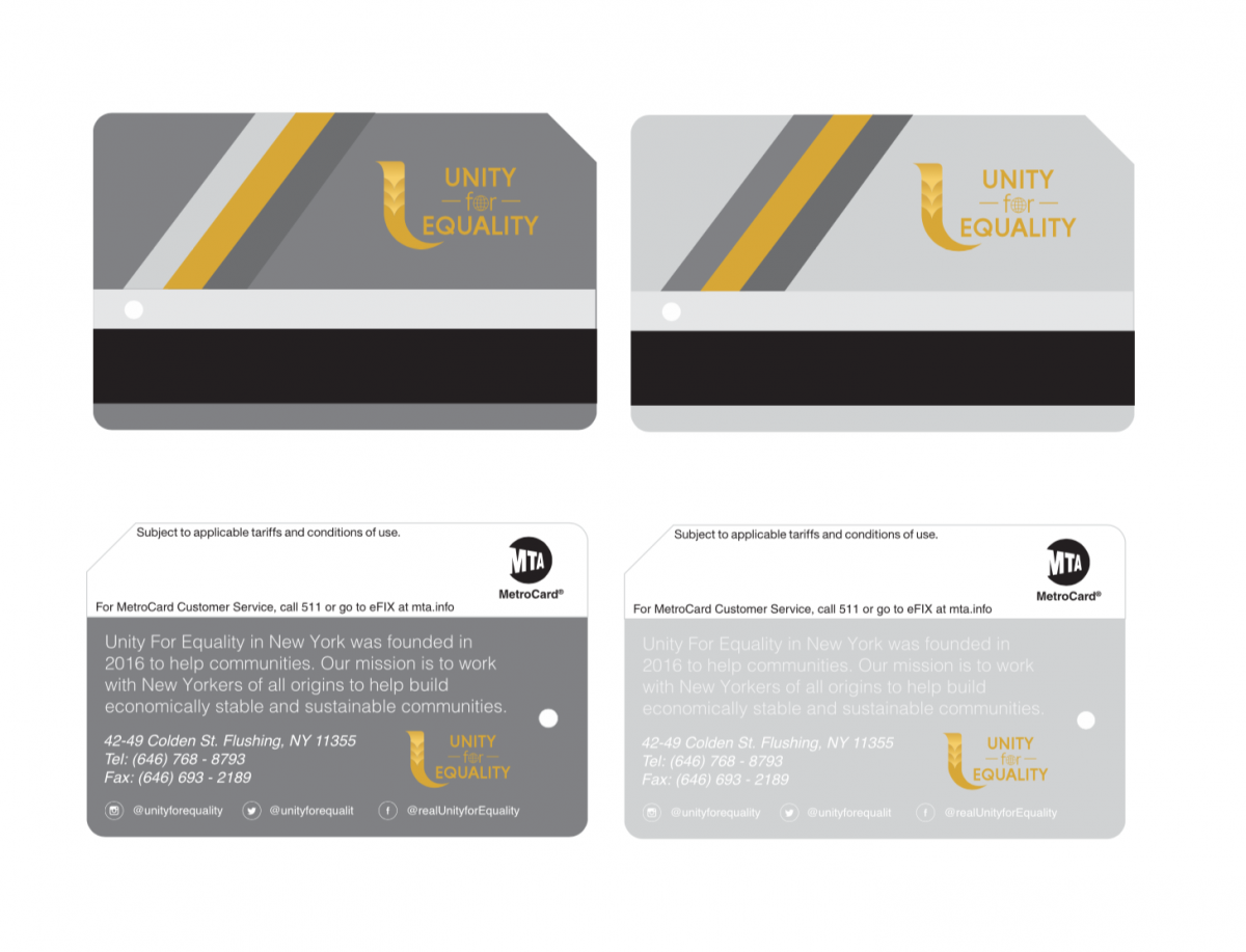
 Neil sent an email announcing that the MTA has agreed to allow Unity to advertise on their Metrocards. I learned a long time ago that the best logos had to be legible on a business card, so I was excited to tackle this assignment, even though they aren’t business cards per se. The fact that the Unity logo is already so well designed, my life was made much easier design wise.
I borrowed previous design elements from other assignments I worked on such, as the frontal tri-stripe feature. Since Unity is still in its infancy graphically, this allows for a greater creative freedom. From the beginning, I knew that I wanted to adhere to the “less is more” philosophy. After experimenting with various background patterns and textures, all of these options ultimately felt unnecessary.
Since Unity’s gold color acts like an anchor, the various shades of grey, provide the perfect logo contrast. I settled upon two designs, nothing too radical, but very clean. I am thoroughly satisfied with these cards and I look forward to their potential MTA usage.

