Category Archives: Uncategorized

Inspiration_daming

Julia Sent. This style of work is overall dark, with dark tones and a dark background that sets off bright objects. Very interesting color matching and irregular object placement. Always have a base for food to place. Not a bright hat, book or cloth to make food or flowers more prominent. Different styles of food or objects make the still life more interesting, and more often the photographer’s own creativity and use of light. In this style she uses a less bright light or a dark background. The foreground, medium and background have different brightness and darkness differences. For example, this crab leg is matched with a silver cup and a dark cloth. The crab script has a certain degree of brightness, but it is not that bright, it has a kind of oil-like brightness.

Inspiration of Richard Foster


Richard Foster is one of the most talented specialists in still life photography, working with various big clients like Prada, Adidas, and Vogue Magazine just to name a few. Looking at his work, I notice that Foster uses lighting, color and other elements to make his images more dynamic and eye-catching to the audience adding to the brand’s presence. In the examples above, Foster is using a colored back light forming a diagonal shape behind the items making the product a more powerful and life like feel. He’s careful to use color that doesn’t draw attention away from the object while keeping the light at an angle that doesn’t produce a harsh glare into the camera. He also uses rim light and probably fill or main light to bring out features and shadows of the glass, this helps add a sense of personality or emotion to the item. When I first saw the photos I thought about the emotion and the audience it would apply to. Being that the first image is a bottle of whiskey it already signaled to me that this was for an older crowd. Then considering the lighting the image felt kind of mysterious and rugged but classic at the same time because of the mature and clean design of the bottle. In the second example, the name brand Prada already signals a luxury item but the strong diagonal of hot pink light gave off a powerful, confident personality that would make someone stand out from the crowd. It honestly made me feel like purchasing the item myself because those are the same ideas I would want to present to the world about my own personality. Richard Foster stands out from the crowd because he gives the subject of his photography a personality even though its an object, after achieving that the image comes to life on its own.

Richard Fosters Campaign

As I looked through all of Richards Fosters images of these different fragrance companies. I realized that he wasn’t just trying to sell the product it self but the bottles as well by using the bottles shapes, transparency and colors to his advantages. With the Stella McCartney bottle he used the bottles purple and black and clear to create both a shadow and refraction of the light on the clear and colored part of the bottle. Which he also did with one of the Tom Fords blue bottles. He used something that looks like a square light above the bottle at an angle while placing the bottle on the edge of a white table which did similar results but the difference here is he using the shadows to create solid geometric shapes out of the shape of the bottle.

Now in the Bottega Campaign with all three bottles he uses the bottles shapes to create both hard and soft shadows shapes with a background that matches the with the color of the fragrance bottles as well.

Richard Foster is a sought after still life photographer because he uses the bottles, glass, liquid, and transparency to its fullest potential and doesn’t waste time showing that through his campaigns. He wants to show off everything that the product has and not just the fact that its a fragrance in a bottle but that the bottle its self is a beautiful item to have and keep. Its a way to catch someones eye instead of someones interest in the smell. Before getting someone to smell and want a perfume/cologne the bottle must catch the eyes of its consumers to get them to look in its directions for it to be noticed.

Inspiration of Gregory Heisler

Gregory Heisler is a very talented photographer who believes in that technique can limit creativity. In a video giving advice to photographers, he stated “looking outside yourself for what’s going to spark your career or photo will not help you more than your own mind. Techniques are like gloves anyone can buy them and wear them for different occasions, your vision is like a fingerprint they don’t change. Techniques may actually hide your fingerprint so it doesn’t show as well.” He was saying that all photographers utilize techniques in their work but if you are wrapped up in the technique you use to compose a photo you lose the unique way you would take the photo.  In Heisler’s photography, I notice there are a lot of black and white frames using a wide range of lighting techniques such as split, rim, short, broad and 3- point lighting. His skills also carry over to his color photography, his subjects looking comfortable in the frame as if they weren’t overly instructed to pose a certain way. As a photographer, he has a don’t think too hard, just shoot type of personality about him.  He advises other photographers not to spend time studying the work of their idols and aspiring to be like them. He says ” Don’t think about how someone else would shoot think about how you would shoot then do it”. It means that photographers shouldn’t compose under the constraints of “how would this person/ or that person do it”, the only person you should be comparing your work to is yourself. He also encourages photographers to be resourceful and ready to shoot under any circumstances because there’s always a chance things will not go as planned. It’s possible that professional lighting won’t be available or you won’t have as much time with a subject as you may have anticipated, but you must be prepared to work well under pressure.

Daniel Singh – Assignment Due March 25 (Inspiration: Richard Foster)

I can see why high-end brands such as Tom Ford, Prada, Stella McCartney and Bottega have sought out Richard Foster’s photography services.  He has a keen eye for framing products so that the eye is immediately drawn to them.  The still-life work he has done with fragrance and cosmetics are exceptional.  The refraction effect used on these glass items is lovely. I love the use of this aesthetic, then combined with the shadows casted from an overhead light made for a most successful Charlotte Tilbury ad.  I can easily picture seeing this in a print campaign through fashion magazines. In the Piaget ad, it does  well in using lighting to layer the different textures, and invoke a bit of drama. This is also replicated in the Dalmore alcohol ad, who also features a pop of red for good measure.  Lastly, I appreciate the geometry found in the Tom Ford fragrance ads, which utilize a low camera angle and light manipulation make for a most striking hierarchy.  Richard Foster’s style would make you double take on a still-life of a half empty bottle of Robitussin.  I admire his work. — Did I mention he has short films?

Richard Foster Inspiration (Kelvin Moncion)

Richard Foster used a style of light refraction, and colour, combined with a low angle camera. Foster uses certain angles to catch different geometric shapes in his photographs. For his glass photography he was an expert at catching the different light effects that the glass produced showing the beautiful rainbow effect on the surface.  His photographs are very infomercial-like, looks like something you would find on a television commercial or a magazine. The products which are the subjects are very crisp and you can see every edge and corner of it, there is no extra lighting or effects to the photographs, they are already well done in quality it is quite simple and has a certain aesthetic to it that is eye candy.

Inspiration of Andrew Scrivani


Throughout all of my semesters in photography, I’ve found that I enjoy photographing two main concepts. Portraits and food. I remember the first time I photographed food in my Photography 2 class in the spring, it was one of the best classes we ever had. It seemed like being able to make interesting compositions while eating brought out the human side of all the students in the class. Looking at Andrew Scrivani’s work I am memorized by the attention to detail and composition skills used in the photos. What makes food photography interesting is selling the the viewer the desire to eat or drink whatever your photographing. You’ll know you’ve reached your goal when even you find yourself wanting to eat it too. In the photo above, I was drawn to the feeling of wonder I got from looking at the bubbles of the beverage. It also made me feel a sense of mystery and intrigue because of the shallow depth of field, I was caught between wanting to drink it and wanting to stare at it all day. In Scrivani’s second photo, I’m drawn to the use of color and the complimenting background. The photo feels light and healthy with the background not clashing with the subject but adding to the ambiance. I also find it interesting that I don’t feel the same type of desire that a person might feel when looking at a photo of a Big Mac from McDonald’s or a Whopper from Burger King. Fast food advertising always seem so aggressive and demanding when promoting their items kind of playing on the idea that a consumer might feel less fulfilled by not eating that burger and fries. Scivani’s approach is more calm and inviting building a consumers interest in the food rather than playing on insecurities.


Andrew Scrivani

The first image makes me want whatever it is that’s in the image, It looks amazing when you start noticing the blue berries that are in it, and the glazing on top of it makes it look more appetizing with how shining and fresh it looks. Like if you manage to get your hands on this now the glaze would still be melting in your hands and tasting fresh out the oven. The spoon in the image gives me the feeling that buying it in a store, you will see them pour the glaze on it as you buy it. It makes it feel like a moment that’s in slow motion and you don’t want to look away. You want to see the food finished right before your eyes. The way the camera focuses on the cake and the glaze on the corner really makes you appreciate it.

The background in this image is interesting to me because in most pictures with food they tend to take a picture from above the food to use the table as the background, but its usually in focus with the food but the colors, plates and food gets separated so that nothing gets mixed in with the other and the food is always the main focus. In this image and others that include an angle or a person and more in the background get focused out enough to focus on the food or drinks more. This one is my favorite because the man is being out of focus but his hand that is around the drink is in focus with the drink. It makes it feel like the man is handing me a drink to try at a bar. Its like if i was a customer just focusing my mind on the drink more than the one serving it. Kinda like  being hypnotized.

Inspiration Post: Gregory Heisler

In this photo taken by Gregory Heisler the lighting and the expression goes hand to hand. The way the shadows appear below his eyes really gives a darker and evil look to the subject. The prop is also a nice touch as the subject holds what seems to be happier times and comparing it to who he is now. The expression compliments the subjects evil aspect as the subject is looking straight at the camera with evil intent. Also the fact that the photographer didn’t place the subject in the center of the frame was a nice touch too giving it a unique look by showing alot of darkness next to the subject almost as if he is being engulfed into the darkness. 

Daniel Singh – Assignment Due March 18 (Inspiration: Andrew Scrivani)

I love food. So naturally, this assignment is heavenly. Minus the fact that Andrew Scrivani captures these items of food so deliciously that it is a major disappointment not being on site to taste test.

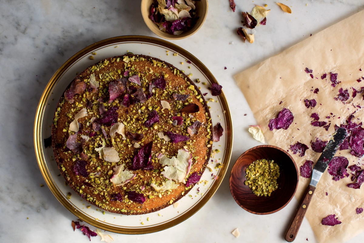
Looking through his current work, I was immediately drawn to this photo and its regal tones. The colors it features are of royalty: from the gold brim of the plate, to the purple topping shaped to be flower petals, to the plush brown of the cake in question.

Closer inspection reveals the many textures found in this photograph.  The luxuriously smooth marble [counter top], the pronounced wood grain of the toppings bowl, to the crinkle of the wax paper on which the glazed topping lay, and lastly the crushed nuts found sprinkled all through out this frame, well these components all stack to create many edible artifacts for the eye to enjoy long before the sending any signals to the mouth to increase saliva production, or the stomach to ready for digestion.

The arrangement of these items across the frame make things interesting. I can name many items shown in this photo but not once can I say it feels convoluted.  The hierarchy leads from the cake to the wax paper, directed by the serving utensil to the bowl, then lastly the eye wanders to the top of the frame to the secondary bowl and scattered toppings.

The lighting comes from the bottom right of the frame, but is set overhead by the way the shadow cast from 9 o clock to 12 o clock in the frame from the cake and plate that it rests on.  It adds a nice dramatic effect, meanwhile subduing empty space in the frame so you can focus on the delectable things. This photo is very much as success by way of my current stomach rumblings.