Author Archives: Da Ming Chen

final project inspiration-ERB

ERB His work on the chef is very realistic, in a combination of art and real life. Very good use of the expression of the model. Many times chefs do not have kitchens or streets or farms to express the life of chefs in different situations. The use of lighting is also very direct. Large light and shadow contrast, use depth of field to blur food or foreground to highlight the main body of the model.For example, the fact that the chef himself was half-squatting and then drowning with salt was very interesting. The light source is from the left. In fact, it is very important to reflect the expression of the model and the reflection of the food to the table.

final project.

My final project should be to help my cousin take a photo of his job relate. He is a sushi chef. So I want to help him shoot a portrait and products. which is divided into two days. May 13th was only time his is free, so that day I help him shoot some portraits about his identity. On May 15th I am going to shoot sushi products.

The main audience is commercial for restaurant. I choose this theme because i saw a video about photography is like sushi by Ralph Gibson from The Art of Photography. (https://www.youtube.com/watch?v=kXaLeP7pD_M)

I am still searching for more commercial portraits of chefs and sushi products.

Sushi pieces placed between chopsticks, separated on black background. Popular sushi food.


Inspiration_daming

Julia Sent. This style of work is overall dark, with dark tones and a dark background that sets off bright objects. Very interesting color matching and irregular object placement. Always have a base for food to place. Not a bright hat, book or cloth to make food or flowers more prominent. Different styles of food or objects make the still life more interesting, and more often the photographer’s own creativity and use of light. In this style she uses a less bright light or a dark background. The foreground, medium and background have different brightness and darkness differences. For example, this crab leg is matched with a silver cup and a dark cloth. The crab script has a certain degree of brightness, but it is not that bright, it has a kind of oil-like brightness.

Tim Wallace_INSPIRATION

Tim Wallace a car photography, his works as whole are very commercial and textured, with a lot of texture processing and a sense of technology feel. Its pretty cool whether he dealing with light or shadow. I like this picture very much. First of all it contains many details. Such as the use of street light and headlight of the car, which bring the light from the left side to the dark side of the light.it make good use of the reflection of the door.  Also it had cool way to get some motion blur.

Manchester Commercial Photographer Tim Wallace. Commercial photography, car, automotive, aviation, truck, engineering and parts photography

Richard Foster_daming_inspiration

Richard Foster style use product light refraction and color, low angle camera. Use light to create geometric shadows and staggered lighting. Use a glass plate to create a reflection. He was a master at using light to create different shapes of color light. The main color is very prominent. Good at using glass products to bring a light reflection and refraction of the different light effects. I think his works are very textural and very commercial. The products themselves are very textured, and the background is to reflect the product itself. There is no extra light or unnecessary things around the products, only simple light and color and his creativity are formed.

Inspiration_Andrew Scrivani_daming

His works are very color composition and food placement and followed using lighting. A lot of it is light and shadow from left to right. Not much exposure. Many of them are close up food photographs, often with the angles from top to bottom and backgrounds blurred. For example, this picture of food looks very delicious. First, the light from left to right turns to dark light. Second, yellow and red, two very strong colors, are matched with a dark gray background. The yellow yolk and the red tomato stand out. Secondly, he photographed the yolk as the juice, which I think is very important in food photography. The background is a blurry close-up of a fork in the foreground. The elevation of the front gives three levels of view.

I think the photo really highlights the interesting background. First, from the point of view of shooting, two different staggered background gray and white collocation. It’s important to be very textured. On a dark background, place the bowl at the intersection of the background colors. Although give a person a kind of very straggly sense. but the color matching and placement is very comfortable.  

daming_GREGORYHEISLER_inspiration

GREGORY HEISLER, After I watch his works, I felt a sense of shock. First, he was very careful in choosing models. The subjects he chose were all portraits, including full-length, half-length and partial portraits. I think he is very good at guiding the model to make different eyes expressions. This kind of expression and the black and white contrast of the photograph, the eyes bring very dramatic styles. I like the picture of the old man very much. First, I noticed that most of his light came from the upper right corner. It gives a very weird feeling, which may be related to the characters themselves. Secondly, he asked the model to put her head forward, so we can see that the clothes and ears of the characters are all blurred. More focus on his face. He used Rembrandt light. The most important thing is to give people a sense of film photos, very simple. The last thing I like most is probably the character’s eyelids forming a triangle and the look up movement. This leads to this weird and different portrait. Most of his works give me the impression that the eyes are equal to a person, and basically the work itself relates to the eyes. So, I think he is a very strong and guide the model how to make these movements and eyes.

daming_Inspiration_Feb 25th.

Demi Moore’s pregnancy photo by Annie Leibovitz in 1991 it was a very bold attempt. Because at that time, not many people had the courage to try and face the evaluation of entertainment media or the public is very cruel and polarized. Speaking of photos, the overall style is broad light. The figure’s face is a three quarter view. Light hits her right side. Her jaw is a little raised. The highlight is on her right forehead. There is a distinct shadow in the clavicle. The photographer may have added fill light in front of her. The background is grey to reflect the main character. The photographer has used the rule of thirds approach to composition, which has produced an eye that is very appealing. She covered her private parts with both hands. Overall it’s a very attractive maternity photo and a very bold attempt.

Beyonce’s pregnancy photo by Awol Erizku in 2017 This picture is very impressive to me. My sister was pregnant when she was pregnant, so I wanted to take a picture of my sister with pregnancy. This photo gives me a sense that photography could have gone in this direction (I didn’t think this style before) . This photo has less privacy than Demi’s. She wears something that covers her private parts. Speaking of this photo, it may not have been very skillful. More is the preliminary arrangement and the topic of the characters themselves. The background is a kind of blue sky feeling, the middle is a wreath, the foreground is the character itself. Although the overall picture is very rich in color, but the overall brightness of my feeling, may be the light green gauze cap gave me this feeling. In fact, the head of the figure has a little quarter view. The main light is on the left side. Because you can clearly see the difference between the wreath on the left and the wreath on the right. In general, there’s nothing interesting about this photo for me, probably just because she’s Beyonce.

What may surprise me more is Demi’s maternity photo. Because at that time, this style was very bold and dangerous.

Daming chen – INSPIRATION FEB11

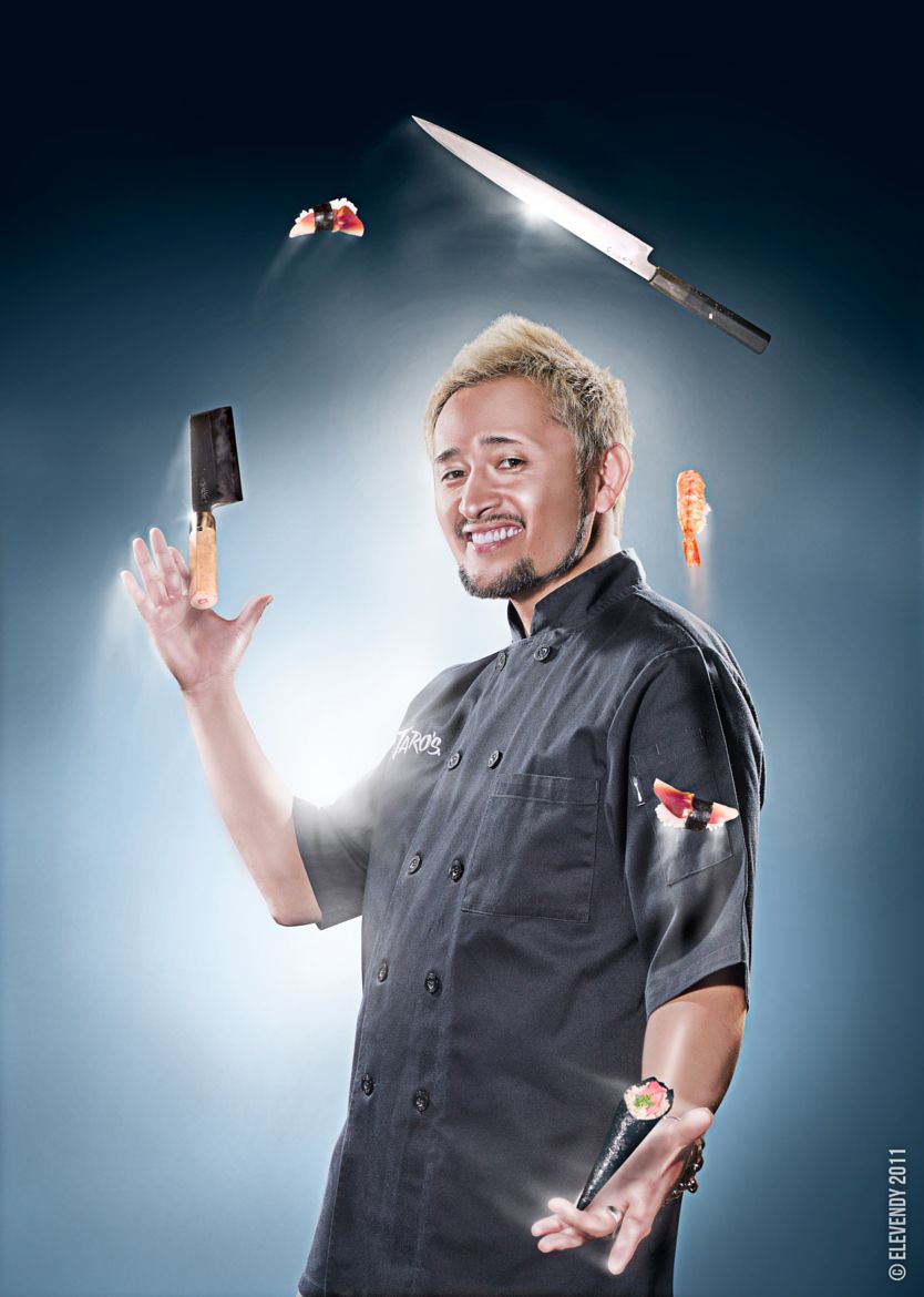
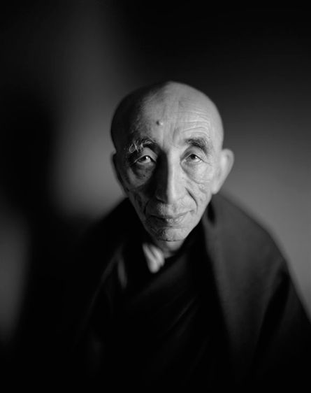
Yousef Karsh portrait, because of the age, his works are all in black and white, but there is a strong contrast between black and white. His choice of background is simple. Few of his models face him. Many of them are side shots or three-quarter views. He used Rembrandt light more than other light. Some of his portrait works show models with gadgets in their hands, which may represent certain information of the models. This method may help the model relax a bit. Because not everyone is very comfortable in front of the camera. For example, the portrait he took of Audrey Hepburn is very representative. First, he used the method of side shot, the main character in the center. Secondly, butterfly light style was used. Hepburn’s eyes were not completely closed, which gave people a mysterious and sexy feeling.

Nadav Kander portrait. His work is basically colored. But he also gives people a black and white feeling, that is his use of light is very strong. First show, he is a very good use of outline light, the portrait of the shadow is formed by light. Secondly, he used to fill shadow on the face and background. The shadow makes it more comfortable. However, some of his works give people the feeling of AI intelligence, which is very futuristic. I don’t know how he used light to achieve this effect, probably retouching. Many of his works are three quarter view. The models seldom look at the camera lens. It seems that there is another important thing that attracts them. The background is very monotonous, giving a sense of intellectual curiosity. For example, his portrait of the current President of the United States is taken by broad light. Trump’s posture is to sit on a chair and then light falls on the side of the visible ear. But the vision of the theme model is very clear, especially the color of the suit and the color of the chair is very oil painting sense. Trump’s face is half bright and half dark, giving a sense of seriousness.

In the following assignment, I think I will let the model try the three-quarter view and side photos. Then the model was asked not to look at the camera and to let other things distract them. Then uses different light color to achieve different result, then pay attention to shadow.

Inspiration of Dawoud bey- daming

After watching Dawoud Bey‘s photographs about Class pictures.  His works give people a very careful description of emotions and young people have different feeling about themselves and give a student a kind of mysterious color. Bey is very good at using body movements and faces to express the emotions of the portrait. His expression is relaxed and natural. The main forms are in the eyes and the overall body sounds. Each portrait has different poses, and different poses convey different messages. I think the most important thing is the hand movements, different hand movements represent different emotions. For example, the first picture of a girl’s hands is against her face. It gives people a very ethereal and clean feeling. He was also very careful about the use of light, he used Butterfly Lighting style to create shadow of the chin and aside. Also use Rembrandt lighting style to create triangle and shadow on the side of face.  His foreground is always the character itself, the background is illusory, but gives a sense of life. Each portrait makes good use of the relationship between foreground and background to express the main subject and other subjects. Most of his framing of portrait is in the center and part of the classroom scene. Let us know he is a student. Models always look at the camera, they all have different expressions and emotions on their faces. I can learn from his works that it is necessary to have a certain amount of time to get to know the model when starting photography. This will make the model relaxed and natural to accept the shooting. Having the models pose in a way that they are comfortable with will allow the photography process to progress quickly.