Monthly Archives: March 2019

Inspiration of Gregory Heisler

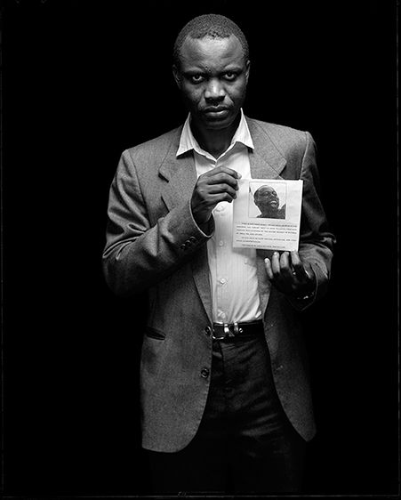
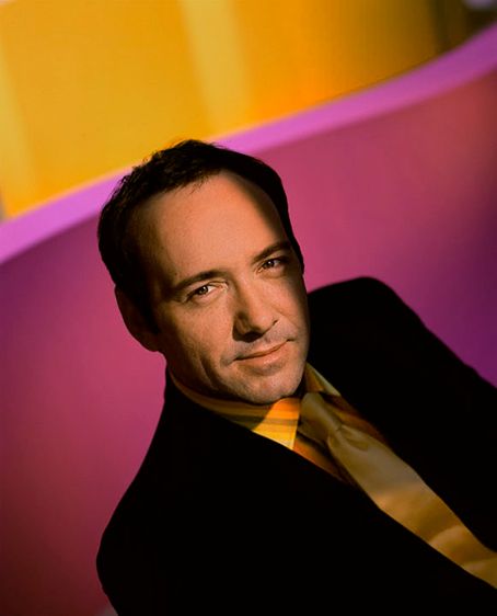
Gregory Heisler is a very talented photographer who believes in that technique can limit creativity. In a video giving advice to photographers, he stated “looking outside yourself for what’s going to spark your career or photo will not help you more than your own mind. Techniques are like gloves anyone can buy them and wear them for different occasions, your vision is like a fingerprint they don’t change. Techniques may actually hide your fingerprint so it doesn’t show as well.” He was saying that all photographers utilize techniques in their work but if you are wrapped up in the technique you use to compose a photo you lose the unique way you would take the photo.  In Heisler’s photography, I notice there are a lot of black and white frames using a wide range of lighting techniques such as split, rim, short, broad and 3- point lighting. His skills also carry over to his color photography, his subjects looking comfortable in the frame as if they weren’t overly instructed to pose a certain way. As a photographer, he has a don’t think too hard, just shoot type of personality about him.  He advises other photographers not to spend time studying the work of their idols and aspiring to be like them. He says ” Don’t think about how someone else would shoot think about how you would shoot then do it”. It means that photographers shouldn’t compose under the constraints of “how would this person/ or that person do it”, the only person you should be comparing your work to is yourself. He also encourages photographers to be resourceful and ready to shoot under any circumstances because there’s always a chance things will not go as planned. It’s possible that professional lighting won’t be available or you won’t have as much time with a subject as you may have anticipated, but you must be prepared to work well under pressure.

Daniel Singh – Assignment Due March 25 (Inspiration: Richard Foster)

I can see why high-end brands such as Tom Ford, Prada, Stella McCartney and Bottega have sought out Richard Foster’s photography services.  He has a keen eye for framing products so that the eye is immediately drawn to them.  The still-life work he has done with fragrance and cosmetics are exceptional.  The refraction effect used on these glass items is lovely. I love the use of this aesthetic, then combined with the shadows casted from an overhead light made for a most successful Charlotte Tilbury ad.  I can easily picture seeing this in a print campaign through fashion magazines. In the Piaget ad, it does  well in using lighting to layer the different textures, and invoke a bit of drama. This is also replicated in the Dalmore alcohol ad, who also features a pop of red for good measure.  Lastly, I appreciate the geometry found in the Tom Ford fragrance ads, which utilize a low camera angle and light manipulation make for a most striking hierarchy.  Richard Foster’s style would make you double take on a still-life of a half empty bottle of Robitussin.  I admire his work. — Did I mention he has short films?

Richard Foster Inspiration (Kelvin Moncion)

Richard Foster used a style of light refraction, and colour, combined with a low angle camera. Foster uses certain angles to catch different geometric shapes in his photographs. For his glass photography he was an expert at catching the different light effects that the glass produced showing the beautiful rainbow effect on the surface.  His photographs are very infomercial-like, looks like something you would find on a television commercial or a magazine. The products which are the subjects are very crisp and you can see every edge and corner of it, there is no extra lighting or effects to the photographs, they are already well done in quality it is quite simple and has a certain aesthetic to it that is eye candy.

Richard Foster_daming_inspiration

Richard Foster style use product light refraction and color, low angle camera. Use light to create geometric shadows and staggered lighting. Use a glass plate to create a reflection. He was a master at using light to create different shapes of color light. The main color is very prominent. Good at using glass products to bring a light reflection and refraction of the different light effects. I think his works are very textural and very commercial. The products themselves are very textured, and the background is to reflect the product itself. There is no extra light or unnecessary things around the products, only simple light and color and his creativity are formed.

Inspiration of Andrew Scrivani


Throughout all of my semesters in photography, I’ve found that I enjoy photographing two main concepts. Portraits and food. I remember the first time I photographed food in my Photography 2 class in the spring, it was one of the best classes we ever had. It seemed like being able to make interesting compositions while eating brought out the human side of all the students in the class. Looking at Andrew Scrivani’s work I am memorized by the attention to detail and composition skills used in the photos. What makes food photography interesting is selling the the viewer the desire to eat or drink whatever your photographing. You’ll know you’ve reached your goal when even you find yourself wanting to eat it too. In the photo above, I was drawn to the feeling of wonder I got from looking at the bubbles of the beverage. It also made me feel a sense of mystery and intrigue because of the shallow depth of field, I was caught between wanting to drink it and wanting to stare at it all day. In Scrivani’s second photo, I’m drawn to the use of color and the complimenting background. The photo feels light and healthy with the background not clashing with the subject but adding to the ambiance. I also find it interesting that I don’t feel the same type of desire that a person might feel when looking at a photo of a Big Mac from McDonald’s or a Whopper from Burger King. Fast food advertising always seem so aggressive and demanding when promoting their items kind of playing on the idea that a consumer might feel less fulfilled by not eating that burger and fries. Scivani’s approach is more calm and inviting building a consumers interest in the food rather than playing on insecurities.


Andrew Scrivani

The first image makes me want whatever it is that’s in the image, It looks amazing when you start noticing the blue berries that are in it, and the glazing on top of it makes it look more appetizing with how shining and fresh it looks. Like if you manage to get your hands on this now the glaze would still be melting in your hands and tasting fresh out the oven. The spoon in the image gives me the feeling that buying it in a store, you will see them pour the glaze on it as you buy it. It makes it feel like a moment that’s in slow motion and you don’t want to look away. You want to see the food finished right before your eyes. The way the camera focuses on the cake and the glaze on the corner really makes you appreciate it.

The background in this image is interesting to me because in most pictures with food they tend to take a picture from above the food to use the table as the background, but its usually in focus with the food but the colors, plates and food gets separated so that nothing gets mixed in with the other and the food is always the main focus. In this image and others that include an angle or a person and more in the background get focused out enough to focus on the food or drinks more. This one is my favorite because the man is being out of focus but his hand that is around the drink is in focus with the drink. It makes it feel like the man is handing me a drink to try at a bar. Its like if i was a customer just focusing my mind on the drink more than the one serving it. Kinda like  being hypnotized.

Inspiration Post: Gregory Heisler

In this photo taken by Gregory Heisler the lighting and the expression goes hand to hand. The way the shadows appear below his eyes really gives a darker and evil look to the subject. The prop is also a nice touch as the subject holds what seems to be happier times and comparing it to who he is now. The expression compliments the subjects evil aspect as the subject is looking straight at the camera with evil intent. Also the fact that the photographer didn’t place the subject in the center of the frame was a nice touch too giving it a unique look by showing alot of darkness next to the subject almost as if he is being engulfed into the darkness. 

Daniel Singh – Assignment Due March 18 (Inspiration: Andrew Scrivani)

I love food. So naturally, this assignment is heavenly. Minus the fact that Andrew Scrivani captures these items of food so deliciously that it is a major disappointment not being on site to taste test.

Looking through his current work, I was immediately drawn to this photo and its regal tones. The colors it features are of royalty: from the gold brim of the plate, to the purple topping shaped to be flower petals, to the plush brown of the cake in question.

Closer inspection reveals the many textures found in this photograph.  The luxuriously smooth marble [counter top], the pronounced wood grain of the toppings bowl, to the crinkle of the wax paper on which the glazed topping lay, and lastly the crushed nuts found sprinkled all through out this frame, well these components all stack to create many edible artifacts for the eye to enjoy long before the sending any signals to the mouth to increase saliva production, or the stomach to ready for digestion.

The arrangement of these items across the frame make things interesting. I can name many items shown in this photo but not once can I say it feels convoluted.  The hierarchy leads from the cake to the wax paper, directed by the serving utensil to the bowl, then lastly the eye wanders to the top of the frame to the secondary bowl and scattered toppings.

The lighting comes from the bottom right of the frame, but is set overhead by the way the shadow cast from 9 o clock to 12 o clock in the frame from the cake and plate that it rests on.  It adds a nice dramatic effect, meanwhile subduing empty space in the frame so you can focus on the delectable things. This photo is very much as success by way of my current stomach rumblings.

Daniel Singh – Assignment Due March 11 (Inspiration: Gregory Heisler)

Enter George Heisler’s website, click portfolios and you are met with an array of categories, or paths if you will, of different ways to digest his work.  I opted for vibrant, and I was not disappointed.

Coincidentally, Alonzo Mourning’s photo that we discussed, then tried to replicate during studio time was in this set.  As I cycled through his works, I was stopped by the portrait of Kevin Spacey.

It was exactly that, Vibrant. Most striking is the lighting followed by the eclectic color palette both worn by Spacey, and then the encompassing background.  The lighting appears to be cast from above [overhead] and slightly behind to the left according to the shadow of the nose and the silhouette of the head cast on the right shoulder.  The lighting frames his forehead, eyes, nose, mouth and chin, for a dramatic effect. Opposed, the ears and the details of the hair are lost as collateral in this drama.  He is wearing a black suit which works as silhouette in the shadows, but brightness of his innards [shirt and tie] contrast lovely against the magenta in the background.  The bright mustard color found on his apparel is almost exactly replicated at the top of the frame, adding another layer of cohesiveness to the portrait. Wether this was intended or not, it is successful, and his gazing eyes through the camera and subtle smirk capture the feel good energy of this shot.


Inspiration_Andrew Scrivani_daming

His works are very color composition and food placement and followed using lighting. A lot of it is light and shadow from left to right. Not much exposure. Many of them are close up food photographs, often with the angles from top to bottom and backgrounds blurred. For example, this picture of food looks very delicious. First, the light from left to right turns to dark light. Second, yellow and red, two very strong colors, are matched with a dark gray background. The yellow yolk and the red tomato stand out. Secondly, he photographed the yolk as the juice, which I think is very important in food photography. The background is a blurry close-up of a fork in the foreground. The elevation of the front gives three levels of view.

I think the photo really highlights the interesting background. First, from the point of view of shooting, two different staggered background gray and white collocation. It’s important to be very textured. On a dark background, place the bowl at the intersection of the background colors. Although give a person a kind of very straggly sense. but the color matching and placement is very comfortable.