Author Archives: Daniel Singh

Daniel Singh – Assignment (Final Inspiration: Annabelle Breakey)

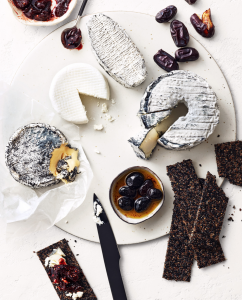
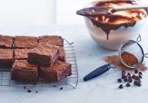
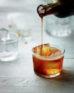
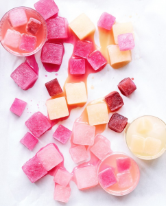
Fittingly, my final inspiration drives my perspective leading into my final project.  I will be shooting freshly made juices, some packaged, some being poured, or still, surrounded by the very ingredients that it is composed of arranged artistically.  One of the absolute best photographers, Annabelle Breakey, comes to mind.  I have especially been drawn to her natural light food, and beverages collections.  I love her use of contrasting textures, arrangements, and color palettes used in her composition.  She is obviously very thoughtful approaching these shots.  The results are delicious through the screen.  She is very masterful with her manipulation of light, in many of the beverage shots she was able to capture sheen on the ice cubes floating near the top of each drink free of any glare on the glass cup/container.  I hope to replicate some of this magic with my own twist.


Daniel Singh – Assignment (Final Project Proposal)

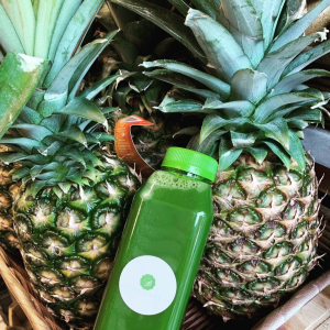
I’ve been really inspired by the work we have done this semester alongside Start Small, Think Big.  With my portfolio in mind, a chord was struck, I want to help the smaller “mom and pop” brands develop their voice, their brand, in this convoluted corporate dominant society.  I’ve reached out to a friend whom recently started a health conscious juicing business named Dvine Greens.  I look to help her capture high resolution photos that she would otherwise not be able to stage for her website, while I get to make my tuition dollars meaningful to someone other than myself.

This market although niche is directly tied to fitness and wellness.  Her most popular offering being the three-day juice cleanse.  As her business grows, I’d like to provide polished photos to match the integrity of these drinks, and their fresh essence.

I’ve provided some of her existing shots, then some that are inspired by food and beverage photographer, Annabelle Breakey.


Daniel Singh – Assignment (Inspiration: Julia Sent)

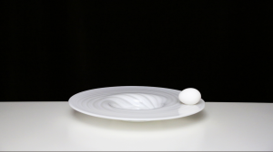
Still life paintings are those of staged inanimate objects that might include fruits, flowers, textiles, etc.  Julia Sent’s spin on this is interesting because she creates a completely darkened or empty background that compels the eye towards the subject and accompanying ceramic platforms.  High contrast, yet very simple.  In the this photo, I am drawn by the sense of motion from the placement of the grapes.  The ceramic cup appears to have tipped over, sending the grapes in different directions.  The most notable is the cluster of grapes that dangles at the edge of the table.  The frame is lit mainly from the 3/4 angle, and the grapes look delectable because of this.  It also does a great job of showcasing the wood grain in the areas most immediately surrounding the fruit, but allowing it to blend in to the dark background as you move further away.  Lastly, I appreciate her use of leading lines by placing the cup and its fruit on the convergence lines of the table, which guide the eye to this portion of the frame, and offer perspective.  Although a simplistic photograph, arrangement and composition strengthen its interest.  Bonus photo added just because it reminded me of the exercise during class. Also high contrast and very effective execution.


BONUS::

Daniel Singh – Assignment (Inspiration: Tim Wallace)

Tim Wallace is a world class photographer perhaps best known for his captures of transportation mediums.  He brings personality to these inanimate objects by gathering a deeper understanding of their design process, and the purpose they serve.  Ultimately, this helps him decide how best to convey it’s message. I appreciate his attention to detail, especially the shots whose focus is on individual components of automobiles.  His choice of composition excels from the use of depth of field, tight cropping, various lighting techniques. For example, the first photo uses leading lines of the structure to point focus to the Aston Martin.  It is lit from above, the evidence being in the shadow of the pronounced body line that runs across the mid-line from rear quarter panel, through the door, into the front quarter panel.  There are many textures in this frame as well, from the clouds, to the tiled structure, the smooth body lines of the vehicle, and the grain of the gravel. The tight crop works well for the second photo as it shows the center most portion of the wheel, the matte black texture, the metallic of the red brake caliper, and the sheen of the cross-drilled rotor all working in harmoniously around the gold Porsche emblem. I love the mystery that is cast in the third photo, the subtle lighting helps to entice the eye.  If you are unfamiliar with the brand, McLaren, this entices you to want to see more, the car in its entire.

Daniel Singh – Assignment Due March 25 (Inspiration: Richard Foster)

I can see why high-end brands such as Tom Ford, Prada, Stella McCartney and Bottega have sought out Richard Foster’s photography services.  He has a keen eye for framing products so that the eye is immediately drawn to them.  The still-life work he has done with fragrance and cosmetics are exceptional.  The refraction effect used on these glass items is lovely. I love the use of this aesthetic, then combined with the shadows casted from an overhead light made for a most successful Charlotte Tilbury ad.  I can easily picture seeing this in a print campaign through fashion magazines. In the Piaget ad, it does  well in using lighting to layer the different textures, and invoke a bit of drama. This is also replicated in the Dalmore alcohol ad, who also features a pop of red for good measure.  Lastly, I appreciate the geometry found in the Tom Ford fragrance ads, which utilize a low camera angle and light manipulation make for a most striking hierarchy.  Richard Foster’s style would make you double take on a still-life of a half empty bottle of Robitussin.  I admire his work. — Did I mention he has short films?

Daniel Singh – Assignment Due March 18 (Inspiration: Andrew Scrivani)

I love food. So naturally, this assignment is heavenly. Minus the fact that Andrew Scrivani captures these items of food so deliciously that it is a major disappointment not being on site to taste test.

Looking through his current work, I was immediately drawn to this photo and its regal tones. The colors it features are of royalty: from the gold brim of the plate, to the purple topping shaped to be flower petals, to the plush brown of the cake in question.

Closer inspection reveals the many textures found in this photograph.  The luxuriously smooth marble [counter top], the pronounced wood grain of the toppings bowl, to the crinkle of the wax paper on which the glazed topping lay, and lastly the crushed nuts found sprinkled all through out this frame, well these components all stack to create many edible artifacts for the eye to enjoy long before the sending any signals to the mouth to increase saliva production, or the stomach to ready for digestion.

The arrangement of these items across the frame make things interesting. I can name many items shown in this photo but not once can I say it feels convoluted.  The hierarchy leads from the cake to the wax paper, directed by the serving utensil to the bowl, then lastly the eye wanders to the top of the frame to the secondary bowl and scattered toppings.

The lighting comes from the bottom right of the frame, but is set overhead by the way the shadow cast from 9 o clock to 12 o clock in the frame from the cake and plate that it rests on.  It adds a nice dramatic effect, meanwhile subduing empty space in the frame so you can focus on the delectable things. This photo is very much as success by way of my current stomach rumblings.

Daniel Singh – Assignment Due March 11 (Inspiration: Gregory Heisler)

Enter George Heisler’s website, click portfolios and you are met with an array of categories, or paths if you will, of different ways to digest his work.  I opted for vibrant, and I was not disappointed.

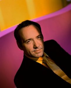
Coincidentally, Alonzo Mourning’s photo that we discussed, then tried to replicate during studio time was in this set.  As I cycled through his works, I was stopped by the portrait of Kevin Spacey.

It was exactly that, Vibrant. Most striking is the lighting followed by the eclectic color palette both worn by Spacey, and then the encompassing background.  The lighting appears to be cast from above [overhead] and slightly behind to the left according to the shadow of the nose and the silhouette of the head cast on the right shoulder.  The lighting frames his forehead, eyes, nose, mouth and chin, for a dramatic effect. Opposed, the ears and the details of the hair are lost as collateral in this drama.  He is wearing a black suit which works as silhouette in the shadows, but brightness of his innards [shirt and tie] contrast lovely against the magenta in the background.  The bright mustard color found on his apparel is almost exactly replicated at the top of the frame, adding another layer of cohesiveness to the portrait. Wether this was intended or not, it is successful, and his gazing eyes through the camera and subtle smirk capture the feel good energy of this shot.


Daniel Singh – Assignment Due Feb 25 (Inspiration: Annie Leibowitz, Awol Erizku)

Demi Moore’s photograph was shot by Annie Leibowitz, a decorated photographer who most recently has taught a lesson on masterclass platform.  This photograph was taken for Vanity Fair, headlining their cover of the August issue, 1991.  It was a cultural shock for a repressed society who some viewed the pregnant female body as obscene or repulsive, much less having it grace the cover of a leading publication bare.

Demi’s body is turned to her right, but her face is captured in a three quarter view. I suspect broad lighting is used here by way of the larger area of her face being lit with the shadows sitting on her right eye, cheekbone and chin.  The background is flat and free of distraction, allowing you to focus on Demi.  Demi is standing, and has created a “hand bra” or used her arms to simultaneously cover her breast and embrace her belly.  This frames the focal point of the photo.

Beyonce photo was captured by Awol Erizku. It’s intended purpose was her public pregnancy announcement across social media.  Culturally, it was embraced and celebrated as it (at the time) went on to be the most “liked” photo of 2017. Times have changed.

Beyonce’s body is also turned to her right, but she is kneeling.  Her face is slightly off-center but not enough to qualify as three quarters. The photo is well lit, I am going to assume a butterfly and a hair light might be in use.  The veil makes it difficult to determine because of the appearance of minimal shadow, which I only see on her neck.  Her hands are placed more closely together, encasing her “bump”.  She is visibly earlier in her pregnancy than Demi.  The colors of this photograph are rich and vivid, from the blue sky, eclectic flower arrangements (which frame Beyonce as the focal point), to the green hue of the veil, and baby blue fringe of her bottoms.  This all helps to add texture, layers, and a depth to this photo.

Daniel Singh – Assignment Due Feb 11 (Inspiration: Yousef Karsh, Nadav Kander)

Enter the work of Nadav Kander.  I love the personality of the subject being infused throughout the portraits in the Solitary series.  Each is very telling to their attitude at time of the photograph and offers a glimpse at their personality.  I believe many of these photos, not all, follow a constructionist approach.  In such that they use body language to build a conveyed emotion and develop atmosphere.  There are so many to choose from here but I will focus on the Yorgos Lanthimos I portrait.  The contrast from his blackened silhouette to the white background is stark, but almost evokes the feel of a missing persons poster. That is until the slither of light that enters the frame, cuts directly across his face to reveal a single eye gazing at you. Mystery, suspense, and drama all immediately come to mind.  I would definitely like to replicate the use of a single “slithering” light in our portraits during lab.

Yousef Karsh has worked with some very polarizing figures.  After viewing the samples in his gallery, one could say his calling card aesthetic is that of black and white portraiture.  I elect to speak on the Ernest Hemmingway portrait.  I love the level of contrast all throughout this photograph. The striations in his hair, his forehead wrinkles, the fluff of his sweater, and heft of his beard, each adds another layer of texture to this photograph. These are definitely brought to light (pun intended) by the use of at least a key, and fill (light) to create then brighten the shadows. His body is positioned straight forward but his head turns slightly, yet not enough to re-create a three-quarters view.

Daniel Singh – Assignment Due Feb 4 (Inspiration: Dawoud Bey)

Dawoud Bey’s portrait series, Class Pictures, gives insight to his unique style.  The online preview gallery at the Milwaukee Art Museum displays six photographs of various children in classroom environments.  For instance, only two of the subjects, Antoine and Kevin, interact physically with something other than a desk in the background.  Each subject lay in the foreground, with their attention directed straight forward to the camera. Usha, Omar and Kevin eyes are especially piercing.  All are centered in their respective frames, each with qualifying traits that are unique to them. I believe Bey did this purposely, as to give character to each portrait long before a caption was available. Shalanta’s decorative shirt, and long designer nails, and tightly pressed smirk draw the eye in, while Kevin’s zip up shirt reads “FCUK” which at quick glance can be easily confused for profanity, his hat is turned off center, and his body leaned in, as to ask “Is there a problem?”.  Omar’s crossed arm stance on his desk, complete with blank stare let’s us wonder if this is a defense mechanism and why, while Antoine’s crossed arm stance, seated with his head tilted, and body leveraging the wall paint a submissive picture with eyes that look as if they are shielding pain but welcoming someone to ask why.  The lighting is concise in each portrait, natural light is present by way of the windows in Lauren, Usha, and Omar’s portrait but I suspect the presence of a key and fill light by way of the triangle above the cheek of the shadows in Shalanta’s, and Kevin’s portraits.  I would characterize Bey’s portrait style as traditional, but with this series, unconventional subjects.