Category Archives: Inspiration

Inspiration Paulette Tavormina

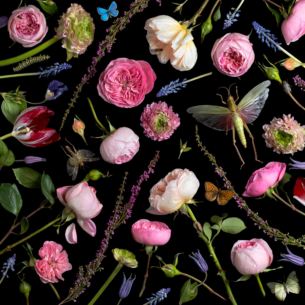
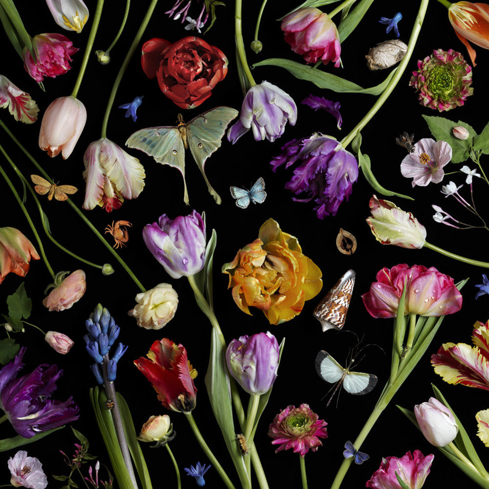
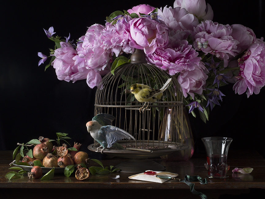
Paulette Tavormina uses still life to inspire her because the way she takes her pictures mostly the frame is cover up with flowers and bugs. But it isn’t clutter, but more filled in with shapes that flowers or bugs make. In a way it’s best describle to be like a jigsaw puzzle. She uses everything to fit in perfectly. I saw like the different colors from each flowers because it’s be to be pop out more because she uses a black background. I also like how picture are able to create this movement but using the stems of the plants or flowers just to make your eye wonder all over the place so wouldn’t focus on one thing. I also like the different sizes of the flowers and bugs. Just to fill in on some of the empty spaces. But also it makes it seem to be more random and more lifely. That’s one of her styles she does. The other ones are mostly like paints are something on the table. In this one she has flowers and bird cage fruits next to the bird cage in this picture can tell that there is two lights one from the left because mostly everything on the left is very lit up. and one in the right because the glass reflection . But the way that it picture is taken I think that left lights are very close. Compare to the right to side where pictures is much darker. But I think that light is much further back.But I think these types of still life is very nature  just because we have flowers,bugs,fruits, and animals in her photos. But mostly enjoy her work with the flowers filling up the whole frame of the photo.

Inspiration Gregory Heisler

In Gregory Heisler photographer we can see that most of his photos are in black and white. The usage of light are two lights. We have the main light and the over the top light. Can tell by the way the face us light up. And the subjects eyes, we can see by the refection from the eyes. And th light is going directly forward. The second light is over the top light because you can see in the picture that top of the helmet is brighter than the face. I also like how the person is able to give a smile making the picture to not be so serious. Is makes the person to be welcoming. Like this person seem hes’ friendly. I also like the way the person has a weird pose, but seems to be working because it makes him to be a very relax person because of his shoulder is leaning to one side. Also can tell that Heisler wants us to look at this person and focus on him, because the background of this picture is blurry. The man he is very clear and sharp, but the background is blurry and out of focus. Like we’re not suppose to pay attention to it. Also this picture shows the personality of the man. We can tell that he is a construction worker by the way he is dressed. You can tell that he a much older man because he as bread going. But the man smile tells us all that he enjoys he’s job. Because it isn’t force, but it has a naturnal feel. And being a construction worker is very difficult, and hard, and dangerous. But looking at this picture it looks like he really enjoys what he does and he doesn’t regret it or he doesn’t mind the working conditions

Inspiration Andrew Scrivani

So the two picture I picked from Andrew Scrivani is the apple pie and the radishes. The reason why picked the apple pie because It looks delicious and they  picture looks well balance in colors nothing is over powering with the apple pie. I like the red cloth is red and white. Yet that red isn’t very strong. I like how the photographer made the choice to cut one of the pieces out. I even like pie is placed even the silce that is next to it. But it’s not over taking the bigger pie. Also for the image that looks interesting I picked the radishes with it’s dull wooden background and the reason for that is to make radishes to pop out more. In this picture there is only light source. This could be the main light or natural light. The wooden background makes the picture to be more natural just because the brown has a much darker shade.

Inspiration Tim Wallace

The reason why I picked this picture to talk about is the way the car is taken. Tim said in his video “You want it to have a tone or mood” meaning you a person who is looking or wanting to buy a car to feel something. The way to capture that mood is by working with the lights. Just like in this picture. The car is the brightest thing in picture because that’s what the photographer wants us to focus on because everything is dark. The lamp is giving this illusion that its lighting the whole car. What makes this picture successful is the idea that car is waiting you for you, because it at the bottom of street. Also this street is very narrow so the direction is going in one way. To me it feels of getting a reaward or if I keep going on this path I might get this great car. This pictures tone or mood is excited, hopeful just way the car is parked, the loaction, the way it’s shot and of course the lighting. Now Tim tries different angles in both his lighting and the camera. It’s important to take high-end car photography just to bring mood from the picture. You don’t want the car to be stale or boring. Also keep in mind about the background of the car. Like in this picture I know there is light behind the car to light up the building so it can be lit up in picture. So the surrounds you have to keep in mind with that. Just like this in photos where the building is framing the car. Also keep in angles of the when shooting to keep the photos interesting.

Inspiration_daming

Julia Sent. This style of work is overall dark, with dark tones and a dark background that sets off bright objects. Very interesting color matching and irregular object placement. Always have a base for food to place. Not a bright hat, book or cloth to make food or flowers more prominent. Different styles of food or objects make the still life more interesting, and more often the photographer’s own creativity and use of light. In this style she uses a less bright light or a dark background. The foreground, medium and background have different brightness and darkness differences. For example, this crab leg is matched with a silver cup and a dark cloth. The crab script has a certain degree of brightness, but it is not that bright, it has a kind of oil-like brightness.

Tim Wallace_INSPIRATION

Tim Wallace a car photography, his works as whole are very commercial and textured, with a lot of texture processing and a sense of technology feel. Its pretty cool whether he dealing with light or shadow. I like this picture very much. First of all it contains many details. Such as the use of street light and headlight of the car, which bring the light from the left side to the dark side of the light.it make good use of the reflection of the door.  Also it had cool way to get some motion blur.

Manchester Commercial Photographer Tim Wallace. Commercial photography, car, automotive, aviation, truck, engineering and parts photography

Richard Foster_daming_inspiration

Richard Foster style use product light refraction and color, low angle camera. Use light to create geometric shadows and staggered lighting. Use a glass plate to create a reflection. He was a master at using light to create different shapes of color light. The main color is very prominent. Good at using glass products to bring a light reflection and refraction of the different light effects. I think his works are very textural and very commercial. The products themselves are very textured, and the background is to reflect the product itself. There is no extra light or unnecessary things around the products, only simple light and color and his creativity are formed.

Inspiration_Andrew Scrivani_daming

His works are very color composition and food placement and followed using lighting. A lot of it is light and shadow from left to right. Not much exposure. Many of them are close up food photographs, often with the angles from top to bottom and backgrounds blurred. For example, this picture of food looks very delicious. First, the light from left to right turns to dark light. Second, yellow and red, two very strong colors, are matched with a dark gray background. The yellow yolk and the red tomato stand out. Secondly, he photographed the yolk as the juice, which I think is very important in food photography. The background is a blurry close-up of a fork in the foreground. The elevation of the front gives three levels of view.

I think the photo really highlights the interesting background. First, from the point of view of shooting, two different staggered background gray and white collocation. It’s important to be very textured. On a dark background, place the bowl at the intersection of the background colors. Although give a person a kind of very straggly sense. but the color matching and placement is very comfortable.  

daming_GREGORYHEISLER_inspiration

GREGORY HEISLER, After I watch his works, I felt a sense of shock. First, he was very careful in choosing models. The subjects he chose were all portraits, including full-length, half-length and partial portraits. I think he is very good at guiding the model to make different eyes expressions. This kind of expression and the black and white contrast of the photograph, the eyes bring very dramatic styles. I like the picture of the old man very much. First, I noticed that most of his light came from the upper right corner. It gives a very weird feeling, which may be related to the characters themselves. Secondly, he asked the model to put her head forward, so we can see that the clothes and ears of the characters are all blurred. More focus on his face. He used Rembrandt light. The most important thing is to give people a sense of film photos, very simple. The last thing I like most is probably the character’s eyelids forming a triangle and the look up movement. This leads to this weird and different portrait. Most of his works give me the impression that the eyes are equal to a person, and basically the work itself relates to the eyes. So, I think he is a very strong and guide the model how to make these movements and eyes.

daming_Inspiration_Feb 25th.

Demi Moore’s pregnancy photo by Annie Leibovitz in 1991 it was a very bold attempt. Because at that time, not many people had the courage to try and face the evaluation of entertainment media or the public is very cruel and polarized. Speaking of photos, the overall style is broad light. The figure’s face is a three quarter view. Light hits her right side. Her jaw is a little raised. The highlight is on her right forehead. There is a distinct shadow in the clavicle. The photographer may have added fill light in front of her. The background is grey to reflect the main character. The photographer has used the rule of thirds approach to composition, which has produced an eye that is very appealing. She covered her private parts with both hands. Overall it’s a very attractive maternity photo and a very bold attempt.

Beyonce’s pregnancy photo by Awol Erizku in 2017 This picture is very impressive to me. My sister was pregnant when she was pregnant, so I wanted to take a picture of my sister with pregnancy. This photo gives me a sense that photography could have gone in this direction (I didn’t think this style before) . This photo has less privacy than Demi’s. She wears something that covers her private parts. Speaking of this photo, it may not have been very skillful. More is the preliminary arrangement and the topic of the characters themselves. The background is a kind of blue sky feeling, the middle is a wreath, the foreground is the character itself. Although the overall picture is very rich in color, but the overall brightness of my feeling, may be the light green gauze cap gave me this feeling. In fact, the head of the figure has a little quarter view. The main light is on the left side. Because you can clearly see the difference between the wreath on the left and the wreath on the right. In general, there’s nothing interesting about this photo for me, probably just because she’s Beyonce.

What may surprise me more is Demi’s maternity photo. Because at that time, this style was very bold and dangerous.