Monthly Archives: April 2019

Daniel Singh – Assignment (Final Project Proposal)

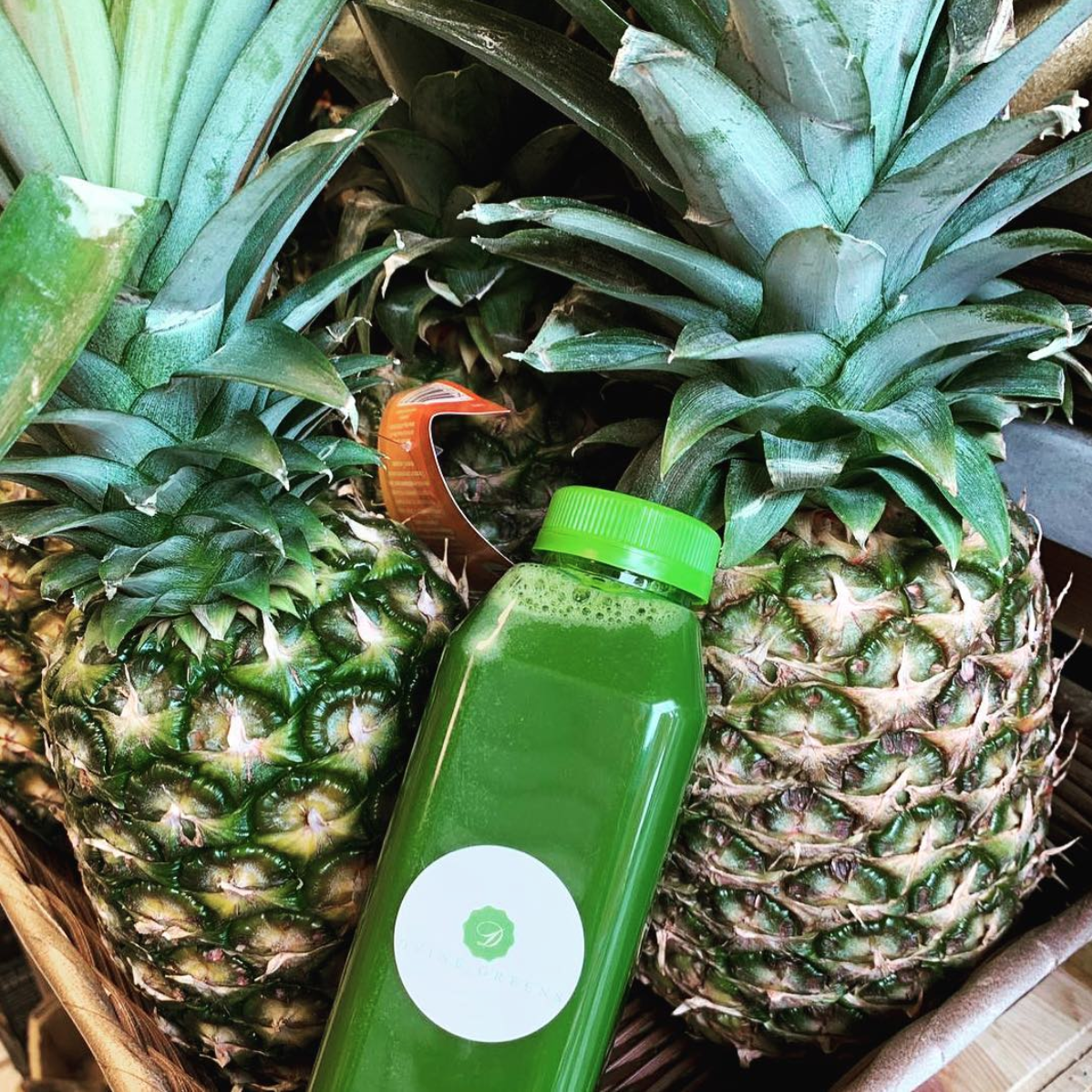
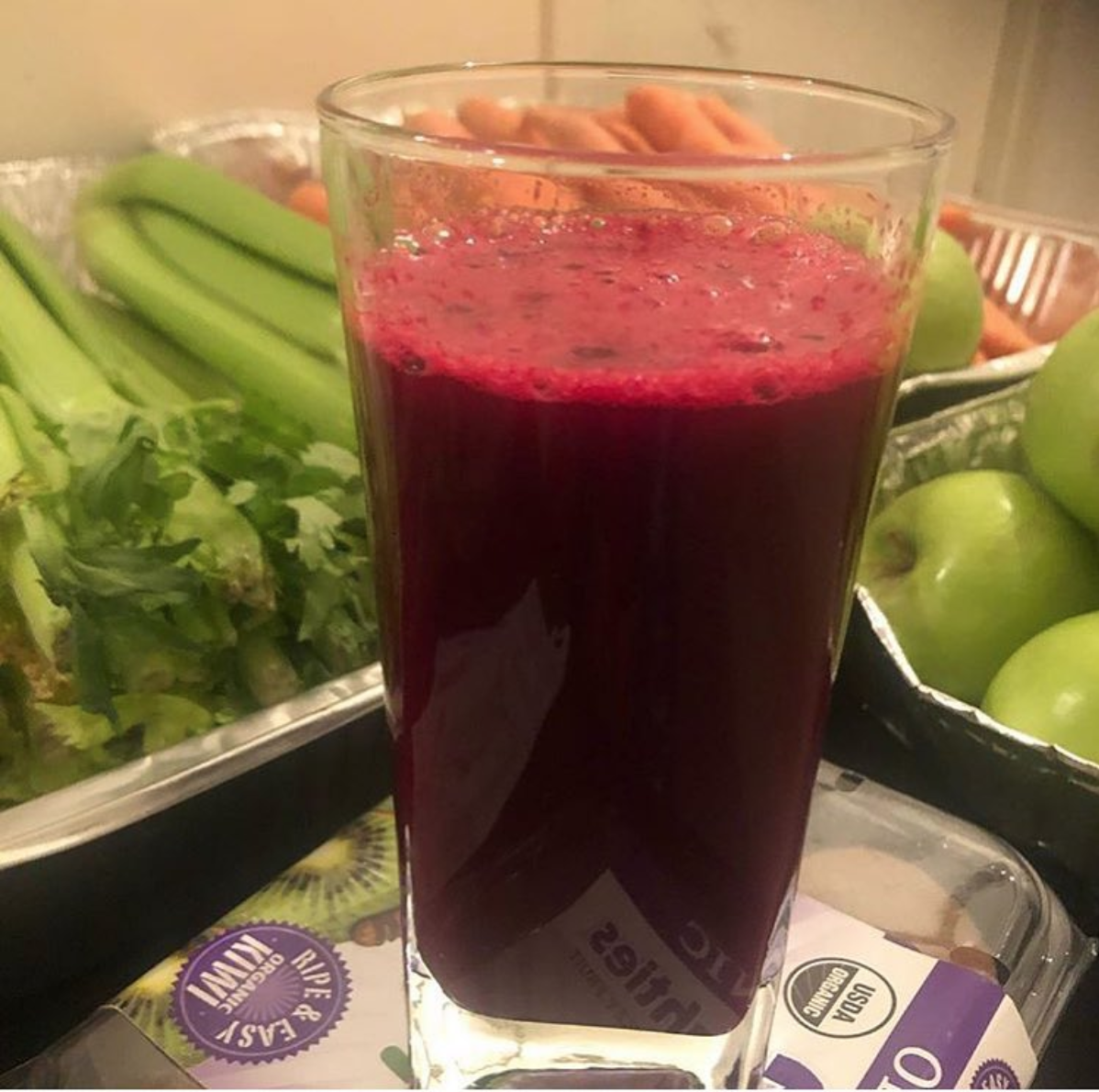
I’ve been really inspired by the work we have done this semester alongside Start Small, Think Big.  With my portfolio in mind, a chord was struck, I want to help the smaller “mom and pop” brands develop their voice, their brand, in this convoluted corporate dominant society.  I’ve reached out to a friend whom recently started a health conscious juicing business named Dvine Greens.  I look to help her capture high resolution photos that she would otherwise not be able to stage for her website, while I get to make my tuition dollars meaningful to someone other than myself.

This market although niche is directly tied to fitness and wellness.  Her most popular offering being the three-day juice cleanse.  As her business grows, I’d like to provide polished photos to match the integrity of these drinks, and their fresh essence.

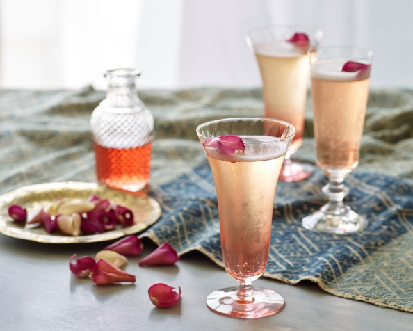
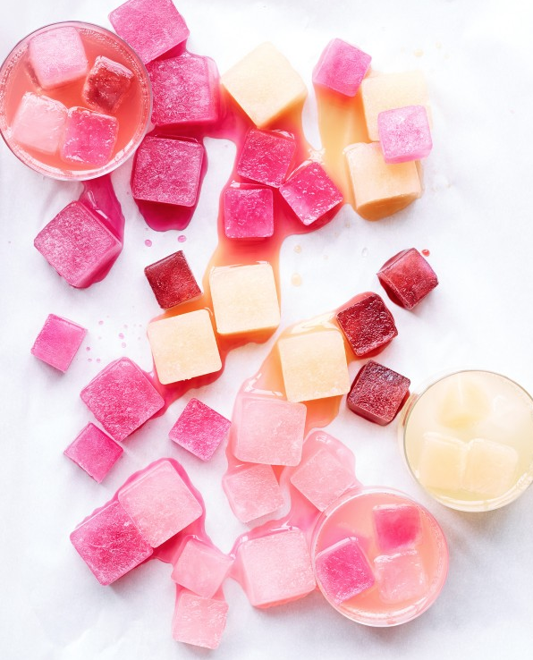
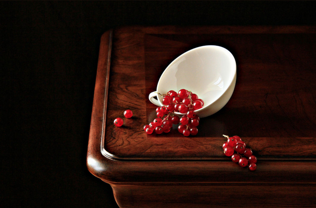
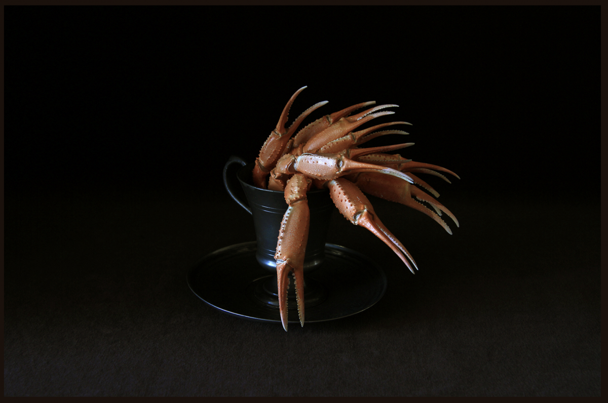
I’ve provided some of her existing shots, then some that are inspired by food and beverage photographer, Annabelle Breakey.


final project.

My final project should be to help my cousin take a photo of his job relate. He is a sushi chef. So I want to help him shoot a portrait and products. which is divided into two days. May 13th was only time his is free, so that day I help him shoot some portraits about his identity. On May 15th I am going to shoot sushi products.

The main audience is commercial for restaurant. I choose this theme because i saw a video about photography is like sushi by Ralph Gibson from The Art of Photography. (https://www.youtube.com/watch?v=kXaLeP7pD_M)

I am still searching for more commercial portraits of chefs and sushi products.

Sushi pieces placed between chopsticks, separated on black background. Popular sushi food.


Daniel Singh – Assignment (Inspiration: Julia Sent)

Still life paintings are those of staged inanimate objects that might include fruits, flowers, textiles, etc.  Julia Sent’s spin on this is interesting because she creates a completely darkened or empty background that compels the eye towards the subject and accompanying ceramic platforms.  High contrast, yet very simple.  In the this photo, I am drawn by the sense of motion from the placement of the grapes.  The ceramic cup appears to have tipped over, sending the grapes in different directions.  The most notable is the cluster of grapes that dangles at the edge of the table.  The frame is lit mainly from the 3/4 angle, and the grapes look delectable because of this.  It also does a great job of showcasing the wood grain in the areas most immediately surrounding the fruit, but allowing it to blend in to the dark background as you move further away.  Lastly, I appreciate her use of leading lines by placing the cup and its fruit on the convergence lines of the table, which guide the eye to this portion of the frame, and offer perspective.  Although a simplistic photograph, arrangement and composition strengthen its interest.  Bonus photo added just because it reminded me of the exercise during class. Also high contrast and very effective execution.


BONUS::

Daniel Singh – Assignment (Inspiration: Tim Wallace)

Tim Wallace is a world class photographer perhaps best known for his captures of transportation mediums.  He brings personality to these inanimate objects by gathering a deeper understanding of their design process, and the purpose they serve.  Ultimately, this helps him decide how best to convey it’s message. I appreciate his attention to detail, especially the shots whose focus is on individual components of automobiles.  His choice of composition excels from the use of depth of field, tight cropping, various lighting techniques. For example, the first photo uses leading lines of the structure to point focus to the Aston Martin.  It is lit from above, the evidence being in the shadow of the pronounced body line that runs across the mid-line from rear quarter panel, through the door, into the front quarter panel.  There are many textures in this frame as well, from the clouds, to the tiled structure, the smooth body lines of the vehicle, and the grain of the gravel. The tight crop works well for the second photo as it shows the center most portion of the wheel, the matte black texture, the metallic of the red brake caliper, and the sheen of the cross-drilled rotor all working in harmoniously around the gold Porsche emblem. I love the mystery that is cast in the third photo, the subtle lighting helps to entice the eye.  If you are unfamiliar with the brand, McLaren, this entices you to want to see more, the car in its entire.

Inspiration of Tim Wallace


Tim Wallace is a internationally recognized corporate and commercial photographer based out of the UK, and often described as conceptual and dramatic. His works with a wide range of industries such as automotive, truck and logistics, aviation, marine, engineering, and freight operations. His clients include McLaren, Peugeot, Jaguar, Land Rover and many other iconic brands. Looking at his work, I am amazed by the sense of wonder he creates with conceptual photographs, showing just enough of a subject to draw the viewer’s eye. In the examples above, I notice that he utilizes show depth of field and light/shadow to create a mysterious yet elegant and whimsical feeling persuading the viewer to want to know more about the scene. In the first photo, I notice that there is a cast of purple color on object and the image is tightly cropped conveying the idea that there is more to see. In the second image, there is a lot of shadow created by a dim over head light making it more mature and serious, the netting and pattern is more textured and defined like you want to reach out and touch it. This image is also cropped tightly leaving a sense that the object goes on beyond what you can see. It gives the feeling that the brand is powerful, elegant and refined. Tim Wallace is beyond talented in this field whether he is capturing the concept of a subject or creating movement using shallow depth of field and dramatic backgrounds.


Final Project Proposal

My concept for my final Advanced photography photo shoot was inspired by the challenges my friends, family and I faced during this past year. Basically, we are all in our early 20’s juggling work, school and a variety of other issues that can become physically, emotionally and psychologically draining on a person’s well being. Speaking for myself and what I’ve experienced from others these various challenges can take us to very dark and negative spaces in our minds, so I want to do a portrait shoot depicting that. I want the shoot to be transitional going from a depressed, stressed, overwhelming and dark feeling to something more hopeful and positive like finding light at the end of the tunnel. My subjects will include myself and four other people (family members, friends, spouse). My audience is young people like us who are also going through some of the most difficult times in our lives trying to be successful and live well but at the same time feeling like we’re running out of time. We fall into pits of depression so deep we often become our own worst enemies doubting ourselves and our abilities thinking we’ll never reach the finish line. I want to see this all narrated by the text from Langston Hughes’ poem Harlem. In the dark scenes, I want to see my subjects in a lot of shadow like partial silhouette in the more positive scenes I want a more hopeful light setting. In the dark settings, my subjects will be wearing dark clothes to add to the mood, in the more positive settings they will be wearing clothing and props that depict what their future aspirations or dreams are. All of this will be back lit in the color red because it represents a feeling of pain and anguish but also passion and strength. This idea can also be explored in a still life by photographing objects representing negative behavior like alcohol, drugs, razor blades and objects representing a person’s aspirations like books, art work, cameras, etc.  My inspirations for concept and lighting are works from Gregory Heisler, Nick Fancher and Jordan Peele’s poster art for his recent horror film “Us.

Lighting


Concept

Inspiration_daming

Julia Sent. This style of work is overall dark, with dark tones and a dark background that sets off bright objects. Very interesting color matching and irregular object placement. Always have a base for food to place. Not a bright hat, book or cloth to make food or flowers more prominent. Different styles of food or objects make the still life more interesting, and more often the photographer’s own creativity and use of light. In this style she uses a less bright light or a dark background. The foreground, medium and background have different brightness and darkness differences. For example, this crab leg is matched with a silver cup and a dark cloth. The crab script has a certain degree of brightness, but it is not that bright, it has a kind of oil-like brightness.

Inspiration of Richard Foster


Richard Foster is one of the most talented specialists in still life photography, working with various big clients like Prada, Adidas, and Vogue Magazine just to name a few. Looking at his work, I notice that Foster uses lighting, color and other elements to make his images more dynamic and eye-catching to the audience adding to the brand’s presence. In the examples above, Foster is using a colored back light forming a diagonal shape behind the items making the product a more powerful and life like feel. He’s careful to use color that doesn’t draw attention away from the object while keeping the light at an angle that doesn’t produce a harsh glare into the camera. He also uses rim light and probably fill or main light to bring out features and shadows of the glass, this helps add a sense of personality or emotion to the item. When I first saw the photos I thought about the emotion and the audience it would apply to. Being that the first image is a bottle of whiskey it already signaled to me that this was for an older crowd. Then considering the lighting the image felt kind of mysterious and rugged but classic at the same time because of the mature and clean design of the bottle. In the second example, the name brand Prada already signals a luxury item but the strong diagonal of hot pink light gave off a powerful, confident personality that would make someone stand out from the crowd. It honestly made me feel like purchasing the item myself because those are the same ideas I would want to present to the world about my own personality. Richard Foster stands out from the crowd because he gives the subject of his photography a personality even though its an object, after achieving that the image comes to life on its own.

Richard Fosters Campaign

As I looked through all of Richards Fosters images of these different fragrance companies. I realized that he wasn’t just trying to sell the product it self but the bottles as well by using the bottles shapes, transparency and colors to his advantages. With the Stella McCartney bottle he used the bottles purple and black and clear to create both a shadow and refraction of the light on the clear and colored part of the bottle. Which he also did with one of the Tom Fords blue bottles. He used something that looks like a square light above the bottle at an angle while placing the bottle on the edge of a white table which did similar results but the difference here is he using the shadows to create solid geometric shapes out of the shape of the bottle.

Now in the Bottega Campaign with all three bottles he uses the bottles shapes to create both hard and soft shadows shapes with a background that matches the with the color of the fragrance bottles as well.

Richard Foster is a sought after still life photographer because he uses the bottles, glass, liquid, and transparency to its fullest potential and doesn’t waste time showing that through his campaigns. He wants to show off everything that the product has and not just the fact that its a fragrance in a bottle but that the bottle its self is a beautiful item to have and keep. Its a way to catch someones eye instead of someones interest in the smell. Before getting someone to smell and want a perfume/cologne the bottle must catch the eyes of its consumers to get them to look in its directions for it to be noticed.

Tim Wallace_INSPIRATION

Tim Wallace a car photography, his works as whole are very commercial and textured, with a lot of texture processing and a sense of technology feel. Its pretty cool whether he dealing with light or shadow. I like this picture very much. First of all it contains many details. Such as the use of street light and headlight of the car, which bring the light from the left side to the dark side of the light.it make good use of the reflection of the door.  Also it had cool way to get some motion blur.

Manchester Commercial Photographer Tim Wallace. Commercial photography, car, automotive, aviation, truck, engineering and parts photography