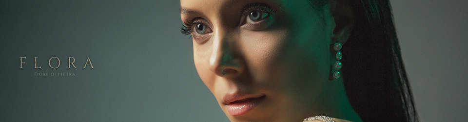
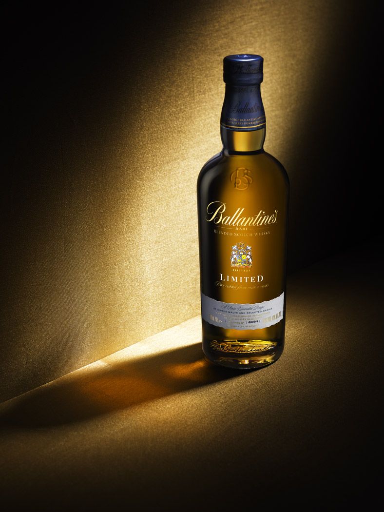
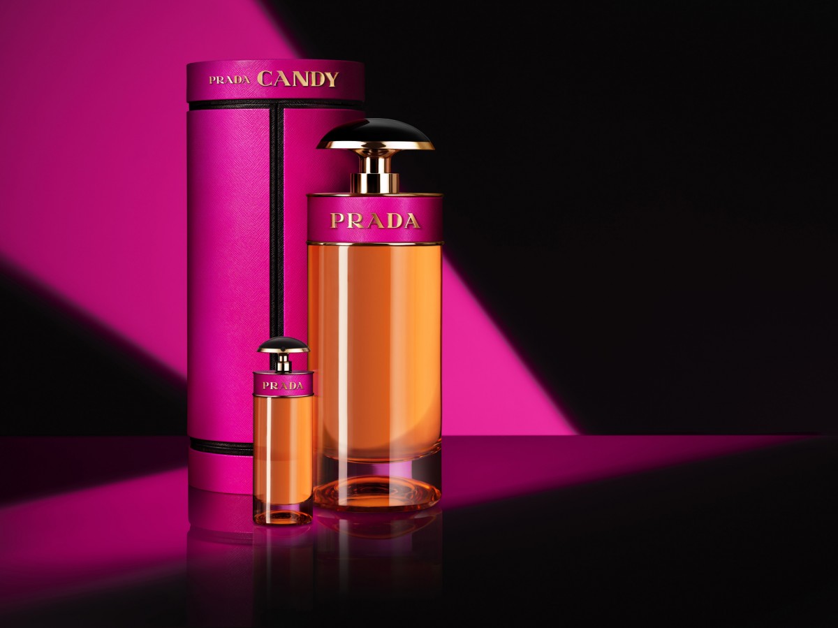
Richard Foster is one of the most talented specialists in still life photography, working with various big clients like Prada, Adidas, and Vogue Magazine just to name a few. Looking at his work, I notice that Foster uses lighting, color and other elements to make his images more dynamic and eye-catching to the audience adding to the brand’s presence. In the examples above, Foster is using a colored back light forming a diagonal shape behind the items making the product a more powerful and life like feel. He’s careful to use color that doesn’t draw attention away from the object while keeping the light at an angle that doesn’t produce a harsh glare into the camera. He also uses rim light and probably fill or main light to bring out features and shadows of the glass, this helps add a sense of personality or emotion to the item. When I first saw the photos I thought about the emotion and the audience it would apply to. Being that the first image is a bottle of whiskey it already signaled to me that this was for an older crowd. Then considering the lighting the image felt kind of mysterious and rugged but classic at the same time because of the mature and clean design of the bottle. In the second example, the name brand Prada already signals a luxury item but the strong diagonal of hot pink light gave off a powerful, confident personality that would make someone stand out from the crowd. It honestly made me feel like purchasing the item myself because those are the same ideas I would want to present to the world about my own personality. Richard Foster stands out from the crowd because he gives the subject of his photography a personality even though its an object, after achieving that the image comes to life on its own.

