Author Archives: Angel Diaz

Tim Wallace Car photography

I think this image of this Land Rover G4 captures the emotions very well. This image just yells freedom and adventurous which is perfect for the type of car that it is. This car was meant for off-road driving in many different type of terrain and weather. It also has a feeling of hope because of the lighting around it gives its surrounding a bit more darkness while keeping the car ver well lit. While the head lights are turned on giving more light to the mud road in front of it while the slightly low angle of the car gives it a feeling of power and control that the car has over the road. To capture the emotions for a car means it has to be within its environment, which I’ve noticed in a lot of his other images as well.

Each car he has taken pictures of all have a different background with different lighting for all to have different emotions and stories to tell.

Hotkenobi: my inspiration for my final

Hotkenobi is a photographer that works with different types of toys to create different types of scenarios that are funny, serious, relatable or a recreation of a moment from something. His images are amazing and entertaining to see every time because within every image I can see the fun he has with the toys and fun with posing them in the way that he does. Most of his work seems to be 3 point lighting but he sometimes changes it to a single light from above or just two lights from the sides. He got some of his work published in japanese magazines along and  one time where the famous Stan Lee acknowledged his work and stated in one of his works “Always said work is like play, this photographer takes that one step further…” Seeing this made me realized that even if your work is for fun, or a hobby, or more it can get noticed by the most unexpected people and can even be turned into something more than just a hobby. I’m hoping to one day make something of this.

final proposal

So for my final project I want to do a shoot where figurines are the subjects of the pictures doing many types of things that can range from a fighting pose to something comedic and silly. I have been a toy collector for many years now and have been building up quite a list of them that are all from different franchises. I’ve always wanted to do more with these to make something of them. I want to show it to the world but in a more creative way.

My target audience are toy collectors of all ages, present and future toy companies, so that I can show that there’s much more to these toys besides just sitting on shelves collecting dust. To show that even toys can become a work of art and that they can tell an original story with just one picture whether it be serious or whimsical.

This idea came to me when I remembered that different toy companies would have commercials on tv showing kids playing with these toys and using their imagination to play with the toys. But then I also remembered that the toy story films did a similar idea but the toys were alive and living a life when ever their owner left the room. So i thought maybe I can do something similar with what I have into a series of photos, and one of my inspirations was a toy photographer named Hotkenobi (https://www.instagram.com/hot.kenobi/?hl=en). He mixes up every day items that you would see everywhere and had the toys interact with them to show a type of action and interaction with other characters.

I want to put this into a portfolio to show that I can be creative, and fun. That I’m someone who enjoys what I do and would love to take it beyond one day.

Richard Fosters Campaign

As I looked through all of Richards Fosters images of these different fragrance companies. I realized that he wasn’t just trying to sell the product it self but the bottles as well by using the bottles shapes, transparency and colors to his advantages. With the Stella McCartney bottle he used the bottles purple and black and clear to create both a shadow and refraction of the light on the clear and colored part of the bottle. Which he also did with one of the Tom Fords blue bottles. He used something that looks like a square light above the bottle at an angle while placing the bottle on the edge of a white table which did similar results but the difference here is he using the shadows to create solid geometric shapes out of the shape of the bottle.

Now in the Bottega Campaign with all three bottles he uses the bottles shapes to create both hard and soft shadows shapes with a background that matches the with the color of the fragrance bottles as well.

Richard Foster is a sought after still life photographer because he uses the bottles, glass, liquid, and transparency to its fullest potential and doesn’t waste time showing that through his campaigns. He wants to show off everything that the product has and not just the fact that its a fragrance in a bottle but that the bottle its self is a beautiful item to have and keep. Its a way to catch someones eye instead of someones interest in the smell. Before getting someone to smell and want a perfume/cologne the bottle must catch the eyes of its consumers to get them to look in its directions for it to be noticed.

Andrew Scrivani

The first image makes me want whatever it is that’s in the image, It looks amazing when you start noticing the blue berries that are in it, and the glazing on top of it makes it look more appetizing with how shining and fresh it looks. Like if you manage to get your hands on this now the glaze would still be melting in your hands and tasting fresh out the oven. The spoon in the image gives me the feeling that buying it in a store, you will see them pour the glaze on it as you buy it. It makes it feel like a moment that’s in slow motion and you don’t want to look away. You want to see the food finished right before your eyes. The way the camera focuses on the cake and the glaze on the corner really makes you appreciate it.

The background in this image is interesting to me because in most pictures with food they tend to take a picture from above the food to use the table as the background, but its usually in focus with the food but the colors, plates and food gets separated so that nothing gets mixed in with the other and the food is always the main focus. In this image and others that include an angle or a person and more in the background get focused out enough to focus on the food or drinks more. This one is my favorite because the man is being out of focus but his hand that is around the drink is in focus with the drink. It makes it feel like the man is handing me a drink to try at a bar. Its like if i was a customer just focusing my mind on the drink more than the one serving it. Kinda like  being hypnotized.

George Heisler Strange Image

In Gregory Heisler portfolio site of all the pictures he has taken. This one grabbed my attention the most due to a weird sense of small confusion. It was under the label “strange,” and when I stare at the image without thinking to hard or to long about it. It definitely has a sense of strangeness. In the image he only seems to be using two light sources, one being the moon to light up the world and the second being a man made light primarily on the subjects face which is a front light in this case, to expose it more than anything else. while the mans body is the darkest thing in the image. completely separating him from the grey snow around him.

The fact that the front light is only exposing his face is the strange part of the image because it sorta causes the face to look weirdly fake, and to add on to the strange side. The man clearly has a shadow of his body behind him on the floor meaning the light is hitting his body but somehow the body is still blacked out with no detail to show besides the outline showing the shape of his body. With only these two lights sources it also gives the background a eerie feel or a supernatural feel with the far distance and emptiness and how dark it is. Kinda makes it look abandoned or has if the man in the image lives in these huge empty acres all by himself.

This image gives me curiosity about everything in the image but also gives me a feeling that makes me never want to visit this strange huge empty farm like area at night.

Beyonce by Awol Erizku vs Demi Moore by Annie Leibowitz

When I see both images, Beyonce picture seems to use front light so that her entire body lights up nicely without to much exposure but as well as not to dark but instead has soft shadows. The soft white light used to take the image also feels more natural.  With the soft front lighting and her pose of her kneeing down on the grass and her hands on her stomach, it feels like elegance with beauty and care. While Demi Moore image is using Rambrandt lighting from the right of the camera with a more harsh light and stronger shadows. It feels more empowering, like as if showing that pregnant women are strong, independent, and with a huge amount of pride on her face expression.

Demi Moore announcement of her pregnancy was put on magazines for the time that it was taken in 1991. While Beyonce was put on her personal social media since now anything on social media can blow up so fast and spread around the world in less than a day compared to a magazine. Also making it easier to land on magazines everywhere.

My thought on the reasons for the different styles that the actress are doing is probably due to how during 2015 to 2018 people have been more open and publicly shaming women/mothers for breast feeding in public. Though the shaming started before the 21st century it started to become more public in recent years, so women tried to not get put within the cross fire of these debates especially actresses. while during the 20th century, women breast were being more sexualized and so women posing naked on camera wasn’t a huge problem, at least not publicly but they still had to censor or hide women’s breast on magazines

Yousuf Karsh vs Nadav Kander

Yousuf Karsh portraits are all black and white but never is it to much black or to much white. Most of his portraits all have a very simple background so he never has to much to work with and never over power the subject. Most of the images seem to have a feeling of hope, power, and happiness. Which could explain why he uses three-quarter views, which can be used to show those emotions just right. Some of his images have 3 point and 2 point lighting, very few have butterfly light but most use rembrandt, short and broad light, but a lot of his subject look very professional.

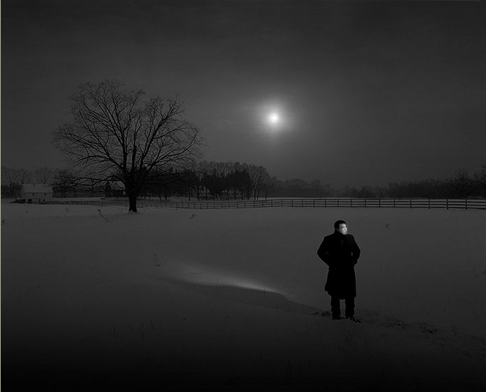
Nadav Kander is a bit more wild with some of his pictures, it has more going on in some of them with a lot more colors. In some of the portraits he uses light and shadows as a way to outline the subject and he also doesn’t hide the subjects shadow, he embraces it to be apart of the background. He also using a lot of the three-quarter view as well as something close to silhouettes on the subjects faces and bodies which doesn’t seem to over power the portrait and gives it a unique and colorful look with keeping a sense of seriousness and importance on the subjects face.

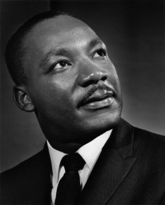
The Martin Luther King Jr. portrait is one that i enjoy and its example of Karshs work to where it shows hope, strength, and power through a three-quarter view with a simple background where the light separates the subject from the background with 3 point lighting.

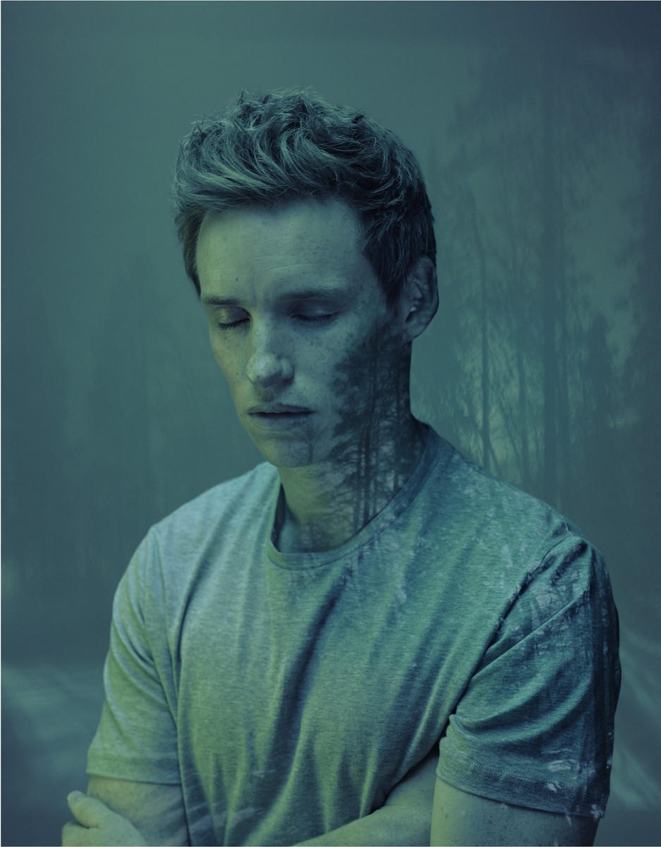
The other is one I like from Kanders is the example where he uses one color with different shades of that one color and places an image over the subject, where the person is still the strongest focus.

On the next assignment I hope to use the three-quarter view more often and get the subject to show different emotions while looking away from the camera with or without any distractions being needed.

Inspiration: Dawoud Bey – Class Pictures

After looking through his class pictures, I’ve noticed that most of the students have a similar expression on their faces but with completely different pose that are unique to each student because thats how they feel comfortable. While some also had different expressions with different poses as well. It seems like he focus more on body language and hand positioning while the students who are the center of each portrait, all stare at the camera and never look away from it. Dawoud Bey always went through a process with each student to somehow get to know and understand them, as well as when taking a picture he makes sure they are comfortable at that moment so that the students look more natural in their element. I’ve noticed that every picture is using two point lighting where one is a light source on one side, and the other a reflector to reflect the light on the opposite side to soften up on shadows on the subject. The background in his images are always the element of a student to show what a school can look like and Foreground is always a desk and the subject. When it comes down to his framing its hard to tell but he uses the environment behind the subjects as a way from framing. One seem to use geometric framing, one of them uses shadow framing, and another felt like it was using colors of the background as a frame for the subject. He would study the students actions and attire during the meetings to understand where and how to photograph that person. To be able to understand what to put around them and what colors go with what they wear thats in the environment to be able to give a description of the students with whats around them, how they pose and with they wear.