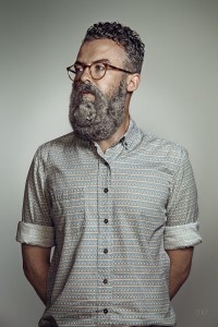
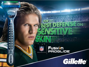
In these series of ads, there are several difference in both of them in terms of how they communicate. The first photo is a horizontal portrait using broad lighting. The image also includes a man with a beard with a squirrel attached to his face. The 2nd ad is a photo of a guy who looks menacing, serious, and tough. The ad uses short light and typography to communicate the brand/product using the athlete as a result for the consumer to shave with confidence. Each image has a different emotional tone to them. The first photo has a calm mood, and the reason why I say that is if you look at the lighting, the color and the expression of the person. He doesn’t seem to be bothered with what is in his face. While the 2nd photograph is more serious, uses colors that reflect the brand, a long with having a stadium as the background to show the setting of the sport as well.
Category Archives: Campaign Analysis
GrandeJ_shaving ad analysis
The Schick ad’s tagline is free your skin. I feel as though they used an animal on a mans face to symbolize the ruggedness a man’s facial hair can get and used the word “free” to emphasize. It was also an amazing idea to go in a different approach and execution. Their razor is being portrayed to be the one to use when facial hair can be tough and wild.
In the second ad, the Gillete fusion execution, they go in a different approach. Showing a tough looking man, a football player looking right in to the camera which is suppose to give an impactful image and displaying the words sensitive skin gives off a humorous feel. The fusion razor is suppose to relate to the football player with great defensive properties built into the razor.
Chris_A
The first ad what i got from it was that the company sells shavers that are “sharp” enough to with stand any Hair type even if your a hairy animal. Probably focuses more on the quality of blade which would explain the overall sophisticated look of the ad.
The second ad has a toughness and a smoothness to it. They are probably trying to focus on the smoothness of the shave with the smoothness of his skin and the toughness of the guys expression making reference to the sharpness of the blades. So soft on skin tough on hair. Its also soft diffused light which adds to it compared to the higher intensity and grungy look of the other ad but thats because they are trying to portray two different things.
Comparison Between Schick and Gillette Campaigns
Schick and Gillette are both leading competitors in the shaving industry and both have churned out exceptional campaigns in the past, such as Schick’s award-winning “Free Your Skin” campaign. However, there are multiple differences between both of these ads.
For instance, the Schick ad uses a more direct and less contrasty butterfly lightning in their ads to give it a more sophisticated and aesthetically pleasing look. However, Schick manages to communicate their brand through the fact that the “beard” of the model in the shot is actually a squirrel masquerading as a beard. This shows that they are aware of the hipster trend of beards and are parodying it, in a sense.
The other difference between the two is the fact that the Gillette ad uses a more broad lightning for the model in the ad. From my observation, this is likely due to the fact Gillette had intended to accentuate the details of a clean-shaven face – which is starkly in contrast to the Schick ad.
Beards Compare and Contrast
Both of the two ads give off a very different vibe. First, the portrait about the bearded man is a full frontal, waist length, and the man head is 3/4 turned. The lighting is broad with smooth shadows. The ad is in portrait by the way the model looks confident. The Audience the ad was communicating were hipsters who love to embrace their beards. The tone they are trying to produce are confident hipsters. On the other hand the Gillette ad gives off a different vibe. This is a landscape ad. The model is shown from shoulders and up. He is looking towards the camera and gives a masculinity to his audience. The audience they are trying to pursue is the manly athletic type men who likes a clean cut.
Vlad_Comparison
The two campaigns have quite a few differences between them. The gillette one has this clean shaven football jockey staring right at the camera while the schick ad has the person staring far off into the distance. Gillette has used short lighting while schick used broad lighting. The other main differences revolve around their message and audience. Gillette’s clean shaven campaign is geared more towards that football jockey personality whereas schick’s seems to be geared towards the hipster type of personality. It has a far less serious tone since it literally puts a squirrel on the face of a person. It also seems to say that you don’t need to rush and shave it off your face, having the model stand there with confidence. We can also see the differences in target audience based on the clothing that the models are wearing.
Campaign Analysis 2-Shaving Ads
Dance Photography in Advertising
The ad for Raymond Weil shot by Lois Greenfield and the ad for Pantone shot by Sarah Silver both executed similar and different campaign elements.
Greenfield’s Raymond Weil ad contains a monochromatic visual. The dancers in the black and white composition are the only elements used as the focal point. In this campaign, figures represent the headline – “Precision movements.” Their body language is compared to the hands of a watch. In the shot, light sources appear from a high angle on the left side creating dark shadows. Each dancer is placed at a different distance, which makes them appear closer in depth producing a shallow space. The negative space around the individuals makes the portrait become balanced. The image also has a high contrast with a few middle tones.
Silver’s Pantone ad contains a polychromatic visual. For the “Make It Brilliant” campaign, lights were used to paint colors with the same vibrancy. In this ad, the colors represent different moods and are used as the focal point. Within the composition, geometric shapes were utilized as walls, props, and texture designs to keep the environment balanced. Although the walls help to construct less negative space, the dancers were placed amongst each other at different distances creating a deep space. The image produced also has a low contrast with mostly middle tones.
Both campaigns used dancers as a human element to bring life to their concept. In each shot, they portray a different message and expression. The dancers for “Precision Movements” metaphorically relates to the hands of a clock by their specified positions. The dancers for “Make It Brilliant,” metaphorically added a touch of life to the newly created neon colors. Each successful shot forms an illusion by a technique called frozen motion photography.
Dance Photography in Advertising
The ad for Raymond Weil shot by Lois Greenfield and the ad for Pantone shot by Sarah Silver both exhibit distinct differences and similarities.
Aside from the obvious color difference, the formal elements of the photographs differ as well. For one thing, the tone and contrast is noticeably different. While, Greenfield’s photograph is full scale displaying many tones from black to white and very high contrast with very dark and and very light areas, Silver’s photograph is low contrast with mostly middle tones. The colors used are bright and have the same value. Both the composition in Greenfield’s and Silver’s photographs are very artistic; they contain dancers that draw the eye of the viewer. The photo taken by Greenfield clearly portrays the headline, “Precision Movements”. The dancers are all skillfully and accurately placed, so as to perfect the art form of precise movements. As for Silver’s photo, the dancers are all interacting with their background or props. They are all very involved with their surroundings unlike the other photo where the dancers are interacting with each other.
While the perspective and space of the photo taken by Greenfield is shallow and most of the dancers are closer together in depth, Silver’s photograph demonstrates deep space where the dancers are all at different spaces. Both of the photographs contain direct light, showing hard-edged, dark, shadows. I also feel that there is symmetrical balance within the photographs and an overall sharp focus. Furthermore, both photographs use dance and dancers to effectively communicate the concept and message of their campaign.
The photographs that Sarah Silver shot for Pantone’s Make It Brilliant Campaign and Lois Greenfield shot for Raymond Weil’s Precision Movements ad are similar in that they use the same technique of having dancers be in their ads. However, while the dancers are a primary focus, they convey different messages and moods. The ad for Raymond Weil is less modern and looks like it could be used for a ballet. I guess this is what makes it so different – the fact that this concept is not what you would expect for this specific product. Although, the ad for Pantone’s Make It Brilliant Campaign contains a pop of colors like you’d expect to see, the dancers are what make it unique. They symbolize a special way to ‘paint a world with light’.
Dance Photography Comparison
Both Greenfield’s and Silver’s advertisement did a great job of capturing their companies’ brands with the use of ballet dancers. They understood that their dancer’s pose could express a wide range of emotions and ideas depending on how they were positioned. This is why taking the photo at eye level was key to both of their success. Capturing the right kind of diffused shadows was also important to make sure that it wasn’t too distracting for the viewer.
Although advertisement for Raymond Weil and Pantone both decided to use dancers as subjects for their ads, they do not necessarily emphasize the same idea. Raymond Weil’s ad uses their dancers to give the advertisement an elegant atmosphere, and their sharp poses is a metaphor for precision of the watches’ mechanical hands. The black and white tone and its use of a high key also helps promote another feature of the watch, which would be its classical and bold appearance.
On the other hand, Pantone’s use of their dancers convey a completely different message. Instead of using dancers to promote mechanical features, it is used in harmony with the lighting to showcase the creativity, fluidity, and energy of the company. The dancers aren’t stuck in poses that are straight or rigid, and in fact their poses are more curved and artistic which helps get the message of their brand across. The use of full scale colors and contrast does exactly what the color company wanted to promote, it’s understanding and wide selection of colors.


