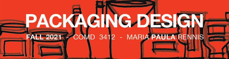
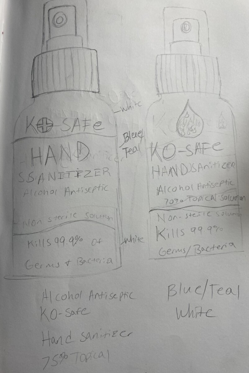
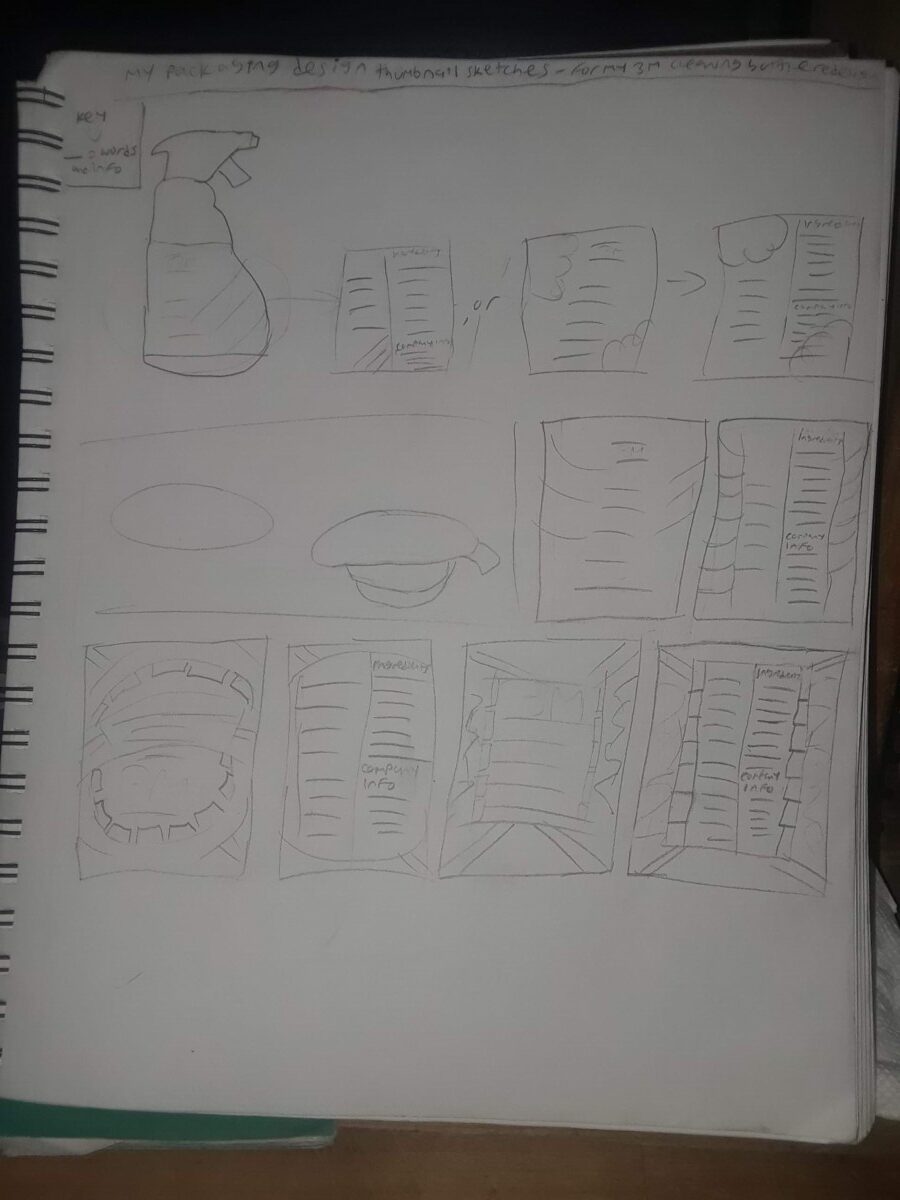
Joseph A-Step 3-Develop-sketches
Leave a reply
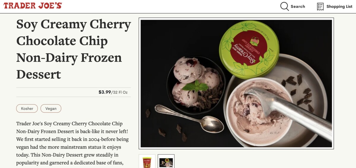
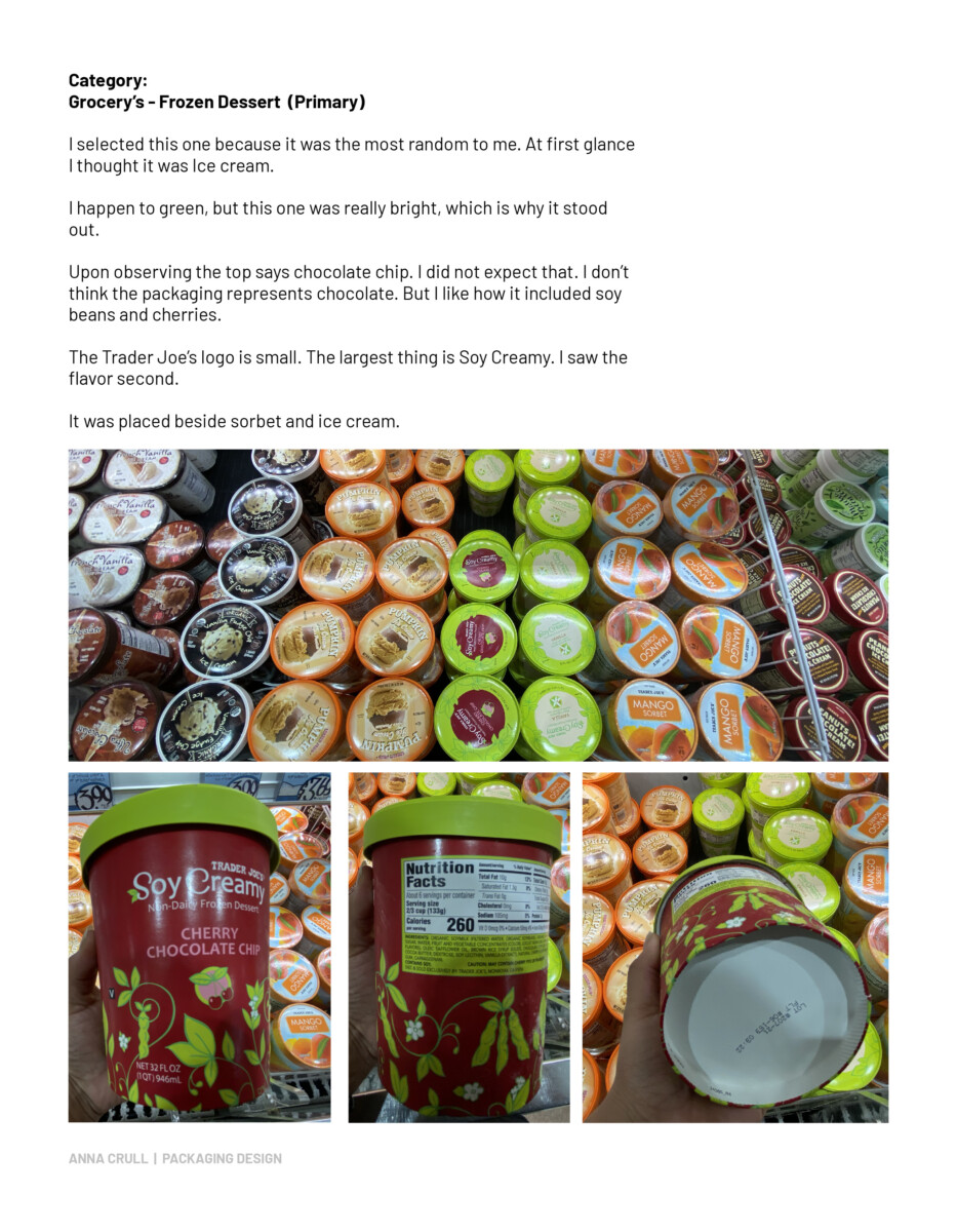
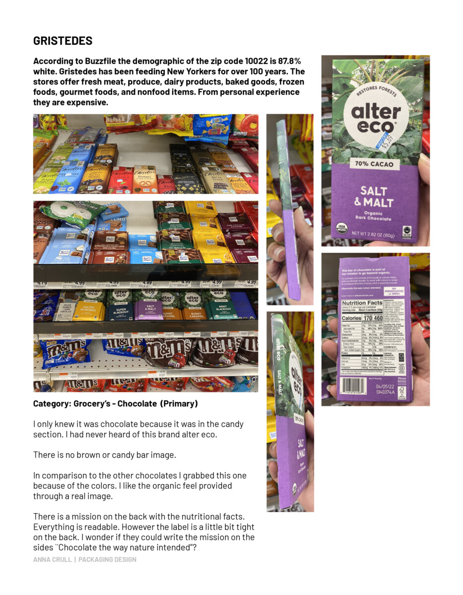
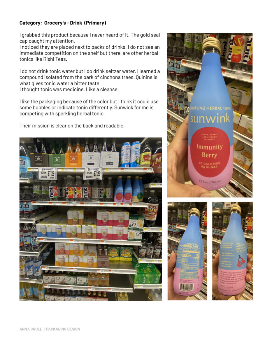
Product: SOY CREAMY Cherry Chocolate Chip Non-Dairy Frozen Dessert from Trader Joes
Research about the consumer. Determine the target audience.
Trader Joe’s overall target audience is usually singles, couples, and small families. For the frozen dessert Soy Creamy, the target audience is anyone that shops there. Specifically vegans. However the product was on shelves before the company went vegan in 2004.
Analyze the perceived economic, physical and emotional benefit that the product has to give to the target audience.
In 2018 the product’s sales began declining. They removed it from their stores in 2019 but brought it back the same year. People took to social media and complained. Many commented it was the only non-dairy dessert they enjoyed. Now it is here to stay.
Explore consumer trends; new developments in materials and technology; environmental issues.
Wow! The innovative ideas for ice cream are very impressive. I learned about dip&dots from visiting zoos, which is flash frozen ice cream. I have seen dragon’s breath in malls and i’ve eaten at Sugar Factory, both famous for their liquid nitrogen treats and drinks. There are other innovative ideas like astronaut ice cream, catrons made of edible wrapping, 3D printed ice cream, alcohol infused ice cream, synthetic bioluminescence ice cream, and color changing ice cream called Xamaleon.
Investigate consumer use. Interaction with the package; size handling and consumer friendliness.
According to the Trader Joe’s website their customers are their own employees, ranging all the way from delivery to corporate.
The product does not seem to come in smaller sizes. Only in 32 Oz (1 Qt). Trader Joe’s targets smaller families. For those who do not want a lot of ice cream, this might be considered a large size.
From interacting with the product it was tall for my hands to hold but I was able to grip the container’s width.
Evaluate shelf-impact.
When I went shopping I was intentionally looking for ice cream. I grabbed the Soy Creamy because of the bright green top. It took me by surprise because what color food is that bright? When reading the top I felt there was not enough representation of chocolate. I felt the shelf impact was eye-catching but labeled badly because the item label was a row over from the actual placement of the item (see step 1). You have to read what you grab. The shelf impact did not include all their flavors. From research they also have a vanilla soy creamy. If their intention was to grab someone like myself by using a lime green color, it worked. If the intention is to buy the product based off the green top, for me it was a no.
Study product’s packaging materials and finishes; gloss, matte, metallic, textured, etc.
The carton is paperboard with a smooth, flat, and matte finish. The shine comes from the frost of being frozen, not from a glossy finish.
Examine typography: its hierarchy, its role in communication and the consumer decision-making process.
The cherry chocolate chip was placed next to actual ice cream and sorbet. Ice cream cartons are labeled ice cream, this product is labeled soy in its name. The other give away in the original product design includes soybean illustration. The illustration also includes cherries. Nothing in the design for me implies the creamy. The carton has a vegan symbol. It also says non-dairy frozen dessert.
The cartons colors are lime green supported by a fern green, white, and a red that is more of a dull pink (like #D5869D) that falls in the Pastel Crimson family. No browns to showcase the chocolate.
Look at photography, images and graphics. Placement, color, size and resolution.
Determine overall color coding: psychological, social and cultural aspects.
Red: can indicate warning, blood, fire, aggression, dominance, power, excitement, passion, warmth, and sexualitiy. It can also seem sleazy or overwhelming. In this case I
think the majority of the carton is red to showcase the cherry and excitement. It can also culturally represent pride.
Dusty Pink: has a light greyish hue with a hint of violet and blue. It can represent tranquility often associated with fertility. When researching I found dusty pink to be the most fascinating. It was used in the 80s to calm prisoners. However it was not a long lasting effect. The University of Iowa used it in their opponents locker room in hopes of gaining a psychological advantage by calming the opposing team. I even found out pink was originally a boys color. It was considered a lighter version of red which was associated with masculinity and military status.
Green: In ancient Egypt, green symbolized regeneration ,good health and rebirth. Middle ages green represented a person’s social status and profession like a banker or merchants.Lime green became popular in the 70’s. Then a few years ago lime green made a comeback. I prefer neon green. I think certain lime greens are overly vibrant. The lime green used for Soy Creamy seems to have a warm undertone when it stands alone. When next to other items it is a very bright color that I would have used sparingly. Normally green has a calming effect. Green is associated with nature, refreshment and a sense of security.
White: can be seen as purity, or neutral. Often worn to celebrate. It can represent independence, cleanliness, energy, optimism and hope. It is said to give you a sense of calmness.
Inspect the role of the UPC code; manufacturer logo and contact, legal and warning copy information.
The purpose of UPC (Universal Product Code) code is to easily identify product features like brand, size, item, and color when scanned at checkout. It is a 12 numeric character that makes it possible to track inventory.
Look over the nutritional facts panel and placement.
Soy Creamy Cherry Chocolate Chip is 6 servings per container, serving size is ⅔ cup (133g) with 260 calories per serving. Overall it has 37g of total sugar, that is not really healthy, but for the size it’s doable. To compare Haagen-Dazs Cherry Vanilla Ice Cream 14 oz is 28g of
total sugars per serving of 290 calories. Whereas the entire Cherry Vanilla per container is 780 calories with 72g of total sugars.
I know the product is vegan because on the front and back of the carton is a black square, rounded edges and white V.
There is another symbol I did not recognize which is the U circle Parve. Turns out it is a Hebrew (pronounced PAHR-vuh) term that means anything that is not and has not been prepared with dairy and meat. Eggs and fish are also considered parve. I learned those who do keep kosher for religious reasons use Pareve recipes because it makes it easier to build menus around the meat and dairy dishes. To my understanding the U basically indicates Kosher.
For me there were three unfamiliar ingredients: 1. Carrageenan, which some scientists believe can cause digestive issues, bloating and IBD ( Irritable bowel disease) and even colon cancer. But it all comes down to how it is used/made. Food grade carrageenan is extracted from red seaweed and processed with alkaline substances. 2. Locust Bean Gum which I learned is not a grasshopper and is vegan. It is extracted from the carob tree. It is similar to a cacao plant. It is a plant based thickener used for structure and stability of vegan desserts and non-dairy ice cream and yogurt. 3. Soy Lecithin is a food additive. Any allergens are removed in the manufacturing process. It claims to be safe because it is used in small doses. Lecithin in soy is natural but for some the chemical used to extract the lecithin is concerning. Overall it has health benefits like lowering cholesterol and treating Ulcerative colitis which is a chronic disease that causes inflammation and sores in the lining of your colon and rectum.
Under the nutritional facts the bolded all cap words calls attention to, contains soy on the bottom of the nutritional facts and caution may contain cherry pits or fragments.
Explore outer (tertiary) packaging for shipping, handling and protection.
The transit packaging or Tertiary for Trader Joe’s was hard to find. Instead I looked up how ice cream is generally stored. Ice cream is most often primary packaging is a paperboard carton or plastic. Pro of plastic is that it can be repurposed when empty. If the paperboard is chosen the plastic rim is bonded to the paperboard to help dimensional stability for the lid during the manufacturing process.
If the lid is plastic it can have a built-in tamper proof zip tie whereas the paperboard needs a plastic film to act as the tamper-proof seal. Tamper proof seals are added at the end of the manufacturing process.


My first choice would be this set of 600 Lumen flashlights from Police Security. While their name states that they make products for police security they use a lake for their package’s background. The grey area has a ton of unused space. The company name is stuck in the far-left corner while also being ridiculously small. The copy does a fair job of highlighting the products features but contains nothing eye-catching. Especially when every other product contains interesting type and brighter colors.


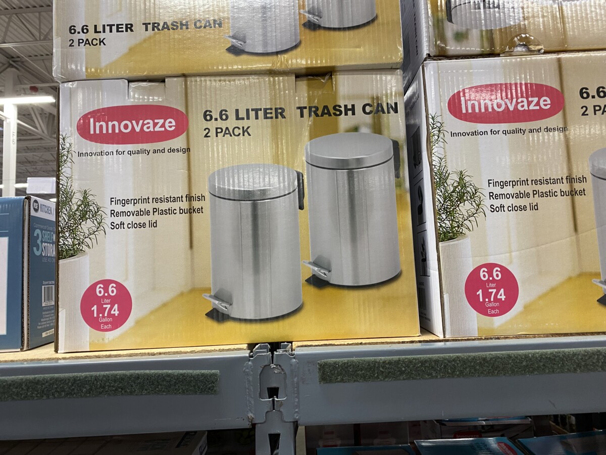
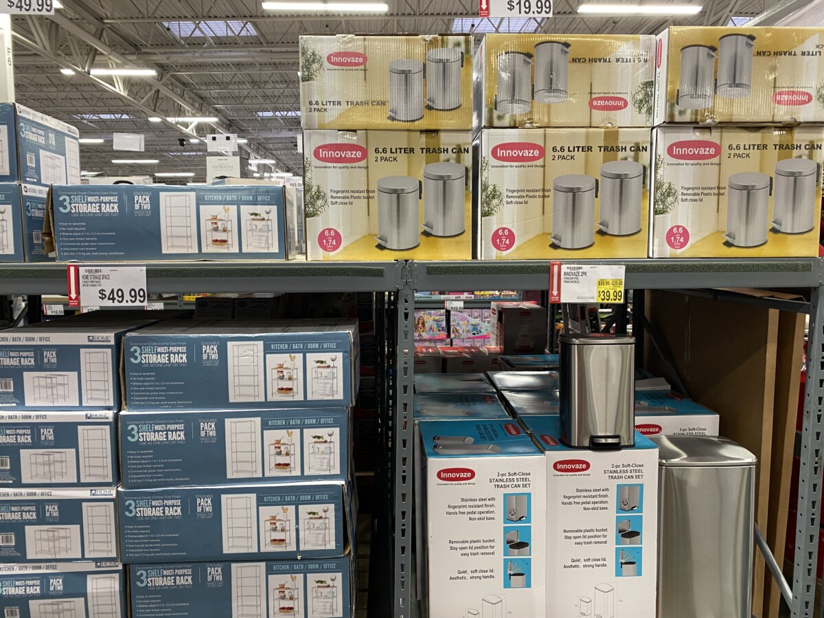
My Second choice would be these 2 packs of 6.6 Liter trash cans from Innovate. The design on this package has a better use of space and highlighting important content. Though, it feels plain and flat. Even though it does communicate its message clearly it doesn’t stand out. Adding a more diverse array of colors could make it more eye-catching. A more dynamic picture would better illustrate their product. Something that would help consumers imagine it in their homes.
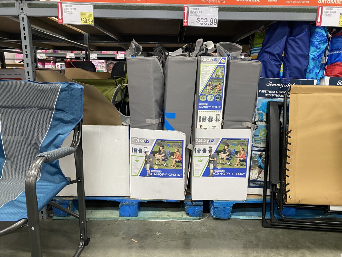
My third choice would be the canopy chair from KELSEYUS. The type and colors are eye-catching. They do a great job in showcasing its features and the ways it can be used. Though the design feels very small. The lower half of the box is an unused white space which the design can use. Because it is small the type is a lot smaller as well. Which makes it hard to read unless you’re really up close. The logotype could also use a color change since the grey background drowns out the white lettering.

Note/Disclaimer: these choices are my attempts, mainly because it’s for the professor to accept it. I hope she does But my point is still the same.
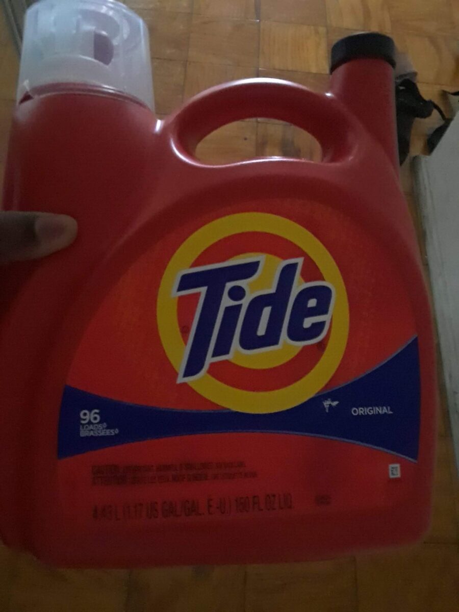
My First Product Choice: Tide(picture shown below)
Target audience: mostly for mid teens and adults. Most likely for anyone who is 15 to 65 years old. That would be my best bet.
People will think it’s affordable
The emotional benefits would be that people can use this product, to clean their clothes so much, that it can lead to their satisfaction.
Consumer trends: people using this item to clean clothes so they always smell fresh and ready to wear until you want to wear them. Which is what many consumers would always like. Many individuals wouldn’t want a detergent that would still leave you’re clothes dirty. God forbid that ever exists. That’s why i bet everyone, including myself uses tide as one of the better choices to make any of our clothes look stunning.
For any new developments in materials and technology issues for this item: P&G (the parent company of tide) keeps finding new ways to improve its methods of cleaning components into each of their tide products. Which is a good development in materials and technology.
The consumer use of this object was good
The interaction with the packages, size handling and consumer friendliness was pretty great as well
The shelf impact for this product, was basically how i could see the tide as the first thing, in my eyes. (see the shelf impact image, for this item below, to probably see what i mean)
The products packaging materials and finish is just very smooth for this object.
The hierarchy in the tide detergent has the logo as the main thing, that your eye would focus on. With the shape below that has the text on it. Then three other pieces of information below that.
It doesn’t have any color coding of psychological, social and cultural aspects
The roles of the UPC codes the manufacturer logos. contact info, legal and copy info were done with intent and for pretty good and smart purposes.
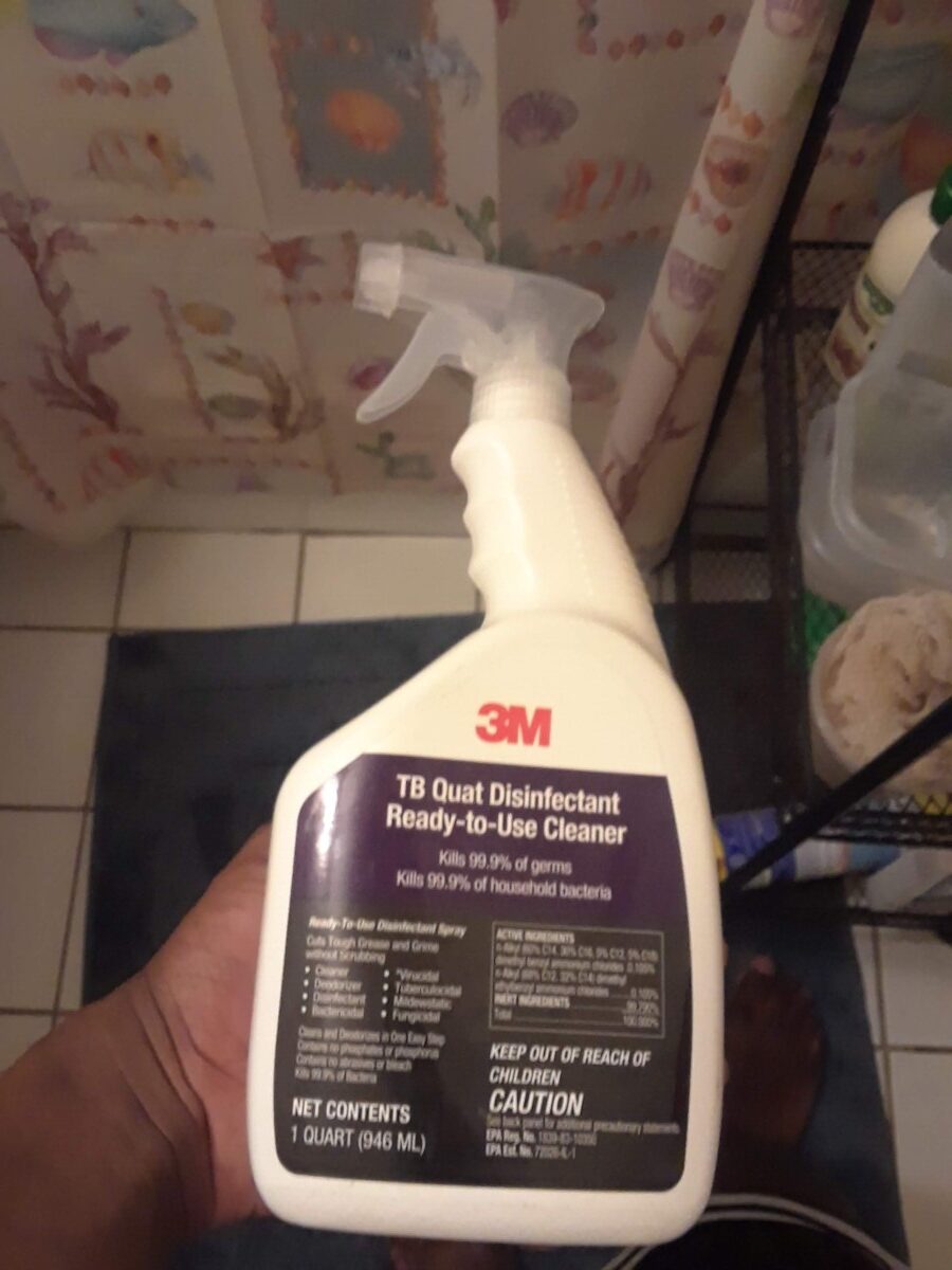
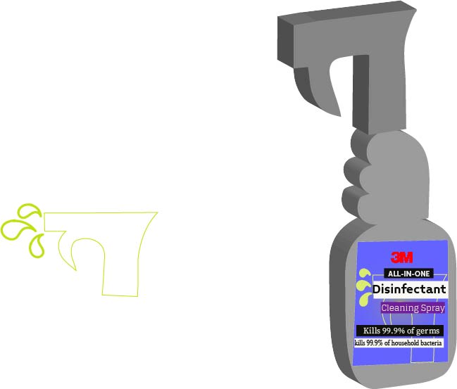
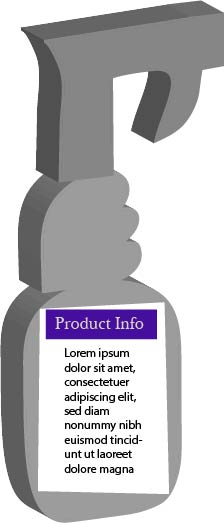
My second product choice: The 3M cleaning bottle/disinfectant cleaner(picture shown below)
Target audience: mostly for mid teens and adults. Most likely for anyone who is 15 to 65 years old. That would be my best bet.
People will probably think it’s affordable or something
The emotional benefits would be that people can use this product, to clean their bathroom surfaces so much, that it can lead to their satisfaction.
For new developments in materials and technology issues for this item: 3M is continuing to strive to find new ways to find ingredients, to make new liquids and chemicals to put those in their cleaning bottles. It kills 99.9% of germs or any other bacteria in your house, so almost everyone’s family won’t get sick or possibly die from all of that, depending on how serious any sickness can be. But even with that, it won’t matter because it will destroy those disgusting particles.
Consumer trends: People use this item to clean bathroom surfaces so they always stay clean until they’re dirty again. Which is what many consumers would always like. Many individuals wouldn’t want a disinfectant that would still leave any surface in your house looking filthy. God forbid that ever exists. That’s why i bet everyone, including myself uses the 3M disinfectant cleaner as one of the better choices to make any of our home surfaces look stunning. Which is what many consumers would always like.
The consumer use of this object was good
The interaction with the packages, size handling and consumer friendliness was pretty great well
The shelf impact for this product, was basically how i could see the 3M cleaning bottle as the first thing, in my eyes. (see the shelf impact image, for this item below, to probably see what i mean)
The products packaging materials and finish is just very smooth for this object.
The hierarchy in the 3M cleaning bottle has the logo as the main thing, that your eye would focus on. With other information in a dark purple shape and a black shape making it seem bland. Mainly for this item, i’m leaning towards redesigning this one, because it still looks kinda sorta boring, from what i think. If you look at it too, you would probably see what i’m talking about, as well.
It doesn’t have color coding of psychological, social and cultural aspects. But I still believe it can be redone. In my own style.
The roles of the UPC codes the manufacturer logos. contact info, legal and copy info were done with intent and for pretty good and smart purposes.
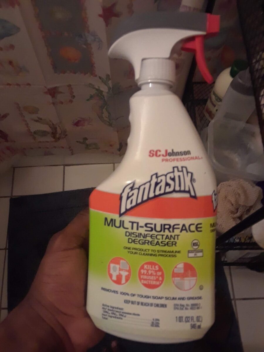
My third and final choice: the fantastik cleaning bottle
Target audience: mostly for mid teens and adults. Most likely for anyone who is 15 to 65 years old. That would be my best bet.
People will think it’s affordable
The emotional benefits would be that people can use this product, to clean their bathroom surfaces so much, that it can lead to their satisfaction.
I couldn’t find any new developments in materials and technology issues for this item
For new developments in materials and technology issues for this item: SC Johnson is continuing to strive to find new ways to find ingredients, to make new liquids and chemicals to put those in their cleaning bottles. It kills 99.9% of germs or any other bacteria in your house, so almost everyone’s family won’t get sick or possibly die from all of that, depending on how serious any sickness can be. But even with that, it won’t matter because it will destroy those disgusting particles.
Consumer trends: People use this item to clean bathroom surfaces so they always stay clean until they’re dirty again. Which is what many consumers would always like. Many individuals wouldn’t want a disinfectant that would still leave any surface in your house looking disgusting. God forbid that ever exists. That’s why i bet everyone, including myself would use the fantastik disinfectant cleaner as one of the better choices to make any of our home surfaces look gorgeous. Which is what many consumers would always like.
The consumer use of this object was good
The interaction with the packages, size handling and consumer friendliness was pretty great as well
The shelf impact for this product, was basically how i could see the 3M cleaning bottle as the first thing, in my eyes. (see the shelf impact image, for this item below, to probably see what i mean)
The products packaging materials and finish is just very smooth for this object.
The hierarchy in the Fantastik cleaning bottle has the logo as the main thing, that your eye would possibly focus on. The reason being is because the logo is going a little bit away from the orange stripe below it. With other information in a light green gradient. Below it are 3 white icons in their own orange circles. Then below that is more information.
It doesn’t have any color coding of psychological, social and cultural aspects.
The roles of the UPC codes the manufacturer logos. contact info, legal and copy info were done with intent and for pretty good and smart purposes.
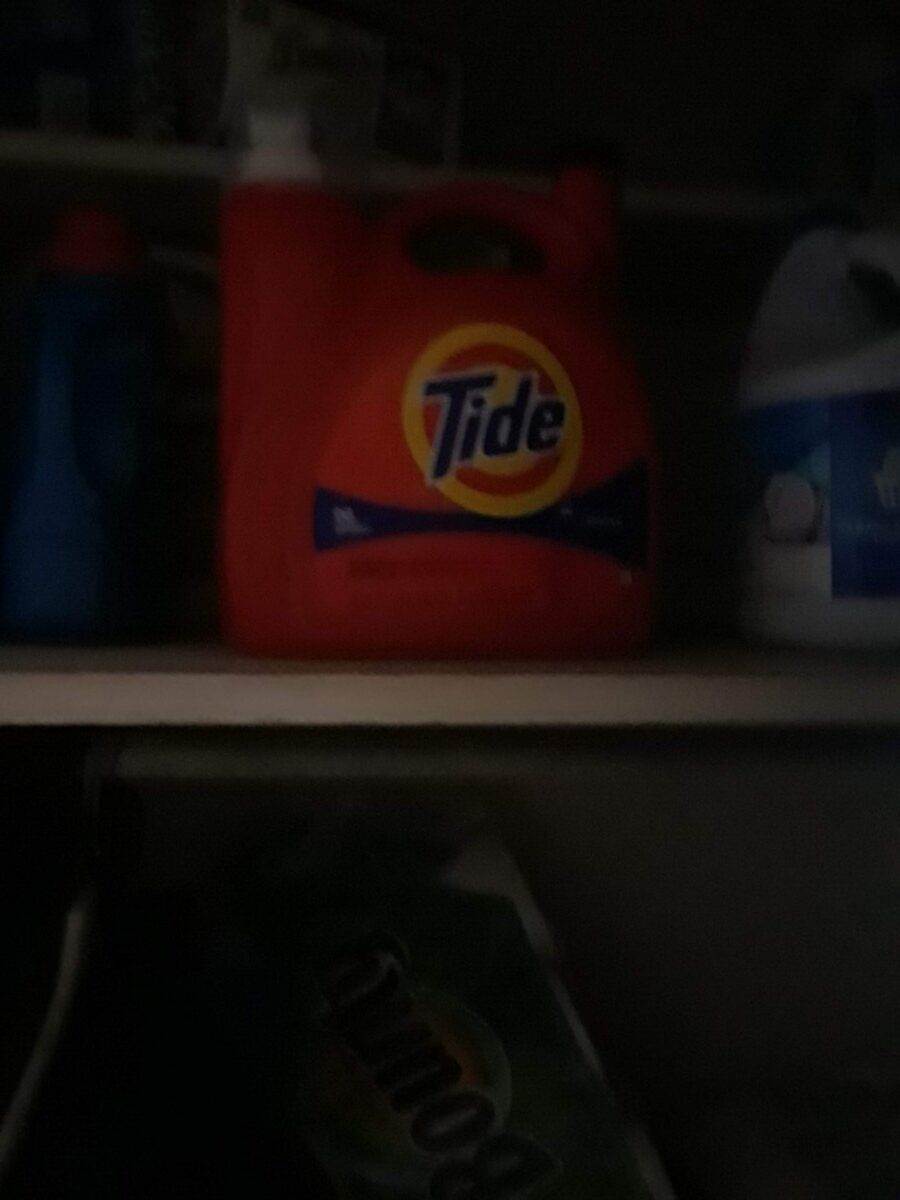
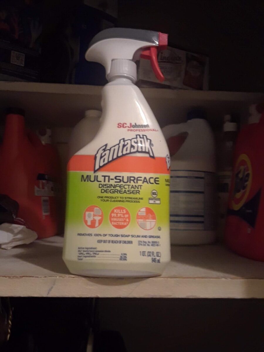
My shelf impact Pictures
For the tide detergent
My Fantastik cleaning bottle
My 3M cleaning bottle

The OpenLab is an open-source, digital platform designed to support teaching and learning at City Tech (New York City College of Technology), and to promote student and faculty engagement in the intellectual and social life of the college community.

