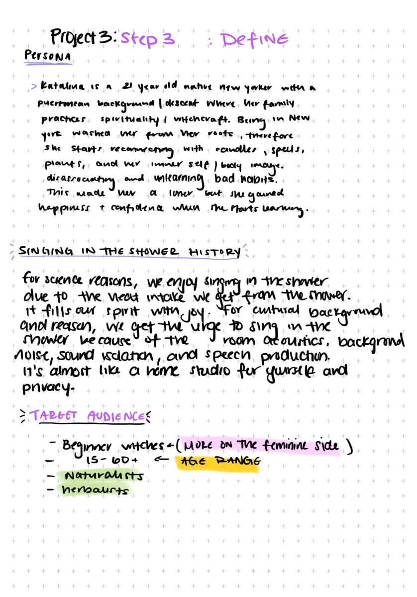
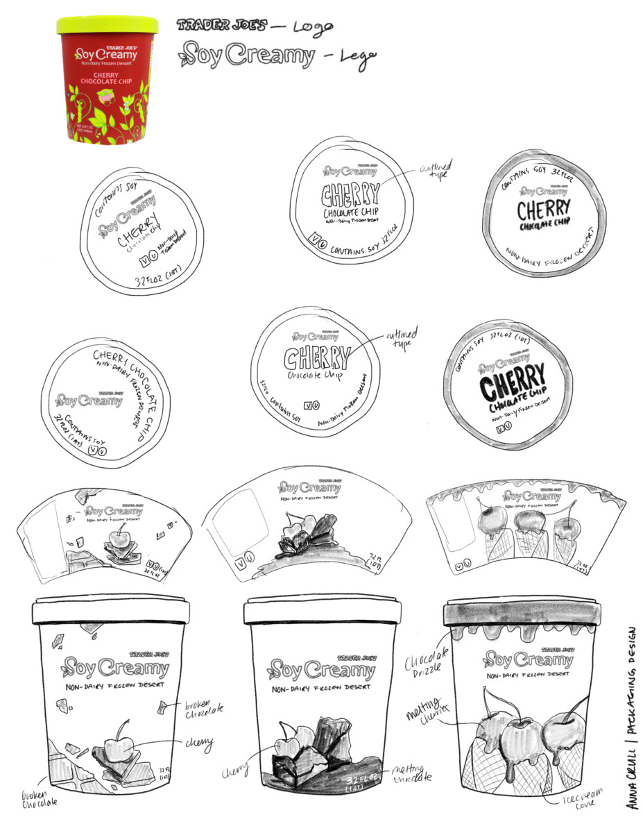
Project 3: Define
1 Reply
Lipton is a British brand of tea, owned by Unilever. Lipton was also a supermarket chain in the United Kingdom, later sold to Argyll Foods, after which the company sold only tea. The company is named after its founder Sir Thomas Lipton. The Lipton ready-to-drink beverages are sold by “Pepsi Lipton International”, a company jointly owned by Unilever and PepsiCo.
Lipton teas are a blend selected from many different plantations around the world, from well-known producing countries including Sri Lanka, India, Kenya, and China. Lipton Yellow Label is blended from about 20 different teas. the company markets many other varieties, both as leaf and ready-to-drink beverages.
Lipton Tea targets tea lovers with Middle to High-class income across all age groups. With its wide range of products like Iced tea Lipton even reaches out to children over 8 years to senior citizens 70 and above.
Typography: Kinda hard to read
Shelf Impact: i’d say was pretty good
Photography: no photography or imagery whatsoever
Target audience: anyone who is 18 to 65 years old
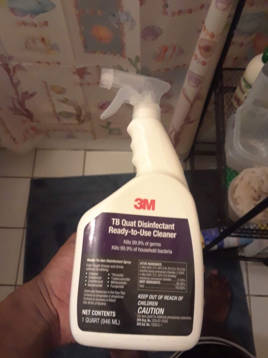
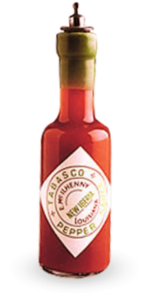
Packaging: gray spray top, white bottle. With the 3m logo. The words “TB quat disinfectant ready to use cleaner, on the purple space.” Two sentences also on the same purple area. Followed by miscellaneous information in a black space.
Analysis with new design conclusion(in simple words): People want a new look. They want one that they can try to understand. With of course, one that has all the information, that you would ever want in a spray bottle. They would probably love the shape of the spray bottle, keeping the original 3m logo, with also keeping all the other necessary info on the label design itself. That’s what i plan to do.

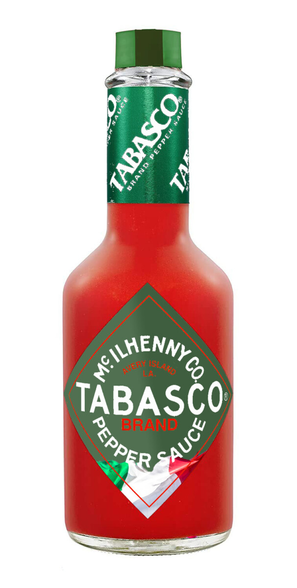
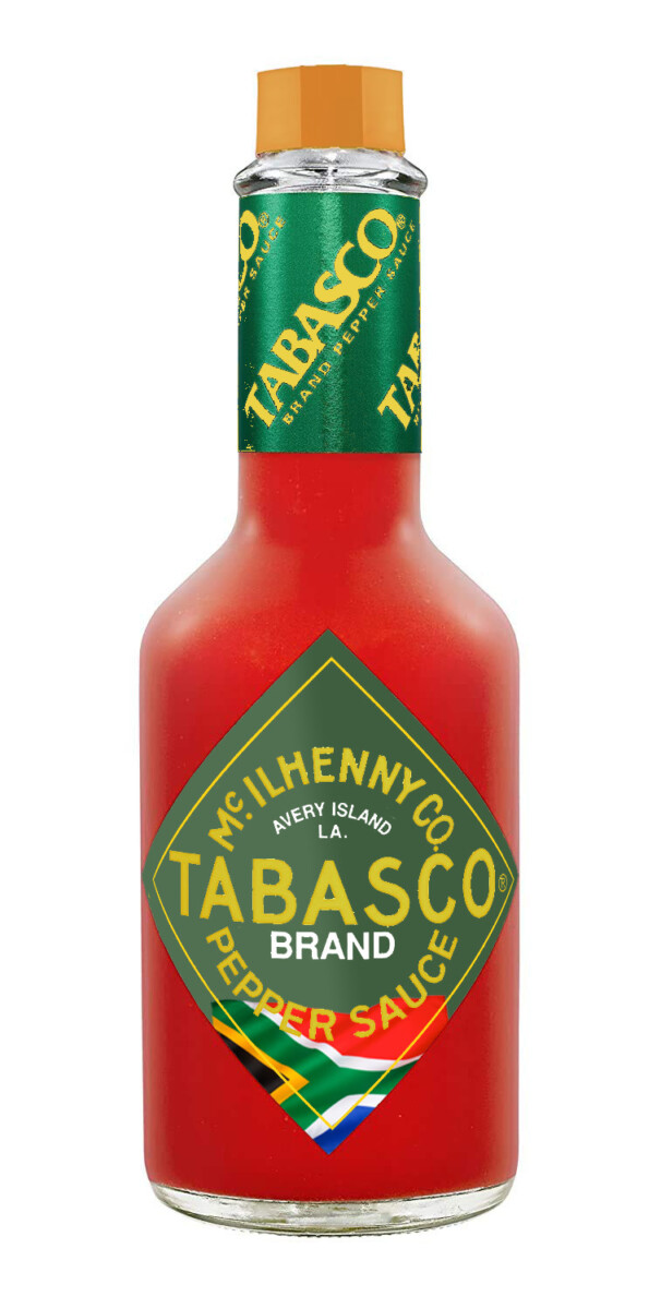
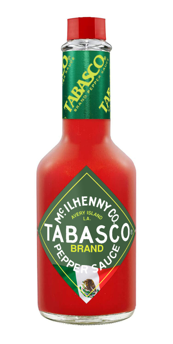

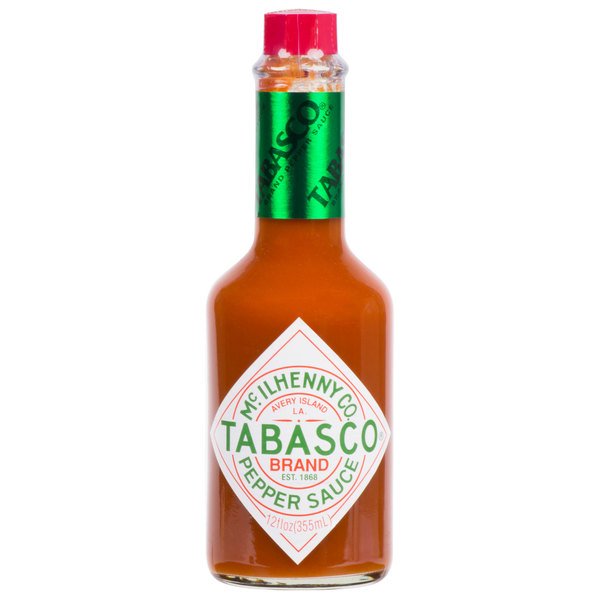
Tabasco Brand hot sauce was first created by Edmund McIlhenny in 1868 on Avery Island, Louisiana. The company is still family owned and though it has gone through very modest packaging changes, it has not deviated from the packaging it has enjoyed since 1927.
The brand can be seen in many restaurants all over the country, as well as in many parts of the world.
Typography
The typography is simple and the hierarchy is is easy to navigate
Photography, etc.
No photography. Design is exclusively type, no graphics (red, white, & green is the color palette). Since the bottle is ubiquitous, no extraneous design choices needed to be made. The label is low gloss.
Shelf Impact
In this particular store, the bottle was found on the shelf closest to the floor, which I thought was counterproductive (it was extremely missable).
Target Audience
Anyone who likes mid-level to higher end quality hot sauce (the bottle pictured is 12oz.). The audience who will buy this is the audience who always has purchased it – 40+. However, due to the ubiquitous nature of the product, consumption is also handed down through generations. It is these new generations that we will market to. We will re-boot Tabasco to make it relevant amongst a fresh, new, younger class of consumer (16 – 49).
Packaging
The packaging is bright orange (secondary), and the primary packaging is a see through bottle with sparse design and a proprietary octagonal red cap. Very easy to spot
Analysis
American producers often fall into the trap of putting so much energy marketing to Anglo Americans that they forget that America is packed (and flanked by) many other cultures and often leave them out of the marketing process. The packaging idea in mind would instill a sense of inclusivity to underserved cultures, and open up a brand new line of consumers for the product. “Cancel culture” is real. It is in every company’s interest to proactively promote inclusivity in their products as well as mission statements.

The OpenLab is an open-source, digital platform designed to support teaching and learning at City Tech (New York City College of Technology), and to promote student and faculty engagement in the intellectual and social life of the college community.

