P2 – Step 3 -Develop
1 Reply
Philip is a 25-year-old full-time college student. He’s majoring in computer science and entering his fourth year. Even though he’s a full-time student he makes time for a part-time job at a local grocery store. Philip is also fascinated with space. His love for space started when he was young, having dreams of being an astronaut. Though his desire for being an astronaut has faded, Philip still likes to be informed about NASA’s new discoveries. He receives emails about fundraisers, programs, and advancements in space technology. Philip truly believes worlds future is space exploration.
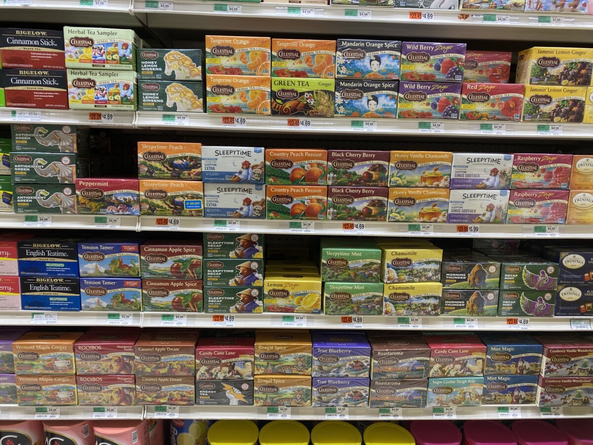

I chose two tea brands for this project. The BIGELOW French vanilla and the CELESTIAL Caramel Apple tea boxes. Both boxes have unique designs but they’re effective. The BIGELOW tea box has a very classic sleek design. It sticks to a very minimal color format which differentiates it from the other tea boxes. What I was most interested in is the design of the box. It has a latch opening with a closing tab making it very convenient. The CELESTIAL Caramel Apple uses a big well drawn image as an attention grabber but also uses a typography forward design on the rest of the box.
My first choice would be this set of 600 Lumen flashlights from Police Security. While their name states that they make products for police security they use a lake for their package’s background. The grey area has a ton of unused space. The company name is stuck in the far-left corner while also being ridiculously small. The copy does a fair job of highlighting the products features but contains nothing eye-catching. Especially when every other product contains interesting type and brighter colors.


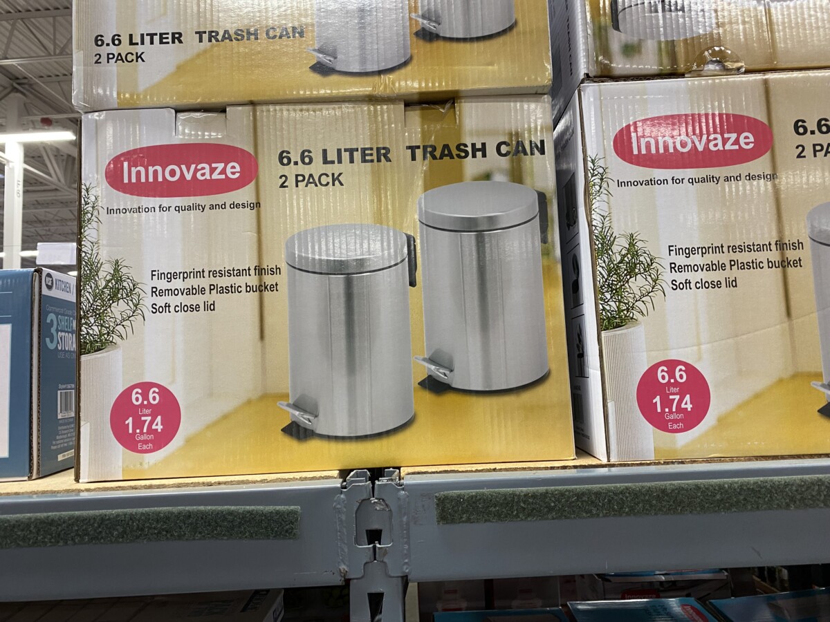
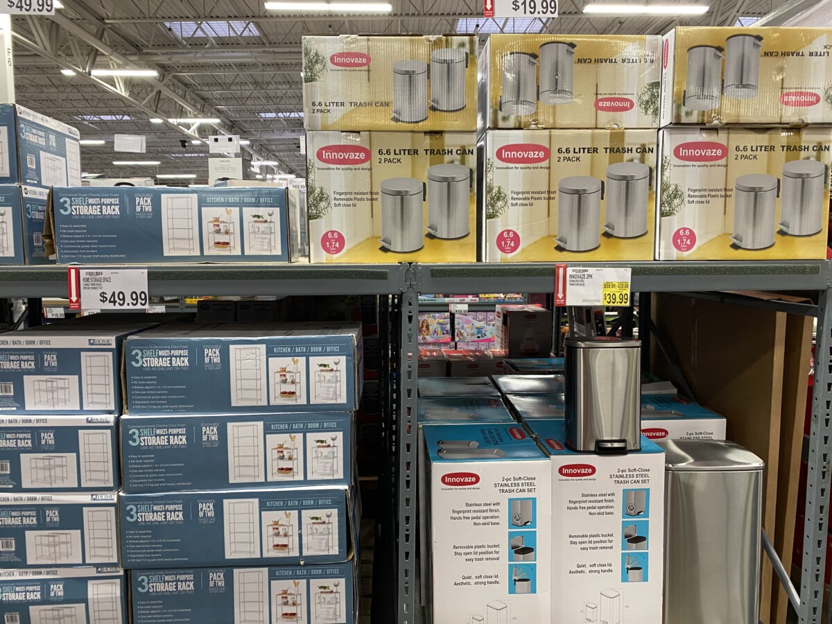
My Second choice would be these 2 packs of 6.6 Liter trash cans from Innovate. The design on this package has a better use of space and highlighting important content. Though, it feels plain and flat. Even though it does communicate its message clearly it doesn’t stand out. Adding a more diverse array of colors could make it more eye-catching. A more dynamic picture would better illustrate their product. Something that would help consumers imagine it in their homes.
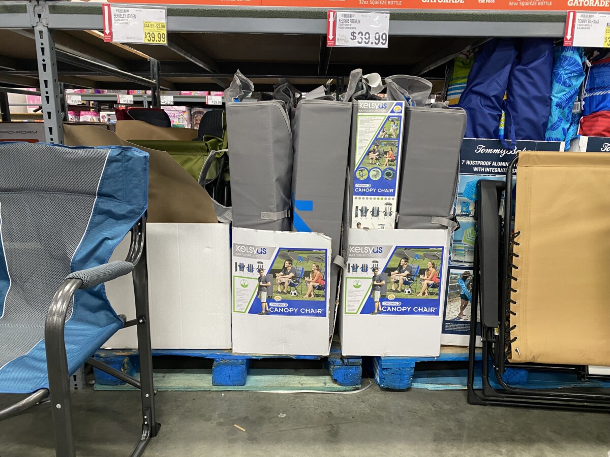
My third choice would be the canopy chair from KELSEYUS. The type and colors are eye-catching. They do a great job in showcasing its features and the ways it can be used. Though the design feels very small. The lower half of the box is an unused white space which the design can use. Because it is small the type is a lot smaller as well. Which makes it hard to read unless you’re really up close. The logotype could also use a color change since the grey background drowns out the white lettering.

The OpenLab is an open-source, digital platform designed to support teaching and learning at City Tech (New York City College of Technology), and to promote student and faculty engagement in the intellectual and social life of the college community.

