My first choice would be this set of 600 Lumen flashlights from Police Security. While their name states that they make products for police security they use a lake for their package’s background. The grey area has a ton of unused space. The company name is stuck in the far-left corner while also being ridiculously small. The copy does a fair job of highlighting the products features but contains nothing eye-catching. Especially when every other product contains interesting type and brighter colors.


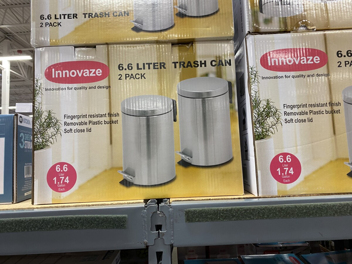
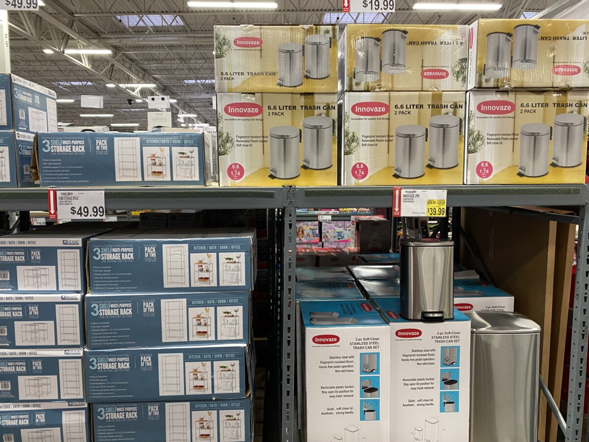
My Second choice would be these 2 packs of 6.6 Liter trash cans from Innovate. The design on this package has a better use of space and highlighting important content. Though, it feels plain and flat. Even though it does communicate its message clearly it doesn’t stand out. Adding a more diverse array of colors could make it more eye-catching. A more dynamic picture would better illustrate their product. Something that would help consumers imagine it in their homes.
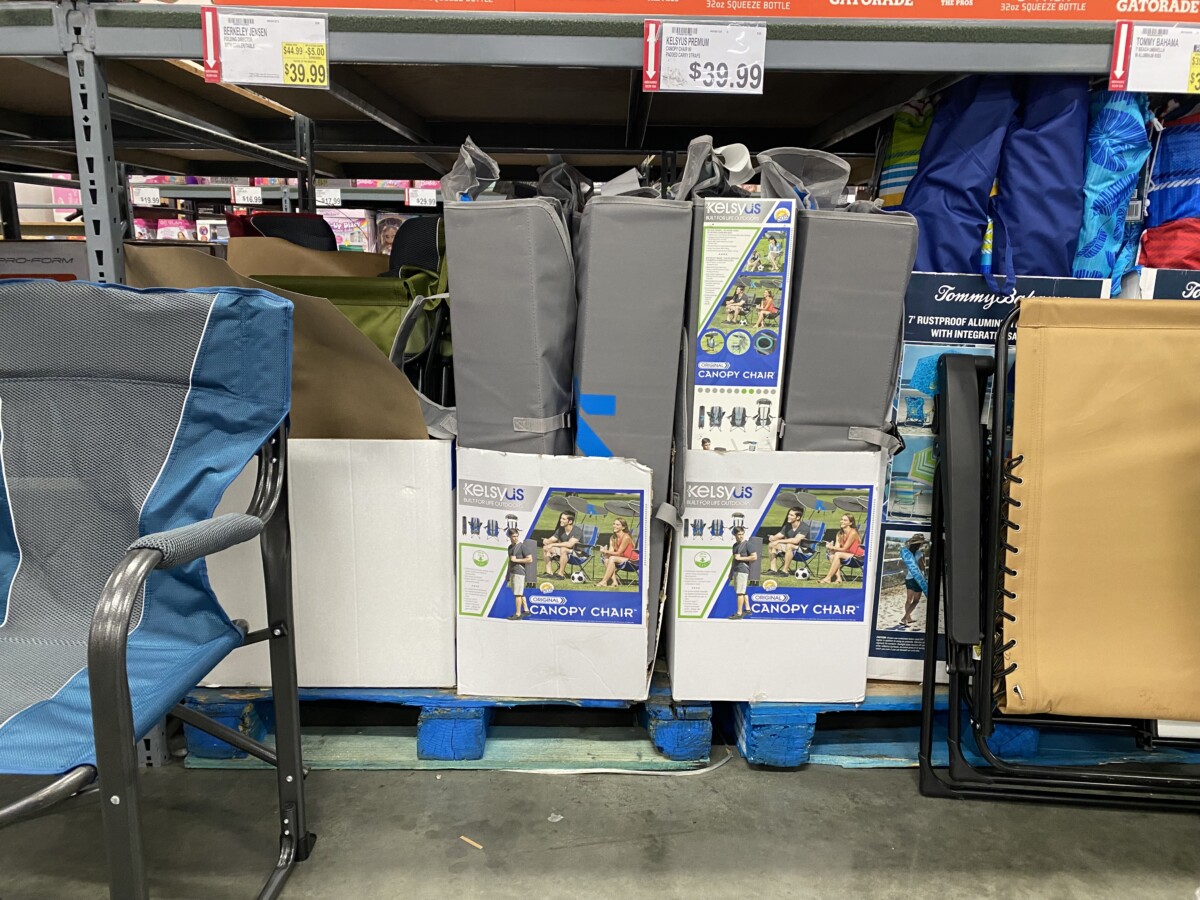
My third choice would be the canopy chair from KELSEYUS. The type and colors are eye-catching. They do a great job in showcasing its features and the ways it can be used. Though the design feels very small. The lower half of the box is an unused white space which the design can use. Because it is small the type is a lot smaller as well. Which makes it hard to read unless you’re really up close. The logotype could also use a color change since the grey background drowns out the white lettering.


All of this looks pretty good, because it seems like you put some pretty decent info into this. Pretty good choices too.
another reason is because it serves as what we need to know for what were looking at within your choices
Your choices can be for something that you can also take to your future classes if possible and then your future graphic design workplace.